Results and Discussion

Presented below are the analyzed projectile velocities of several test firing runs of our group’s rail accelerator. The data contains limited data points due to the low fps camera’s inability to accurately capture portions of our projectile’s movement. Another factor limiting both the number of data points and the velocity of the projectile is the tendency of the projectile to vaporize and then ionize into plasma upon the current being connected through it. The electric current transforms the projectile which fades away into nothing as it travels through space.

drawing

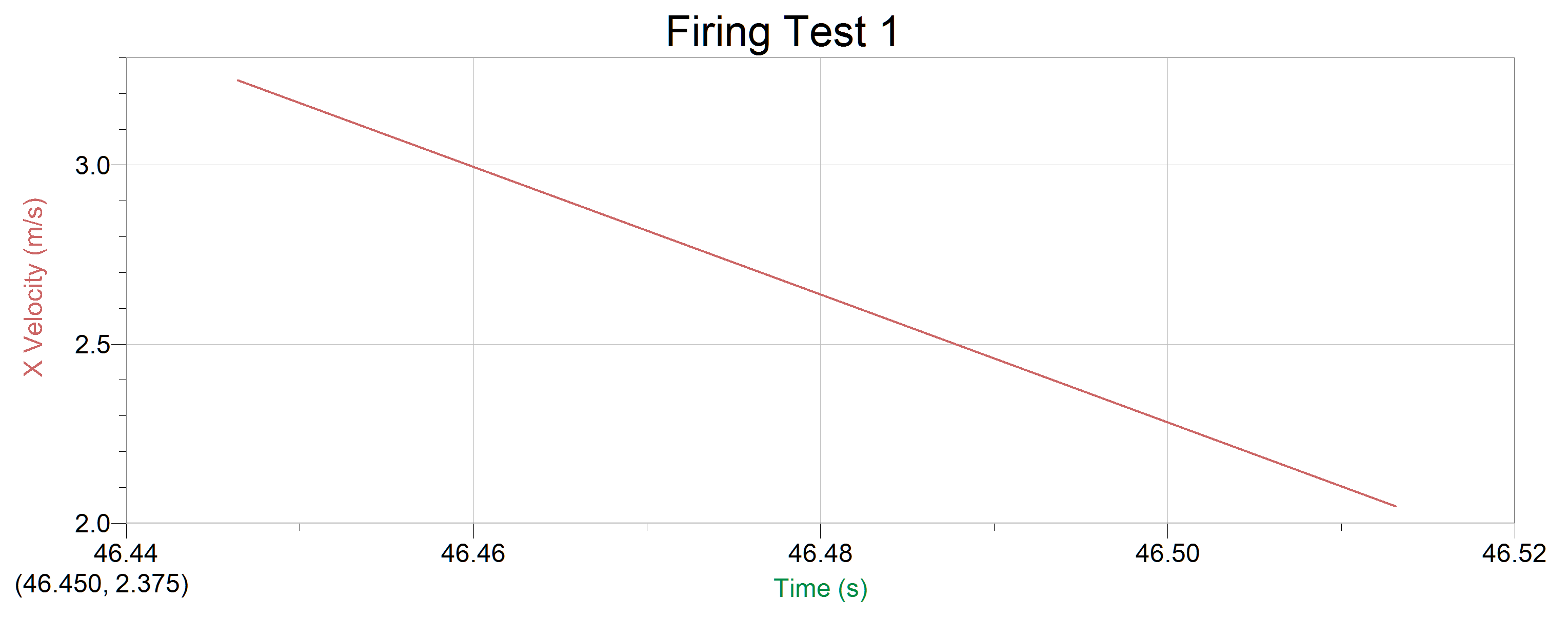
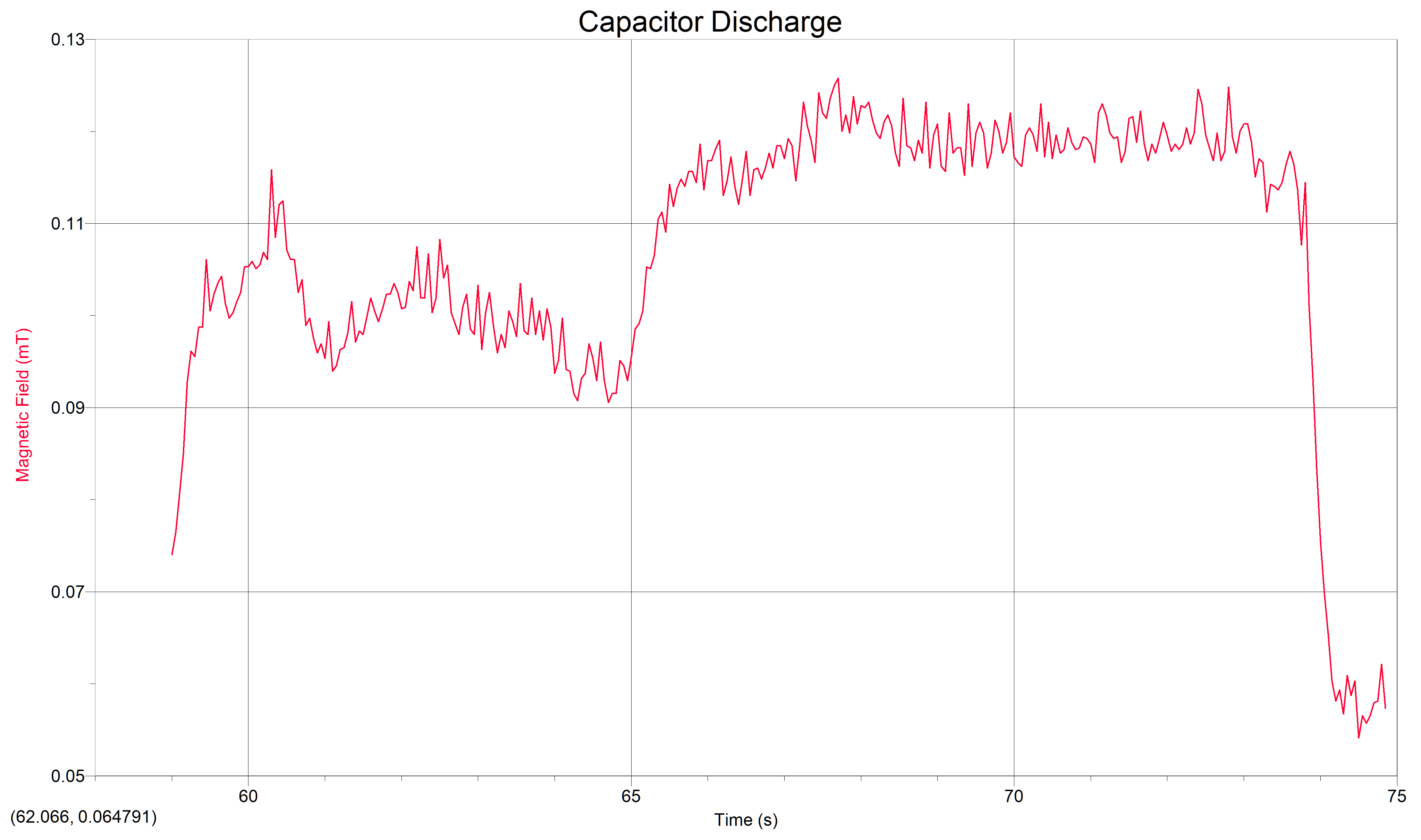
Figure 1: Graphed data from our first firing test (click to enlarge)


firingTest2

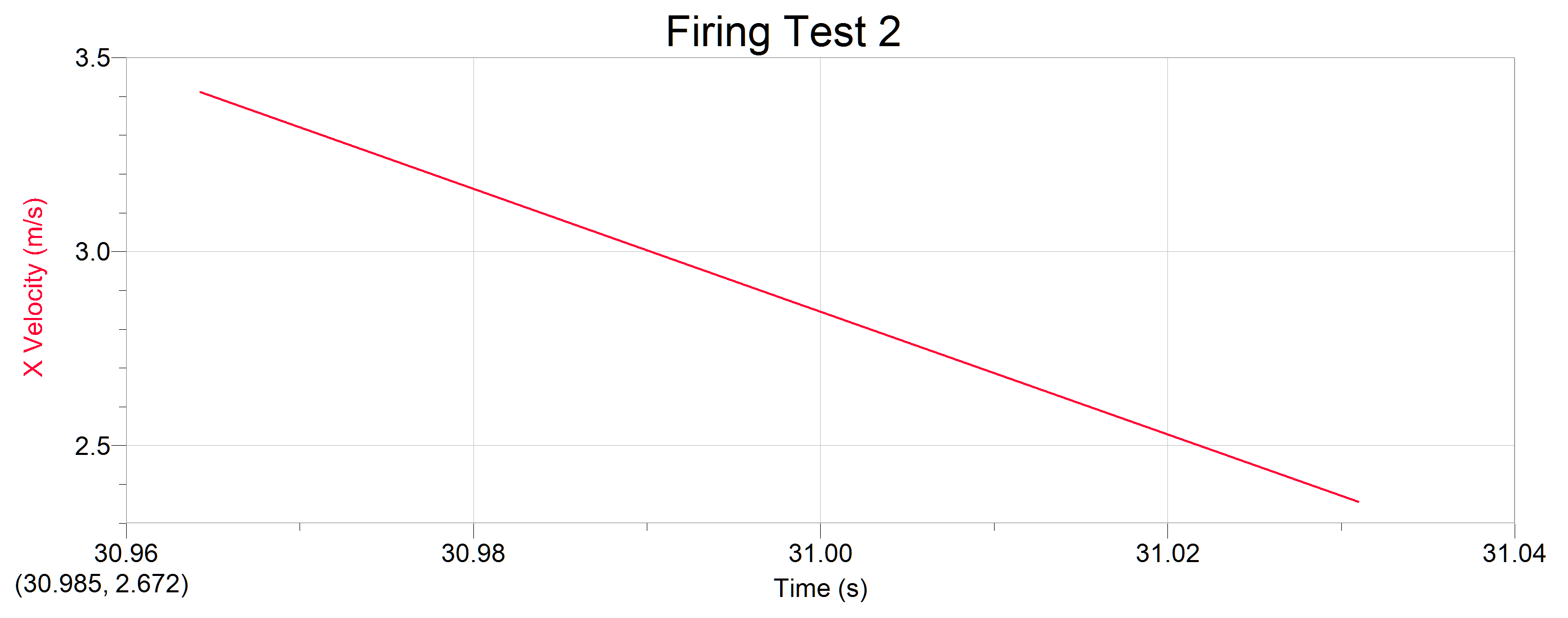
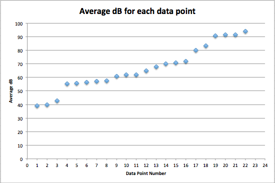
Figure 2: Graphed data from our second firing test (click to enlarge)

These results clearly show the deceleration of our projectile as it fades away and ceases to travel. The initial velocity in the graph represents the velocity as the projectile leaves the rails, no acceleration can be picked up by the camera before then, as the fps is too low to identify the nearly instantaneous acceleration.

The results match our expectations for the projectile’s behavior in that we initially recognized the potential for the projectiles to become plasma. The velocity exhibited seems reasonable given the size of our rail accelerator and projectiles, as well as the relatively low voltage stored in our capacitor bank.

Due to the variable educational backgrounds of our group members, everyone learned something a little different. As an overview we all learned something about the physics involved in the function of a rail accelerator. Specifically we learned through hands-on experimentation about the use of electricity to generate Lorentz force to propel a projectile. A lot of our learning went a little beyond the direct science of the project though, as we all learned something about actually constructing a scientific apparatus for testing.

railgunCircuit


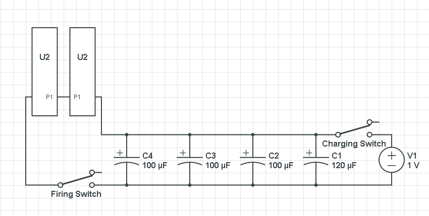
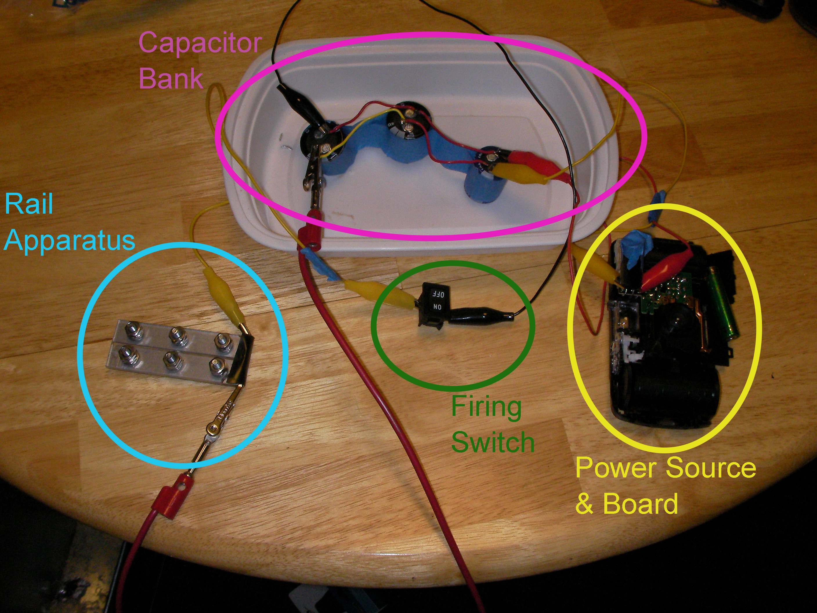
Figure 3: Circuit Diagram for our Rail Accelerator (U2 represents a rail) ((Battery Voltage 1.5V not 1))

If we had to do this project again we would be more attentive to the original construction of our rails and circuit. Small problems in our construction caused major annoyances later in the project. Having constructed a rail accelerator previously would also be largely beneficial. If we were to continue the project, or maybe even in other trials there are several additions we would consider. Testing with different projectiles is the easiest to attempt, if we had suitable materials we might have been able to avoid the problem with the disintegration of our projectiles. If we continued the project it would be interesting to investigate the effects of adding additional capacitors to the charging circuit. Comparing the two charging circuits would clearly show the role the capacitor bank plays in the speed of the projectile fired from the rail accelerator. Another option would be to look into obtaining and using higher quality materials to avoid component failure which adversely affected the entire project.

Group 9: Results and Conclusions

The bar chart below displays the adjusted opacity values of our samples.  The longer the bar, the more transparent the liquid, and hence, the lower the opacity.

Adjusted Opacity Values

We expected our opacity readings to be strongly correlated with our spectroscopic data, but this was not always the case.  For example, Axe Shower Gel had a high opacity (low lux reading) and had full absorbance (to the limit of the spectrometer) across the visible spectrum.

axe shower gel graph

Coffee, on the other hand, was the most opaque sample we measured, but only displayed full absorbance from 400-580 nm.  We did not expect this result, and are not sure why this is the case.  Maybe because the light which is absorbed is all higher energy wavelengths?

coffee graph

The most transparent liquids all had very low absorbances across the spectrum, which is what we expected.  Locations of minor spikes in absorbance varied, but this did not affect opacity because the lux readings covered the entire visible spectrum.

Many of the liquids were colored, and these colors were based on their absorbance patterns.  Coffee, for example, absorbs everything up to  580 nm, and then trails off, which means it reflects light in the red to orange area of the spectrum, giving it its brown color.

We also diluted coffee with unknown pineapple juice (what pineapple juice does the Deece use?) and found that the mixture had some yellow and green absorbance readings as well.  The problem is that since we don’t have the spectrum of pineapple juice, we can’t determine whether the yellows and greens are due to the pineapple juice’s absorbance wavelengths, or simply through the dilution of coffee.

coffee and unknown pineapple juice graph

Orange juice absorbs everything in the visible spectrum except the wavelengths from 640 to 700 nm.  From 640 to 700 nm the absorbance varies, but it is never completely saturated.  Thus its orange color.

orange juice

The spectroscopic readings for Axe Shower Gel were fully saturated, but when we mixed it with the almost completely transparent listerine, we wound up with an interesting spectrum.  Since the two substances did not react chemically, the spectrum produced is most likely a reflection of the spectrum of Axe Shower Gel.

listerine and axe shower gel

This project gave us a better grasp of the principles of atomic spectroscopy.  At the risk of over-simplifying, a spectroscope shines light through the sample, and then measures how much is absorbed at each wavelength.  Since each element only absorbs certain wavelengths, the spectrographic measurement of a substance is akin to a fingerprint, although it requires a trained spectroscopist to analyze it accurately.  We utilized the spectroscope to examine the absorbance properties of our samples, and compared that to the overall opacity of the samples.

If we had this project to do over, we would make a few corrections to our approach.  We would record the concentrations of each liquid in our mixtures, and vary the concentrations to examine the difference in absorbance.  We would handle the cuvettes with more care, because fingerprints on the cuvettes could subtly alter the spectroscopic readings.

If we had another six weeks, we would dilute all of our fully absorbent liquids with water (since water would not cause much interference, as a relatively clear, non reactive, liquid) so we could measure their absorbances.  We really liked the idea of analyzing the composition of sunset lake.  We would like to suggest hiring a trained spectroscopist to work with us to help us interpret the spectroscopic readings.  😉

Group 2 Data: Lasers and Sound

For our project, we build a device to convert sound waves into patterns of laser light:

diagram

We recorded each member of the team saying a standard sentence into the device, and then took a video of the resulting pattern. We also took data regarding the volume (dB) and frequency (Hz) of each speaker.

Displayed here are three different voice recordings of one sentence, “the quick brown fox jumps over the lazy dog.” This sentence was chosen because it contains all the letters of the alphabet and would hopefully provide variation in the laser patterns produced. The patterns of one boy’s voice and two girls’ voices were measured. As seen in the video clips, deeper/lower voices/frequencies created a larger, circular laser pattern; higher pitched voices created a smaller ring-shaped pattern and also figure 8 shapes, as well.

Elizabeth’s Sentence:

Tim’s Sentence:

Becca’s Sentence:

The length of the sentence was about four seconds. The data recorded includes the video of the laser patterns, the audio recording, and the decibel recording, as well.

While further playing around with the device, we found that “P” noises (like the word “pop”) elicit a large circle, whistling into the cup and also playing music through an iPhone (classical and also bass/drum heavy) do not vibrate the balloon enough for much of a visible laser response.

Decibel levels of each speaker’s sentence:

db_graph

Frequency plot of Elizabeth’s voice:

freq_elizabeth


Frequency plot of Tim’s voice:

freq_tim


Frequency plot of Becca’s voice:

freq_becca


Looking at Tim’s frequency plot, there is a steep drop-off after 500Hz. This lines up with our observation that lower frequencies had more of an impact on the laser pattern, as his was much larger than the other two.

Decibel level did not have a discernible effect on the results. Much more important was the low frequencies.

We also recorded each member singing a set of three notes:

Elizabeth Singing:

Tim Singing:

Becca Singing:

Problems Encountered:

-The correct assembly of the device. For instance, less stretched balloon drum on top of the cup responded better to sounds. The application of the piece of mirror to the balloon drum was best executed using glue instead of tape, which buffered and absorbed some of the vibrations of the balloon, desensitizing the mirror and laser’s responses. The size of the mirror was also important–the heavier and larger the mirror piece, the less it would respond to vibrations. The material for the cup was also important and plastic works best (over paper). Mounting the laser onto the cup using a paperclip was best done by unfolding the clip to have two legs to tape to the cup, rather than one.

-The distance of the device and input source from the observation point, a black board. A distance of about 12.5 feet worked well for us; a longer distance increases the amount of the pattern seen.

-Playing music from a phone didn’t have enough low frequencies to move the laser a discernible amount.

Group 7 Initial Project Data

For collecting our data, the sample was placed into a 20 gallon plastic container with the Geiger counter pointing downwards at the sample, and the Vernier LabQuest was placed away from the container to minimize any additional environmental variables. The samples were placed 6 inches away from each sample. The container was covered before testing began, and all testing was conducted in a dry room at 75°F. Pictures are shown below.

IMG_20140221_141734IMG_20140221_141644IMG_20140221_141820IMG_20140221_141756IMG_20140221_141741

The data was collected for a period of 10 minutes at intervals of 10 second through the Vernier LabQuest and was compiled into a data chart on the devices. The samples that were tested were as follows: a banana, peanut butter, Beck’s beer, and a blank. The data was then transferred to Microsoft Excel where various calculation were conducted. A total summation of all the radioactive counts are shown in Figure 1, and a line graph of the variation of counts per 10 second interval are shown in Figure 2. 


Screen Shot 2014-02-21 at 5.10.25 PM

Figure 1 – Summation of Counts

Screen Shot 2014-02-21 at 5.03.19 PM

Figure 2 – Counts over Time

The data overall showed that radiation was indeed being emitted from each of the samples, however, the type of radiation has yet to be determined.

Data for Magnetic Fields of Televisions

The data was obtained at Best Buy In Poughkeepsie, NY.

How the televisions were measured:

There were two settings on the magnetic field probe. Both settings were used.


High vs Low


On each of the two settings, I took the magnetic field [in micro-Teslas] in three different postions for the 32″ and the 40″-42″, and only two of the postions for the 55″ and the 80″.

Parallel to the screen:

Paralle to Screen

Perpendicular to the screen:

Perpendicular to Screen

Parallel to the frame:

Parallel to frame

Using the Vernier LabQuest, I obtained a 10 second reading of each position. From the graph, I picked the average of the reading.

Graph

The following data show the results and averages.

Data


Group 4 Project Data

Energy consumption (in watts) and average monthly cost (in $) of appliances in a typical TH:

Energy consumption (in watts) and average monthly cost (in $) of appliances in a typical TH

(continued from table #1)

(continued from table #1)

Explanation of data:

The data we have collected thus far is organized by the location of each appliance in a typical TH. We have four different locations (kitchen, living room/dining room, bedrooms, bathroom), each with a separate list of appliances normally found in those rooms. For each appliance, we have recorded the cost (in $/month) of powering the appliance, as well as the energy consumption (in watts) that it uses. We have also calculated (using Microsoft Excel) the cost of powering each appliance over the course of a semester, which just involves multiplying the monthly cost by 4 (months in a semester). Additional calculations during data analysis will allow us to make more accurate estimates of the average energy use and energy cost in one TH, taking in to account about how long each appliance is plugged in and used each month.

Picture of data-gathering setup: 


How did we take the data:

We began our data collection by making a list (organized by room) of every personal appliance we have in our houses and have used throughout the year. After making this list, we gathered our data one room at a time, plugging each appliance in to the Watts Up? Pro to measure the cost per month as well as the watts of each appliance while in use. For appliances that tend to remain plugged in while not in use (such as lamps and the microwave), we took two sets of measurements: one set while the appliance was plugged in but not on, and another set while the appliance was plugged in and on/in use. We gathered all of the data together, with one person managing the Watts Up? Pro while the other recorded the data as it was measured.

Technology used to gather data:

The technology we used to gather our data included the Watts Up? Pro, a laptop computer, all of the appliances being measured, and a Microsoft Excel spreadsheet.

Conditions under which data was taken:

The conditions under which our data was taken are described above in the explanation of how we gathered our data.

Units:

The units of our data include dollars per month for the cost, and watts for the energy consumption.


Experiment and Data

 Experiment Setup and Background:

Rail Accelerator Construction

The initial phase of the our project was to construct a rail accelerator which would be the object of our tests and analysis. This construction involved building separately the two major components of the accelerator, the charging circuit to power the device, and the rails themselves to run the charge through.

Rail Design

The rail design is relatively simple, two thin pieces of aluminum are placed side by side with a gap of about 1/16″ between them. These aluminum bars are sandwiched between two sheets of lucite (clear hard plastic) and via holes driven through all four objects, held together by steel bolts. Our original design had us attaching our leads to these bolts to run current through the rails, but was later changed for reasons that will be discussed when we discuss the challenges presented by testing phases of this project.

Charging Circuit

The charging circuit was slightly more complicated to construct on our end. The basis for the circuit is the circuit board from a disposable camera. using the battery and charging switch from the camera we soldered additional capacitors in parallel in the circuit and added a switch on one side of these capacitors. Using the flash charging switch (or button depending on the camera) to charge our capacitor bank lets us build up charge before releasing it from the capacitors via the switch, completing the circuit with our accelerator wired between the positive and negative of the capacitors.

SANY0015

Figure 1. The layout of our rail accelerator as connected (Power source partially removed in this picture)

Experiments and Test:

The initial testing phase of our project focused on testing the parts of the rail accelerator before finally putting the charging circuit to the rail and attempt to fire it. With the rails the only testing that could really be done was an overview examination and the first firing test, with our circuit we had a little more time to test. So in essence our tests are as follows.

Capacitor Bank Testing

First we tested the capacitor bank to see that it could charge from our power supply and be safely discharged. After managing to properly construct our power supply and setup the charging switch from the camera this was no problem. Our capacitors easily charged and functioned safely even soldered together as a capacitor bank. The second phase of testing for our capacitor bank itself is a test of the magnetic field produced by the electricity in the capacitors, and the change in this field when the capacitors are discharged. The interesting results of these experiments are below.

drawing


Figure 2: A graph of the magnetic field around our capacitor bank at the point just before and at discharge. Noticeable drop can be seen.


Time (S) Magnetic Field (mT)
71.95
72
72.05
72.1
72.15
72.2
72.25
72.3
72.35
72.4
72.45
72.5
72.55
72.6
72.65
72.7
72.75
72.8
72.85
72.9
72.95
73
73.05
73.1
73.15
73.2
73.25
73.3
73.35
73.4
73.45
73.5
73.55
73.6
73.65
73.7
73.75
73.8
73.85
73.9
73.95
74
74.05
74.1
74.15
74.2
74.25
74.3
74.35
74.4
74.45
74.5
74.55
74.6
74.65
74.7
74.75
74.8
74.85
0.121015622295
0.119624020764
0.11782958721
0.118623044224
0.118024899706
0.118623044224
0.120417477777
0.118623044224
0.119819333259
0.124592282371
0.123005368344
0.119624020764
0.118220212201
0.11682861067
0.119819333259
0.11682861067
0.11782958721
0.124787594867
0.119416501237
0.117634274714
0.120014645755
0.120808102768
0.120808102768
0.118818356719
0.115046384147
0.117036130197
0.116633298174
0.111262204544
0.114240720103
0.114045407607
0.113654782616
0.114448239629
0.116437985679
0.11782958721
0.116437985679
0.113654782616
0.107673337437
0.114448239629
0.101105954771
0.0931469705743
0.0834057598545
0.0754345686264
0.0698681625008
0.06548583838
0.0603100572457
0.0581249987008
0.0593212877366
0.0567333971694
0.0609082017636
0.0587231432187
0.0603100572457
0.0541455066023
0.0565380846738
0.0557324206293
0.0565380846738
0.0579296862052
0.0581249987008
0.0621044907994
0.0573315416873

Figure 3: The values for the Magnetic data represented in Figure 2

Rail Testing:

Testing the rail accelerator itself has been the most problematic phase of our project. First because finding a space to both work with capacitors safely, and potentially fire a small projectile at the same time is not exactly easy on a small college campus. Our original plan was to use the archery field, but the snow (feet of it) seemed to make that seem like less of a good idea, especially because water falling from the sky and electricity don’t really play nicely together.

Phase 1 Rail Testing: So when the time came for initial testing of our rails we found ourselves outside near the archery field later than it was easy to take video results but prepared to test fire anyway. This first trial was a failure. The rails themselves weren’t completing the circuit they way they were intended, and we initially couldn’t figure out why. When we did figure it out the problem was in the construction of the holes for the screws in the rails. Having had the construction done by Carl an assistant to the physics department with access to a drill press, we hadn’t checked that the screws actually made contact with the rails themselves. Since the screws only made contact with plastic, attaching the leads to them wasn’t going to put a current through the rails and allows us to generate our lorentz force by closing the circuit. Because the rest of the rails were covered we had to deconstruct the rail apparatus and clip back some of the lucite so that the clips could be attached directly to the rails.

Phase 2: Our second test and the final test to this point had us once again by the archery field, this time during the day and with a camera ready to test our full system. These tests were a success, and our circuit can be completed and the rail accelerator fired. Videos of small firing can be seen below. Complications still exist at this point however. Firstly, because we are using small pieces of aluminum for our project, the heat from the electricity has a tendency to turn them into plasma, little more than melting aluminum sparks shooting from our rail accelerator. This limits the maximum projectile range, and occasionally simply fuses the aluminum to the rails themselves with the heat. While we do have a few successful tests firing partially plasmified aluminum, the next step before final data analysis and reporting will be to attempt to fire a more substantial material and compare the results.

Figure 4: Our first firing of the Rail Accelerator skip all the time it took to charge

Figure 5: Another shot of the accelerator firing. Watch for the spark shooting from the rails, that’s what’s left of the projectile by the time it leaves the rails


Group 3 Data


Graph of Data

Average dB

Table of data


Data Point Location, date, and time Description Average dB dB Range d(dB)/dt in dB/s Settings Inputter Graph

1

Jewett. 9:23pm on 2/13/14 Noise level during night time in my dorm (wellness and quiet).

38.98

38.00 – 48.86

-0.002022

S/Reset/A/Lo Christopher Graph

2

Library. 3:15pm on 2/12/14 Studying in library. No conversations.

39.82

37.70 – 53.74

-0.006618

S/Reset/A/Lo Christopher Graph

3

Jewett. 12:40pm on 2/14/14 Noise level during day time in my dorm (wellness and quiet).

42.65

41.91 – 48.52

-0.002447

S/Reset/A/Lo Christopher Graph

4

Raymond. 9:45pm on 2/18/14 Listening to “Arabella” by Arctic Monkeys on computer. Microphone 72.5cm from computer (comfortable ear distance when computer on lap) at 50% volume.

55.12

10.82-70.22

0.0118

S/Reset/A/Lo Phe Graph

5

ACDC. 3:30pm on 2/12/14 Closing time for ACDC (big side).

55.75

49.75-67.47

-0.003545

S/Reset/A/Lo Hannah Graph

6

OLB 205. 12:00pm on 2/17/14 Physics 152 lecture.

56.45

43.40 – 67.35

0.03432

S/Reset/A/Lo Christopher Graph

7

Jewett. 7:50pm on 2/13/14 Conversation with a friend in my dorm.

57.3

42.40 – 80.32

-0.002987

S/Reset/A/Lo Christopher Graph

8

Raymond. 9:41pm on 2/18/14 Listening to message on iPhone at 100% volume. Microphone against speaker. Message begins at t=5s.

57.51

0.08392-80.95

0.1028

S/Reset/A/Lo Phe Graph

9

Jewett. 9:13pm on 2/13/14 Listening to Kings&Queens – 30STM, volume at 100%, using headset with volume at 100%, however headset is on my head and microphone is 0cm from left ear.

60.86

50.78 – 67.38

0.05022

S/Reset/A/Lo Christopher Graph

10

ACDC. 12:00pm on 2/13/14 Noise level at ACDC (big side) during lunch.

61.75

51.99-77.08

-0.009397

S/Reset/A/Lo Phe Graph

11

Jewett. 8:58pm on 2/13/14 Listening to Kings&Queens – 30STM, volume at 60% and microphone 10cm from speakers.

61.86

41.28 – 71.53

0.08031

S/Reset/A/Lo Christopher Graph

12

Retreat. 6:00pm on 2/18/14 Noise level at Retreat during dinner.

64.98

58.11-74.58

0.01566

S/Reset/A/Lo Phe Graph

13

Vassar’s Infant Toddler Center. 2:30pm on 2/18/14 The infant room at the ITC, with babies crying sporadically

67.73

54.50-80.95

-0.02128

S/Reset/A/Lo Hannah Graph

14

Jewett. 9:07pm on 2/13/14 Listening to Kings&Queens – 30STM, volume at 100%, using headset with volume at 100%, microphone in place where head should be (2-4cm apart from each ear piece).

69.9

42.28 – 81.31

0.1129

S/Reset/A/Lo Christopher Graph

15

Retreat. 3:00pm on 2/17/14 Lunchtime at the retreat, crowded

70.8

64.10-83.32

-0.0111

S/Reset/A/Lo Hannah Graph

16

Retreat. 12:08pm on 2/18/14 Noise level at Retreat during lunch.

71.83

63.85-80.08

-0.03982

S/Reset/A/Lo Phe Graph

17

ACDC. 6:20pm on 2/12/14 Dinner time on the west side (big side) of ACDC.

79.9

69.97-91.31

0.02131

S/Reset/A/Lo Hannah Graph

18

Raymond. 10:40 on 2/17/14 Listening to “What Makes You Beautiful” on iPhone from apple earbuds at 100% volume. Earbuds up against microphone.

83.39

72.49-91.48

-0.01072

S/Reset/A/Hi Phe and Hannah Graph

19

Raymond. 10:34pm on 2/17/14 Listening to “What Makes You Beautiful” on iPhone from jvc earbuds at 100% volume. Earbuds up against microphone.

90.66

79.48-97.23

0.01003

S/Reset/A/Hi Phe and Hannah Graph

20

Jewett. 8:35pm on 2/17/14 One of my friends practicing with her oboe from t=4 to t=113. 109 seconds of data.

91.29

77.99 – 101.40

-0.05215

S/Reset/A/Lo Christopher Graph

21

Raymond. 10:45 on 2/17/14 Listening to “What Makes You Beautiful” on iPhone at 100% volume. Apple earbuds with holes on back covered. Earbuds up against microphone.

91.46

77.48-101.9

0.07732

S/Reset/A/Hi Phe and Hannah Graph

22

Villard room. 12am on 2/15/14 Villard room party 100 nights, dubstep-like music was playing. 5-6 feet away from speakers.

93.8

86.69-101.5

-0.06069

S/Reset/A/Hi Hannah Graph

Sample experimental Setup Photo

setup

Experimental Setup Explanation

Level of sound (in decibels) was collected using a Vernier Sound Level Meter (Vernier SLM-BTA)  in conjunction with a Vernier LabQuest 2. The data was collected under 22 different conditions, as specified in the table above. All data, with the exception of data point 20 (see table), was recorded for 180 seconds. The Time Weighting switch on the Sound Level Meter (SLM) was set to “S” (slow), as is standard for most measurements. The Maximum Level Hold switch on the SLM was set to “Reset,” so that the screen would continuously display the sampled reading as opposed to the maximum reading. The Frequency Weighting switch on the SLM was set to “A,” which measures sound levels that most match those in the human hearing range. The Power/Measurement Range Switch on the SLM was most often set to “Lo,” which measures amplitudes in the range of 35-90 dB. When appropriate (when dB exceeded 90), the switch was set to “Hi,” which measures amplitudes in the range of 75-130 dB.

Explanation of Data:

The data is displayed in the table above. After collected, all data was transferred to the computers and analyzed in Logger Pro 3.8.6.1. The mean amplitude (dB), range, and slope of each graph was extracted using Logger Pro. This information, along with a photo of each graph is in the table. The mean amplitudes will be used to determine which conditions are damaging to human hearing after prolonged exposure. According to the National Institute on Deafness and Other Communication Disorders and to The American Speech-Language-Hearing Association, repeated or prolonged exposure to sounds at or above 85 dB can be damaging. Based on this statistic, the data will be analyzed to determine which sounds (based on mean dB) are dangerous.

Technology involved:

  Two Sound level meters: Vernier SLM-BTA (Type 2) were used in conjunction with two Vernier LabQuest 2 to record the sound level of each condition. The Vernier LabQuest 2 recorded the data and provided graphical representation of the data for each of the conditions. For further analysis, the Vernier LabQuest 2 were connected to computers (a MacBook Pro and a Samsung Series 9 Laptop), which had Logger Pro 3.8.6.1 installed. We utilized the stats tool and the linear fit tool to analyze the data in Logger Pro. Further more, we created a graph of the average dB level exposure per activity (Average dB for each data point) and created a chart of all of the data using Google Docs.

Conditions under which data was taken: 

Twenty-two conditions with various amplitude levels, from studying in the library to a Villard room party, were studied. Please see table above for specifics.

Citations:

“Noise.” ASHA. n.p., n.d. Web. 17 Feb. 2014.

“Noise-Induced Hearing Loss.” NIDCD. NIH, Oct. 2013. Web. 17 Feb. 2014.


Group One’s Data: Radiation on Vassar’s Campus

For our research project, we attempted to measure the counts of radiation in academic buildings around campus using a Geiger Müller (GM) tube attached to a LabQuest 2. We were also interested in seeing if the radiation levels observed correlated with the ages of the buildings tested. This is an important type of testing to do, as over-exposure to radiation, especially \gamma 
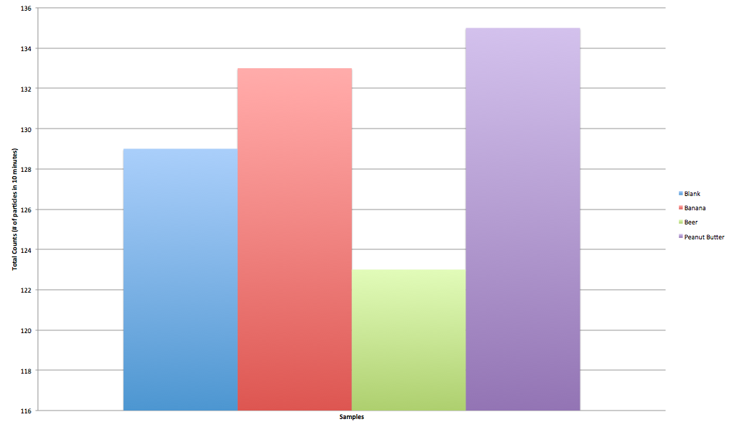
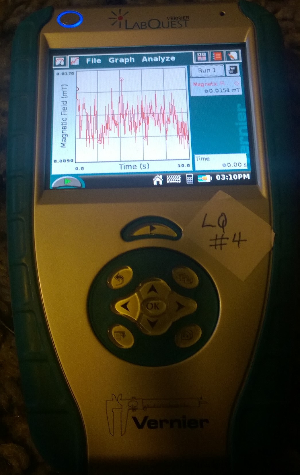
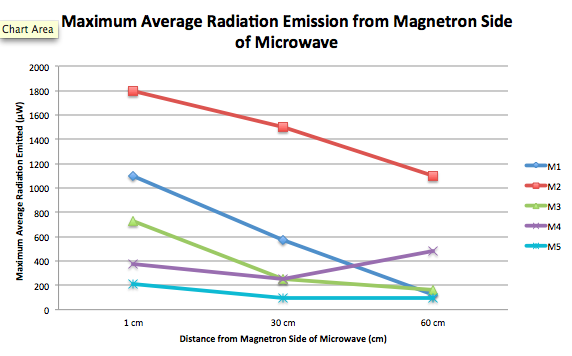
particles, which are high energy photons without mass, can lead to negative results. These can include radiation poisoning, as well as cancer and other genetic mutations. To conduct our research, we walked around each of the buildings at a steady pace for 5 minutes, moving the GM tube from side to side. When there was an indication of possible radiation contamination, the tube was focused on that area to determine if there was a higher radiation count.  For example, there are areas in Olmstead that have radiation warnings on the door, and we stopped and waved the Geiger tube there for a considerable amount of time to test for any radiation contamination that may have been leaking through.


Figure 1. The apparatus used for recording radiation. The GM tube is located on the right. It is a gas filled detector, which functions using a low-pressured inert gas to amplify the signal of any radiation entering the tube. Radiation passes through the gas in the device and the molecules in that gas are ionized, leaving positive and negative ions in the chamber. These ions move toward separate charged sides (the anode and cathode), creating a current which is then sent through the wire to the LabQuest 2 Device to be measured and recorded. Each \alpha, \beta, or \gamma particle entering the tube is measured as one “count” of radiation.

Average (Counts/0.1 Min)

Max (Counts/0.1 Min)

Age

Aula

1.94

5

1890

Blodgett Hall

1.54

4

1929

Chicago Hall

1.86

6

1959

Kenyon

1.28

5

1933

Library

1.98

6

1905

Mudd Chemistry

1.16

5

1984

Old Observatory

1.62

5

1865

OLB

1.34

4

1872

Olmstead

1.36

5

1972

Rocky Hall

2.38

6

1897

Sanders English

1.94

4

1909

Skinner Hall

2.44

7

1932

Swift Hall

1.58

4

1900

Background

1.32

3

Figure 2. Table of Average and Maximum radiation counts as compared with the age of the building. As read from left to right, the columns are labeled as (1) the buildings tested, with “Background” representing the data we collected between buildings to determine an average radiation level, (2) the average count of radiation observed in each building (per 0.1 of a minute over the course of 5 minutes), and (3) the highest amount of radiation observed in each building, and the age of the buildings that we observed. We initially hoped to be able to distinguish \alpha, \beta, and \gamma radiation from each other, but upon further review, we determined the only types of radiation we were likely to detect were \gamma and high energy \beta. This is because these travel further from their source than \alpha, and are generally emitted by the same type of material.

Figure 3. The average radiation counts compared with the age of the buildings. A trend line has been plotted to show the direction of correlation.


Figure 4. The maximum radiation counts compared with the age of the buildings tested. A trend line has been plotted to show the direction of correlation.


We plotted the above data observed in two graphs (Figures 3 & 4).  Figure 3 shows the average radiation levels by the year that the building was built, while figure 4 shows the maximum radiation level observed by the year the building was built.  As you can see, there is little to no association between the variables in either figure (figure 3: r=0.275, r²=0.076; figure 3: r=0.228, r²=0.052, where the “r” value indicates the closeness of correlation of the data, and the r² value indicates the percent of data that fits within that correlation).

The literature provided by Vernier, the makers of M tube and the LabQuest 2 device, states that expected background radiation levels should be between between 0-2.5 counts of radiation/0.1 min. Our average background radiation testing was within this range (avg=1.32 counts/0.1 min, max=3 counts/0.1 min). All of the average readings from buildings were also within this range (the highest average being taken in Skinner Hall: 2.44). With this information, we can conclude that Vassar campus is safe in terms of radiation levels.


Group 8 Project Data: Microwave Radiation

EXPERIMENT SET-UP:

Readings were taken at three distances (1 cm, 30 cm, and 60 cm) from the microwave oven door as well as from the right side (magnetron) of the oven.

 ExpSetUp

TECHNOLOGY USED:

Our data was collected with entirely with an RF Meter: with it, we tested the EM field strength around different microwaves at various locations around campus. The only other technology used in this experiment were the microwaves tested, which were all of varying models and ages.

DATA COLLECTION OVERVIEW:

We collected our measurable data as a team, with all three people assessing the qualitative variables before beginning measurements, and then one person recording data, and two using the RF meter in conjunction with the microwave to collect data. We allowed the microwave for ~30 seconds before starting to collect data to make for a more consistent readings from each distance.  We first observed the average value at each distance.  This required us to be subjective–since the average value switched as the RF meter collected data, every second or so, two people observed the average values for about 10 seconds before deciding an approximation where most of the values fell.  We then switched to measuring the maximum average, a value that stood constant on the RF meter.  We repeated this process at each distance from the microwave.  We of course switched roles periodically in order to give each member of the group a better understanding of the overall process!

We got to this streamlined process through trial and error, and toggling with the RF meter, whose manual is not extremely comprehensive.  We had to test measuring from different axes and also realized that we needed to measure the radiation in the general vicinity of the microwave before we measured for microwave radiation, so that we had an idea of the baseline of EM fields in the area.  We also had to toggle with measuring values on different settings.  While we began measuring only maximum average, we realized this did not give a sufficient idea of the radiation emitted on average.  Furthermore, if the RF meter caught a signal from something like a cell phone receiving a text, that outlying measurement would appear on the meter rather than the measurement from the microwave.  We decided to use both average and maximum average measurements to get an idea of how much radiation was generally emitted, as well as how much could potentially be emitted.

We also collected data by researching the safety standards of microwaves.  This data will help us understand what our values mean during analysis/conclusions.  We found that the International Electrotechnical Commission has set a standard of emission limit of 50 Watts per square meter at any point more than five centimeters from the oven surface. The United States Federal Food and Drug Administration has set stricter standards of 5 milliWatts per square centimeter at any point more than two inches from the surface. Most consumer microwaves report to meet these standards easily. Further, the dropoff in microwave radiation is significant with the FDA reporting “a measurement made 20 inches from an oven would be approximately one one-hundredth of the value measured at 2 inches.”

DATA COLLECTING CONDITIONS:

The conditions under which our data was collected were simply the conditions of the microwaves habitats: some were found in secluded kitchens without much EM feedback from its surroundings (before testing each microwave we made a note of the general, ground-level EM reading in the vicinity so we could adjust and compare microwaves after taking that initial radiation into account), and others were found in areas where wi-fi signals and cell phone usage really bumped up the ground-level readings, and requiring us to adjust how we understood the data accordingly,

UNITS:

  1. Distance from the microwave (cm.)
  2. Power of Microwave, found on microwave label (Watts)
  3. Radiation (µW/m^2)

DATA TABLES:

1) Preliminary Observations

Sample #

Location

Brand

Wear and Tear, Year?

Radiation Off

M1

Strong Kitchen

GE

MSES1139BC03

June 2011

No major wear and tear

AVG: 0.00

MAX AVG: 0.00

M2

Retreat

LG Orbit

LRM1230W

December 2004

In good shape

AVG: 0.00

MAX AVG: 0.00

*but when measuring not on avg., values did appear

M3

Noyes Dorm Room

Microfridge with Safe Plug

N060203077

February 2006

Squeaky noises

AVG: 0.00

MAX AVG: 0.00

M4

UpC

Amana Commercial Microwave

RFS11MP2

February 1999

AVG: 17.7 µW/m^2

MAX AVG: 18.4 µW/m^2

M5

South Commons Senior Housing

Emerson MW8999SB

March 2013

New condition

AVG: 0.00

MAX AVG: 0.00

2) Average EM Radiation Values

Sample #

Power (Watts)

EM Radiation from Front (1 cm)

EM Radiation from Front (30 cm)

EM Radiation from Front (60 cm)

EM Radiation from Magnetron (1 cm)

EM Radiation from Magnetron (30 cm)

EM Radiation from Magnetron (60 cm)

M1

1,600 W

300 µW/m^2

475 µW/m^2

350 µW/m^2

800 µW/m^2

300 µW/m^2

125 µW/m^2

M2

1,200 W

275 µW/m^2

200 µW/m^2

250 µW/m^2

700 µW/m^2

1.00 mW/m^2

300 µW/m^2

M3

700 W

270 µW/m^2

100 µW/m^2

90 µW/m^2

600 µW/m^2

125 µW/m^2

130 µW/m^2

M4

1,250 W

1.5 mW/m^2

800 µW/m^2

300 µW/m^2

200 µW/m^2

350 µW/m^2

300 µW/m^2

M5

900 W

300 µW/m^2

275 µW/m^2

120 µW/m^2

250 µW/m^2

80 µW/m^2

30 µW/m^2

3) Maximum Average EM Radiation

Sample #

Power (Watts)

EM Radiation from Front (1 cm)

EM Radiation from Front (30 cm)

EM Radiation from Front (60 cm)

EM Radiation from Magnetron (1 cm)

EM Radiation from Magnetron (30 cm)

EM Radiation from Magnetron (60 cm)

M1

1,600 W

628.3 µW/m^2

662.5 µW/m^2

508.8 µW/m^2

1.1 mW/m^2

571.3 µW/m^2

123.4 µW/m^2

M2

1,200 W

1.2 mW/m^2

282.9 µW/m^2

482.9 µW/m^2

1.8 mW/m^2

1.5 mW/m^2

1.1 mW/m^2

M3

700 W

457.7 µW/m^2

182.2 µW/m^2

169.1 µW/m^2

726.3 µW/m^2

252.2 µW/m^2

162.4 µW/m^2

M4

1,250 W

2.5 mW/m^2

1.7 mW/m^2

1.6 mW/m^2

372.0 µW/m^2

250.0 µW/m^2

477.9 µW/m^2

M5

900 W

798.2 µW/m^2

488.8 µW/m^2

149.6 µW/m^2

209.4 µW/m^2

92.3 µW/m^2

97.9 µW/m^2

DATA GRAPHS

1) Average Radiation from Front

Screen Shot 2014-02-17 at 9.35.17 PM

2) Average Radiation from Magnetron

Screen Shot 2014-02-17 at 9.35.06 PM

3) Maximum Average Radiation from Front

Screen Shot 2014-02-17 at 9.34.50 PM

4) Maximum Average Radiation from Magnetron

Screen Shot 2014-02-17 at 9.34.35 PM


Emma Foley; Hunter Furnish; Hannah Tobias