1
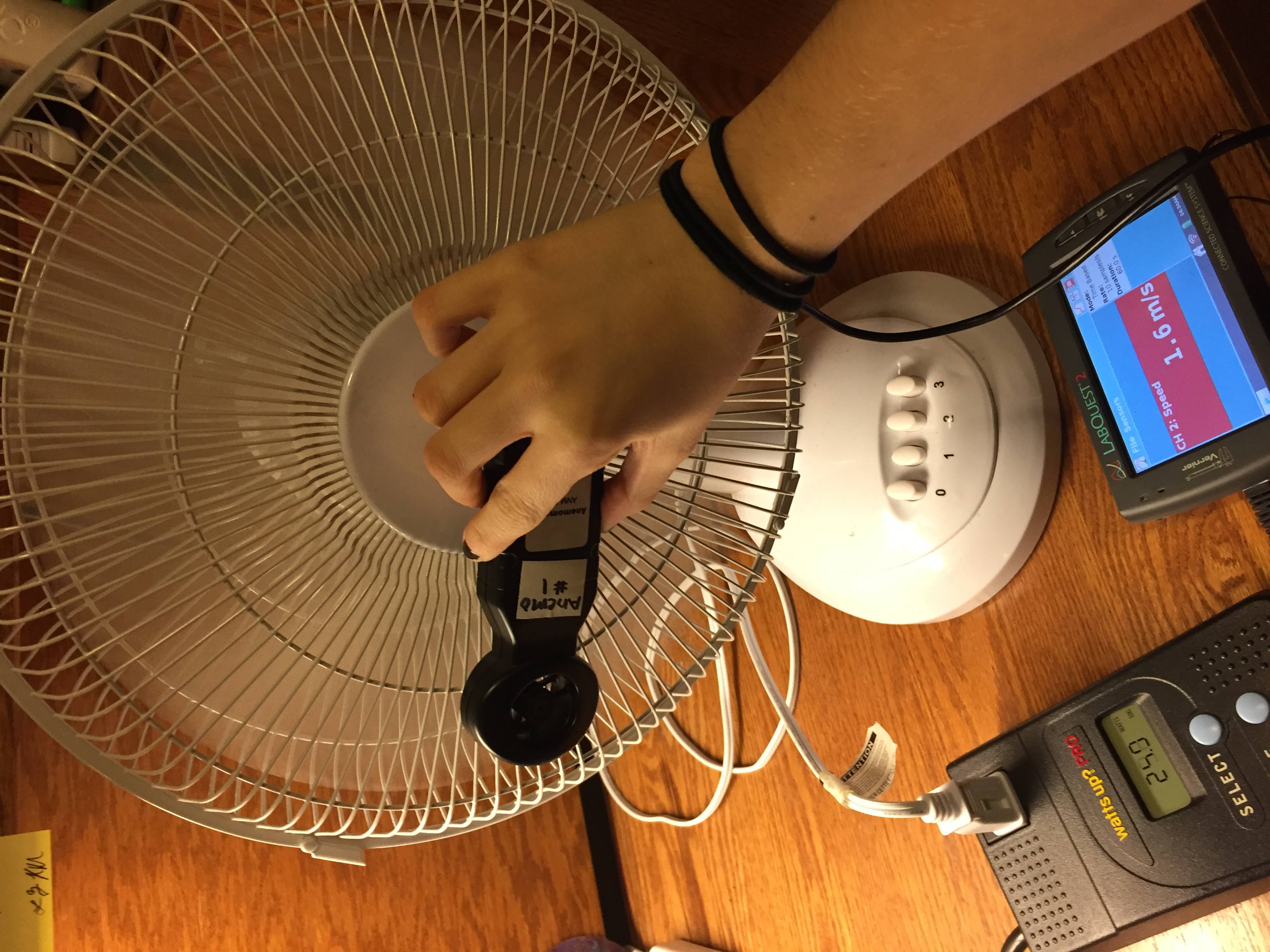
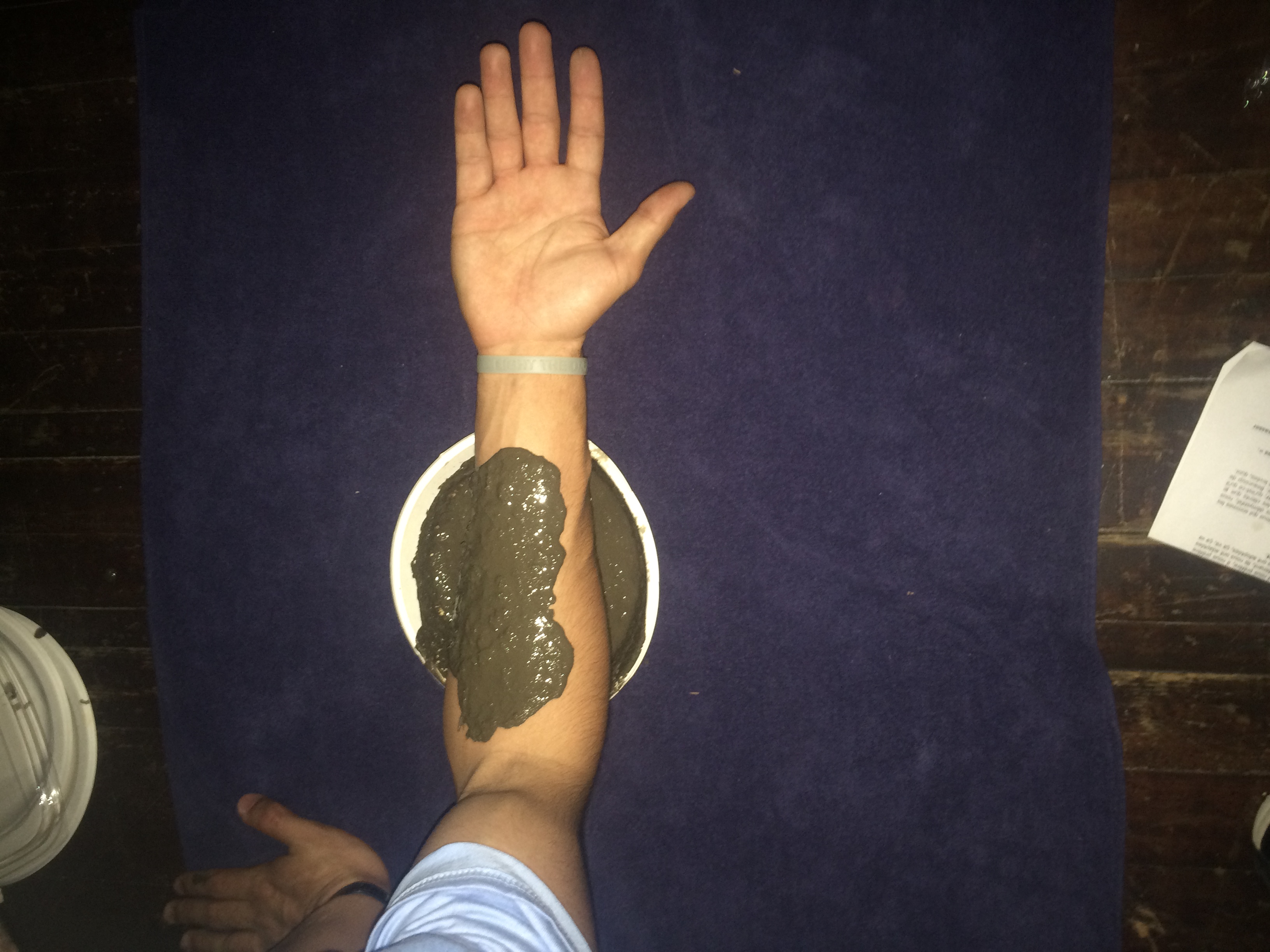
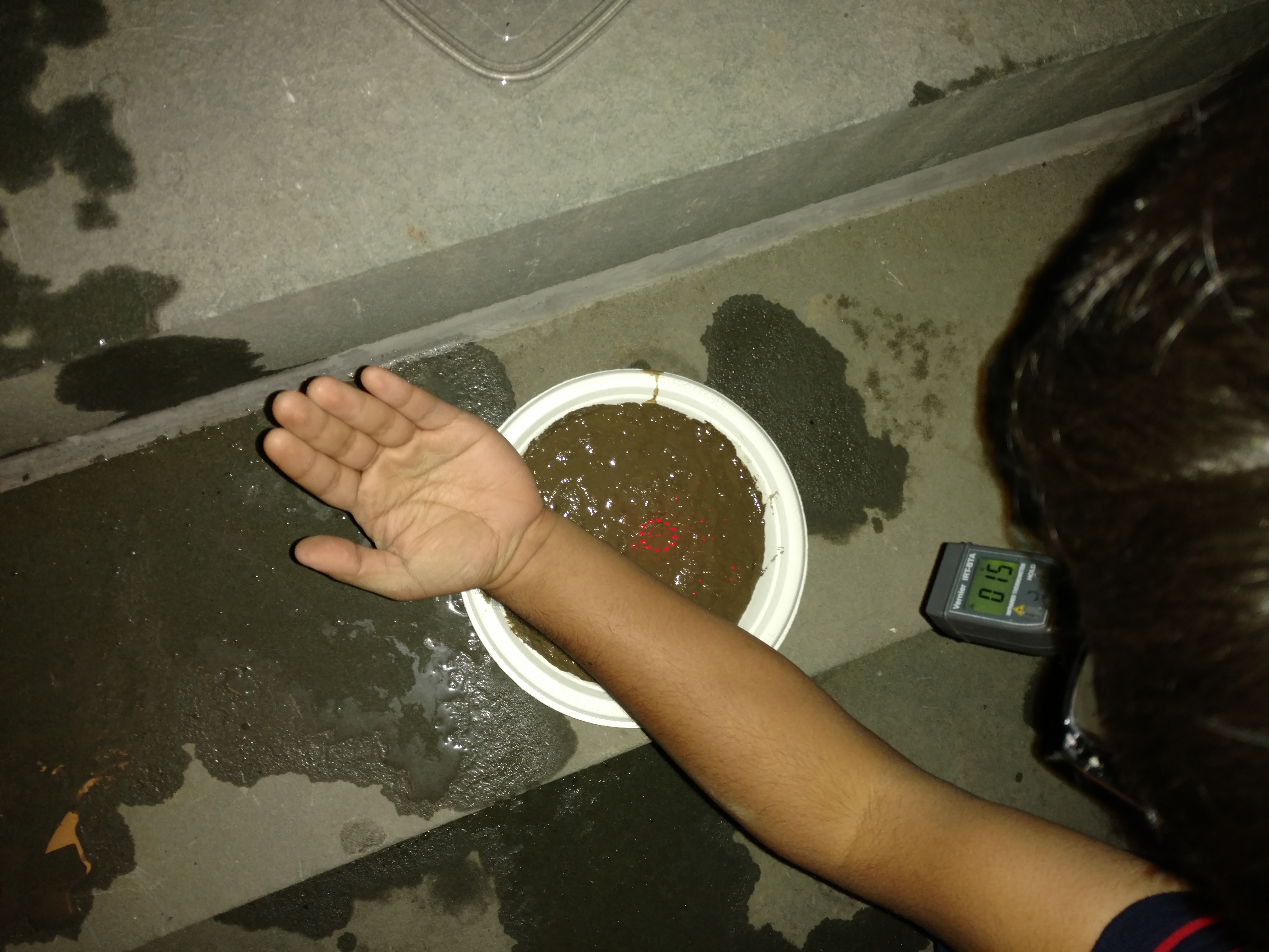
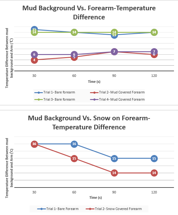
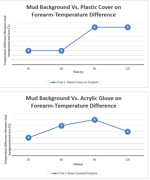
Latent temperature of the human body is naturally around 37 degrees Celsius, which is generally warmer than its surroundings. Therefore, it is rather easy to spot warm-blooded humans in the environment due to the temperature difference using infra-red vision. In the film Predator (1987), the titular villain exploits infrared vision to spot his human adversaries, but the hero in the story, Dutch played by Arnold Schwarzenegger, insulates his infrared radiation using mud in the finale of the film.(https://youtu.be/ktVqsBgOvBI?t=1m31s) We used mud as our background for each of the experiments in order to best replicate Dutch’s situation in which he found himself surrounded by mud. Such insulating properties of various materials and their ability to camouflage body heat like the scene in the movie are what experimentally verified in the tests. We used the Infra-red thermometer and night vision goggles. The Infrared thermometer measures the temperature of a surface in degrees Celsius. The night vision goggles, on the contrary, absorb infrared radiation from the environment and creates a crude grey-scale image. Our equipment detects infrared radiation that is invisible to the human eye, which will reveal the temperature difference between the two entities (being our forearm and mud background. Basically, the procedures involved us using mud as a constant, unchanging background throughout the experiment. First, we applied mud to each of our forearms (one person at a time) and measured the infrared radiation being emitted from that covered patch in comparison to the mud background. We chose the forearm because it has the least concentration of hair on the arm, which acts as an insulator and may have skewed our results. After this, we moved on to a patch of snow on the forearm in comparison to a mud background. Then we proceeded to test an acrylic glove and a transparent plastic cover. All the above mentioned was measured using an infrared thermometer. We started by measuring temperature of the mud background for each experiment and then at the 30 second mark, we switched the infrared thermometer to quickly measure the temperature of the covered forearm. Then we immediately kept measuring the mud background and switched back to the forearm in intervals of 30 seconds until we reached 120 seconds total time. We collected the quantitative data outdoors in semi-dark conditions (artificial light) and 19 degree Celsius weather. We took the difference between mud and covering object and presented that within the line charts. As for the second part of the project procedure, we used night vision goggles to gather empirical evidence of the before mentioned objects. However, snow was no longer present, so we could not include this in the second part of our study. In addition, we used a white shirt, black shirt, and white grocery bag to broaden our approach. While using a grey scale, the night vision goggles picked up infrared heat and displayed white for hot and dark grey/black for cold objects. The initial project data was taken February 23, 2017 and final project data was taken by March 8, 2017.
2 RESULTS
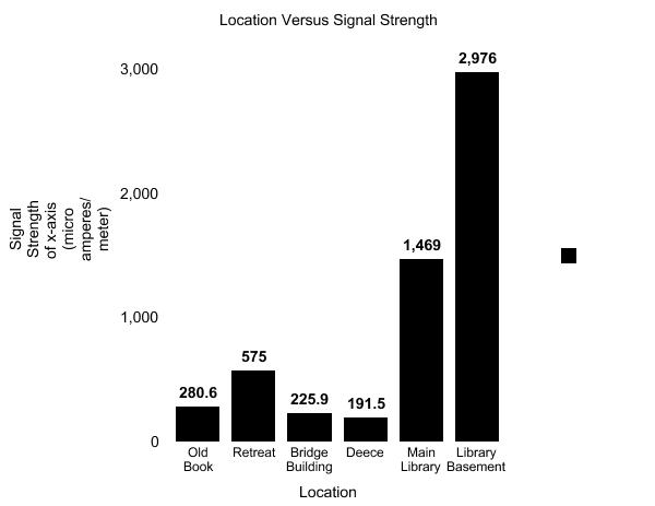
| MUD | ||||
| Trial 1-Bare forearm | Trial 2- Mud Covered Arm | Trial 3- Bare Forearm | Trial 4-Mud Covered Arm | |
| 30 seconds | Mud-12°C | Mud-13°C | Mud-13°C | Mud-14°C |
| Arm-27°C | Arm-17°C | Arm-27°C | Arm-20°C | |
| 60 seconds | Mud- 12°C | Mud-13°C | Mud-13°C | Mud-14°C |
| Arm-26°C | Arm-18°C | Arm-27°C | Arm-20°C | |
| 90 seconds | Mud-13°C | Mud-13°C | Mud-13°C | Mud-14°C |
| Arm-26°C | Arm-20°C | Arm-27°C | Arm-21°C | |
| 120 seconds | Mud-13°C | Mud-13°C | Mud-14°C | Mud-13°C |
| Arm-27°C | Arm-19°C | Arm-28°C | Arm-20°C | |
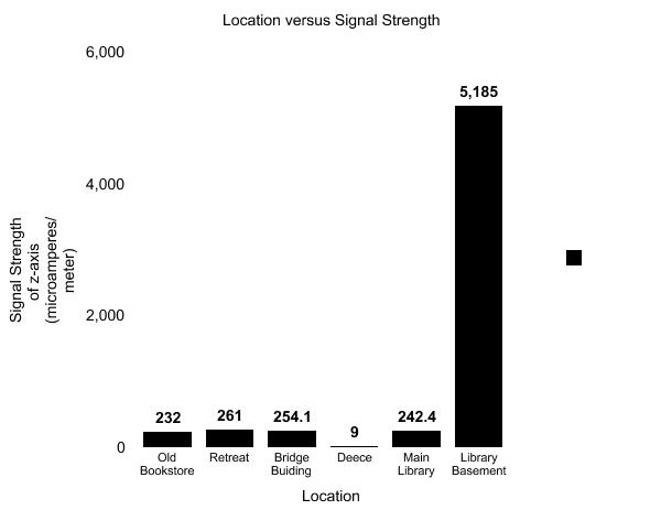
| SNOW | ||
| Trial 1- Bare Forearm | Trial 2-Snow Covered Arm | |
| 30 seconds | Mud-14°C | Mud-14°C |
| Arm-30°C | Arm- -2°C | |
| 60 second | Mud-14°C | Mud-14°C |
| Arm-30°C | Arm- -1°C | |
| 90 seconds | Mud-14°C | Mud-14°C |
| Arm-29°C | Arm-0°C | |
| 120 seconds | Mud-14°C | Mud-14°C |
| Arm-29°C | Arm-0°C | |
| PLASTIC COVER | |
| Trial 1- Plastic Covered Arm | |
| 30 seconds | Mud-14°C |
| Arm-22°C | |
| 60 seconds | Mud-14°C |
| Arm-22°C | |
| 90 seconds | Mud-15°C |
| Arm-24°C | |
| 120 seconds | Mud-15°C |
| Arm-24°C |
| ACRYLIC GLOVE | |
| Trial 1-Glove covered Arm | |
| 30 seconds | Mud-15°C |
| Arm-18°C | |
| 60 seconds | Mud-14°C |
| Arm-19°C | |
| 90 seconds | Mud-14°C |
| Arm-20°C | |
| 120 seconds | Mud-13°C |
| Arm-17°C |
We also used night vision goggles to empirically verify the quantitative data and below are the results for this experiment
| (Mud as Background) | Observations with Nightvision Goggles |
| Mud on Arm | Arm/Mud blended in. Similar infrared-heat detected (for both Josh’s and Anik’s arm) |
| Mud Vs. Acrylic Glove | Infrared heat of arm penetrates right through glove (radiates white) |
| Mud Vs. White Shirt | Infrared heat of arm penetrates through white shirt (radiates white) |
| Mud Vs. Black Shirt | Infrared heat of arm penetrates through black shirt (radiates white) |
| Mud Vs. Plastic Cover | Infrared heat of arm pierces right through plastic cover (radiates white) |
| Mud Vs. Plastic Bag | Infrared heat of arm pierces right through plastic cover (radiates white) |
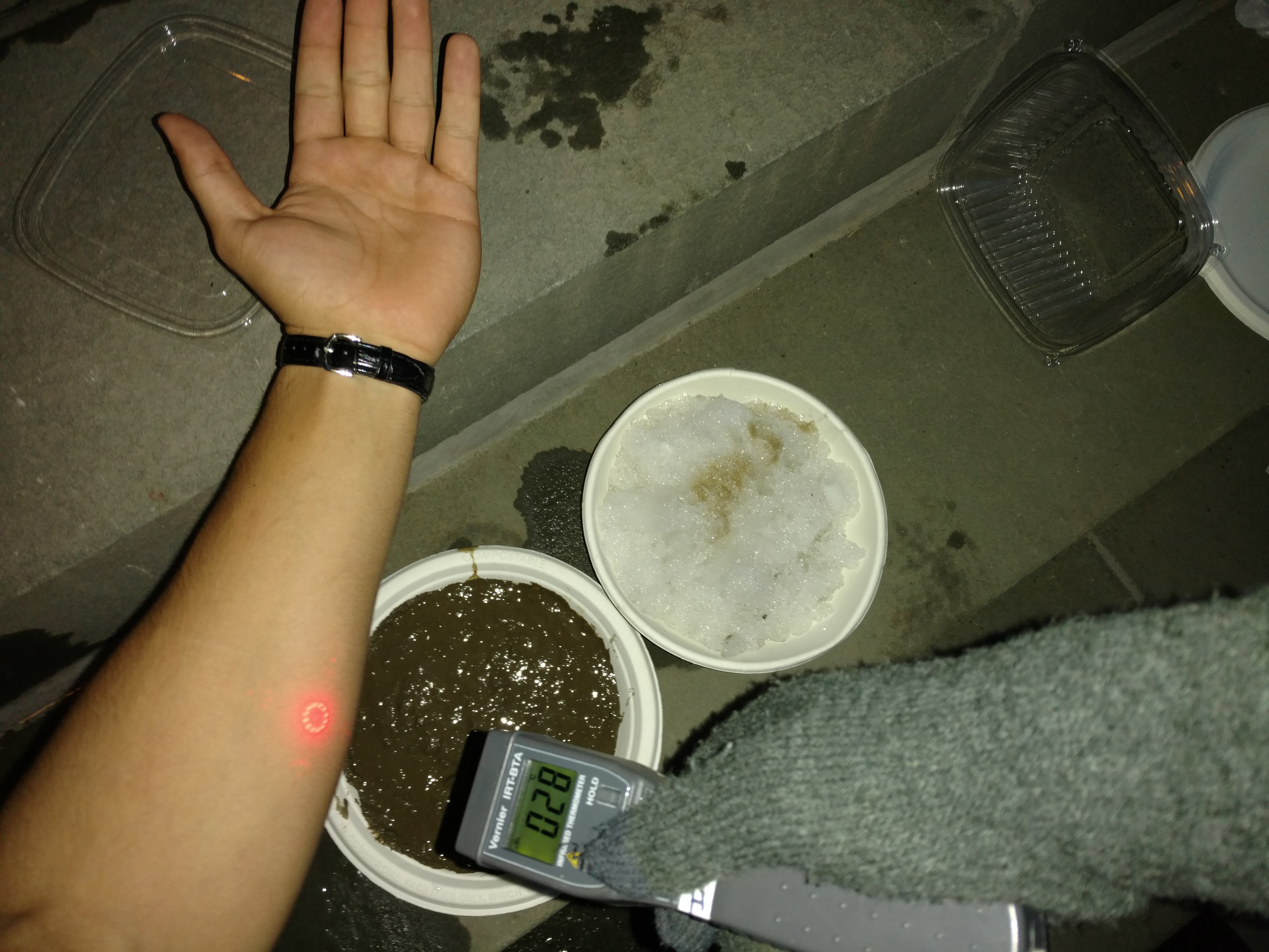
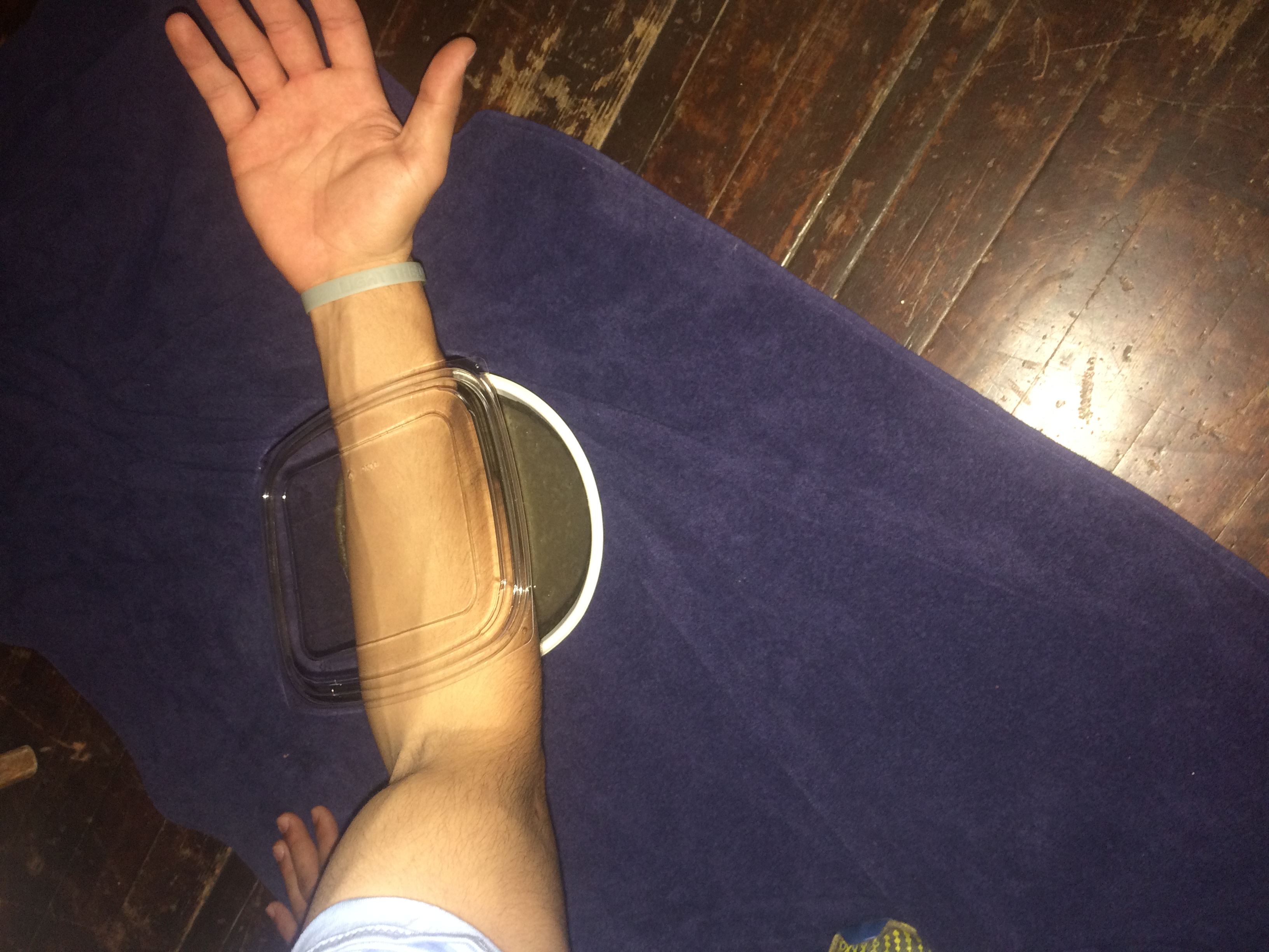
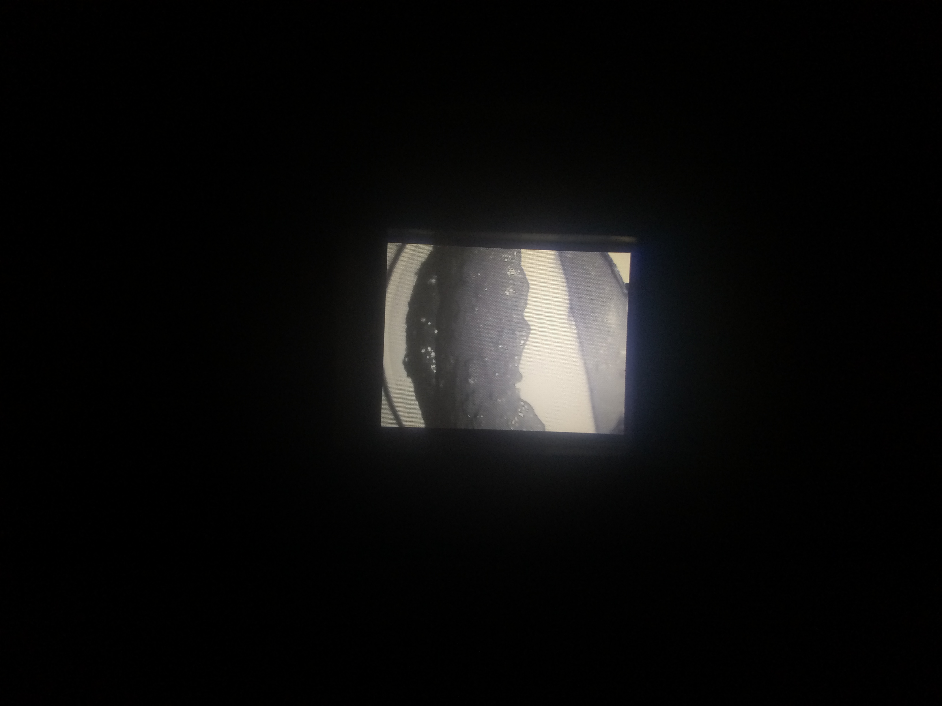
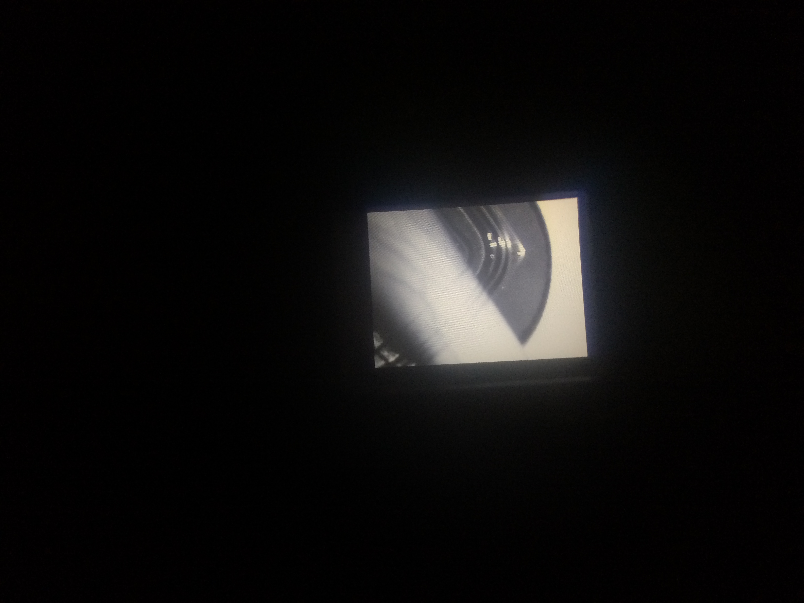
This first picture through the night vision goggles represents Josh’s mud covered forearm and its similarity in infrared heat to that of the mud background (emits black/mud background and arm are same). The second picture demonstrates the penetrability of the plastic cover while on Anik’s forearm. As shown, his infrared heat (white) pierces right through the plastic cover and is detected by the night vision goggles rather easily.
Below you will find line charts, providing a visual representation for the above data over the course of 120 seconds for each trial
3
To this effect, Dutch would in fact be able to hide from the Predator’s infrared detection as was portrayed in the movie. Because the difference in temperature between the skin and the mud was less when the mud was applied to the forearm, the mud made it more difficult to detect body heat while using the infrared thermometer. In addition, we found that the acrylic glove performed rather well at masking infrared heat when using the infrared thermometer. Such was determined when the difference in temperature between the mud background and the glove covered forearm was rather small. However, when the study was performed with the night vision goggles, only the mud background vs. mud covered forearm demonstrated a complete masking of body-produced infrared heat. The acrylic glove, on the other hand, allowed most of the body-produced infrared heat to penetrate right through, showing white while viewing through the night vision goggles. Given that Predator was using infrared technology to identify his opponents, the movie was accurate in showing that Dutch was capable of hiding from Predator when he spread mud around on his body. Using other materials such as acrylic gloves, t-shirts, plastic bags, or plastic cover would have allowed his infrared heat to simply penetrate.
4
Based on the data, the results were in fact what we predicted. Based on the properties of mud, we speculated that it would in fact serve as an excellent insulator of infrared heat and effectively block any infrared radiation. As was shown through the infrared thermometer and night vision goggles, the mud on the forearm effectively blocked out most body-produced infrared heat to blend in with the mud background.
5
The science we learned from this experiment was that infrared radiation is naturally emitted by all objects and can be detected in terms of degrees Celsius. Furthermore, we learned that night vision goggles absorb the infrared radiation from targeted objects and projects the image in a grey scale, black indicating cold temperature and white indicating a warm temperature.
6
Our project ties in perfectly with the evolving world of military technology. With this knowledge of how infrared works, we now make the jump to drones and how they implement infrared radiation to seek out targets in foreign countries. We know that bodies emit infrared heat, so advanced sensors can detect a “warm” body in contrast to cold or even hotter surroundings. Such a technology is also built into night vision goggles that the military uses when soldiers are on the ground. This assists in the detection of enemies just as a drone would work, only at a much closer range.
7
If we could perform this experiment again, we would choose to perform both segments in a consistent location as opposed to one set of data obtained outdoors and one set indoors. In addition, we would choose more materials that might actually have a greater ability to block body-produced infrared radiation. Also, we would choose to use more advanced night vision goggles that use a rainbow scale and allow for spot temperature readings.
8
If we had to continue this experiment for another 6 weeks, we would likely be gathering data every week (from winter to spring) and determine if the outdoors general temperature might have an effect on the likelihood that the mud covered forearm would still be easily masked. Also, we would attempt the experiment against different background such as snow, brick walls, grass, asphalt, and other surfaces humans commonly find themselves tracked against.
In the course of this experiment, Josh Carreras and Anik Parayil contributed equally to its overall success and progress.