Spectroscopy of artificial lighting on Vassar campus


Description:

This project aimed to look at light pollution and the effectiveness of artificial lighting across Vassar campus, as well as the differences in the lighting of various areas. There is a particular focus on the presence or absence of blue light (~450-495nm), as blue light is associated with a reduction in the production of melatonin. The data was taken in various buildings using a spectrometer in association with the Logger Pro software.


Results:

Above, we can see a graphical representation of the data collected from 6 different areas. The full data is available at:

https://drive.google.com/file/d/0B7OWeFlLunXCcUZNWjJjWDFWNUk/view?usp=sharing

Analysis:

We can see that the data falls within two general patterns. While the data lines for Raymond MPR and the Shiva work lights are somewhat harder to see, they follow the same trend as the curves for the Raymond room. In fact, all three of these seem to follow the same pattern as the Main College Center lights, which is simply much more pronounced: we see peaks at around 435, 550 and 610 nanometers, corresponding to blue, green and orange respectively. I expected that most of the lighting would be fluorescent lighting, and as such this falls within expectations as this is the typical emission spectrum of a three band lamp. The other peaks in the spectrum of the Main College Center lighting could be due to light pollution from other sources or the presence of foreign agents. We also see that, while the levels of intensity are very similar for the Main College Center spectrum, blue light has lower intensity in the three other spectra.

The other pattern we observe is that of Deece and Villard room lighting. Here, we see a mostly constant curve with two slight peaks at 450 and 610, in the blue and orange. This is typically the spectrum of incandescent lighting. We also see that the Villard room’s lights have higher intensity and seem to contain slightly more blue light. While it was within my expectations to find some incandescent lighting on campus, I did not expect the Deece to use it as incandescent lighting is less efficient and the Deece is one of the main, most populated areas.


Science learned and context:

While I did not use any highly advanced technology during this project, it let me familiarize myself with the use of spectrometers and the Logger Pro software. I did not expect that such a small and unassuming piece of affordable equipment could take data with so much precision, taking readings with intervals of 0.6 nanometers.

I think my project fits in with current technology in two ways. First, technology is making increased use of various mediums of light, visible or slightly outside vision range. Secondly, as screens and artificial lighting have become so prevalent, a number of people have started looking into the different effects of different types of lighting on the human body and brain. The fact that melatonin production is inhibited by blue light is now fairly well known, and there are many very popular apps or programs to reduce the emission of blue light on phones and computers at night in order to try and preserve the circadian sleep cycle. There are also innovations that are being made, such as an electronic headband called the iBand+ that supposedly uses a combination of light signals and vibrations to help the wearer sleep and induce lucid dreaming. While there seems to be limited evidence to support that claim, we see that technology has started focusing on this aspect of light more


Conclusions and looking back:

As said previously, blue light is less conducive to sleeping, and so could be seen as better for studying. Light with higher intensity may also be more helpful when working, but less comfortable when relaxing. As such, in terms of lighting, the Main College Center seems like a good place to work and the Deece seems like a good place to relax.

If I had to do the project again, I would try to control more accurately for light intensity. Indeed, while the spectrum will not change much regardless of where you point the spectrometer, it is a precise measuring tool and being a few degrees off can make a significant change in the perceived intensity of the lighting. I also failed to take into account the number of lights in the room, and in one case the proximity (the Shiva data was taken while sitting on top of the risers, which is atypical of where students would be when the lights are on).

If I had another 6 weeks, I would probably try to measure outside lighting as well. I am curious as to the path lighting, and would also have liked to take measurements from natural lighting in order to see how bright certain areas were and how much artificial lighting influences the brightness in comparison with moonlight.

Group 3 Results and Conclusion

Results:

 also this

put this in

Explanation of Results:

The results in the above graph show the average dB levels for each condition. The line across the center of the graph shows the mean dB level of all trials, 66.59 dB. The standard deviation from this mean is 16.439 dB.

The vast majority of the conditions we tested do not pose a threat to our hearing. Sound during lectures, during meals, from computer speakers, in our rooms, and in the library was not found to be harmful. Even while working in the Vassar Infant Toddler Center,  surrounded by crying babies, there seems to be very little danger. However, some of the sounds recorded were loud enough to eventually cause hearing damage. According to the National Institute on Deafness and Other Communication Disorders and to The American Speech-Language-Hearing Association, repeated or prolonged exposure to sounds at or above 85 dB can cause damage to, or death of hair cells. Hair cells are sensory receptors of the auditory system, in the cochlea. Damage to hair cells often results in hearing loss.

The average amplitude of the Villard room party we measured was 93.8 dB. According to the Center for Disease Control and Prevention (CDC), repeated exposure to this amplitude for under two hours could be dangerous to hearing. The sound intensity reached as high as 101.5 dB in the Villard room party. According to the CDC, repeated exposure of just 15 minutes at a time can cause damage when the amplitude of the sound is at 100 dB. This is to say that going to Villard room parties repeatedly over your time at Vassar, could cause permanent hearing loss.

We tested the intensity of sound that comes out of headphones and earbuds multiple times in the project. When listening to music at 100% volume from a headset, the mean amplitude was only 60.86 dB, which does not pose any threat to hearing, even after long exposure. Listening to music at 100% volume from Apple earbuds, the mean amplitude was 83.39 dB and the intensity went up to 91.48 dB at some points. Over years, these intensities can damage ears after repeated exposure of just a few hours a day. Apple earbuds have holes on the back that let some of the sound escape from them. They are made to lower the likelihood of causing damage to your ears. For one of our runs, keeping the volume constant, we covered these holes and found a mean amplitude of 91.46 dB and a high of 101.9 dB. The mean amplitude of the sound from the covered earbuds was essentially the same as the highest amplitude emitted from the uncovered earbuds. The highest amplitude for the uncovered earbuds run was high enough to cause damage after exposure of less than 15 minutes a day, according to the CDC. We also tested another brand of earbuds, JVC, that do not have holes on the back to release sound. The mean amplitude was 90.66 dB and the highest was 97.23 dB. These values were higher than the sound levels we measured from untampered Apple earbuds, and only slightly lower than the intensity measured when the Apple earbuds were covered. This indicates that the holes on the back of Apple headphones do in fact work to protect listeners from hearing loss.

Another potentially hazardous source of sound we are exposed to is from musical instruments. We measured the sound emitted from an oboe, and found a mean amplitude of 91.29 dB and a high of 101.40 dB. Over a few years, exposure to these sound levels for even less than 2 hours at a time, can cause permanent damage. This is important to note because people who play instruments often have 2-hour long rehearsals, and have to practice by themselves on top of that.

Somewhat surprising to us, was that the ACDC at dinner time reached sound levels of 91.31 dB. The mean amplitude was only 79.9 dB, which is not damaging, but the sound did get intense enough to cause some damage over extended periods of time. Considering that many Vassar students eat at the ACDC every night for months, this is an interesting find. According to the CDC, repeated exposure to 90 dB for even less than 2 hours at a time can cause hearing damage. The data suggests that the sound fluctuates enough that no student would be exposed to 90 dB of sound for an entire 2 hours at the ACDC. However, it is something to keep in mind on especially busy ACDC nights.

Expectations:

Our results were for the most part as predicted. For example, we did not expect quiet places, such as the library or our own rooms, to be loud enough to cause hearing damage; we wanted to study them for comparison. We expected the sounds at the Villard room party to be intense. However, we did not realize how damaging they would be. As explained above, repeated attendance at these parties could cause permanent hearing loss. We expected the sound emitted from headphones at a high volume to be enough to damage ears, because this is one of the main warnings you are given when told about hearing loss. However, we did not realize the difference that different types of headphones/earbuds would have on our measurements. The same song was played at the same volume through different earbuds, and resulted in different amplitudes.

Problems that arose:

It is important to point out the limitations of our study. We were only able to measure most conditions one time and the data would be stronger if the measurements were repeated. We also had difficulties when measuring the sound emitted from headphones/earbuds. We held the microphone up to the speakers, in an attempt to imitate the placement in relation to our ears when we are actually listening to music. However, in actuality, part of what makes headphones/earbuds so dangerous, is that the sound is tunneled through the ear canal to the inner ear. We were not able to recreate this, and some of the sound escaped during our measurements. This would be an interesting problem to attempt to solve. Possibly a model of the human ear canal would be needed to take accurate measurements of which sounds are really reaching and damaging hair cells.

Take away message:

In order to prevent hearing loss while at Vassar, students can limit their prolonged exposure to Villard room parties and limit their proximity to those practicing loud instruments. Additionally, we have observed the effect of tampering with headphones, and demonstrated the importance of using earbuds as intended, and at moderate volumes. Investing in a pair of headphones that allows sound to escape may be beneficial, as would be keeping them in their original condition.

Science we learned:

Although we already knew about sound amplitude and decibels, through the project we learned the significance of these measured values. We learned that 30-40 dB is very quiet while 85+ dB can be damaging over time. We also learned how to use a Sound Level Meter (SLM), which we used to take our data. By playing with the different SLM settings in order to figure out which to use, we learned more about it. For example, we could either record continuous measurements of fluctuating sound, or just record the maximum values, depending on the setting. We also learned that different settings are needed to measure lower amplitudes versus higher ones. We learned that the SLM has a microphone that senses and records sound. When connected to the LabQuest 2, the data resulting from the recorded sounds was displayed as a graph. We could then connect the LabQuest 2 to a computer with Logger Pro to further analyze the sound.

Additional data we would have liked to look at:

If we could have done this differently, we would have also tried to record the frequencies of the sound waves. With our limited amount of time, we were only able to obtain the amplitudes of the sound waves. We would have also liked to note how often an average person is exposed to these sound levels and for how long. We had some events that were extremely loud that many students only attend once a month, so the effect of these occasions may seem insignificant in the grand scheme of things.

The Next Step:

If we had another six weeks, we would have taken a lot more data. Particularly, we would try to have a larger variety of data, but also enough points for each activity to get a good average for each activity. We would have also liked to calculate how long the exposure to a certain activity had to be to damage our ears.

Citations:

“About Hearing Loss.” CDC. n.p., n.d. Web. 25 Feb. 2014.

“Noise.” ASHA. n.p., n.d. Web. 17 Feb. 2014.

“Noise-Induced Hearing Loss.” NIDCD. NIH, Oct. 2013. Web. 17 Feb. 2014.


Group 4 Project Results and Conclusion

What were your results?

After conducting the appropriate calculations to take into account how often each of these appliances is actually on/in use versus simply plugged in (for a typical TH), we found that the total cost of powering all of these personal appliances based on typical usage in a semester would be $69.95. This is considering that there are 5 bedrooms in the house so we have multiplied the bedroom costs by 5. Below is a graph depicting the energy consumption by rooms, which demonstrates that the majority of the energy consumption comes from the 5 bedrooms.


energy use by room

To provide a contrast, the cost of powering all of these appliances if each of them remained in use for the entire semester would be $1,253.83. Clearly this is not a realistic scenario, but the extreme disparity between the numbers helps provide a context to better understand the realities of our calculated energy consumption. The graphs below depict the cost ($) of powering each appliance when plugged in versus in use/on for a semester (4 months) based on a typical monthly usage. The first graph shows the data with a larger scale, and the second shows the data on a smaller scale to reveal the smaller details.

Cost Chart (big picture)

Cost Chart (zoomed in)

             With regards to energy consumption, the total amount of energy (in kilowatt hours) all of these appliances use in a semester—taking into account how often each of them is actually on/in use versus simply plugged in—comes out to about 3,103 kilowatt hours. (This is also considering that there are 5 bedrooms in the house so we have multiplied the bedroom energy consumption by 5.) The graphs below depict the energy consumption (in watt hours) of each appliance when plugged in versus on/in use over a semester (4 months) based on a typical monthly usage.

energy graph big pic

energy graph zoom in

             All of these calculations were made based off of what we believed was a typical monthly usage time for each appliance. In the chart below we explain what we believe to be a typical daily usage (minutes or hours) for each for each appliance. (For some appliances that aren’t used every day—such as a vacuum, for example—the typical monthly usage was decided and divided by 30 to find average daily usage.)

Average time used per day

Average time used per day(2)

Looking at the graphs, it is clear that certain appliances contributed to the majority of the cost and the energy consumption as compared to other appliances. The appliances that consumed the most energy were (from most to least out of all the substantial contributors): the mini fridge, floor lamps, desk lamps, computer charger, fan, Christmas lights, kettle, and microwave. Similarly, the appliances that contributed most to the semester’s cost were (from most to least of the substantial contributors): the mini fridge, floor lamp, and desk lamp. In this case, there is a large difference in cost between the floor lamp and desk lamp, with fairly insignificant values for the appliances after the desk lamp as well.

Knowing that the mini fridge and floor lamps are the main source of energy use and cost can provide students with valuable information when deciding which appliances to have in their households. It is important to keep in mind that the total cost and energy consumption calculated for a typical TH included 5 mini fridges (because each bedroom typically includes a mini fridge), so both of these values would decrease relatively significantly if a house has less than 5 mini fridges.              We must also take into account the fact that we didn’t gather data for the stove, heat, overhead lighting, or main refrigerator, which in future housing (not on a college campus) will likely make most of the impact in an electricity bill and with general energy consumption.

What do your results mean?

Although this is only significant with some appliances, leaving them plugged in when not in use really can make a difference. Even though it is not as much as we originally thought, just the fact that leaving certain appliances plugged in (when not in use) does cost some money and use quite a bit of energy reinforces the belief that most things should remain unplugged when not in use.

Additionally, our data demonstrates that using alternative methods to making certain foods or doing certain activities could make a difference, however small it may seem. For example, one could make popcorn on the stove to avoid using the microwave or a popcorn popper, or one could use a toaster instead of toaster oven. Cost and energy consumption could also be reduced by cutting down on the number of mini fridges in a house, by unplugging Christmas lights when no one is in the room, and especially by turning off and unplugging floor lamps when they are not being used. Even simply cutting down on the amount of time one uses each appliance per day or per month could make a small but important difference for energy conservation as well as saving money. Below we have included some simple pie charts that depict comparisons between certain appliances that have similar functions and could be used as alternatives.

chart3 chart5 chart4 chart2 chart1

Without knowing the cost of the main appliances (oven, stove, big refrigerator, etc.) it is hard to make any general statements about the portion of our tuition that goes towards housing because the cost of these personal appliances is relatively insignificant in comparison to the cost of the main appliances. However, it is important to be aware of how all the little costs and power usages add up: soon we (college students) will have to pay full electricity bills ourselves, and energy conservation is a crucial part of taking care of our environment.

Were your results as predicted?  Why? or Why not?

In general, our results confirmed our predictions. We expected appliances such as the mini fridge and lighting sources to be the biggest contributors to cost and energy consumption, and this was definitely confirmed. The refrigerator is on constantly and uses a lot of energy to keep it at such high temperatures, and the floor lamps and most lighting sources are on for such a large part of the day that we also expected them to use a lot of energy and contribute a lot of the cost. That being said, a few of the appliances did provide surprising results; we had not expected the Christmas lights, kettle, or the popcorn popper to have values as high as they did, but now that we know more about how these appliances use money and energy, we can adjust and cut down on how often we use them.

What science did you learn during this project?

Despite this being a small project, it was very informative. Not only did it give us some insight into how much energy our appliances use, and the subsequent costs to operate and maintain these appliances, but it taught useful applications of basic science. Because we were measuring energy consumption we have now become adept at using the Watts Up? Pro and can have a better understanding of converting different units of energy such as watts (joules/sec) to watt hours, and joules to watt hours. In addition, we have learnt how these different values of energy consumption relate to the cost of operating an appliance.

What would you do differently if you had to do this project again?

Having now completed the project, we are more aware of some of the sources of error and limitations we faced. If we had to repeat this project we would make a simple graph of watts by time for each appliance. A problem we occurred when doing this project was that some appliance, particularly those whose function was to produce heat (kettle, toaster etc.), varied in energy consumption. This was probably due to the fact that it was using more or less energy dependent on how much heat it still needed to produce. If we had graphed watts by time we could have used this to calculate the average energy consumption during the usage of the appliance. This I believe was the major confound in doing this experiment.

What would you do next if you had to continue this project for another 6 weeks?

If we had to continue the experiment for another 6 weeks, we would widen our sample size and take averages of the energy consumption of the appliances, as well as the reported usage of these appliances by residents. In addition, to ensure more accurate and realistic data we would have a “sample month”, in which we record carefully the amount of time of usage of each appliance in this month. We were restricted in doing this due to the short span of time to conceptualize and carry out this experiment. However, given more time we could have removed a great deal of conjecture from our project.


Magnetic Fields of Televisions

Introduction

Electromagnetic fields (EMFs) is a rather popular topic, especially in the current time period where technology plays huge roles in our everyday lives. Most of us are constantly surrounded by various electronic devices. Electric and magnetic fields are produced in our homes by the various appliances, electrical wiring, and the power lines and substations outside the home. When electricity flows through a wire as an electric current, magnetic fields are produced. It is obvious to assume that the larger the current, the stronger the magnetic field. Magnetic fields are of interest because they can cause currents in the body. If exposed to high levels, magnetic fields can cause phosphenes, which are faint flickering visual sensations, or stimulate nerves and muscles. The typical exposure at home tend to be lower than the guidelines levels, providing some reassurance of safety for most people. Of course, electrical appliances produce higher levels when they are plugged in and in use, however moving further away from these appliances helps to reduce one’s exposure.

The kind of magnetic fields that tend to cause more damage are those that are alternating. Fortunately, magnetic fields from appliances are point sources, whose level of emission drops off dramatically with increasing distance from the source. Magnetic fields are categorized into two types: 1) non-ionizing are low-level radiation and hence harmless due to lack of potency, which includes microwave ovens, wireless networks, cell phones, Bluetooth devices, power lines, computers, MRIs, etc; 2) ionizing: are high-level radiation with the possibility of cellular and DNA damage with prolonged exposure, which includes UV light, some X-rays, and some gamma rays. Hence, television are considered non-ionizing and should not have a huge effect on our bodies.

Materials and Methods

In order to get access to a variety of television, I decided to conduct the experiment at Best Buy. I choose the most popular sizes [32″, 40″/42″, 55″] and even threw in an 80″ screen for fun. All of the television were LED, which is a more advanced and energy-efficient upgrade from LCD technology. Also, all of the television were on and playing some type of best buy commercials.

The vernier magnetic field sensor used had two settings to read magnetic fields, [see Figure 1]. There was a low setting, used for detection of weak fields, and a high setting, used for detection of strong fields. I took readings under both settings assuming I was not sure what type of field these televisions would most-likely emit. However, the most probable answer would be that manufacturers would invest a decent amount of money to ensure that the magnetic field emitted is at relatively low and “safe” levels. Hence, I decided to test the magnetic field on the front of the screen, which is what always faces the users. The sensor also has two positions: the tip of the probe bent perpendicular to the rest of the sensor, which I called parallel to the screen [see figure 2]; and both the probe and tip facing one direction, which I called perpendicular to the screen [see figure 3]. As I was taking readings, I decided to take a reading of the top of the frame of the TVs out of curiosity, (I also wanted to take the back of the television near the power cord but it was hard to reach in most units) and found that they tended to be much higher than the readings on the screen. I took the readings of the frames with the tip bent, since it was easier to reach, and called this parallel to the frame [see figure 4]. Note: I could not get the frame reading for the 55″+ televisions since the frames were unreachable.

Since the readings tended to fluctuate, I took a 10 second Magnetic Field vs time graph for each reading and took the average from the graph [see figure 5]. Readings were recorded in milli-Teslas (mT).

Results

I accumulated the data onto one excel sheet [see Figure 6]. I took the average of both tip positions in the low setting and the average at the high setting, not including the frame readings for either setting since I could not obtain the readings for the larger televisions.

I then created bar graphs for the average settings, (since for this data it’s easier to see the results as opposed to using scatter plots). For both the low setting [see Figure 7] and the high setting [see Figure 8] notice that most of the magnetic field readings of the televisions tended to be close to the recorded reading away from the television sets (labeled No TV). I also created graphs for the frame readings for both the low setting [see Figure 9] and the high setting [see Figure 10]. It is especially noticeable in the frame readings for the low settings that the magnetic fields are much higher coming from the frame of the television as opposed to the magnetic fields from the screen of the television.

Discussion:

Assuming that the low setting is the more probably reading for this particular electronic appliance, the magnetic fields being emitted do not seem to be too harmful. However, it was interesting that the Best Buy store brand Insignia, emitted a lower level of magnetic fields as opposed to popular name brands such as Samsung. It was also quite surprising how much higher the magnetic fields readings were emitting from the frame of the televisions. Pretty much all of the televisions, except for the 32″ Insignia, were above the magnetic field reading away from the televisions; and considerably higher under the low setting. Interestingly, there seemed not be much impact with increasing screen size; this was the opposite of what I predicted to happen. One would think that with an increased screen size there would be a higher magnetic field readings; however, it does make sense for there to me not much differences between screen sizes since manufacturers would want all of there units to be “safe.”

To date, there are no clear regulatory limits. I found a site that compiled the limits as stated by the American Conference Governmental Industrial Hygienists (ACGIH) Threshold Limit Values (TLV) data. The International Radiation Protection Association (IRPA).

As per these organizations:

  • Routine occupational exposures should not exceed 60 milli-Teslas to the whole body on an 8 hour time weighted average.
  • Routine occupational exposures should not exceed 600 milli-Teslas to the extremities on an 8 hour time weighted average.
  • A maximum ceiling should be 2 Teslas for the whole body and 5 Teslas for the extremities.
  • Pacemaker users or others with magnetic implants should not exceed 0.5 milli-Teslas at any time.

For most individuals, a couple of hours of television usage should not have a huge impact on our bodies. However, for those with pacemakers it is recommended that there exposure time should not exceed 0.5 milli-Teslas. Though the average low setting magnetic field readings for all of the televisions was at -0.0205 milli-Teslas, which is rather low, those with pacemakers should still take precautions with television usage.

Conclusion

It was rather interesting learning about the impact that EMFs have in our lives and the exposure that we should limit ourselves to. I definitely expected the magnetic fields of large screened television to be considerably high, however, as we can see from the data that was not the fact. Though the results were more reassuring about the exposure we submit ourselves too.

One thing I would change about the project is probably to change the type of electronic appliance. I would probably choose a cellphone or computer since I would be able to measure the magnetic field at various locations and would, thereby, not be limited by size.

If I had 6 more weeks to continue the project, I would consider taking the electric fields of the same televisions along with the microwave fields (via the usage of the RF meter). It would be interesting to see the impact of these additional fields and determine which is more harmful, (if any), and how they compare to “safe” values.

Figures

Figure 1

Figure 1: The two settings for the magnetic field sensor.

Figure 2: Tip is bent and perpendicular to the rest of the sensor; Parallel to the screen.

Figure 2: Tip is bent and perpendicular to the rest of the sensor; Parallel to the screen.

Figure 3: Tip and sensor aligned in same direction; Perpendicular to the screen.

Figure 3: Tip and sensor aligned in same direction; Perpendicular to the screen.


Figure 4: Tip is bent and on the top of the television frame; Parallel to the frame.

Figure 4: Tip is bent and on the top of the television frame; Parallel to the frame.

Figure 5: Magnetic Field vs Time graph (over a 10 sec period) on the LabQuest.

Figure 5: Magnetic Field vs Time graph (over a 10 sec period) on the LabQuest.


Figure 6: Data collected [updated]

Figure 6: Data collected [updated]

Figure 7: Average magnetic field for the low setting.

Figure 7: Average magnetic field for the low setting.


Figure 8: Average magnetic field for the high setting.

Figure 8: Average magnetic field for the high setting.


Figure 9: Frame reading under the low setting.

Figure 9: Frame reading under the low setting.

Figure 10: Frame reading under the high setting.

Figure 10: Frame reading under the high setting.

References

http://www.emfrelief.com/emf.html

http://www.niehs.nih.gov/health/topics/agents/emf/

http://sp.ehs.cornell.edu/lab-research-safety/radiation/magnetic-safety/Documents/Magnetic_Field_Safety_Program_Cryo_Guide_v4.pdf

http://www.hpa.org.uk/Topics/Radiation/UnderstandingRadiation/UnderstandingRadiationTopics/ElectromagneticFields/ElectricAndMagneticFields/ReducingExposureToElectricAndMagneticFields/

Group 2: Conclusions Lasers and Sound

Results:

The results of our study are a collection of videos that documented the sound-designated laser patterns of two male and two female voices, as well as graphs depicting the decibel relationship to frequency of the sentences spoken. We also took screen shots of the laser patterns from each persons video of them saying the sentence “the quick brown fox jumps over the lazy dog” and charted them next to the individuals frequency/decibel graphs.

Additional Male-Voice Frequency Graph:

Frequency graph of Jared's voice

Frequency graph of Jared’s voice


Results Analysis:

The results show that male voices produce a larger laser pattern, one that affects the balloon-drum differently than the female voices; when comparing the videos/screenshots, the male voice patterns create bigger circles and squiggly patterns, when the female voices produce smaller figure 8s and tighter movement.

This difference may be explained by resonance modes. In short, when the balloon drum resonates with a certain frequency, it will oscillate/move more and with with a greater amplitude. When the male subjects spoke into the cup there were more vibrations/oscillations most likely because frequencies in a man’s voice are in resonance with the drum (stretched balloon). The human, and especially the male voice, has many undertones, and the drum vibrates more because of the increased number of resonant frequencies produced. This is why the male subjects created patterns covering larger surface area then the female subjects.

We did not have any specific predictions for male v. female voices in our project plan, but we expected that gender would affect the patterns differently. This expectation was confirmed by our results with the laser device. After running multiple tests with the laser device and analyzing the footage we decided that the differences were due to the differing frequencies present in lower, generally male, and higher, generally female, voices. The different frequencies produce different sound-waves which resonate uniquely with the drum and create different patterns. Although every voice regardless of gender creates a unique pattern, there are more similarities in the patterns between same gender voices than there are between genders.

Science Used:

We used a device to map the vibrations from a human voice visually allowing us to study resonance modes/the analysis of sound waves using frequency and decibel. Using the Vernier LabQuest Pro Sound Level Meter we mapped the decibel levels of our voices. And using a program called Audacity we were able to graph the frequency alongside the decibel.

The science used during this project included: resonance modes, and the analysis of sound waves (frequency, decibel–how it’s measured).

In Hindsight: 

Some things we would do differently if we had to do the project again would be: change and experiment with the type of balloon used (ex. thicker v. thinner rubber) to find the most sensitive drum, and experiment with the types of cups used (paper, plastic, etc) to see the dampening effects the material may have on the sound waves.

Next Steps:

If we had six more weeks to continue the project, we would continue to take data from different male and female voices to get a better idea of the differences between the two; we would also vary the ages of the subjects to see if there is a difference in older v. younger voices; we would attempt to measure the different frequencies of music notes (through finding a musical apparatus/instrument or a singer that could produce specific pitches) to further examine the effects of specific frequencies and possible find the resonant one. It would also be interesting to try to discover and catalog what patterns individual notes make visually and then to see what happens when multiple notes are played at once, like in a chord or a song. Also to see how different a note looks across gender; would the same pitch look the same when sung by different people?


How To Cook Yourself: Group 8 Analysis and Conclusions

I. Results

A. Results Regarding Radiation

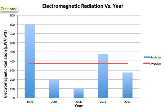
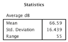
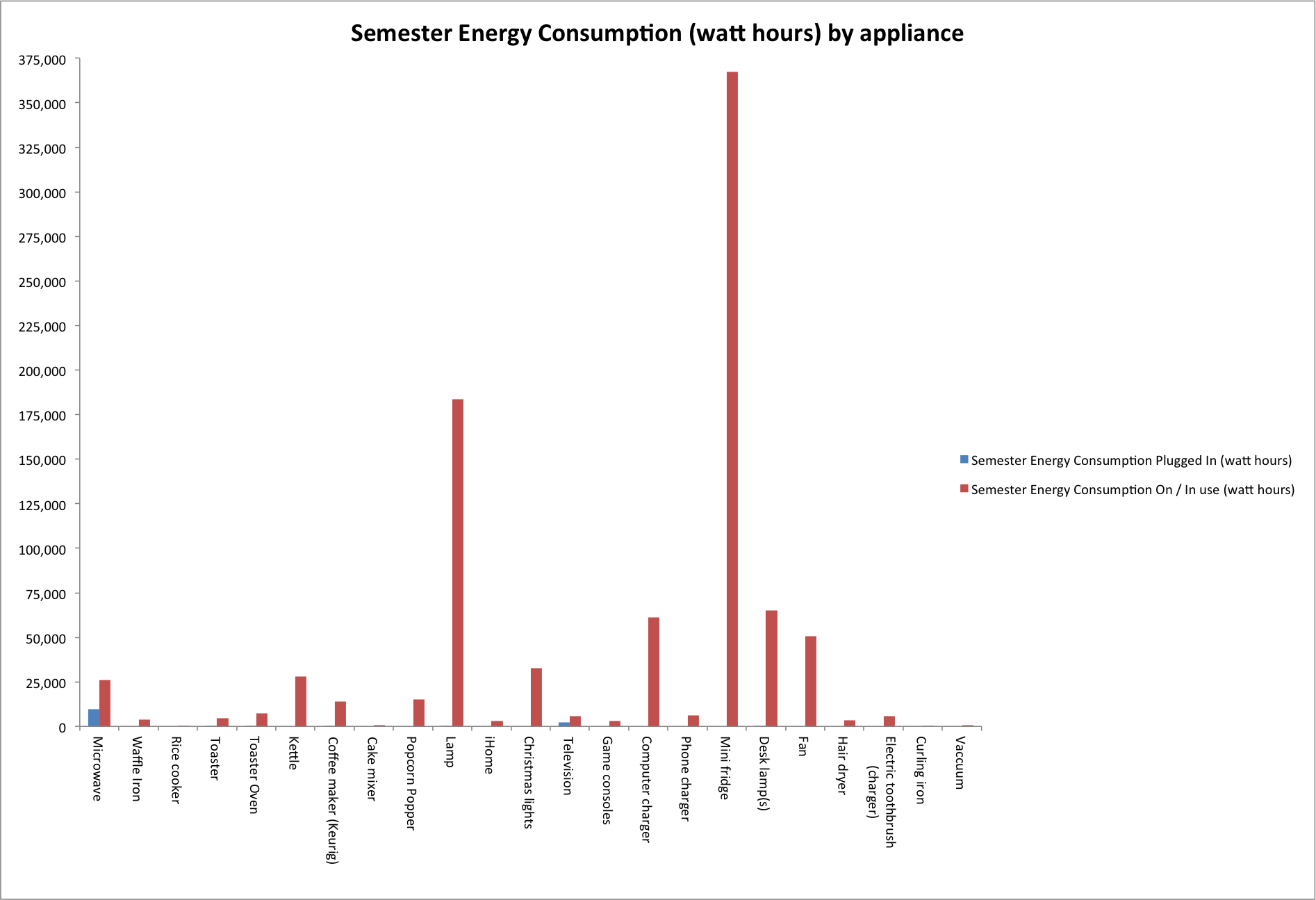
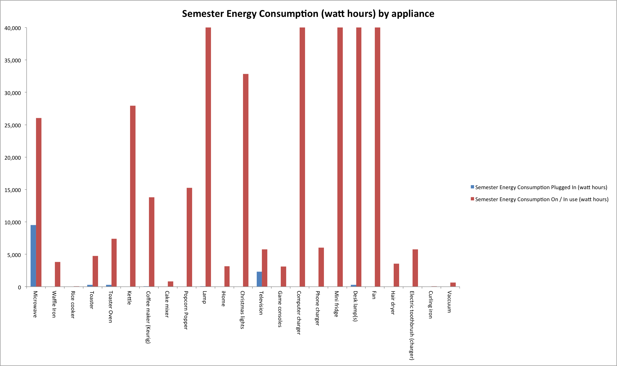
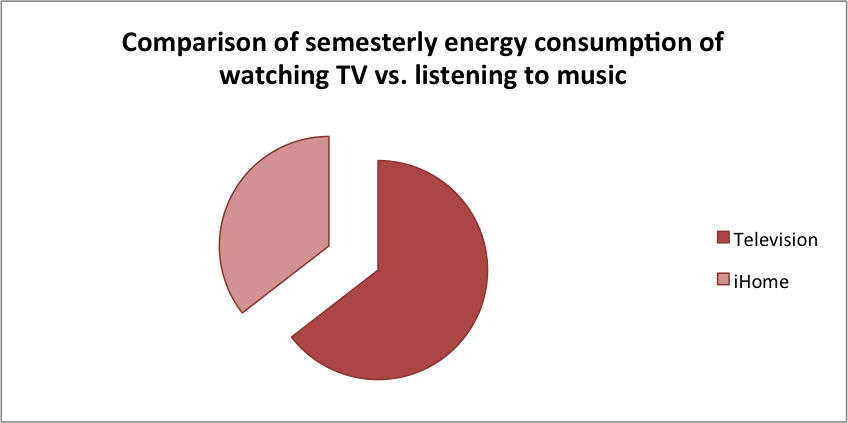
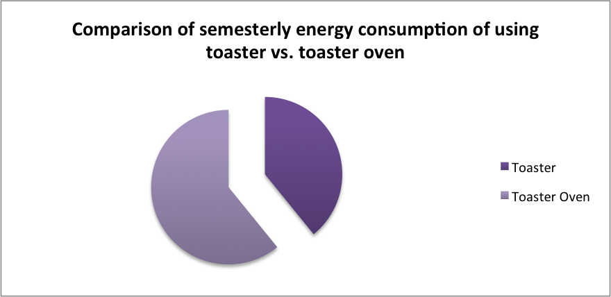
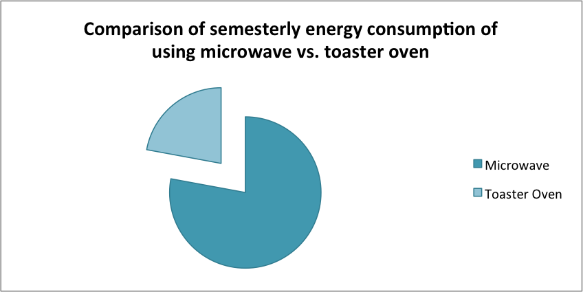
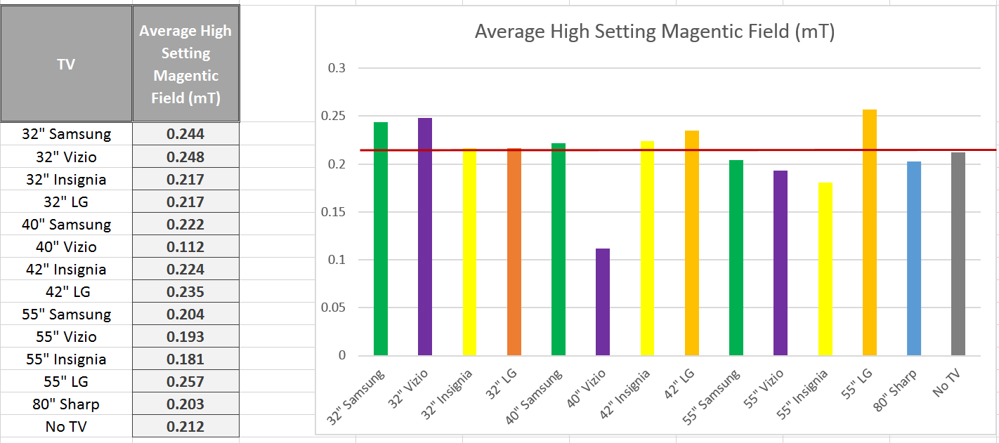
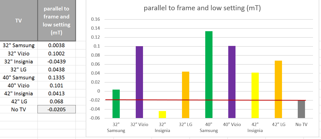
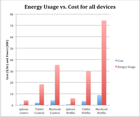
Overall, all microwaves measured emitted a fairly similar amount of radiation, ranging from the weakest emission at the furthest point from the microwave at 30 µW/m^2 to the strongest emission at the closest point to the microwave at 1,500 µW/m^2.  While the general trend seemed to be that radiation decreased as we moved further from the microwaves, not all cases followed this trend exactly.  To further understand factors that may have affected radiation, we compared radiation with 1) the power levels of microwaves and 2) the age of microwaves.  The following graphs show this comparison, with an added average line to see which microwaves fall below and above the average.  The graphs plot the Average values from the front at 30 cm.  We chose this orientation and distance because we felt it is the most practical in reference to where a person would be standing while microwaving food.  Furthermore, since some microwaves emit a relatively consistent amount of radiation regardless of distance from the microwave, and others taper off, we felt this represented a good middle ground.

i.  Microwave Age

It is certainly notable that the oldest microwave (M4) emitted by far the most amount of radiation.  However, as the years progress, the general trend after that case does not necessarily descend.  A microwave from 2011 also emitted a significant amount of radiation higher than the average.  It is also notable that when taking measurements of the 1999 microwave, the only industrial microwave in our sample, the radiation emitted seemed to appear in cycles.  It would drop down to zero, rise consistently, then fall back to zero.  This cycle made it difficult to choose an average from the reader, and also perhaps accounted for our perceived higher average radiation.  While microwaves may have become more advanced over the years, therefore emitting less radiation, we would need a larger sample and to keep power levels constant to test this hypothesis further.
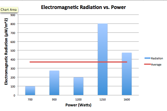
Screen Shot 2014-02-27 at 12.19.41 AM

ii. Microwave Power

The association between power, in Watts, and electromagnetic radiation seems to be a positive one.  The microwaves that, on average, emitted the most radiation also were the highest in power, exceeding the average.  The microwaves that emitted radiation below the average were lower in power.  The exceedingly high spike in EM radiation in the 1250 Watt microwave may be influenced by other factors, considered in section i., but is significant nonetheless.  While again we would need a larger sample and more controlled conditions to test for a correlation between these two variables, there does seem to be a positive relationship. 

Screen Shot 2014-02-27 at 12.05.09 AM


IMG_3437 

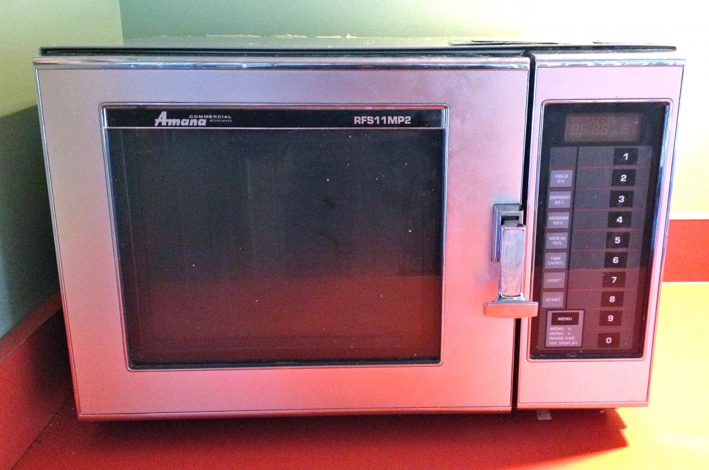
This microwave, M4, was the oldest microwave in our sample and also the only non-commercial microwave in our sample, as evident from its unconventional aesthetics.  While it emitted by far the highest amount of radiation, it provided an interesting case to investigate further.

B. Microwave Radiation and Safety Standards

The EM radiation data values were all significantly below the safety standards set for consumer microwaves.  (See Section II.)  Across variables of age, power output, wear and tear, and added interference, no microwaves at any point even exceeded half of the safety limit set by the United States Federal Food and Drug Administration.

C. RF Meter Findings

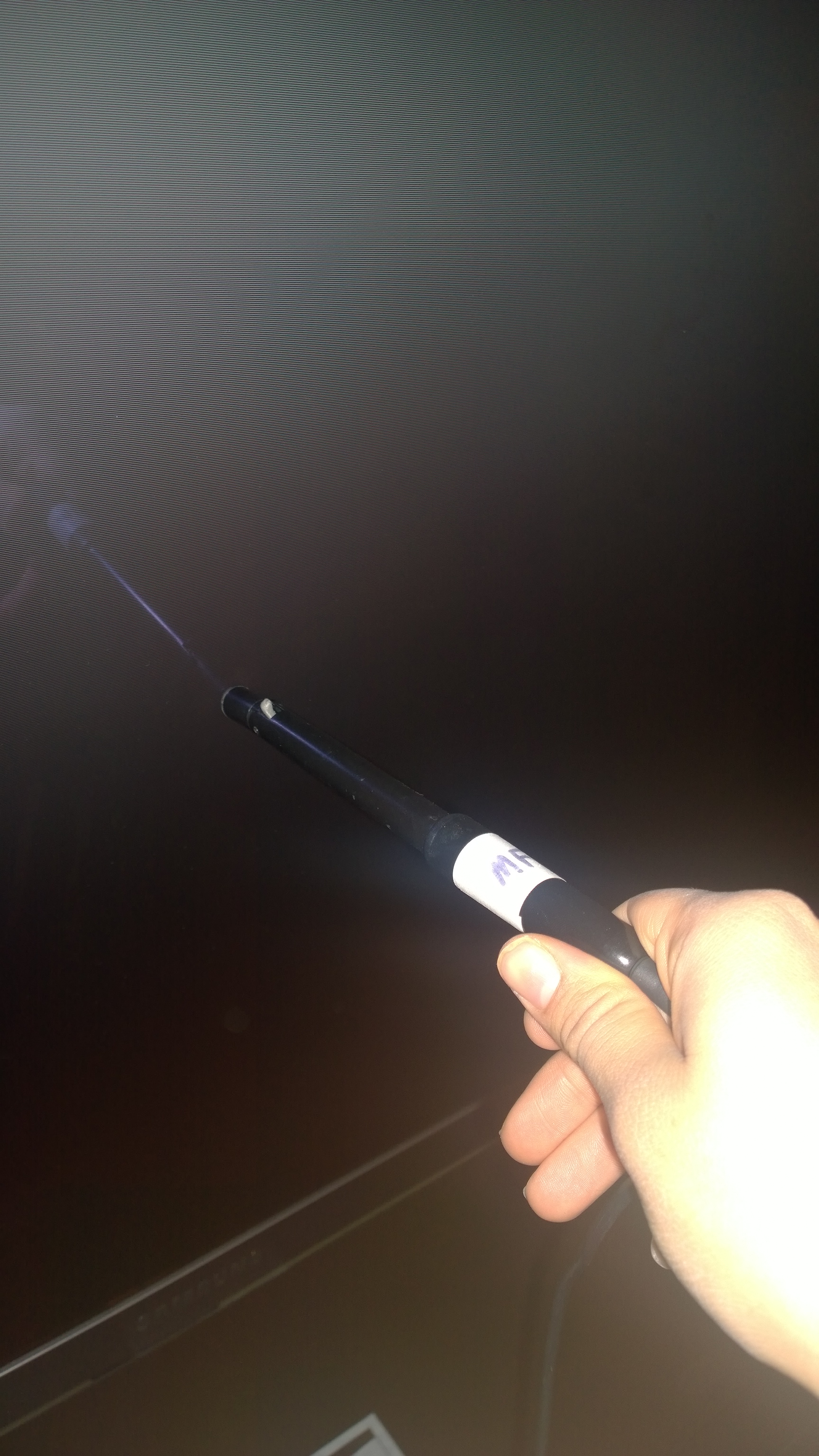
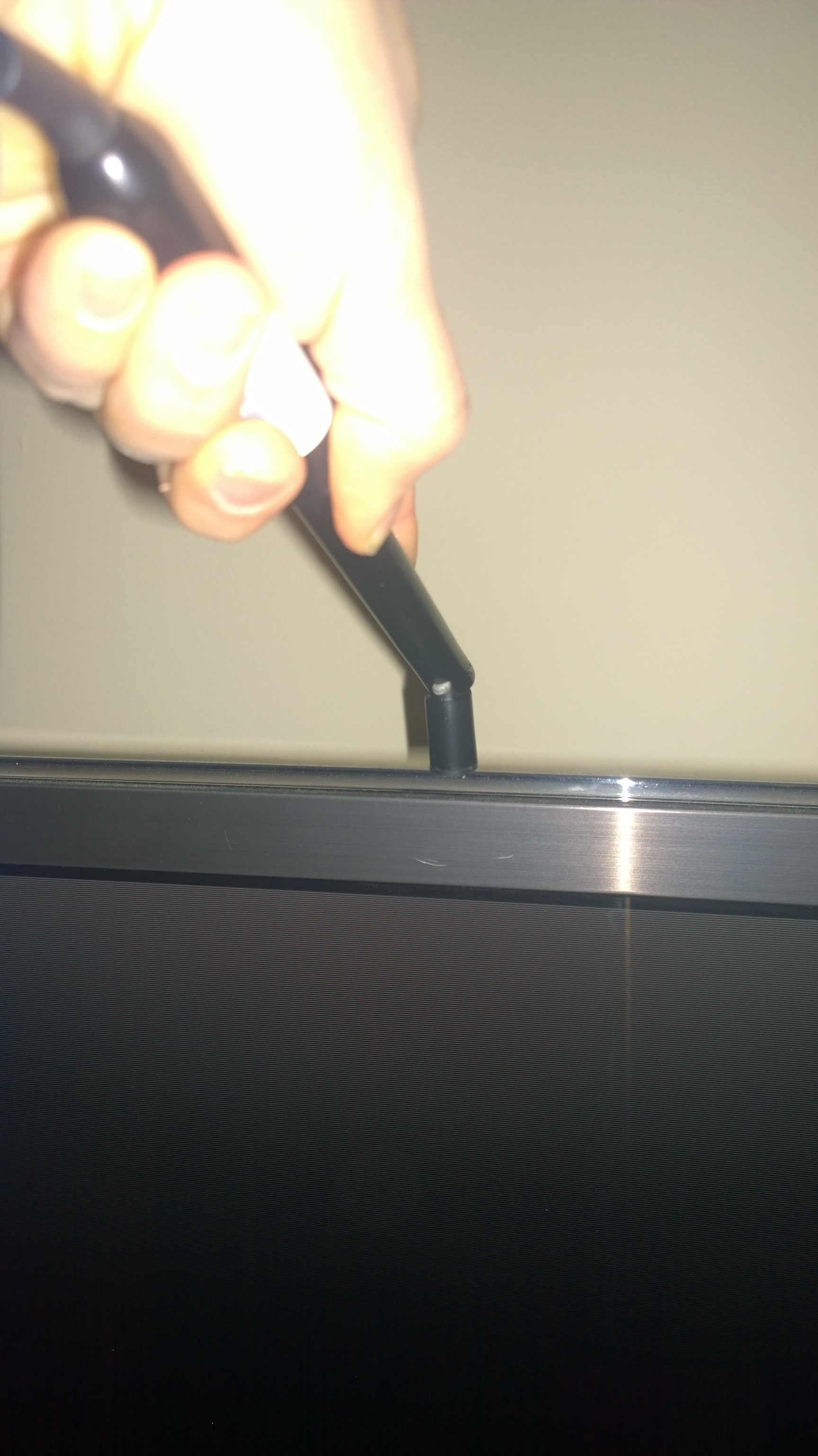
Through our data collecting process, we also went through trials and tribulations with the RF meter, an instrument used to measure EM radiation.  Since the manual was relatively vague, we performed a lot of trial and error to get the most accurate measurements possible.  We had a few helpful findings that may be helpful to individuals using this instrument moving forward.

First, we found it is necessary to take a preliminary measurement of EM radiation in the general vicinity of the appliance being measured.  This interference may account for unforeseen variance and unexpected values in a data set so it is good to know if it exists or not.  Furthermore, it is important to keep nearby cell phones and laptops off, as they can also interfere with these measurements.

Second, we found it more accurate, in our case, to measure from one axis rather than all three.  This limits interference from other directions, and therefore leads to a more accurate measurement of the appliance itself.

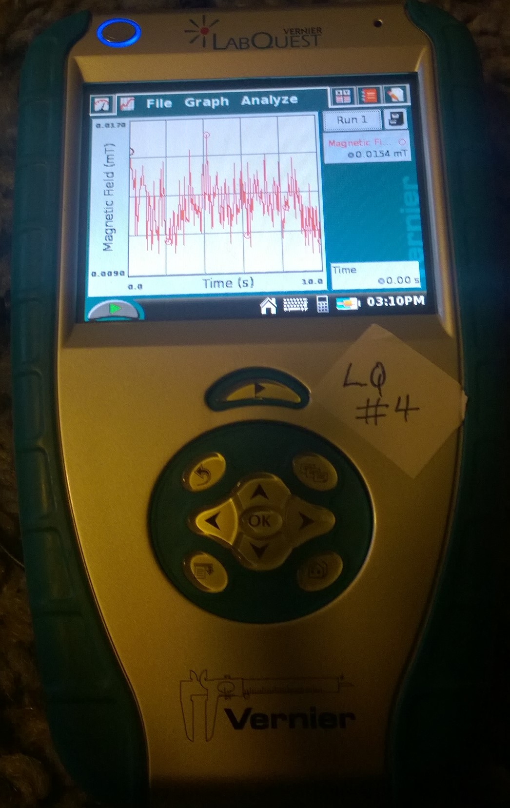
Finally, we found it important to use different settings of the RF meter to measure different values.  While we began measuring just on the “Maximum Average” setting, we soon realized that this was an unreliable measurement for getting a sense of the general radiation emitted.  Furthermore, the highest calculated “Maximum Average” value remains on the RF meter until a higher radiation is detected.  Therefore, if something interferes for even a second, its value will be displayed and remain displayed on the RF meter.  We decided that although this value is telling, we also needed a more reliable, general idea of emission.  We decided to use the “Average” setting for this, which averages the values every few seconds, and displays that reading.  Since the reading constantly changes, we watched the meter in pairs and decided a number that seemed to be a middle-ground of the readings we observed.  These settings are important to test and understand so that the operator is truly measuring what they are meaning to measure.

II. Results Analysis and Conclusions

The process of generating high levels of heat through the use of microwaves does mean that contact with human tissue and organs is potentially lethal. Despite this, there are few health risks posed by common consumer microwave ovens due to strict safety standards and efficient interlocking technology.

First, the International Electrotechnical Commission has set a standard of emission limit of 50 Watts per square meter at any point more than five centimeters from the oven surface. The United States Federal Food and Drug Administration has set stricter standards of 5 milliWatts per square centimeter at any point more than two inches from the surface. Most consumer microwaves report to meet these standards easily. Further, the dropoff in microwave radiation is significant with the FDA reporting “a measurement made 20 inches from an oven would be approximately one one-hundredth of the value measured at 2 inches.” As the majority of our readings, despite substantial electromagnetic interface at times, were in the microWatts range these standards appear to be successful.

Second, microwaves use a two-step interlock system that ensures the magnetron cannot function while the door is open. This means little radiation leaks, and opening the door even when the oven is turned on will immediately shut off all microwave radiation emission. Our readings did suggest higher levels leaked from the right side of the oven (near the magnetron) than from the door, but these levels remained well below international standards.

Our results are not overly surprising as we entered the experiment recognizing the strict safety standards in place for microwave oven radiation levels. Thus, our data supports our hypothesis: standard consumer microwave ovens do not emit microwave radiation levels anywhere near levels needed to be dangerous to the user. While not all of our data is as logical, when graphed, as expected, we believe this to be a result of our imperfect data taking conditions and irregular interference levels. Should we continue to record data in more controlled conditions, we believe the outcomes would continue to adhere to safe standards.

III. What Science Did We Learn?

Microwaves are high frequency radio waves used for many purposes from television broadcasting to kitchen cooking. Microwave ovens are common household items that generate microwaves (around 2450 MHz) using a metal tube called a magnetron. These microwaves are directed into the oven cavity – a space of metal walls, roof, and ground with the exception of the oven door. Metal totally reflects microwaves, creating high bounce back in the oven, while glass and some plastic is nearly transparent to microwaves, allowing the waves to be readily absorbed into food (especially those largely water based). Microwaves force atoms to reverse polarity at high enough rates to generate heat and, thus, cook the food or boil the water.

While the radiation of microwaves can be dangerous, microwave ovens adhere to safety standards that prevent harm with proper use and maintenance (if an oven door is damaged, more radiation may leak out). While microwaves have been shown to break down key nutrients in some food, the process does not radiate the food or make it dangerous to eat, only less healthy.

IV. For the Future…

If we had to do this project again, we start by testing the RF meter and its functions before gathering data with it to gain a better understanding of its diverse (and sometimes unintuitive) settings (Max Avg vs Avg, etc etc). We collected some surprising data from the industrial microwave (M4) tested; the radiation levels fluctuated from almost nothing to nearly 2.5mW/m2 (Max Avg), which is a huge range! Perhaps this was partially caused by the base-level radiation (this was the only microwave whose surroundings had a measurable electromagnetic field without being on), perhaps we didn’t have a complete handle of the RF meter, or perhaps the microwave functioned in a different way from the others, sending out pulses instead of a steady stream of microwaves and so creating the oscillation in our readings. Should we do the project again, we would make sure we knew precisely how all data the RF meter takes is taken, and we would research further the different mechanics of microwaves to better explain surprising data such as this.

V. Next Steps

If we had to extend this project, we would test a wider variety of microwave models: it would be interesting to test the trend of microwave emission over the years, gathering data and testing a hypothesis concerning the technologic improvement being made in microwave development.  It would also be interesting to test industrial microwaves versus commercial microwaves, seeing as how M4 differed so greatly from the other microwaves.   We would also be sure to widen our sample selection to more reliably test some of the relationships we have preliminarily identified.  While the relationship between microwave power output and EM radiation seemed promising, we would need to test this hypothesis in a bigger sample, with more controlled conditions, to find a mathematical formula to describe this relationship.

Emma Foley; Hunter Furnish; Hannah Tobias

Group 6 Results

For our project we attempted to compare three smart technologies, a smartphone, a tablet, and a macbook based on four criteria: battery life, issues with overheating, cost, and energy consumption. All criteria were tested in two ways, while the devices were using Netflix, and while they were on but not running any other processing devices. The results of each test are as follows:
Battery Life:
 Screen Shot 2014-02-26 at 11.54.20 PM
Here we have a graph comparing how much charge each device lost over an hour. In the control test the Macbook lost the most charge, and the smartphone lost the least. In the Netflix test group the Macbook lost the most charge and the smartphone lost the least. It is interesting to note the  difference in the control and Netflix test for all the devices, the graph shows a huge increase in loss of charge for all devices while watching Netflix when compared to the control group.
Issues with overheating:
Screen Shot 2014-02-26 at 11.53.32 PM
Here, we have a graph that tracks the increase in temperature over a period of 40 minutes, data was taken every five minutes. This graph illustrates how each device increased in temperature over time to some degree. It is interesting to see how, while watching Netflix all the devices’ temperatures increased more rapidly than while in the control test groups.
Screen Shot 2014-02-27 at 3.01.48 PM
This graph is a comparison of the overall change in temperature for all of the devices. In the control group the Macbook’s temperature increased the least, and the tablet’s temperature increased the most. In the Netflix test the MacBooks’ temperature increased the most, and the smartphone’s temperature increased the least. Also, the tablet has the least amount of change between its temperature increase in the control and Netflix tests, and the macbook has the most amount of change between the two tests.
Cost:
Screen Shot 2014-02-26 at 11.47.52 PM
This graph compares the amount of money it takes to run each device over an hour. For both tests the macbook costs the most to run, and the smartphone costs the least to run. More interestingly there is a huge increase in cost between the control and the Netflix groups. For all devices the cost of running while using Netflix for an hour was on average $2.103 dollars higher than the control group.
Energy Consumption:
Screen Shot 2014-02-26 at 11.50.35 PM
This graph compares how much power each device used over an hour in Kilowatts. In both tests the iPhone used the least amount of energy, and the macbook used the most. There is an interesting increase in energy consumption for the devices while they use Netflix when compared to the control tests.
In order to understand what or results meant, we compared varying test groups to see if there
were any correlations that could me made between them.
Comparison of battery life and the change of temperature:
Screen Shot 2014-02-26 at 11.52.43 PM
The above graph is a comparison of the change in temperature and the loss of charge over an hour. When comparing the data (especially the smartphone and tablet) we saw that though there was a significant difference between how much each device increased in temperature, there was not a corresponding significant increase in loss of charge. This meant that there was not a correlation between the loss of charge and the increase temperature.
Comparison of the loss of charge and the energy consumed over an hour:
Screen Shot 2014-02-26 at 11.53.12 PM
The above graph is a comparison of the charge lost and the energy consumed over an hour for all devices. We noticed that since the energy consumed increased significantly when comparing all the devices, and the loss of charge did not increase significantly between all devices there is no correlation between the two.
Comparison of energy consumed and the change in temperature for all devices:
Screen Shot 2014-02-26 at 11.51.45 PM
The above graph is a comparison between the energy consumed and the change in temperature change. There is a noticeable correlation between the amount of energy consumed, and the increase in temperature. However, there is an outlier to this correlation – the macbook in the control group did not increase with energy consumption. This can be explained because, when running dormant, a macbook has temperature control software that prevents overheating.
Comparison of the energy consumed and the cost of the devices:
Screen Shot 2014-02-26 at 11.50.57 PM
The above graph shows that there is a correlation between the energy consumed and the cost of the device. As the energy consumed increases per device the cost of the device also increased.
We also decided to analyze the cost of the device, when taking into account the down payment/data plan for each device. The most cost efficient device was calculated to be: iPhone
Were your results as expected?

We predicted that the MacBook Pro would use the most energy, followed by the tablet, followed by the smart phone. This prediction was accurate, in both the control tests and Netflix tests. This is due to the positive correlation between the size of the device/number of processes and energy consumption.

We expected the laptop to have the best battery life, followed by the tablet, then the phone. However, it turns out the smartphone lost the least amount of charge over an hour, followed by the tablet, followed by the laptop. Battery life is effected significantly by rate of energy consumption as well, and because the MacBook Pro consumes a very large amount of energy, it’s battery life is the worst of the devices tested. The iPhone, because it consumes very little energy, has the best battery life.

We expected the phone’s temperature to increase the most when using Netflix, followed by the tablet, then the laptop. However, the MacBook Pro’s temperature increased the most during the Netflix test, followed by the tablet, and then the smartphone. It is more resource intensive for a laptop to watch Netflix than a tablet or a phone, so it is understandable why the laptop would have the largest increase in temperature for the Netflix test.

We predicted that the tablet would be the most cost effective of these devices because the down cost of a MacBook Pro is quite high, and the cost of a phone plan is high as well. However, it turned out that the tablet uses so much more energy than the smart phone, that over time it becomes less cost efficient. These costs were obtained using the cost per hour of each device obtained from the Netflix test.

Graph
What science did you learn?
We learned how take measurements using an infrared temperature probe, and a Watts up Pro? How to take raw data and convert raw data and convert it into graphical form. Lastly, we learned
how to calculate the cost of a device using KWH (1 hour is equal to 12 cents).
What would you do differently if you had to do this project again?
Instead of using Netflix as a test, we would use a more resource intensive task that would provide more accurate data with regards to battery life and issues with overheating. We would also use devices from the same provider, (i.e. all windows product, all mac products, or all android products) this would provide for a more controlled experiment.
What would you do next if you had to continue this project for another 6 weeks?
We would continue our tests in the same manner as before, and compare the sound quality on each device, the screen clarity,the  ability to connect to wifi, and the amount of radiation that each device produces.
 

Group 7: Results and Conclusion

1. Calculation Explanation 

In order to account for the total amount of radiation being emitted from the sample, an estimate of the surface area of radiation emittance had to be calculated. Due to the fact that only one Geiger-Müller tube was being used, the surface area of our detector could only detect a small set of a whole sphere that surrounds our sample. It was found that each sample was 25.4cm from our detector, which gives the radius of sphere of emittance.

Surface area of a sphere =4\pi r^{2}

in our case r=25.4cm

and thus A_{sphere}=4\pi 25.4^{2}=8106cm^{2}

Now we need to find out how many of our detectors will fit into this area. Measuring the radius of our circular detector we get 0.64cm

so A_{detector}=\pi 0.64^{2}=1.3cm^{2}

so the factor we will multiply our counts by is \frac{8106}{1.3}=6235. We will call this constant d for simplicity.

Here are some more variables and constants we wish to define.

C= 
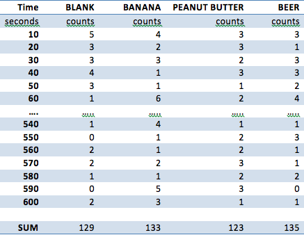
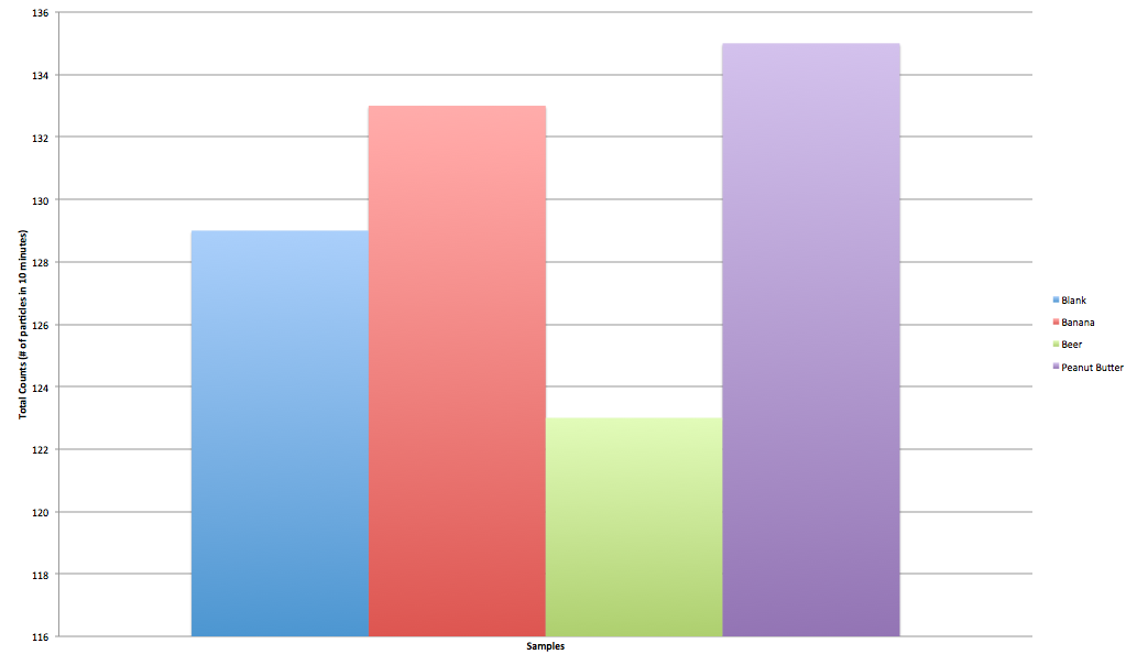
The total counts per minute measured in the blank room

C_{1}= The total counts  per minute measured for a sample

d= Amount of detectors in our sphere =6235

t= Average time it takes to digest a food product

\beta= Max energy of a beta particle =2.13\times 10^{-13} J

From these constants and variables, we can see that the total amount of energy absorbed due to radiation  E=\left (C_{1}-C \right )dt\beta

To calculate the total amount one must consume of an object to induce death, it was found that 2 Gy of radiation was enough to give ones self acute radiation poisoning over a period of 6-8 weeks. 1 Gy=\frac{J}{kg}. So assuming an average person who weighs 60kg The amount of energy to kill them would be 2\frac{J}{kg}*60kg=120J

lastly to find the total amount one must eat of a given food would be our equation above over 120J

(1)   \begin{equation*}\frac{120J}{E=\left (C_{1}-C \right )dt\beta}\end{equation*}

2. Data 

For collecting our data, the sample was placed into a 20 gallon plastic container with the Geiger counter pointing downwards at the sample, and the Vernier LabQuest was placed away from the container to minimize any additional environmental variables. The samples were placed 6 inches away from each sample. The container was covered before testing began, and all testing was conducted in a dry room at 75°F. The following samples were taken: a blank, a banana, a tablespoon of peanut butter, and (1) cup of beer. Each sample was obtained from the same grocery store, and a single serving size (the entire sample) was taken from each of the sources. Below in Figure 1 is the data that was collected. The ellipses abbreviate the data that was collected for the sake of brevity.

Screen Shot 2014-02-28 at 8.45.33 PM

Figure 1 – Raw Data Collection for Blank, Banana, Peanut Butter, and Beer 

3. Results

The data was collected for a period of 10 minutes at intervals of 10 seconds through the Vernier LabQuest and was compiled into a data chart on the devices. The samples that were tested, as mentioned above, were as follows: a blank, a banana, peanut butter, Beck’s beer. The data was then transferred to Microsoft Excel where calculations as shown in two sections above were conducted. A total summation of all the radioactive counts are shown in Figure 1, and a line graph of the variation of counts per 10 second interval are shown in Figure 2.

Screen Shot 2014-02-21 at 5.10.25 PM


Figure 2 – Summation of Counts for Blank, Banana, Peanut Butter, and Beer  

Screen Shot 2014-02-21 at 5.03.19 PM

Figure 3 – Counts vs Time for Blank, Banana, Peanut Butter, and Beer  

For each of the samples, the standard deviation for the blank, banana, peanut butter, and beer are as follows, respectively: 1.46, 1.33, 1.42, 1.72. These standard deviations indicate a fair spread given the maximum and minimum values that were recorded for each sample. Beer was found to have the most radiation whereas peanut butter did not emit any; the banana was found to emit radiation but less than that of beer.

When calculating how much one must consume to induce death, it was found that it takes on average about four hours to digest the radioactive isotopes. The four hours was converted to minutes to keep units consistent in calculations. In addition, the units for counts per minutes were accounted for by dividing by ten in the calculation. Figure 4 below shows how much of one of the samples you would have to consume to to induce radiation poisoning to the point of death. The Merck Manual of Radiation Exposure and Contamination was used to data in regards to how many Gy’s it would take to kill a person in a matter of 6-8 weeks.

Screen Shot 2014-02-28 at 9.16.01 PM

Figure 4 – Amount of a Serving Size of a Banana, Peanut Butter, or Beer to consume to Induce Death at 2 Gy  

4. Conclusion

It was found that you would have to consume more beer than bananas to induce radiation poisoning to the point of death over a period of 6-8 weeks. In short, it is practically improbable for one to die from consuming these objects in excess because of the little radiation that is emitted from these sources. This makes sense because the FDA (an in other countries) would not allow for these products to be sold if they posed a radiation risk to consumers. In the data that was collected, it was shown that the peanut butter emitted less radiation than the blank itself. This can be explained by the setup of the experiment. Because we are only using one Geiger counter, we are only able to approximate the radiation emitted in all directions and in the different amounts. Thus, it was possible for some samples to have higher or lower readings than others.

Through the course of this experiment, a better understanding of constructing controlled experiments, use of a Geiger-Müller tube, and energy calculations/conversions amongst units was obtained. In addition, learning more about the methods of collections through different units such as Sieverts or Greys and Counts vs Dosage were better understood through research and trials within this experiment.

If this experiment could have been setup differently, the first change that would have been implemented would have been the use of multiple Geiger-Müller tubes. If more tubes were used, more accurate data could have been collected and our theoretical approximations of sample emittance could have been more accurate. In addition, a simulation of digestion using HCl at a pH similar to that of stomach acid would have been conducted to see what happens to the radioactive isotope once consumed as the assumption in this project was that radiation ceased upon digestion. If the experiment were conducted for a longer period of time, more samples would have been taken over a longer period of time to look for patterns or see if the rate of emittance follows the approximate rate of decay for the radioactive isotopes in each sample. In addition, the use of highly radioactive samples would have been used to add variance to the control group versus a blank. This experiment can be repeated using one Geiger-Müller tube, a Vernier LabQuest machine, a plastic container, and the samples used in this experiment.

Radiation on Vassar’s Campus: Group One’s Results and Conclusions


For our research project, we attempted to measure the counts of radiation in academic buildings around campus using a Geiger Müller (GM) tube attached to a LabQuest 2. We were also interested in seeing if the radiation levels observed correlated with the ages of the buildings tested. This is an important type of testing to do, as over-exposure to radiation, especially \gamma particles, which are high energy photons without mass, can lead to negative results. These can include radiation poisoning, as well as cancer and other genetic mutations. To conduct our research, we walked around each of the buildings at a steady pace for 5 minutes, moving the GM tube from side to side. When there was an indication of possible radiation contamination, the tube was focused on that area to determine if there was a higher radiation count.  For example, there are areas in Olmstead that have radiation warnings on the door, and we stopped and waved the Geiger tube there for a considerable amount of time to test for any radiation contamination that may have been leaking through.

Figure 1. The apparatus used for recording radiation. The GM tube is located on the right. It is a gas filled detector, which functions using a low-pressured inert gas to amplify the signal of any radiation entering the tube. Radiation passes through the gas in the device and the molecules in that gas are ionized, leaving positive and negative ions in the chamber. These ions move toward separate charged sides (the anode and cathode), creating a current which is then sent through the wire to the LabQuest 2 Device to be measured and recorded. Each \alpha, \beta, or \gamma particle entering the tube is measured as one “count” of radiation.


Average (Counts/0.1 Min)

Max (Counts/0.1 Min)

Age

Aula

1.94

5

1890

Blodgett Hall

1.54

4

1929

Chicago Hall

1.86

6

1959

Kenyon

1.28

5

1933

Library

1.98

6

1905

Mudd Chemistry

1.16

5

1984

Old Observatory

1.62

5

1865

OLB

1.34

4

1872

Olmstead

1.36

5

1972

Rocky Hall

2.38

6

1897

Sanders English

1.94

4

1909

Skinner Hall

2.44

7

1932

Swift Hall

1.58

4

1900

Background

1.32

3

Figure 2. Table of Average and Maximum radiation counts as compared with the age of the building. As read from left to right, the columns are labeled as (1) the buildings tested, with “Background” representing the data we collected between buildings to determine an average radiation level, (2) the average count of radiation observed in each building (per 0.1 of a minute over the course of 5 minutes), and (3) the highest amount of radiation observed in each building, and the age of the buildings that we observed. We initially hoped to be able to distinguish \alpha, \beta, and \gamma radiation from each other, but upon further review, we determined the only types of radiation we were likely to detect were \gamma and high energy \beta. This is because these travel further from their source than \alpha, and are generally emitted by the same type of material.

Figure 3. The average radiation counts compared with the age of the buildings. A trend line has been plotted to show the direction of correlation. The black line indicates the linear regression line of best fit, and the blue lines represent the upper and lower limits of the possible fit of that line, according to the standard deviation of the data.

Figure 4. The maximum radiation counts compared with the age of the buildings tested. A trend line has been plotted to show the direction of correlation. The black line indicates the linear regression line of best fit, and the blue lines represent the upper and lower limits of the possible fit of that line, according to the standard deviation of the data.


We plotted the above data observed in two graphs (Figures 3 & 4).  Figure 3 shows the average radiation levels by the year that the building was built, while figure 4 shows the maximum radiation level observed by the year the building was built.  According to the statistical testing, there is hardly any correlation in the data for either graph. In figure 3, r=0.275 and r²=0.076, and in figure 4, r=0.228, r²=0.052, where the “r” value indicates the closeness of correlation of the data, and the r² value indicates the percent of data that fits within that correlation. Since both are rather close to zero, this indicates very little fit in the data. Even so, the standard deviation of the average radiation values was only 0.41, which makes the range of possible best fit lines less than half a point higher or lower on either side of the already plotted line, and the maximum radiation level, although a bit higher, has a standard deviation of only 0.95, which still would only raise or lower the line of best fit by less than one count of radiation on either side of the already plotted line. Considering the already low levels of radiation, this standard deviation does not influence the significance of the data in terms of dangerousness of radiation.

The literature provided by Vernier, the makers of M tube and the LabQuest 2 device, states that expected background radiation levels should be between between 0-2.5 counts of radiation/0.1 min. Our average background radiation testing was within this range (avg=1.32 counts/0.1 min, max=3 counts/0.1 min). All of the average readings from buildings were also within this range (the highest average being taken in Skinner Hall: 2.44). Since the radiation count values are so low, and the statistical analysis does not indicate a high possibility that radiation levels are out of our tested range, we can conclude that Vassar campus is safe in terms of radiation levels.

What would you do differently if you had to do this project again?

If we had to redo this project, we would have monitored radiation levels in relation to the GPS coordinates of the buildings.  This would have allowed us to find a possible association between locations on campus and radiation levels. While this would have also more than likely ended up manifesting in insignificant results, it is possible that we could have found an interesting relationship between the two.  It is definitely possible that certain areas of campus are more radioactive than other areas of campus.

What would you do next if you had to continue this project for another 6 weeks?

If this class were to continue for another 6 weeks, we would have been able to attempt to differentiate between types of radiation detected by placing a few sheets of aluminum foil in front of the detector. Only \gamma radiation should be able to pass through this barrier, and the other types of radiation should not. We would certainly have tested this with materials we knew to be radioactive before we went into the field.  The data we collected with the Geiger tube did not differentiate between types of radiation.  This could be somewhat problematic.  Certain types of radiation (i.e. \alpha and low-energy \beta) are much less harmful to humans than other types of radiation (i.e. high-energy \beta and \gamma).  By knowing what kinds of radiation we are detecting, we could have more information about the potential risks facing the Vassar community.

What science did you learn during this project?

First of all, we learned about the purpose of the Geiger tube and how it works. This is explained earlier in this post.  We also learned about the different types of radiation, and the risks associated with each kind. \alpha radiations are short range particles that  are made up of helium-4 (4He) nuclei. They pose little external hazard. \beta radiations are lighter short range particles made up of either electrons or positrons that can pose some risk, but are easily stopped by barriers as thin as a piece of paper. \gamma radiations are photons traveling at high speed that can cause major damage to DNA and other chemocellular functions. These are not easily stopped. Finally, we learned about compiling our data into concise and succinct data tables and graphs.

Information from an Interview with Professor Dave Jemiolo

Dave Jemiolo is the current radiation safety officer on Vassar’s campus, as well as a professor of Biology. We spoke with him about his experience dealing with an issue of radiation in Sanders Physics that came up a few years ago.

Jim Kelly, the radiation safety officer at the time, asked Professor Jemiolo to check out a darkroom below the auditorium in Sanders Physics. By using a geiger counter, he discovered that the entire floor of the room was hot with Radium contamination. He left x-ray paper overnight on the hottest parts of the floor and, upon review, saw that radiation had leached into the paper at various points. It seemed that a radioactive substance had been spilled on the floor, probably in the 1940s, and then some of it was unwittingly sealed in with varnish. He called in some specialists from off campus who ripped out the floor of the room. This led to the physics library below, where Jemiolo discovered background levels of radiation 3 times higher than normal in the entire room. Upon inspection, he discovered that the chemistry department had stored chemical compounds on shelves at one end of the room. Because they were alphabetized, elements like Thorium and Uranium were placed closed together. These two elements are natural radiation emitters, but had never been on license at Vassar before that point and were leaching radioactivity into the room.

In another instance, Professor Jemiolo was asked to check for radiation sources in the geology department. He suspected that radiation could be coming from naturally radioactive minerals stored there, in much the same way as those he discovered in Sanders Physics. He was right and prompted the removal of various minerals stored there. In an exciting turn of events, after removing radioactive minerals from a box and then removing the still hot box, he found radiation seeping through a wall. It was coming from a large rock of Uranium (oxide) that was radioactive enough to penetrate a solid wall.

What these two stories point to is the fact that not all radiation exists as we may imagine. There are many elements where radiation naturally occurs. Professor Jemiolo showed examples of this in one of the Biology labs, including potassium (one of its isotopes is a weak beta emitter).

Many things we are around on a daily basis emit radiation. Older clocks used to have their dials coated in a paint containing Radium because of its luminescent properties. Bananas are rich in Potassium. Some welding rods contain Thorium. This points to some interesting directions our research could have taken. It also is indicative of the many ways in which we are exposed to radiation on a daily basis, but at levels our body is usually capable of regulating or that do not pose a threat.