Category Archives: Spring 2017

Laser Refraction through Various Liquids

Xiaoxue Jiang

I’d wanted to do a project on lasers all along, given the few (if any) chances I’d get to do so after college. I was always fascinated by their technology and wanted to know how such an advanced, isolated manifestation of science would interact with certain elements of our world. I came up with testing laser refraction through liquids of varying colors and densities, as they would give me a good variety of samples in a consistent form.

Shown below is the basic set-up I used for the experiment. I used a power-meter set to milli-Watt units to measure the power output of the helium neon laser after its refraction through a liquid. This particularly striking substance creating the fluorescent effect is nothing but orange juice.

With this set-up, I collected the following data, making sure to include both distilled water and an empty vial as the control.

Refracting Material Power (mW)
None 3.734
Empty vial 2.885
Water 4.418
Green tea 2.133
Orange juice 0.002
Red water 4
Yellow water 3.375
Green water 0.012
Blue water 0.013

While the results were not as consistent as I’d hoped, I did find a few patterns in the data. Given that the color of the laser was red, I was not surprised by the incredibly low power levels of the laser refracted through green and blue, as it was most likely absorbed rather than reflected onto the power meter. Red water, in contrast, resulted in a high power reading thanks to the same scientific concept.

Orange juice was a different matter entirely, given its high opacity. Rose, who assisted me in the experiment, told me that the opacity scattered the laser light and therefore allowed very little through to the power meter, making its color largely irrelevant.

I’m also unsure as to why water yielded a higher reading than having simply nothing there to refract. With what I have, I can only attribute this to human error. By and large, the results were as predicted given what I knew about electromagnetic waves in the visible spectrum and the principles of absorption/reflection in color.

If I could redo this project, or have an additional six weeks, I would have definitely done multiple trials to ensure the accuracy of my data. There is a possibility that the curtains were not fully drawn to prevent outside light from affecting the reading. I would have also used more materials, perhaps even solid ones such as quartz or crystal if I could acquire it in time.

I am generally happy with the opportunity I was presented with to work with lasers in a safe and controlled environment. I enjoyed learning more about them (specifically the scattering phenomenon in an opaque liquid) and getting some hands-on experience in the scientific method.

What’s my body doing while I sleep?

What’s my body doing while I sleep?

As we wrap ourselves in the warm embrace of our blankets each night, we hand over conscious control of our body to our so called “reptilian” and limbic brain regions, and allow biology, under the governance of physics, to steer us through the night. We keep breathing—at different rates at different times—our body temperature remains within the normal range, although it does fluctuate, our brains progress through a sequence of states, each with their own mysterious functions, and our bodies are free to move—as long as our brains aren’t ready to arrest their movement. In sum, our bodies are quite active while we sleep, doing important things to keep us performing optimally while we are awake.

I wanted to learn a little about this behavior, specifically with regard to the muscular movements we make, the temperature changes our bodies undergo while we sleep, and the relationship between these two things. There are actually apps that allow for just this kind of investigation; they fall into the class of sleep-tracking apps, which utilize the sensors found in smartphones to track at least one aspect of sleeping behavior and let you know information about the quality of your night’s rest, such as the proportion of time spent in deep sleep, the number of times you woke up during the night, and even what your snoring sounded like.

These applications standardly use the accelerometers in smartphones to detect motion in the mattress due to motions of the sleeper. Accelerometers are devices that detect changes in orientation by noticing how the components of the device are reacting to gravity. The reaction of a particular component, typically the directional motion of flexible silicon, triggers electrical currents, which are translated to a signal that can be interpreted by the phone’s operating system. The sleep tracking apps that use this sensor require that the phone be placed on the mattress on which the user is sleeping, so when the person moves, the mattress moves and the app can keep track of the motion. The results of the motion tracking is then represented in a graph which plots levels of motion activity over time. Relatively more motion is interpreted as an indicator of light sleep, whereas very little motion is interpreted as a more restful sleep stage referred to as deep sleep.

I asked two main questions in my experiment:

  1. To what extent does the motion graphs of two different sleep tracking apps agree with each other, given that they receive the same input of motion data?
  2. How accurate are the sleep stages graphs in representing actual changes in sleep stages?

I investigated the first question by running two sleep tracking apps, “Sleep as Android” and “SleepBot,” concurrently while I slept, and later cross checking the peaks in their motion graphs to see what percent of the total peaks showed up in both apps. I attempted to use core body temperature sensing as a measure of the different sleep stages in order to investigate the second question. Core body temperature during sleep is lower than it is during waking hours, and some studies have shown that core body temperature is lowest during deep (Stage 3) sleep, although, this observation has been contradicted by observations in other studies and there was not a consensus on the matter of which I was aware. I collected core body temperature data using a Surface Temperature Sensor, which was taped to a portion of the skin on my stomach area to collect that data while the sleep tracking apps were also collecting their data.

The Surface Temperature Sensor detects changes in temperature by noticing changes in the resistivity—the strength of a material’s opposing force to the flow of an electrical current—of the material that is used for the sensor, which is called a thermistor. The resistivity of the thermistor changes predictably in response to changing temperature conditions, and this makes it possible to use resistivity as a measure of changing temperature. Additionally, the Surface Temperature Sensor’s thermistor is exposed, so it can be used to measure small changes in temperature including that of skin temperature.

I collected data on the two apps and a LabQuest2 device, which interpreted the data from the Surface Temperature Sensor, on five different nights for variable durations of time spent sleeping.

Results

See attachment for motion activity graphs and temperature changes graphs.

Day Total Peaks, “SleepBot” Total Peaks, “Sleep as Android” % consistent peaks
1 27 22 42/49 = 86%
2 26 20 35/46 = 82%
3 21 19 36/40 = 90%
4 26 21 38/47 = 81%
5 22 20 36/42 = 86%

Table 1. Comparison of number of motion activity peaks between “Sleep as Android” and “SleepBot” graphs. The average percent of consistent peaks over the five days recording period was 85%.

Table 1 shows that the motion data from the two sleep tracking apps was quite consistent with each other. The average percent of consistent peaks between the two sets of graphs turned out to be 85%. The apps did not present motion graphs that quantified the level of motion activity recorded. “SleepBot” explicitly gave a scale of high, medium and low, whereas “Sleep as Android” did not, but this could be inferred from the shape of the curve. “SleepBot” was also configured to approach the motion data with caution because the app asked to select a level of mattress firmness, and I chose high based on my experience with the mattress on which I slept. This could be a potential confound in this data set because “Sleep as Android” did not prompt me to do the same. This also explains why, upon a qualitative analysis of the graphs, one might say that “SleepBot” is showing that the activity was not as high as “Sleep as Android” was showing.

Day

(Time (h), Temperature (C))

Sleep Stage

  Activity Level

1

(Temp. range: 2 ⁰C)

(4.4, 34.9)
(1.8, 35.1)
(2.5, 36)
(3.6, 36.1)
(5.9, 36.1)
(0.9, 36.9)
Light
Light
Deep
Deep
Light
Deep*
Active
Active
Inactive
Inactive
Active
Inactive
2

(Temp. range: 1.1 ⁰C)

(1.3, 35.3)
(1.9, 35.4)
(0.7, 35.9)
(2.4, 35.9)
(1.6, 36.4)
Light
Deep*
Light
Deep
Deep
Active
Inactive
Inactive
Inactive
Active
3

(Temp. range: 1.3 ⁰C)

(0.3, 35)
(1.4, 35.2)
(4.0, 35.2)
(4.9, 35.9)
(1.2, 36.3)
Light
Light
Deep*
Deep
Light*
Active
Active
Active
Inactive
Active
4

(Temp. range: 1.3 ⁰C)

(4.5, 35.5)
(3.2, 35.6)
(6.0, 35.7)
(5.7, 36.2)
(1.2, 36.8)
Light
Light
Light
Deep
Light
Active
Active
Active*
Active
Inactive
5

(Temp. range: 1.1 ⁰C)

(1.7, 34.8)
(1.1, 35.4)
(3.1, 35.9)
Light
Deep
Light
Active
Inactive
Active

Table 2. Relative maximum and minimum temperatures and corresponding sleep stage and activity level according to “Sleep as Android.” *On the border between light and deep sleep.

Table 2 shows that three out of seven deep sleep instances occurred while there was some amount of movement, and two out of fourteen light sleep instances occurred while there was no movement. Since these are the minority of cases, it seems like deep sleep occurred while the body was not moving much, and light sleep generally occurred while the body was more active. This is consistent with my expectations.

As can be seen in Table 2, except in two cases of deep sleep, one of which was on the border between deep and light sleep, the deep sleep stage occurred while the temperature was between 35.9⁰C and 36.9⁰C, inclusively. The full deep sleep temperature range was from 35.2⁰C to 36.9⁰C. Nine out of fourteen light sleep stages in this table corresponded to a temperature less than 35.9⁰C, the other five were at or above 35.9⁰C, which was the temperature when most of the deep sleep stages began. Light sleep’s full range was from 34.8⁰C to 36.8⁰C. Although the temperature ranges overlap between the two stages, there is one clearly exclusive range: only light sleep occurred when the temperature was lower than 35.2⁰C. This data indicates that light sleep generally occurs while the core body temperature is lower, and deep sleep seems to occur when core body temperature is relatively higher, although the latter is less clear from the data.

This finding is not exactly what I expected, as the background research I did on the topic indicated that core body temperature is lowest during deep sleep; however, I was also aware of some research studies which had found the opposite result, namely that core body temperature was at its highest during deep sleep, which was observed in this experiment. I noticed that the sleep stages graphs from the “Sleep as Android” app were not as precise as they could be because they chunked together motion data in which there were frequent peaks of activity as a large period of light sleep, however, there were also short periods of baseline activity within these ranges, which could have reflected short periods of deep sleep. This treatment of data by the app could be interfering with my interpretation of the stages that actually correspond to the temperatures I was selecting and attempting to code to a corresponding sleep stage. The temperature sensor was taped to my skin to collect its data, and this limited my range of motion while I slept. I was conscious of this fact as I went to sleep, so it might have influenced my resulting motion activity, and it is possible that at least some of my motion behavior was different from what it might have been under normal conditions without the temperature sensor taped to my skin. Overall, core body temperature, if measured in a way similar to how it was done in this experiment might not be a good way to track a sleeper’s progression through the various sleep stages. In addition, I think my experimental design to answer the question of how well the apps are representing actual changes in sleep stages was flawed to begin with since core body temperature is not a well-established means to track such changes.

Science Learned

I learned one exact mechanism through which temperature probes are able to detect changes in temperature, and how this information is able to be represented in real time on devices like the LabQuest2 software. I also learned about a part of my smartphone that I was not previously aware of. Specifically, I learned how accelerometers work on the microscale to enable the screen rotation function of smartphones, and that this data can be harnessed to by apps downloaded on the phone, which is interesting to be because it intersects with my interest in computer science.

Current Technology Connection

There is an abundance of smartphone applications today that attempt to track the occurrence and quality of bodily functions in which humans are interested. There are many fitness tracking apps similar in broad design to that of sleep tracking apps that utilize sensors that are already in phones in a way that is different from its regular function in the phone. Apps are even adding their own accessories to do things like tracking heart rate. This field, of course, is largely dependent on available technologies with which to sense features of the world and features of people. Sleep tracking apps are also connected to the broader field of artificial intelligence which focuses on developing devices that can intelligently sense the environment.

Improvements to the experiment

If I were to do this project again, I would make more of an effort to reduce sources of potential confounds. I would probably set the sensitivity level of the accelerometer to normal on the “SleepBot” app and be more consistent with the placement of the temperature sensor. I would also like to investigate further the role of the circadian rhythm in controlling body temperature and how this interacts with body temperature during sleep. Through the circadian system, body temperature fluctuates throughout the day with temperatures being higher in the morning and lower at night, but I wonder how other activities performed during the day or other processes occurring in the body might affect this normal rhythm. I think it is possible that activities during waking hours could have an effect on what happens during sleeping hours, and I wonder whether this would have any effect of the stages of sleep during the night. This could be tested by observing temperature and motion activity in groups that do different activities during the day, such as physical exercise or lack thereof or even higher or lower stress levels during the day. Additionally, more knowledge about the circadian system’s control of temperature would have helped me to better interpret the temperature data I collected. So, if I had to continue this project for another six weeks, I would gather more data in the way that I have been, but I would also vary waking hours’ activity to test whether there is a consistent effect on sleep stages and temperature changes during sleep.

PHYS-152_Graphs

Testing the Efficiency of Fan Models

Testing the Efficiency of Fan Models

Amy O’Connell

Project:

My project involved finding the relative efficiencies of different fan models in terms of power used and volume of air flow produced. To do this I first measured the power usage of each fan in Watts using the Watts Up Pro. I then used the anemometer to measure the air velocity generated by the fan. This step was particularly difficult, as the air velocity produced is generally not uniform over the surface of the fan. To account for this, I measured the air velocity at many individual locations on the surface of the fan by setting the lab quest to collect two measurements per second, and scanning the surface of the fan for three trials of thirty seconds. I then averaged these values to arrive at one uniform air velocity for the entire surface. I found the volume air flow produced by multiplying the surface area of the fan, pi(radius)^2, by the average air velocity produced. Using these values, I calculated the efficiency of each fan in volume of air flow produced per second divided by power consumed. To give the data a more practical application, I compared the calculated efficiency to the price of each fan model.

I also designed two fans of my own, and used a small motor made from a battery, magnet, and copper coil to test them out.

The first model was made from an index card, had six blades, and measured 1 cm in radius:

The second model I 3D printed in plastic using a 3Doodler pen. It measured 3cm in radius, had two blades, and was modeled after a small drone repeller.

Both were attached to the end of a simple motor, pictured here, and tested for air velocity produced over ten seconds.

Results:


Design Volume Air Flow Produced (m^3/s)
Card stock (index card), 1cm radius, 6 blades 0.00013644461
Plastic (3D printed), 3cm radius, 2 blades 0.00307510048

What this means:

The results indicate that the most efficient model tested was the O2COOL 10-inch Portable Fan, with an efficiency of 0.0274 cubic meters per second produced per watt. This was more than 4 times more efficient than the next most efficient model, the Lasko 1827 (as seen in room 205 of Sander’s Physics). This was followed by the generic table fan from Rite Aid, and finally the Vornado 573, with an efficiency of just 0.0028 cubic meters per second produced per watt. The O2COOL also had the highest efficiency compared to price, at 0.0012 units of efficiency per dollar. Again, this was more than 5 times the efficiency vs. price of any of the the other models tested.

As for my fans, I could not measure the efficiency because the power used by each model was unknown, but the plastic propeller- like model produced an air flow that was more than twice that of the paper model.

Were my results as predicted?:

My results were not at all as predicted. I assumed going into this project that more expensive fans would be more energy efficient, as a product of a more intelligent design and higher quality building materials. What I found was that there is a negligible relationship between the price of a fan and its relative efficiency. I also found that one aspect of a fan design, the type of current it uses, most significantly impacts the efficiency. The reason the O2COOL model has such a high efficiency was because the power it consumed was significantly less than that of any other model (around 6 times less than the next lowest power used). I believe this is because the O2COOL is also capable of running on batteries. Batteries by nature produce less power than a wall outlet, so the fan must be able to use very little power in order to run efficiently on batteries. This efficiency then translates to very little power consumed even when plugged in.

For my own fan design, I am not surprised that the plastic propeller-type model produced more airflow than the card stock model. I modeled my design after the propellers found on small drones, which must produce a large amount of airflow in order to counteract the force of gravity on the drone.

What science did I learn?:

While completing this project, I learned about a variety of topics. Taking data for the fans and calculating efficiency values taught me about air movement, and how the design of an air moving device impacts its function. I also learned about electricity and power, and how different sources of power are capable of powering different devices. In my fan designing, I learned about how radius, weight, blade rotation, and materials can affect the function of a fan. I also learned a great deal about simple motor design, and how electricity and magnetism combine to perform tasks of increasing complexity, from rotating fan blades to running a motor vehicle.

Relation with current science/technology?

Energy use is one of the most pressing topics in science and technology, and has been for several decades, because it has many implications. As developing countries become more industrialized, the global demand for energy continues to rise. This creates many problems, such as air pollution, environmental destruction, and climate change. It is important to conserve energy as often as possible, and creating more efficient devices for household use like table fans or kitchen appliances is important for conserving energy and minimizing global damage from energy consumption.
What I would do differently:

If I were to repeat this project, I would try to develop a more accurate system for calculating the air velocity produced by the fan. I probably would have better accounted for the various velocities produced at different locations as well as fan faces curvature by computing the volume of air flow in a manner similar to the computation of a surface integral. I would use a grid to section off the surface of the fan into individual squares, measure the air velocity at each individual square, multiply this by the area of the square, then sum the values at each square to arrive at one cumulative volume air flow produced.
What would I do next?:

Obviously efficiency is not the only thing to consider when assessing the quality of a fan model. If I were to continue this project for another 6 weeks I would collect data for other potential selling points for fans, like sound produced and size. I would also work on improving my own fan designs, and attaching them to a motor capable of faster and more predictable rotation for better results.


designing for holograms: a revealing

While discussing this project with friends, I lost track of how many asked if I could make another Tupac hologram. I could not, due to a few problems. Confusingly, the Tupac case, so embedded in our collective cultural memory as the prime example of hologram technology, was in fact not a hologram, but rather a large-scale modern day advancement of a few centuries old stage trick,  a two-dimensional image projected onto a hidden screen, a trick that cost well over a hundred thousand dollars.

Disheartened and perplexed by this discovery, I decided to explore the technology of the holograph at a rather introductory level. With an accessible interaction occurring on a small scale, I hoped to be able to gain an understanding of the process which would better inform and encourage consideration of holographic technology on a much larger scale. On this blog site, I found a similar project, one which served as the foundation for my own exploration.

If  Tupac is not a hologram, then what is? Holography is a technique which allows for a three-dimensionally displayed image of an object through the interaction between two different light beams: exposure to monochromatic (laser) light, encoding interference patterns; and an illuminating beam, producing the image. It is often considered in relation to the photograph, of which there are many key differences, including the required apparatus, how the light of the object or scene is recorded, and the necessary lighting conditions for viewability.

With this basic understanding, I was able to began my exploration of the technology, using the Litiholo Hologram Kit and hologram procedure sheet generously provided by the physics department.

Materials included:

  • Laser tower.
  • Laser Diode
  • Lens/ Laser Mount Assembly.
  • Spacer
  • Holographic plate holder
  • 2”x3” film plate
  • Black card
  • White card
  • Toy car
  • Lighter
  • Sturdy table
  • Timer
  • LED Blue flashlight

Procedure:

  1. Place the holographic plate holder and plate support assembly against the flat end of the laser tower spaces so that the long slot on the holographic plate holder is closest to the spacer and centered on it.
  2. Turn on the laser diode. Place the practice film plate in the long slot in the holographic plate holder, resting against the holographic plate support. The object should be placed directly behind the plate as close as possible without touching it. Using the white card, verify that the expanded laser beam is hitting the film plate, then passing through the plate to illuminate the object. Should be preset, but important to make sure of.
  3. Place the black card on the laser tower spacer so that it blocks the laser light
  4. Turn off all lights. Remove hologram film plate from the box and inner bag. Place it onto the holographic plate holder with the cover sheet faced away from the object.
  5. Wait 3-5 minutes. Total silence and stillness extremely crucial.
  6. Gently lift the black card to expose the hologram. Expose for 12 minutes. Total silence and stillness still crucial.
  7. Replace the black card momentarily. Remove your object. Remove black card again to view your hologram. Look through the laser tower legs to see the holographic image that appears behind the film plate. If you can see the image of your object, it is a success.
  8. To see the hologram without a laser light, use a bright light coming from the same angle as that of the laser when the hologram was made.

I followed this procedure exactly as described three times, making three different holograms (two of a small red toy car, one of an orange Bic lighter).

Initially I expected to have some difficulty when first starting to toy with the hologram kit, understanding the need for the chosen objects to be incorporated so as to produce the clearest, most impressive images. With this in mind, I prepared for small- to medium-sized objects of a rather shiny caliber. On my first day, to my surprise, the department presented an arsenal of these caliber objects at my disposal, including castles and miniature Star Wars figurines, but I ended up choosing one of the shiny red cars.  After preparation and twelve moments of total stillness, I removed the object and turned on the laser, to see a clear, red, seemingly three-dimensional image of the car that was in my hand.


I expected to have some difficulty in trying to expand my thinking to a bigger scale. In my second attempt I wanted to attempt making a hologram of  an object of my own, an object that had not already been proven to work with this kit. Due to its size and light constraints, I had to think small, and chose to use the orange bic lighter I had in my pocket. I had difficulty arranging it properly behind the film plate, and had to put the toy car behind the lighter to prop it up. In this attempt, another hologram was made, but the image was definitely not as clear as the first, due perhaps in part to the visual appearance of the object itself. As well, unintentionally and ever so-slightly, I bumped into the table during the exposure process, thus altering it. Although totally silent, my slight movements may have interfered with this attempt.

And so I tried a third time, using once more the toy car, and with what I learned from my first two attempts was capable of producing an image remarkably clearer.

Holography today and of the near future has a vast range of applications across disciplines, including art, fashion, design, government and non-government regulated security, biotechnology, and perhaps most importantly, data storage. This ubiquitous existence was certainly running through my mind throughout this project, but due to the constraints of the kit in its smallness and touchiness, and my own inexperience, was not able to apply it directly to any of these disciplines.

If I had six more weeks to do this project, or if I had to do it all over again, I would have explored further the holographic ability of a vaster range of objects. Were I to use the exact same kit, the size constraints would certainly still exist and limit my exploration. In that scenario, then, I would perhaps find it fruitful to intentionally alter with the exposure process in a way which would allow me to manipulate the holographic image into a more distorted one. While not with immediate scientific value, I believe studying human perception and response to these distorted, three-dimensionally displayed images would prove profoundly insightful. For instance, what happens to the image when I am not totally silent, and how do different levels of noise-making affect the holography process? In other words, I would like to compare the environmental stimuli which afford the making of the holographic image as they relate the multisensory experience of human’s witnessing these images.

With access to more advanced holographic technologies, I would like to delve more explicitly into the aforementioned disciplines in which they are becoming increasingly involved, namely as it relates to data storage and design. The logo on a bank credit card is often a hologram, storing personal, computer-generated data. Frustratingly, most of the public are not aware of the ways in which holograms have already begun to invade their daily lives. In a larger scale project, with higher-end technologies, I would hope to bring awareness of the hologram’s existence in our daily lives, through the design and installation of images(either holographic or referring to the holographic) into the public spaces many of us often inhabit.  

Hair Diameter Measurement Using Laser Diffraction Patterns

Cris Carianna

Experimental Design

My project consists of the diffraction of laser light of 2 known wavelengths around the hair follicles of several Vassar students. Each student will provide three hairs and the diameters of each will be calculated and averaged together, using both colors of laser light in an effort to see which of the two provide more precise measurements. The laser will be fixed to a wooden mount and shine from the inside of one end of an originally 1’ x 2’ x 6” rectangular prism made of 3/4” thick medium density fiberboard, wood glue, and pocket-holed screws. It will pass around the item to be measured, which will be fixed level to the laser and 1” away from its tip by a small frame made of 5mm thick sheet metal held steady between two halves of a 2 x 4, and will project a diffraction pattern on a piece of 1/4” thick MDF plate at the other end of the box. This plate was positioned exactly perpendicular to the laser to ensure that the measurement of the diffraction pattern was not skewed by the angle from which the laser emitted.

The diffraction pattern will be measured with digital calipers and this measurement will be taken from the center of the pattern’s brightest point to the edge of the pattern’s first ‘dark patch’ in millimeters to the nearest sig fig.

Using this formula in each measurement trial, I will plug in the distance, which has been standardized by the fixing of the laser to the inside of the box, and the known wavelength of the laser, either 532 nm or 473 nm, to find the diameter of the hair. Theta in this equation represents the angle of diffraction, and because this angle is very small, I can use the small angle approximation formula, which is the distance measured to the first minimum (or band) from the pattern’s center divided by the distance from the hair to the projection surface. To make things even simpler, the numerator in my equation can simply be the laser’s wavelength because I am only measuring to the pattern’s first minimum, meaning that m is 1.

At the end of initial data taking, I was not impressed with my results. The numbers seemed random and the only clear pattern I could discern was in one student’s results; his average head hair thickness was significantly higher than other subjects perhaps due to his south Asian background.

Unfortunately I think there were more failures than successes with this initial experimental setup, enough that I felt the need to readdress the experimental design and retake the data. First, the distance between my hair-holding frame and the laser itself as well as the distance between the hair-holding frame and the MDF board on which the diffraction pattern was projected is too small. The distances I used were 10 and 35 centimeters respectively, meaning that the total distance between laser and MDF was 45 cm. I set it up this way based on the set up of a similar experiment that I found online which I scaled down to fit the fiberboard box that I built to house the experiment. This downscaling of the set-up created diffraction patterns that were quite a bit smaller than I would’ve liked, meaning that the accuracy with which I measured the space between the bands was unacceptable for taking accurate measurements with the digital calipers. I measured the bands using digital calipers set to metric units to the thousandth decimal place, a method that I thought would yield highly precise results, but the patterns presented with an almost fish-eye quality that I attribute to the shorter distance and which I believe contributed to my less than ideal results.

Another obstacle in my attempts at precise data taking was in the design of the experimental enclosure’s lid. I initially used a piece of MDF fit to the exact dimensions of the box top attached with 3/4” strap hinges. I hoped this set up would allow for customizable levels of darkness so as to improve my ability to see the precise edges of the diffraction pattern’s bands, and I eventually added a hole in the lid which corresponded to an identical hole in the box frame and cut a series of dowels varying in size so that the box’s lid could be suspended at differing heights depending on how illuminated I wanted the inside of the box to be. This apparatus eventually began to restrict the range of motion of my arm during diffraction pattern measurement using the calipers, and this problem was exacerbated by the lid interfering with my ability to extend the calipers to the appropriate width needed for precise measurement. After data taking, I used my router to inlay the piece of PVC board into the MDF rather than simply attaching it with screws like I had done initially, and this seemed to solve the problem of the full extension of the calipers after a little more tinkering. However, I still had problems with the box’s top getting in my way. To solve both of these problems, I simplified. I removed the back wall of the box entirely by cutting off the part of the box which housed the laser mount and hair-holding frame. I moved this now independent apparatus to the other end of the table and clamped it in place to assure repeatability across trials. I then took my newly three-sided box, which I’ll now fancily refer to as the laser amphitheater because of the likeness, and clamped it to the other end of the table and extended the projection surface a full 9 inches off the edge of the table before clamping. Despite the lid and opposite wall being removed, my projection surface remained dark enough to see distinct lines in the diffraction pattern, probably because I conducted the experiment in my basement. All this resulted in a hair to projection surface distance of 226 cm, which yielded much more regular looking and measurable diffraction patterns.   

This photo shows my new and improved experimental setup. The hair-holding apparatus was screwed into the MDF platform that was cut off of the box and which holds the laser mount to ensure that the distance between the hair and the laser remained unchanged throughout the trials. Moving the hair-holder onto a platform also helped to center the beam along the y axis of the metal holder to improve the pattern’s image. The projection amphitheater is projecting off the left side of the table about nine inches and is clamped in place to ensure distance repeatability. The platform with the laser mount and hair mount is also clamped in place.

This picture shows the apparatus from the back, with the 473 nm laser and the digital calipers I used for measurement beside it.

Pictured above from left to right is the hair-holder mounted in the block for stability. Tightening those screws would keep it in place. The middle shows the new apparatus. The block is screwed into the MDF, which is in turn clamped to the table. The laser mount is also screwed to the MDF with pocket holes. The right photo shows the hair holder being loaded into the block. Because the only thing I had to do was remove the holder, put the next hair in, and put it back, I could guarantee that both the distance between the laser and the hair and the hair and the projection surface remained identical for all trials.


Above are some additional pictures, depicting the metal hair-holder with a framing square for scale, the experimental apparatus housing the blue laser, and the measurement of a green diffraction pattern using the back arms of my digital calipers, which are used for measuring internal spaces rather than the external bounds of an object.

Results

After all of this adjustment, my new results came in with a lot more regularity. The measurements had much less variation across a given individual’s three trials in both wavelengths of laser, and the overall experiment yielded much less variation across the individuals’ average diameters as well. The best example is found in Diana Howland’s trials, especially in the 532 nm data. In my initial experimental setup, the data to which can be found in my initial data submission, Diana’s 532 nm wavelength three head hair trials yielded measurements of 30, 61, and 67 microns. In my improved setup, her three measurements for the same wavelength of laser light used were 57, 60, and 63 microns. These results instill much more confidence that my method is precise, I believe due to the changes I made to the repeatability of the standardized numbers in my calculations (by way of adjusting the enclosure and distances therein).

In terms of the differences between the green laser trials and the blue laser trials, I couldn’t find much. Most of the individual averages were within ten microns of each other; Caroline’s two averages were 54 microns for the green and 57 for the blue. I would say that that at least proves the reliability of my measurement method. Generally speaking, the blue trials yielded less precise data in that the diameters within an individual varied across the three trials more than that of the green laser trials. A notable exception was Jacob, whose blue trial data was noticeably more uniform than his green data. I also noticed that in his green trials, his average was 10 microns higher than the next highest number, which I expected due to his south Asian genetics. This spike was not observed in the blue trials, however. I expect the general trend toward imprecision in the blue trials is due to the brightness of the laser; during measurement, I had noticeable trouble looking at the center of the blue diffraction pattern for too long and this made locating the edge of the band and the middle of the pattern more difficult than it had been during the green trials. Interestingly, after standard deviation and variance calculations, the averages for the blue trials actually showed more precision in that the spread was far smaller than the green. However, I believe this actually points to inaccuracy in the blue trials because these numbers seem too close based on both the variance of human hair widths (around 20-120 microns) and on the data for the green trials appearing much more precise within an individual’s trial.

Conclusion

Overall, I would say the experiment mostly taught me the importance of repeatability across all trials of an experiment. In the context of our class, deriving the formula that we were shown early on gave me a lot more insight into why it works so well. I struggled for a while about how to find the sine of theta because I was convinced that the small angle approximation just wouldn’t do the trick. I tested a bunch of ways of measuring that angle, but none seemed as accurate as simply approximating the angle. Looking back now that I have results, I see that my method isn’t accurate enough to warrant that type of precision anyway.

This method of measurement is used in physics all the time; it is incredibly accurate when standardized with expensive equipment of course. One would think that this is an awfully expensive way of accomplishing simple measurement, but you’d be surprised how often it applies to the actual world of experimental physics.

If I could go back and change something, I would have projected my patterns and measured the distance to my patterns’ first minimum using some disposable surface, paper even, and marking on the paper exactly the bounds of my measurement. I would then turn the laser off, and measure the distance between my two marks with the digital calipers. This method would have been especially helpful during the blue laser trials because I believe its brightness was a hinderance to the accuracy of my measurements.

If the project was to continue, I would do my best to get my hands on a micrometer. This way I could first measure the hair’s actual diameter and I’d have a real understanding based in numbers of how accurate my methods actually are. I also would measure some smaller items, such as particles in pond water, in order to yield and measure diffraction patterns which show bands both above and below the one line, meaning that the light is diffracting both to the left and right of the object and around the top and bottom of the object. I would love to see what kind of accuracy I could get in finding the shape of a very small object with only light to help me out.

Decibel Measuring: Is there an app for that?

Emma Mertens

Intro and Science:

Want to measure how loud your dog barks? How much noise exactly your dorm neighbors make when you’re trying to sleep? Well I’d love to tell you, “there’s an app for that,” but unfortunately the apps available for measuring decibel levels are not the most well-developed. For this experiment, I tested out apps on the iPhone that measure decibel levels. In order to do this, first I had to do some research about what a decibel actually is. A “decibel” is a measurement used to describe sound. Sound is wave, and there are two important characteristics that we can describe about a certain sound wave that make it distinct from a different sound wave. The two characteristics are intensity and pitch. Intensity is measured by the amplitude of the sound wave, or how tall the sound wave is. Intensity is what we are thinking about when we think about how loud or quiet a sound is. The larger the amplitude of the sound wave, the louder the sound appears to us. This is the aspect of sound that we measure with decibels. The other aspect of sound is pitch, which we measure by measuring the frequency of the sound waves. Frequency is how many sound waves fit into one second. The higher the frequency, the higher the pitch of the sound. We measure frequency with Herz.

For this experiment, I tested applications that measured decibels, so the frequency of each sound was not recorded. Decibels (dB) measure the intensity of sound. Because the human ear can hear such a variety of levels of sound, decibels do not increase and decrease linearly. The scale starts at zero, which represents silence. Ten decibels is ten times louder than 0 decibels, which seems to make sense. But 20 decibels is 100 times louder than zero, and 30 decibels is 1,000 times louder than 0 decibels.

Our ears can hear slight differences in decibel levels, and as always, technology is still trying to catch up with the complex human body. There are scientific tools that measure decibel levels quite accurately, but I wanted to know how accessible those tools were to us, the masses without access to a physics lab. I tested several cell phone apps that can be downloaded on the iPhone, which measure (or claim to measure) decibel levels.

Description of Project:

 To do these trials and compare the apps to one-another, I used an online sound generator. I used this to make sure I had control of the fluctuation of sound that the app picked up. I turned the volume on my computer up to the maximum level, to ensure a constant level of sound throughout the trials. I set the measurement app to 0 (if the app had the available setting). Then I pressed play and waited one second before I played a tone from an online tone generator. The online generator played a constant tone for 3 seconds. I played the same tone twice with one second in between, and then played a tone that was the same level as the first, but went up 6 decibels after one second. I played that tone twice. I then played a tone that played the original sound level and then went down 6 decibels after 1 second. I played that tone twice as well. I played each of these tones with 1 second in between. I then ended the recording session and collected the data.

Results:

 The first app was: Decibel 10th

This app was by far the best app that I reviewed. Some of its best features include the ability to export data by email; the ability to start, pause, and reset the data collection process; and the in-time graph of the data being taken. This app recorded the minimum, maximum, and average decibel levels collected during the data collection process. Decibel 10th collected the most data and displayed it in the most user-friendly way. Another positive aspect of Decibel 10th was its accuracy. According to the Department of Design and Environmental analysis at Cornell University, a whisper is about 34 decibels. This closely aligns with the minimum decibel level recorded by Decibel 10th, which was 38.2 decibels.

I give this app 4.5 out of 5 stars.

The second app was: DecibelMeter

The free version of this app does not have very many features. The user is able to pause the data-taking process and reset the “max value,” but these are the only major features of the app. There is a graph, but the scale of the graph is too large to be helpful tracking smaller changes in decibel levels. Additionally, this app does not appear to be very accurate. In various quiet rooms in which this app was opened, this app measured around 60 decibels of sound. This is reflected in the data set and on the graph, in which you can see that the minimum decibel level recorded during the data collection was 75 decibels.

I give this app 2.5 out of 5 stars.

The third app was: Decibel Ultra

Decibel Ultra’s main flaw is that it is not user-friendly. There are many numbers on the screen that are not labeled clearly. If you’re someone that knows a lot about sound, these labels may be helpful to you, but otherwise they’re just overwhelming and confusing. That being said, there are a lot of numbers on the screen, so if you can figure out what they all mean you’ll be in good shape. The app does have instructions, but they’re also not very clear. Some of the features of this app are helpful, however. It has pause, stop, and reset buttons which make for clear data collection. This app also has a visual, but rather than graphing the decibel level over time, like Decibel 10th does, this visual shows the decibel level at each moment independently. This app also appeared to be fairly accurate, as it would hover between 30 and 40 decibels in a quiet room.

I give this app 3.5 out of 5 stars.

The fourth app was: SoundMeter

SoundMeter is by far the app with the least number of features, of the ones that I tested. SoundMeter’s screen consists of two bars, one labeled “Average” and one labeled “Peak.” It also shows the Max level reached. This app does not even attempt to show the sound level at any given time. It does not show a minimum value or have a reset button, although it does have “start” and “stop” buttons. Clicking on the information button simply prompts the user to buy the full version. SoundMeter, like DecibelMeter tended to report higher decibel levels than expected, with the average recorded decibel level being 71.

I give this app 0.5 out of 5 stars.

Data:


App Name Minimum Level Recorded Maximum Level Recorded Average Level Recorded Peak Recorded
Decibel 10th (App 1) 38.2 68.5 62.7 71.3
DecibelMeter

(App 2)

75 -* 66 70
Decibel Ultra

(App 3)

33.8 66.3 -* -*
SoundMeter

(App 4)

-* 77 71 76

*Application did not collect this data


Conclusion:

The take-away from this experiment was pretty unfortunate. Decibel 10th is probably your best option for proving those pesky neighbors are too darn loud (unless of course you want to skew the data, then I would suggest DecibelMeter or SoundMeter, but I’m not condoning lying). Each app measured slightly different data, so in some ways it was difficult to compare the accuracy. Looking at the graph, all the apps that measured the average decibel level appeared rather similar. However, again we can see that the minimum level measured by DecibelMeter was much higher than the other two apps that measured minimums. Looking at the maximums recorded, SoundMeter’s maximum was significantly more than the other two apps that measured the maximum decibel level, which again makes me question its accuracy. Ultimately it was clear to see that Decibel 10th out-shined the rest of the apps tested, however these were just the free versions.

These results were slightly worse than I would have predicted because I was hoping more accurate technology would be available in 2017. I was especially surprised because I used a cell-phone, and intuitively one would assume that cell-phones have some of the most up-to-date sound measuring equipment since measuring sound is one of the most important aspects of a cell-phone. To capture and analyze sounds, the cell-phone uses what is called a transducer. A transducer is a device that converts variations in a physical quantity, such as pressure, into an electrical signal, or vice versa. So the microphone in an iPhone measures sound frequencies (dB) and converts it into a voltage. When you are talking to someone on the phone, the phone you speak into measures frequencies, converts them to voltage, and then sends that voltage to the other phone which converts the voltage back into physical frequencies. Because a cell-phone has this capability, I had hoped that it would be better able to measure sound frequencies (dB).

Endnotes:

In another experiment, or if I were to continue this experiment for six more weeks, someone could test the apps that must be purchased. My prediction and hope would be that these apps would have more features (like reset buttons) and would be more accurate, and therefore get more similar results. A flaw in this experiment also could have arisen from the environment it took place. I completed this experiment in my room, which has noises from neighbors and the street that do not remain constant. In order to fix this in a new experiment, I could complete the experiment in a soundproofed room.


Sources:

Information about Decibels:

http://www.human.cornell.edu/dea/outreach/upload/FPM-Notes_Vol1_Number11.pdf

http://science.howstuffworks.com/question124.htm

Online Tone Generator: http://www.audiocheck.net/blindtests_level.php?lvl=6

Information about Transducer: https://www.merriam-webster.com/dictionary/transducer

http://efxkits.com/blog/different-types-of-transducers-in-practical-applications/

Information about Sound Waves:

https://www.nde-ed.org/EducationResources/HighSchool/Sound/components.htm

Relationship between sound level in dorm and sleep quality

Relationship between sound level in dorm and sleep quality

Shijie Guo

Project Description:

My project was aimed to find out the relationship between noise level in the dorm overnight and my sleeping patter and sleeping quality. The level of sound in the dorm over night was found by using the app “Decibel 10th” on my iPhone. To find my sleeping patterns, I used LabQuest’s x-acceleration, y-acceleration, and z-acceleration sensor. I put the LabQuest under my pillow to record my movement while I was asleep. Then I used Logger Pro and Excel to graph x, y, and z acceleration and sound level. By comparing the graphs, I can conclude if there is any correlation between sound level and my sleeping pattern.

Results:


February 21st:

Figure 1 Sound Level on February 21

Figure 2 Sleeping Pattern Feb 21

February 23rd:

Figure 3 Sound Level Feb 23

Figure 4 Sleeping Pattern Feb 23

March 8:


Figure 5 Sound Level March 8

Figure 6 Sleeping Pattern March 8

Interpretation of the results:

As shown above in the figures, when there is an abrupt change in the x, y, or z acceleration, there is also an increase in sound level. However, when there is an abrupt change in the sound level, it’s not necessary to have a change in x, y, or z acceleration. So, we can conclude that might be some correlation between sound level and sleeping pattern. However, it’s insufficient to conclude that there is a causation relationship between the two.

Results vs. Predicted:

My predicted result was that there would be strong evident to show change in sound level could cause change in sleeping pattern. However, the results suggest that there is no causation. Noise level in dorm could a contributing factor to sleeping factor, but it’s not enough to cause change in sleeping patterns alone.

Science learned:

Before doing this project, I don’t know how applications on smart phones are able to measure people’s sleeping quality. After this project, I learned that we can measure people’s sleeping pattern by measuring their movement while they are asleep (by measuring acceleration on x, y, and z directions).

What I’d do differently:

If I were to this project again, I would use apps on iPhone to measure my sleeping quality because it’s easier to visualize data on apps than on LabQuest. And putting LabQuest, a thick block object, under my pillow may affect my sleeping and thus affecting the result. And I would use a sound meter that can be programed to collect data at certain intervals. What I did was to keep sound meter running for 8 hours and, as a result, the size of data was overwhelming even for computer to graph and analyze. If I could reduce the size of data while keep the effectiveness of data, it would be better.

If I had to continue this project for another 6 weeks:

If this project were to be continued for another 6 weeks, I would measure my sleeping pattern without any influence from noise in the room (perhaps by sleeping in a quiet hotel over Spring Break). And I can use this uninfluenced sleeping pattern data as background data and compare it with my sleeping pattern when I was affected by noise in the room. So, I can conclude how much influence does the change in noise level have on my sleeping pattern.


How Dutch Beat Predator/How to Hide From the U.S. Government

1
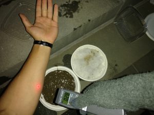
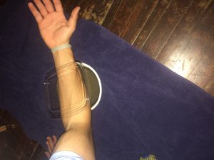
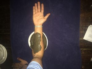
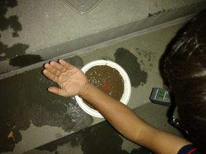
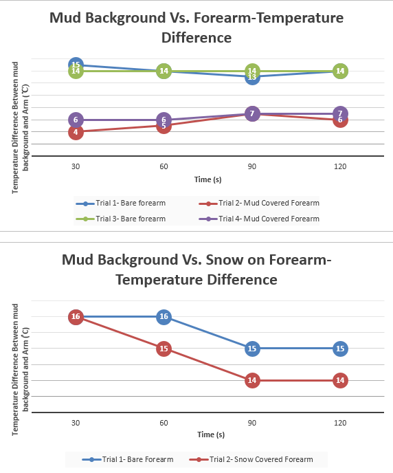
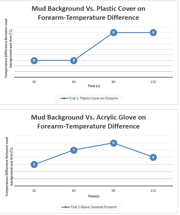
Latent temperature of the human body is naturally around 37 degrees Celsius, which is generally warmer than its surroundings. Therefore, it is rather easy to spot warm-blooded humans in the environment due to the temperature difference using infra-red vision. In the film Predator (1987), the titular villain exploits infrared vision to spot his human adversaries, but the hero in the story, Dutch played by Arnold Schwarzenegger, insulates his infrared radiation using mud in the finale of the film.(https://youtu.be/ktVqsBgOvBI?t=1m31s) We used mud as our background for each of the experiments in order to best replicate Dutch’s situation in which he found himself surrounded by mud. Such insulating properties of various materials and their ability to camouflage body heat like the scene in the movie are what experimentally verified in the tests. We used the Infra-red thermometer and night vision goggles. The Infrared thermometer measures the temperature of a surface in degrees Celsius. The night vision goggles, on the contrary, absorb infrared radiation from the environment and creates a crude grey-scale image. Our equipment detects infrared radiation that is invisible to the human eye, which will reveal the temperature difference between the two entities (being our forearm and mud background. Basically, the procedures involved us using mud as a constant, unchanging background throughout the experiment. First, we applied mud to each of our forearms (one person at a time) and measured the infrared radiation being emitted from that covered patch in comparison to the mud background. We chose the forearm because it has the least concentration of hair on the arm, which acts as an insulator and may have skewed our results. After this, we moved on to a patch of snow on the forearm in comparison to a mud background. Then we proceeded to test an acrylic glove and a transparent plastic cover. All the above mentioned was measured using an infrared thermometer. We started by measuring temperature of the mud background for each experiment and then at the 30 second mark, we switched the infrared thermometer to quickly measure the temperature of the covered forearm. Then we immediately kept measuring the mud background and switched back to the forearm in intervals of 30 seconds until we reached 120 seconds total time. We collected the quantitative data outdoors in semi-dark conditions (artificial light) and 19 degree Celsius weather. We took the difference between mud and covering object and presented that within the line charts. As for the second part of the project procedure, we used night vision goggles to gather empirical evidence of the before mentioned objects. However, snow was no longer present, so we could not include this in the second part of our study. In addition, we used a white shirt, black shirt, and white grocery bag to broaden our approach. While using a grey scale, the night vision goggles picked up infrared heat and displayed white for hot and dark grey/black for cold objects. The initial project data was taken February 23, 2017 and final project data was taken by March 8, 2017.
2                                                                   RESULTS

MUD
Trial 1-Bare forearm Trial 2- Mud Covered Arm Trial 3- Bare Forearm Trial 4-Mud Covered Arm
30 seconds Mud-12°C Mud-13°C Mud-13°C Mud-14°C
Arm-27°C Arm-17°C Arm-27°C Arm-20°C
60 seconds Mud- 12°C Mud-13°C Mud-13°C Mud-14°C
Arm-26°C Arm-18°C Arm-27°C Arm-20°C
90 seconds Mud-13°C Mud-13°C Mud-13°C Mud-14°C
Arm-26°C Arm-20°C Arm-27°C Arm-21°C
120 seconds Mud-13°C Mud-13°C Mud-14°C Mud-13°C
Arm-27°C Arm-19°C Arm-28°C Arm-20°C
SNOW
Trial 1- Bare Forearm Trial 2-Snow Covered Arm
30 seconds Mud-14°C Mud-14°C
Arm-30°C Arm-  -2°C
60 second Mud-14°C Mud-14°C
Arm-30°C Arm-  -1°C
90 seconds Mud-14°C Mud-14°C
Arm-29°C Arm-0°C
120 seconds Mud-14°C Mud-14°C
Arm-29°C Arm-0°C
PLASTIC COVER
Trial 1- Plastic Covered Arm
30 seconds Mud-14°C
Arm-22°C
60 seconds Mud-14°C
Arm-22°C
90 seconds Mud-15°C
Arm-24°C
120 seconds Mud-15°C
Arm-24°C
ACRYLIC GLOVE
Trial 1-Glove covered Arm
30 seconds Mud-15°C
Arm-18°C
60 seconds Mud-14°C
Arm-19°C
90 seconds Mud-14°C
Arm-20°C
120 seconds Mud-13°C
Arm-17°C

We also used night vision goggles to empirically verify the quantitative data and below are the results for this experiment

(Mud as Background) Observations with Nightvision Goggles
Mud on Arm Arm/Mud blended in. Similar infrared-heat detected (for both Josh’s and Anik’s arm)
Mud Vs. Acrylic Glove Infrared heat of arm penetrates right through glove (radiates white)
Mud Vs. White Shirt Infrared heat of arm penetrates through white shirt (radiates white)
Mud Vs. Black Shirt Infrared heat of arm penetrates through black shirt (radiates white)
Mud Vs. Plastic Cover Infrared heat of arm pierces right through plastic cover (radiates white)
Mud Vs. Plastic Bag Infrared heat of arm pierces right through plastic cover (radiates white)

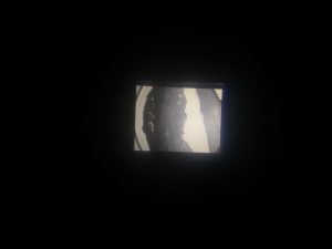
This first picture through the night vision goggles represents Josh’s mud covered forearm and its similarity in infrared heat to that of the mud background (emits black/mud background and arm are same). The second picture demonstrates the penetrability of the plastic cover while on Anik’s forearm. As shown, his infrared heat (white) pierces right through the plastic cover and is detected by the night vision goggles rather easily.

Below you will find line charts, providing a visual representation for the above data over the course of 120 seconds for each trial


3
To this effect, Dutch would in fact be able to hide from the Predator’s infrared detection as was portrayed in the movie. Because the difference in temperature between the skin and the mud was less when the mud was applied to the forearm, the mud made it more difficult to detect body heat while using the infrared thermometer. In addition, we found that the acrylic glove performed rather well at masking infrared heat when using the infrared thermometer. Such was determined when the difference in temperature between the mud background and the glove covered forearm was rather small. However, when the study was performed with the night vision goggles, only the mud background vs. mud covered forearm demonstrated a complete masking of body-produced infrared heat. The acrylic glove, on the other hand, allowed most of the body-produced infrared heat to penetrate right through, showing white while viewing through the night vision goggles. Given that Predator was using infrared technology to identify his opponents, the movie was accurate in showing that Dutch was capable of hiding from Predator when he spread mud around on his body. Using other materials such as acrylic gloves, t-shirts, plastic bags, or plastic cover would have allowed his infrared heat to simply penetrate.
4
Based on the data, the results were in fact what we predicted. Based on the properties of mud, we speculated that it would in fact serve as an excellent insulator of infrared heat and effectively block any infrared radiation. As was shown through the infrared thermometer and night vision goggles, the mud on the forearm effectively blocked out most body-produced infrared heat to blend in with the mud background.
5
The science we learned from this experiment was that infrared radiation is naturally emitted by all objects and can be detected in terms of degrees Celsius. Furthermore, we learned that night vision goggles absorb the infrared radiation from targeted objects and projects the image in a grey scale, black indicating cold temperature and white indicating a warm temperature.
6
Our project ties in perfectly with the evolving world of military technology. With this knowledge of how infrared works, we now make the jump to drones and how they implement infrared radiation to seek out targets in foreign countries. We know that bodies emit infrared heat, so advanced sensors can detect a “warm” body in contrast to cold or even hotter surroundings. Such a technology is also built into night vision goggles that the military uses when soldiers are on the ground. This assists in the detection of enemies just as a drone would work, only at a much closer range.
7
If we could perform this experiment again, we would choose to perform both segments in a consistent location as opposed to one set of data obtained outdoors and one set indoors. In addition, we would choose more materials that might actually have a greater ability to block body-produced infrared radiation. Also, we would choose to use more advanced night vision goggles that use a rainbow scale and allow for spot temperature readings.
8
If we had to continue this experiment for another 6 weeks, we would likely be gathering data every week (from winter to spring) and determine if the outdoors general temperature might have an effect on the likelihood that the mud covered forearm would still be easily masked. Also, we would attempt the experiment against different background such as snow, brick walls, grass, asphalt, and other surfaces humans commonly find themselves tracked against. 

In the course of this experiment, Josh Carreras and Anik Parayil contributed equally to its overall success and progress.


Movers and Shakers: Reporting Earthquakes

For my project, I was interested in earthquakes; more specifically, I was interested in how people feel the impact of earthquakes that happen further and further away from them. Since noticeable earthquakes are fairly rare on the East Coast, and are certainly beyond my ability to reproduce, I instead collected data from the USGS’s online databases of recent earthquakes and reports thereof.

I decided to focus on  four earthquakes in the US (including Hawaii) which had an unusually high number of responses, and construct models based on the data that I had gathered. Graphing the models themselves proved difficult (since I have multiple input variables, graphs would have to be in 3D), but below are individual graphs of the variables for the earthquake in American Canyon, California. The text form of general model for that earthquake is also below. (I produced graphs for all models, but I only included one, since they all look more or less the same).

The individual plots and model formula more or less behaved as expected. First of all, being further away from the earthquake makes you less likely to report it, which did not come as a surprise (the zero values are because I took the logarithm to make the data more visible, and ln(1 report) =0). The reported shaking (MMI) follows a rough bell curve distribution, which was also to be expected: towns that experienced class 1 shaking were unlikely to report it at all, and very few towns experienced class 7 or 8 shaking (which consist of severe property damage).

The models were also fairly powerful: the models for Pawnee, Waikoloa, Belfair, and American Canyon explained 24%, 22%, 41%, and 56% of the variability in my data, which was a lot more than I was expecting. A big source of error is that the data are not weighted for town size; ten reports from a town of two hundred people is a lot more important than ten reports from a city of eight million, but the model weighs them the same. This is likely why the Pawnee and Waikoloa reports are bad. The data for the Pawnee earthquake (in Oklahoma) features reports from Florida, Nevada, and Maryland, while almost half of the Waikoloa data are reports from one city.

If I could continue this project for another 6 weeks, I would try and write or find a piece of code to weight the data points by zip code population density. Doing this by hand would be impossible (the Pawnee data set contains 3981 zip codes, for example), but a computer could chew through it quickly if I could teach it how. (All of the necessary data is publicly available from the census, so that wouldn’t be a problem).

If I were going to start this project over again entirely, I would try to do comparisons between earthquakes. The way that the USGS’ website is structured makes it impossible to directly compare the reports without downloading and merging hundreds of individual earthquake reports, but again, I could try to find or make a piece of code that could do this. It would open up some interesting questions that were unavailable with this approach: when in the day are people most likely to report an earthquake? How does the magnitude affect how far away the average report is? How about the depth?

The science involved here was in how the energy released by earthquakes is felt by humans, and I learned a lot about that. I also learned a good bit about data wrangling and interpretation from this project; I’ve taken classes about it before, but this was my first use of the techniques in the wild.

Most of the science around earthquakes is based around understanding how they happen with the pipe dream of predicting them. This data is of limited use in that respect, but research like this has potential in understanding how people assess and prepare for earthquakes. Do frequent minor earthquakes make people nervous or jaded? How about larger ones nearby? Even if we can’t predict earthquakes, understanding these kinds of questions could help the USGS and other organizations prepare responses for when they do.

Examining the Draw Force of a Recurve Bow

Recurve Bow Draw Force

Andrew Schrynemakers

Introduction

As an archer, I was interested in the physics behind shooting my recurve bow, and therefore designed an experiment to examine the force involved with drawing my bow. My bow claims to be a 40lb bow, meaning that as the string snaps forward upon firing it, the arrow travels with 40lbs of force. Yet in my experience, drawing the bow seems much easier than lifting up a 40lb weight. I supposed that this was perhaps due to the construction of the limbs of the bow, and the transfer of the force from the large string to the thin arrow. So I designed a bow draw experiment as an attempt to see if the lbs of draw force were equal to the amount printed on the bow. I used the hooked attachment on the dual range force meter in place of my hand to draw the bow at an even pace to my full draw length.  I repeated this several times to make sure my draw speed was even and that the force meter seemed to be correctly calibrated.

Bow Pull photo

Description: Example of un-strung bow (for safety) and Dual Range force meter.

Results

Figure 1. Raw Data From Dual-Range Force Meter

Figure 2. Approximation of force required to pull back bow a certain amount of distance

Analysis

My results show that the force it takes to draw the bow the full 25in to firing position only actually takes 13.65lbs of force. As I pull the bow back, it gets exponentially harder to pull back until it is at its maximum extent, where it levels out for the duration of the test. This was always the same under repeated tests, and the graphs for pulling the bow back 5in, 10in, 15in, 20in, and 25in level off where I have indicated in figure 2. at 1.54lbs, 3.10lbs, 4.96lbs, 9.01lbs, and 13.65lbs, respectively.

This demonstrates that the bow is easier to pull back than the 40lbs it has printed on the limbs, and must be measuring some other statistic, even though it is called the draw weight. They seem to follow what I predicted based on feeling. Drawing a bow is not easy, but most people can do it, and you only use one hand to do so. In the same way, it seems to be much harder for most people to lift a 40lb weight, which is theoretically applying the same amount of stress to the arm, and takes the same amount of strength to lift. Observing this, it seems much more likely that it takes around 14lbs of force to pull back, which is much more doable.

Conclusions

My experiment taught me about using the Logger Pro software in conjunction with a force meter to examine force over time or distance. Both of these are concepts that could be used as part of the data necessary to calculate how fast the arrow it fires might travel, as well as how far the arrow will go. The science I used is directly related to energy, specifically the potential energy stored by the limbs in the bow. On top of this, my tests gave a more useful statistic on whether or not a person could actually pull back a bow or not, and while 40lbs of draw weight sounds like it would be quite difficult, 14lbs is more accurate to what actually goes on and gives people a more reasonable knowledge of whether they’ll be able to do it.

If I had to do this project again, I would possibly check with multiple force meters to make sure they were all calibrated correctly and that none of the data comes from a broken meter. I would also get some help to pull back the bow, as it would be easier to maintain a constant draw at any of the intervals shorter than maximum draw. I would also make sure my Logger Pro software was more cooperative with PC systems, as it took quite a lot of time to get it running.

If i could continue for another six weeks, I would measure the force transferred from the bow into the arrow, how much energy was lost to heat, and see if I could predict how far an arrow would go based on the weight of the draw. The speed of the arrow could then also be measured with a high speed camera and measuring equipment.