The next phase of my project involved actually creating some models of the magnetic field of a magnetic dipole. This proved to require more steps and creativity than previously thought, but in the end I did get some useful plots. The three finalized Mathematica files that I refer to throughout this post can be found via the link at the bottom of this post.
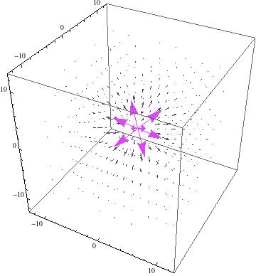
The first breakthrough I had was using a different technique to convert the expression for the magnetic field from spherical to cartesian coordinates so that Mathematica can plot some version of its information. This technique worked way better than using Mathematica’s built in TransformedField function, which produced some weird results (see Preliminary Data post). Instead, I decided, with the help of Shelly Johnson, to write out the explicit cartesian forms of $r$, $\theta$, and $\phi$ as well as the explicit spherical forms of $\hat{r}$ $\hat{\theta}$, and $\hat{\phi}$, and then let Mathematica substitute these expressions in the larger expression for the magnetic field. This worked pretty well to give the three components of the magnetic field, $\vec{B_x}$, $\vec{B_y}$, and $\vec{B_z}$, as can be seen at the top of my Mathematica file titled “3D_vector_graphs.nb”.
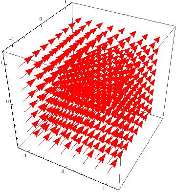
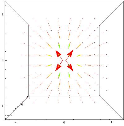
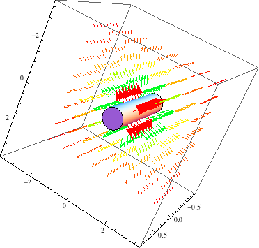
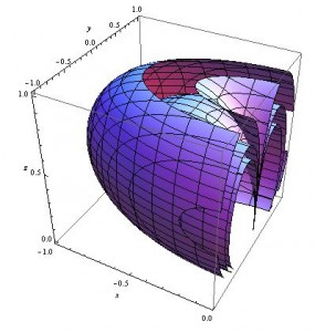
When these expressions are plotted using VectorPlot3D, however, the results are pretty uninformative.
3D vector plot of the magnetic field of a magnetic dipole
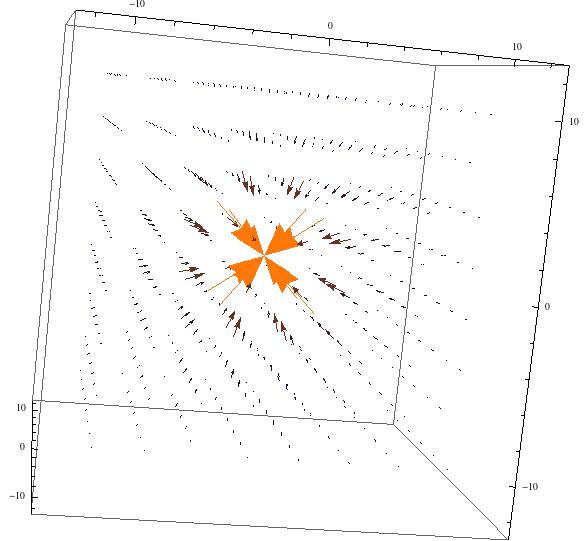
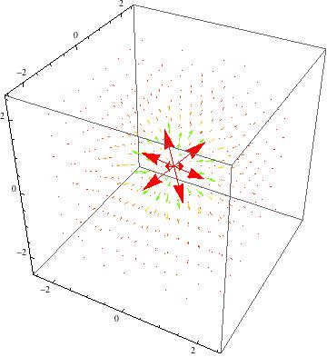
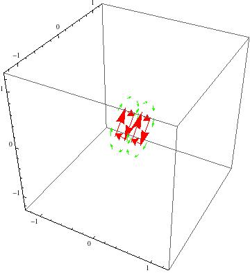
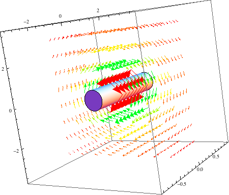
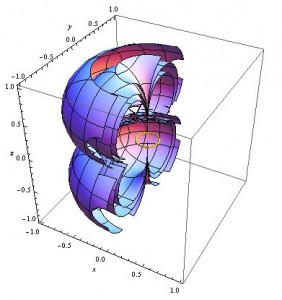
Even zoomed in and seen from a more right angle, this field is not helpful.
Same plot as above, but seen zoomed in and in the xz plane
Since this approach didn’t work well, for reasons discussed more in my next Conclusion post, and my previous attempts at plotting the vector field at representative points was getting complicated as well, I decided to try to use this new transformation by substitution method to try Contour plots instead.
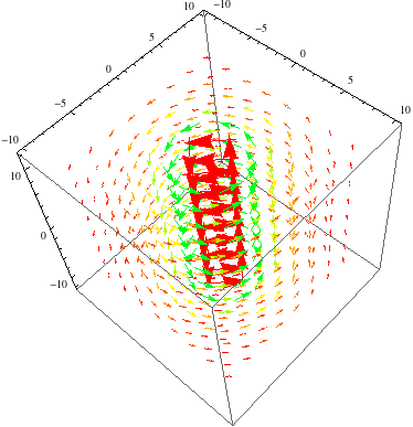
I began by forming one expression for the magnetic field value at points in space, with no vector information. This expression ends up being pretty manageable, and the contours of this can be made effectively using ContourPlot3D. Some different results are shown below, taken from my Mathematica file “3D_contour_graphs”.
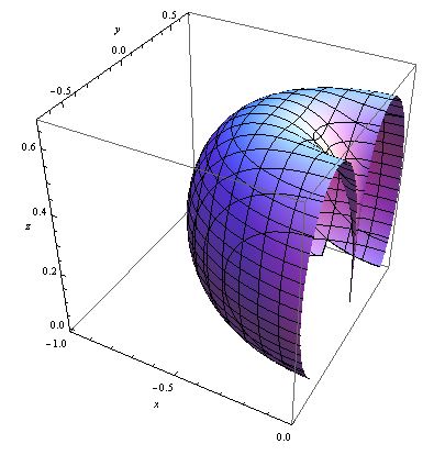
3D contour of my expression for the magnitude of the magnetic field of a magnetic dipole. This contour is for when the magnetic field equals 1

The same plot as above, but this time zoomed in and shown “cut in half” to see what happens on the inside of the symmetric circular outer portion
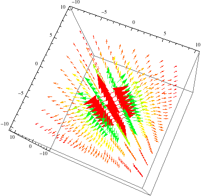
These results are pretty promising, so I then added in a few more contours, to see how the different values looked relative to one another.
Similar plot to the above, but this time with three contours. From the inner to outer contours, these surfaces represent the places where the magnitude of the magnetic field equals 0.75, 0.5, and 0.28 respectively.
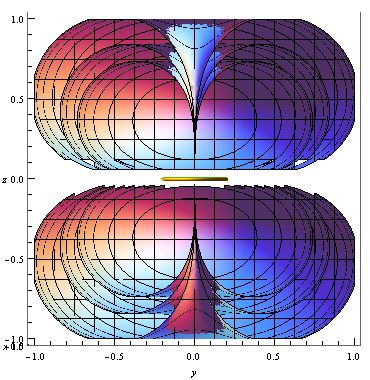
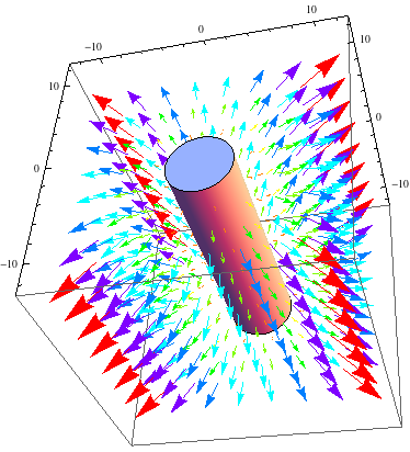
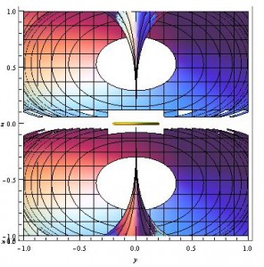
This is pretty good, but where are these surfaces in relation to the small current loop that is supposed to be creating these magnetic field contours? My next few contours include a small yellow ring at the origin, which indicates the placement of the loop, and also plots both positive and negative contours, which gives the whole picture both above and below the ring (which, looking at the original equation, should be symmetric).
The same three contours as above, along with their negative counterparts, and a small yellow ring representing the current loop that creates the magnetic field modeled.
A different view of the above graph, which allows one to look into the part of the contour that has been “cut open”.
Now that there is a current loop in our models, what happens when the current in this loop is increased? The above models were made with a magnetic dipole moment, $m=1$, but the below image increased the current so that $m=2$.
Similar plot to above, but with a stronger magnetic field (m=2).
Putting images with $m=1$, $m=2$, and $m=3$ side by side shows that the same contours move farther away (and change curvature a bit) for models with larger m values, which is expected because larger m values indicate larger magnetic fields.
From left to right, Contours with m = 1, m = 2, and m = 3.
This is all pretty good, but what are these contour surfaces actually telling us about the magnetic field? These contour surfaces represent places where the magnitude of the magnetic field is at a constant value, so these shapes represent equipotential surfaces. While equipotential surfaces are not often talked about when talking about magnetic fields, the general principle that field vectors are perpendicular to equipotential surfaces is true of magnetic fields as well as electric. Therefore, these contours actually tell us something about the magnetic field of a dipole, albeit in an indirect manner.
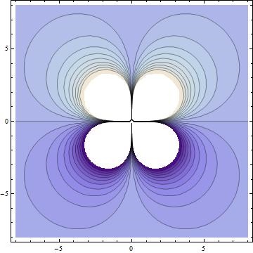
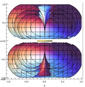
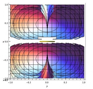
To try and get a better picture of what the field lines look like around this current loop, I plotted these contour surfaces in 2D by removing any y dependence, so that the 2D contours plotted are shown in the xz plane. This doesn’t lose much information again because of the $\phi$ independence of the magnetic field of a dipole. The result is shown below, which is taken from my Mathematica file “2D_contour_graphs”.
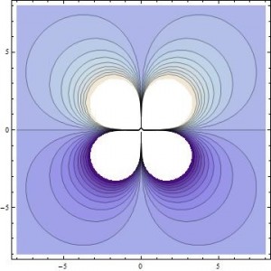
2D contour, showing 20 different contour lines, both positive and negative.
This gives us a representation where the vector field lines may be easier to picture, and easier to compare to the lines shown in Griffiths’ “Introduction to Electrodynamics” 5.4.3 – pg. 255, which are shown in 2D. It took some squinting, but I can see that lines perpendicular to these (and more) contour lines forms loops expected of a magnetic dipole. I overlaid a few representative loops over my 2D contour image in paint to illustrate this idea.
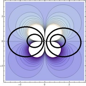
Same image as above, but with (approximate) magnetic field lines overlaid in thick black.
Link to final Mathematica files: 3 Final Mathematica Files

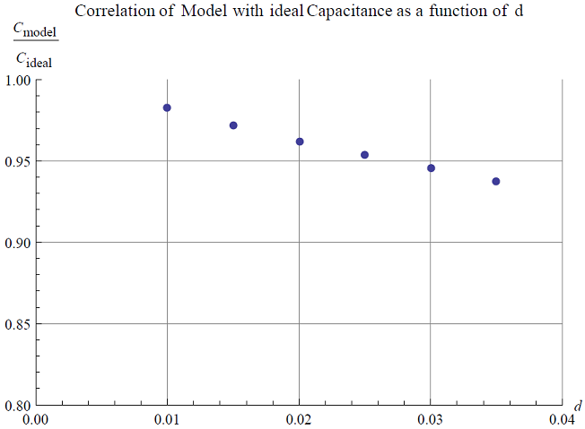
 , then through both methods I yield this plot:

 is the wavelength, and d is the diameter of the lens.