We performed tests to compare a smartphone, a laptop, and a tablet with one another. The smartphone used was an iPhone 4 running iPhone 5 software, the laptop used was a Macbook pro, and the tablet used was a nook running android software. We compared each device with regards to battery life, overheating issues, energy consumption, and cost efficiency.
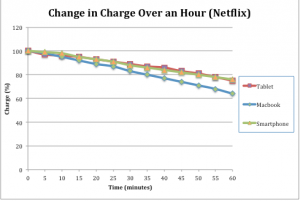
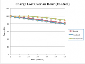
Battery Life: This test was to see how much charge each device’s battery lost over the course of an hour. We tested the battery life of each device using a stopwatch and the device’s charge reading. Each device was tested while they were running Netflix (Netflix test group), and while they were on but not performing any additional tasks (Control test group). A reading of the battery’s remaining charge was taken every five minutes. All data readings were taken in percentage. After all data was collected we calculated the amount of charge the devices lost every five minutes respectively. We then took the average of the charge lost every five minutes to show the average charge lost every five minutes.
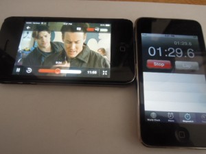
Test set up pictured below (Netflix):
Loss of charge (Netflix):
| Time (minutes) |
Macbook (%) |
Tablet (%) |
Smartphone(%) |
| 0 |
100 |
100 |
100 |
| 5 |
98 |
97 |
99 |
| 10 |
95 |
96 |
98 |
| 15 |
92 |
95 |
95 |
| 20 |
89 |
93 |
93 |
| 25 |
87 |
91 |
91 |
| 30 |
83 |
89 |
88 |
| 35 |
80 |
87 |
86 |
| 40 |
77 |
86 |
84 |
| 45 |
74 |
83 |
82 |
| 50 |
71 |
81 |
80 |
| 55 |
68 |
78 |
78 |
| 60 |
64 |
75 |
76 |
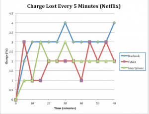
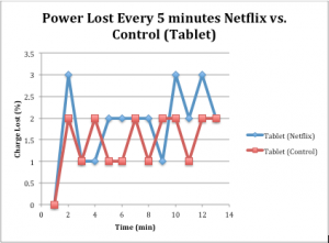
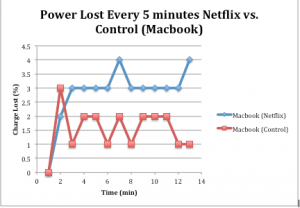
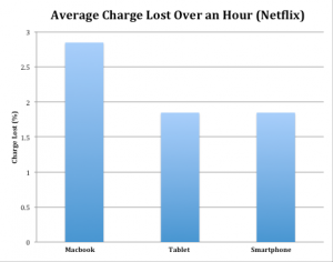
Charge lost every five minutes (Netflix):
| Time (minutes) |
Macbook (%) |
Tablet (%) |
Smartphone (%) |
| 0 |
0 |
0 |
0 |
| 5 |
2 |
3 |
1 |
| 10 |
3 |
1 |
1 |
| 15 |
3 |
1 |
3 |
| 20 |
3 |
2 |
2 |
| 25 |
3 |
2 |
2 |
| 30 |
4 |
2 |
3 |
| 35 |
3 |
2 |
2 |
| 40 |
3 |
1 |
2 |
| 45 |
3 |
3 |
2 |
| 50 |
3 |
2 |
2 |
| 55 |
3 |
3 |
2 |
| 60 |
4 |
2 |
2 |
| Average: |
2.846153846 |
1.846153846 |
1.846153846 |
Loss of charge (Control):
| Time (minutes) |
Macbook (%) |
Tablet (%) |
Smartphone (%) |
| 0 |
100 |
100 |
100 |
| 5 |
97 |
98 |
100 |
| 10 |
96 |
97 |
100 |
| 15 |
94 |
95 |
100 |
| 20 |
92 |
94 |
100 |
| 25 |
91 |
93 |
99 |
| 30 |
89 |
91 |
98 |
| 35 |
88 |
90 |
97 |
| 40 |
86 |
88 |
96 |
| 45 |
84 |
86 |
94 |
| 50 |
82 |
85 |
93 |
| 55 |
81 |
83 |
91 |
| 60 |
80 |
81 |
90 |
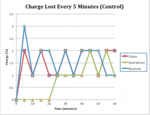
Charge lost every five minutes (Control):
| Time (minutes) |
Macbook (%) |
Tablet (%) |
Smartphone (%) |
| 0 |
0 |
0 |
0 |
| 5 |
3 |
2 |
0 |
| 10 |
1 |
1 |
0 |
| 15 |
2 |
2 |
0 |
| 20 |
2 |
1 |
0 |
| 25 |
1 |
1 |
1 |
| 30 |
2 |
2 |
1 |
| 35 |
1 |
1 |
1 |
| 40 |
2 |
2 |
1 |
| 45 |
2 |
2 |
2 |
| 50 |
2 |
1 |
1 |
| 55 |
1 |
2 |
2 |
| 60 |
1 |
2 |
1 |
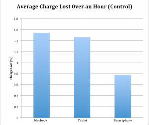
| Average |
1.538461538 |
1.461538462 |
0.769230769 |
We then took this data and graphed it to compare the devices and the test groups:
Comparison of the charge lost over an hour in all three devices (Netflix):
Comparison of the charge lost over an hour in all three devices (Control):
Comparison of the loss in charge every five minutes for all devices (Netflix):
Comparison of the loss in charge every five minutes for all devices (Control):
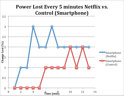
Comparison of the charge lost every five minutes for the Netflix group and the Control group (Smartphone):

Comparison of the charge lost every five minutes for the Netflix group and the Control group (Tablet):
Comparison of the charge lost every five minutes for the Netflix group and the Control group (Macbook):
Average Charge Lost every 5 minutes for all devices (Netflix):
Average charge lost every five minutes (Control):
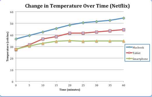
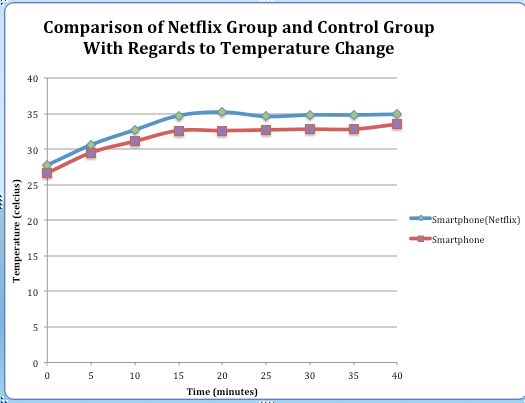
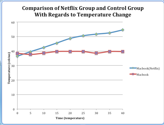
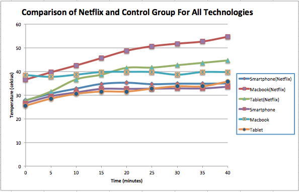
Temperature Change: We recorded the temperature change in all three devices using an Infrared temperature probe. We used this probe in two tests: a control test where the devices were on, but not performing any additional tasks, and a Netflix test where the devices were running Netflix. A temperature reading was taken every five minutes, and each trial lasted 40 minutes. The probe was placed at the same spot on the device for every reading, the placement of the device was determined prior to testing using the infrared temperature probe to find the hottest spot on the device. After each trial we calculated the overall change in temperature by subtracting the final temperature reading from the initial reading. All temperature data was taken in degrees celsius.
Infrared temperature probe pictured below:

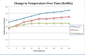
Change in Temperature (Netflix):
| Time (min) |
Macbook Temp (°C)
|
Tablet Temp (°C)
|
Smartphone Temp (°C)
|
| 0 |
36.5 |
27.5 |
27.7 |
| 5 |
39.6 |
31.5 |
30.6 |
| 10 |
42.5 |
36.6 |
32.7 |
| 15 |
45.6 |
38.6 |
34.7 |
| 20 |
48.7 |
41.5 |
35.2 |
| 25 |
50.6 |
41.6 |
34.6 |
| 30 |
51.7 |
42.6 |
34.8 |
| 35 |
52.6 |
43.6 |
34.8 |
| 40 |
54.6 |
44.6 |
34.9 |
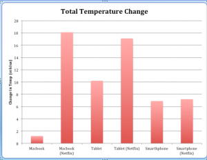
| Overall Change |
18.1 |
17.1 |
7.2 |
Change in Temperature (Control):
| Time (min) |
Macbook Temp (°C)
|
Tablet Temp (°C)
|
Smartphone Temp (°C)
|
| 0 |
38.5 |
25.5 |
26.6 |
| 5 |
37.7 |
28.5 |
29.5 |
| 10 |
38.6 |
30.5 |
31.1 |
| 15 |
39.7 |
31.5 |
32.6 |
| 20 |
39.8 |
31.5 |
32.6 |
| 25 |
39.7 |
32.7 |
32.7 |
| 30 |
38.6 |
33.7 |
32.8 |
| 35 |
39.7 |
33.7 |
32.8 |
| 40 |
39.7 |
35.7 |
33.5 |
| Overall Change: |
1.2 |
10.2 |
6.9 |
We then took this data and graphed it to compare the differences in all of the test groups:
Comparison of all three devices in the Control group:

Comparison of all three devices in the Netflix group:
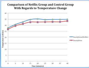
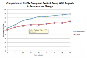
Comparison of the temperature change between the Netflix group and the Control group (Smartphone):
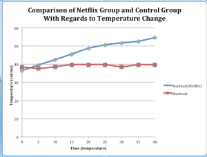
Comparison of the temperature change between the Netflix group and the Control group (Macbook):
Comparison of the temperature change between the Netflix group and the Control group (Tablet):
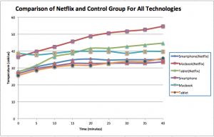
Comparison of the difference in temperature between all three technologies in both the Control and the Netflix test groups:
Comparison of all the devices with regards to the overall temperature change (Netflix and Control):
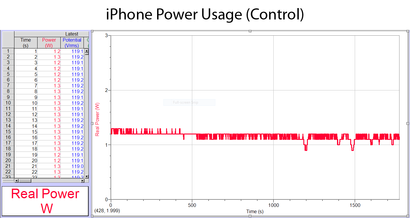
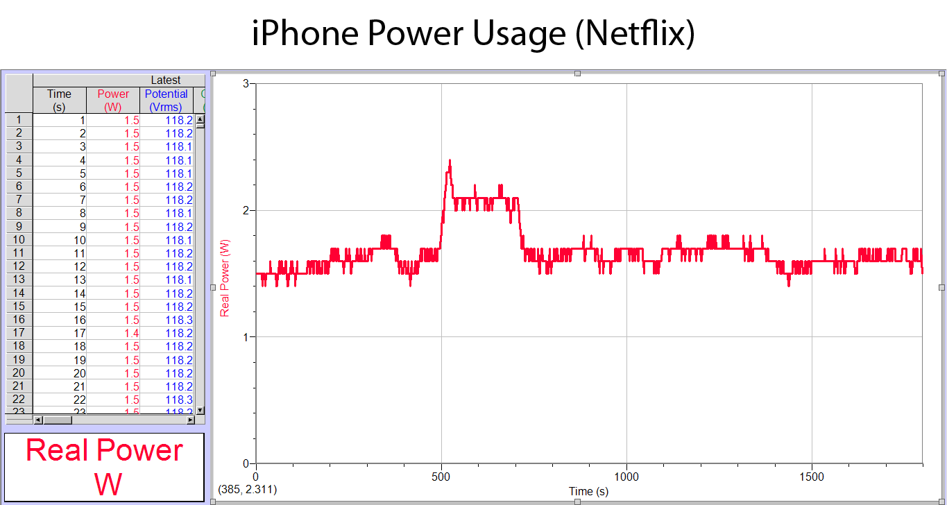
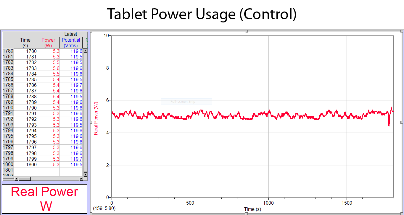
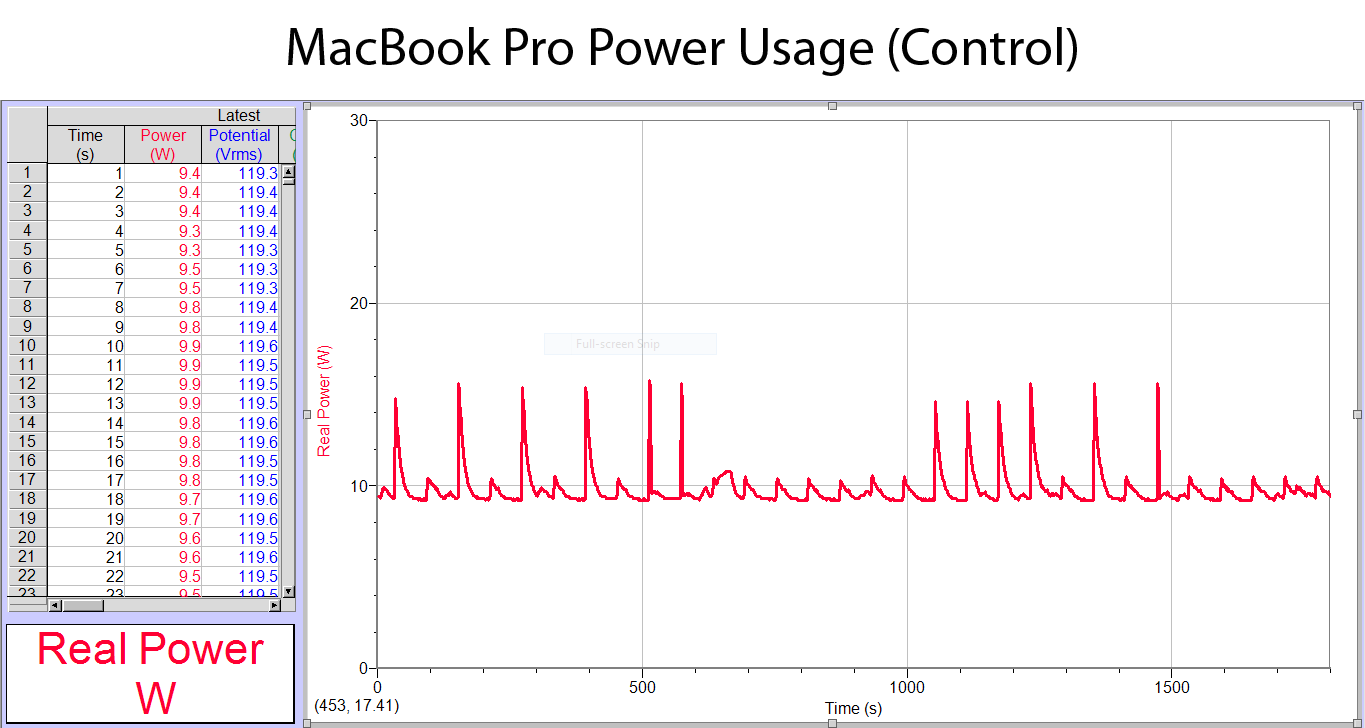
Energy Consumption: We recorded how much power (in watts) each of these devices uses in an hour while idling (control) and while watching a film on Netflix. This was done using a Watts Up Pro and Logger Pro software. First, each device was fully charged, then the control test was done. In the control test, each device’s power consumption was measured while their displays were left on. Afterwards, still with a full charge, the Netflix test was done. Both tests measured the wattage of each device for 30 minutes. The Watts Up Pro took real time measurements of energy consumption and Logger Pro graphed these measurements. The overall wattage used by each device was obtained by taking the integral of each graph in Logger Pro.
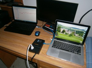 Watts Up Pro setup shown above.

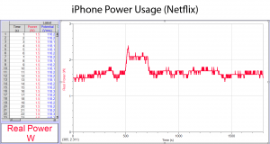
The iPhone, while idling, used a total of 2,069 watts in 1,775 seconds, which is about 4,196 watts/hour. The iPhone, while watching a video on Netflix, used a total of 3,018 watts in 1,797 seconds, which is about 6,046 watts/hour.

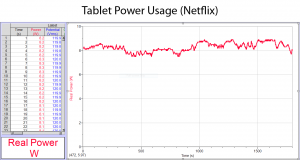
The tablet, while idling, used a total of 9,133 watts in 1,800 seconds, which is 18,266 watts/hour. The tablet, while watching a video on Netflix, used a total of 14,910 watts in 1,800 seconds, which is 29,820 watts/hour.
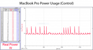
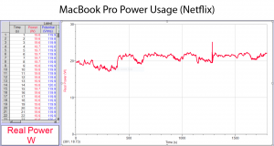
The MacBook Pro, while idling, used a total of 17,640 watts in 1,800 seconds, which is 35,280 watts/hour. The MacBook Pro, while watching a video on Netflix, used a total of 37,180 watts in 1,800 seconds, which is about 74,360 watts/hour.
| Device |
Control Test (W) |
Netflix Test (W) |
| iPhone |
4,196 |
6,046 |
| Tablet |
18,266 |
29,820 |
| MacBook Pro |
35,280 |
74,360 |
Cost Effectiveness: By converting each of these power consumption values to kilowatt hours, we determined the cost to run each of these devices for an hour while both idling and watching Netflix. The average cost of a kilowatt hour in the United States is 12 cents.
iPhone (Control): 2069 W / 1775 s = 2.069 kW / 0.493055555 h = 4.1963 kW/h
4.1963 (12) = 50.3556 cents ($0.50 per hour)
iPhone (Netflix): 3018 W / 1797 s = 3.018 kW / 0.499166666 h = 6.0461 kW/h
6.0461 (12) = 72.5532 cents ($0.73 per hour)
Tablet (Control): 9133 W / 1800 s = 9.133 kW / 0.5 h = 18.266 kW/h
18.266 (12) = 218.712 cents ($2.19 per hour)
Tablet (Netflix): 14910 W / 1800 s = 14.910 kW / 0.5 h = 29.82 kW/h
29.82 (12) = 357.84 cents ($3.58 per hour)
MacBook Pro (Control): 17640 W / 1800 s = 17.640 kW / 0.5 h = 35.28 kW/h
35.28 (12) = 423.36 cents ($4.23 per hour)
MacBook Pro (Netflix): 37180 W / 1800 s = 37.180 kW / 0.5 h = 74.36 kW/h
74.36 (12) = 892.32 ($8.92 per hour)
| Device |
Control Test ($/hour) |
Netflix Test ($/hour) |
| iPhone |
0.50 |
0.73 |
| Tablet |
2.19 |
3.58 |
| MacBook Pro |
4.23 |
8.9 |


 ,
,  , and
, and  , but depending on the sensors available, that may not be possible.