Using Discord for Teaching, Learning, and Community

In the scramble to get classes and work online this spring, there wasn’t a lot of time for careful evaluation of online collaboration tools. We had to move our curricula and other work online as quickly as possible, so we used the tools that were quick, easy, and familiar. Our campus Zoom license gave us an easy excuse to use it as a replacement for face-to-face classes, meetings, and social events.

As the semester winds down, we have more time to consider what tools and techniques we might employ for the fall semester. Uncertainty looms over what forms our teaching, learning, and other work will take, but now is the time to explore alternatives. All of us, myself included, have experienced “Zoom fatigue” and wondered what other options exist.

Discord is a free online chat application that was originally designed with gamers in mind, but the more questions we see from faculty who are looking for Zoom alternatives, the more promising Discord seems for a variety of purposes. This article will merely scratch the surface of Discord’s capabilities, but there’s much more to this easy-to-use tool. I’ll share some resources for installing and setting up Discord and then touch on a few possible applications.

To get started with Discord, I recommend following their guide to using Discord for your classroom. Discord gives you the ability to create as many free servers as you like, with each server hosting up to 500 voice, chat, or video channels. You can organize these channels under categories, and there’s a full permissions suite to control access to these channels.

You and your students can chat via video and voice, just like Zoom, and text chat channels give you realtime or asynchronous ways to share files, thoughts, announcements, syllabi, or whatever else you can think of. You can make custom channels for breakout rooms or group work. You can share your screen, stream video to your students at high resolution, and give your class a place to connect whenever and from wherever. Your servers are always open, and only you and people you give access to can join. As the server administrator, you have full control over all your channels and server membership, so in the unlikely event someone joins your server uninvited, you’ll be able to remove them quickly and securely.

Using Discord is the best way to see the possibilities it offers, so if you’d like to know more, please contact your ACS liaison and we’ll arrange a demonstration for you.

Share

ACS Collaborates with ART 386 students and faculty on “first-of-its-kind exhibition.”

Amitabha Buddha, Central Tibet, 19th century; pigment on cloth; 38 1/2 x 25 1/2 in.; The Rubin Museum of Art, New York, F1997.6.3.

Amitabha Buddha, Central Tibet, 19th century; pigment on cloth; 38 1/2 x 25 1/2 in.; The Rubin Museum of Art, New York, F1997.6.3.

ART 386,  Embodying Compassion in Buddhist Art: A Curatorial Training Seminar was taught by Karen Lucic during Fall semester, 2014. The purpose of the class was to give students the opportunity to research and curate an exhibition at the Frances Lehman Loeb Art Center. During the summer of 2014, Professor Lucic contacted me to discuss creating a website for her students to use as a repository for their research and eventually this site would become a companion site to the final exhibition in April, 2015. Over the course of the Fall semester, students wrote and compiled content for the site and they worked closely with ACS to design and populate the site.

From ART 386 Syllabus:

Each student will be responsible for the digital content and interpretation of 2-3 works in the exhibition. The instructor will assign the objects to each student, based on her/his experience and preparation. These student contributions will be posted on the exhibition application and/or website. (60% of grade.)

Students will work in teams to produce additional resources for the exhibition: gallery guide, interactive maps, guide to web resources, etc. Students in the team will also give feedback on other team members’ work before submission (20% of grade.)

From ART 386 Assignment Sheet:

The purpose of this assignment is to create digital educational content for the exhibition. Always remember who your audience is: visitors to the exhibition, or online users, who might not know much—or anything—about the topic. What you write, and your choice of materials should be based on your assessment of what will enhance their experience and understanding of the exhibition. Texts should be concise and to the point. Other materials should be short but engaging.

For each work you have been assigned:

1) Write an interpretative text (no more than 100 words) for app/website

2) Select one comparative image (must be open access and high resolution); include full caption of comparative image

3) Write a text (no more than 100 words) explaining the comparison

4) Select an audio file, if possible, that enhances the work (no more than two minutes). Examples: chanting, singing, mantra recitation, etc.

5) Select a video file, if possible, that enhances understanding of the work (no more than 2 minutes). Examples: practitioners circumambulating, prostrating, spinning prayer wheels, making sand mandalas, offering incense, etc.

6) If there are no appropriate audio or video files, choose another comparative image.

7) Compile a list of unfamiliar terms from your texts, with definitions

8) Map your work, at least by country. With some works (Putuoshan, Nachi, etc.), it may be possible to be more precise about locations.

9) Record your written contributions.

While students were working to create the content for the site, ACS student employee Bryce Daniel worked on building a wireframe for the WordPress site. Professor Lucic also collaborated with Duke University students to design an App for the exhibition. The App hosted audio files recored and edited by ACS Consultant, Baynard Bailey. These recordings, narrated by both students and Professor Lucic, include short commentaries describing individual pieces in the exhibit, as well as a pronunciation guide for a glossary of terms.

The Embodying Compassion WordPress site is a comprehensive online exhibit reference guide, containing audio, video, images, interactive hotspot maps, and extensive research, curated by ART 386 students. This project proved to be a excellent example of how students, faculty, and ACS consultants collaborate to produce educational materials for the classroom and public audience.


Links:

Embodying Compassion Website

The Frances Lehman Loeb Art  Center: Embodying Compassion is a first-of-its-kind exhibition celebrating one of the most important figures in Buddhist art, April 23-June 28, 2015

Get the App


Share

Remix your Syllabus

I found a good idea for Vassar faculty in my email today and I wanted to share it. One of the ideas mentioned in 10 Things the Best Digital Teachers Do seemed like a simple yet powerful idea that might be useful to some.

If you are rethinking how you are teaching a course and want to invite the students to collaborate on redesigning the course, stick your syllabus in a wiki (like a Google doc or a Moodle wiki) and invite them as collaborators and rewrite it together. I imagine the process could be very invigorating.


Share

Creating Interactive PDFs using Adobe InDesign

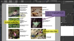
IndesignScreenShot

Using InDesign to create interactive PDFs

The term “interactive PDF” refers to a PDF file designed to be viewed on screen. Interactive PDF features are the parts of a PDF that provide your audience with additional functions that are more commonly found in websites. Some of these features include buttons, hyperlinks, rollover states, embedded sound, and video, among others.

Designing an interactive PDF might be advantageous when you want to create an interactive experience for your reader but don’t necessarily want to place this content on a website. Using Adobe InDesign also allows for total creative control of your design, unlike most blog or webpage templates. Another advantage to creating an interactive PDF is that the file size is generally small and easily sent by email.

There are some disadvantages to this format though. To take advantage of the interactive features, your reader must view the file in Adobe Reader. If the file is opened in a web browser or other programs like Preview, the results are often unpredictable. Another drawback is that while InDesign is a powerful program, it takes some time to learn the design workflow. I have found Lynda.com tutorials to be very helpful in providing basic introductions for creating interactive PDFs.

Click here for Lynda tutorial

Recently, Vassar’s Art History Department chose to use the interactive PDF format to build study guides for Art 106. Students in this course are required to identify many works of art and architecture, but making these images available to students in a clear and concise manner has been a challenge for faculty. Interactive PDFs allow students to view a thumbnail image of each work, along with the corresponding metadata. When these thumbnails are clicked, they link to the Luna database that stores high-resolution, and detail views of each work. When the viewer scrolls over each thumbnail, the caption next to the image disappears. Scrolling on and off the image functions like using a flashcard, and is useful for self-quizzing. Even though this format is designed to be viewed on screen, it can easily be printed as well.

Here are links to two interactive PDfs that demonstrate several of the features mentioned in this post. For proper functionality, remember to view these documents in Adobe Reader.

Click here to view an example of the Art 106 interactive PDF.

Click here to view an example of other interactive PDF features.

Share

Flipping the Classroom

arrowsA hot topic in Higher Ed circles is known as “Flipping the Classroom.” The idea is to take the standard, traditional structure of student work in and out of the classroom and flip them— move the lecture out of the classroom and move the “homework” into the classroom. Typically, the lecture is moved out by making a recording of it available to students online.

The idea is for the mostly one-directional transmission of information to happen out of class, so that the in-class time can take maximum advantage of everyone being together.

Of course, this oversimplifies a lot of diverse practices. In reality, a lot of classes— especially humanities and social science classes at small colleges— already place the bulk of their “information transmission” (in the form of reading) outside of class and use class time for discussion. And “homework” may be an inadequate label for what happens in many flipped classrooms. Often, class time is used for what has been called “active learning,” which might include small-group problem-solving or project development.

Benefits
The biggest benefit of flipping is that the most valuable time— the time when everyone in a course is together in one place— is used to its best advantage. If your class time— or even just a portion of it— is used for mostly non-interactive lecturing, why does everyone need to be together?

group_work

[Image from http://serc.carleton.edu/sp/library/sac/]

Another benefit of moving the lecture outside of class is that students can pause a recording, replay it, take careful notes, then continue it. This can be helpful for all students, but especially for those for whom English is not a first language or for students with learning disabilities.

Challenges

[From http://www.theguardian.com/education/mortarboard/2013/feb/19/]

[From http://www.theguardian.com/education/mortarboard/2013/feb/19/]

The biggest challenge with flipping is probably the time and effort required by the instructor— both to produce the lecture recordings and to develop meaningful in-class activities. And some students react negatively to the flipped design— either because they prefer to be passive in the classroom or because they feel that their tuition payment entitles them to a “live performance.”

Interested in flipping, but not sure it’s right for you? You don’t have to flip everything. You can try just flipping two or three class sessions or just portions of a class. Your ACS liaison can help you with the recording.

Share

Taxonomy of Learning Environments

by Steve Taylor
There’s been a great deal of talk in higher-education circles over the past year, about the perils and possibilities of online learning. Often that talk has been in the context of MOOCs or Coursera, but there are many variations of online learning and I often find that two people discussing the topic have fairly different things in mind. Here then is a taxonomy that we can use to get a little closer to understanding each other.

Classroom Learning (also called Face-to-Face Learning)
This type of course serves to anchor one end of the spectrum of remoteness in learning environments. It refers to the traditional environment, in which matriculated students and their instructor meet in real space, on a frequent basis— usually two or three times per week. Readings and homework assignments exist on paper.

Enhanced Classroom Learning
As in traditional classroom learning, matriculated students and their instructor meet in real space on a frequent basis, but some of their course materials— and more significantly their course activities— reside on the web. Students may be expected to contribute to online discussions or blogs, collaborate online with classmates on group projects, or take quizzes or exams online.

Blended Learning (or Hybrid) Courses
In this type of environment, matriculated students conduct a majority of their learning online, but meet face-to-face with their class a few times throughout the term of the course. This is essentially a distance-learning approach, with some added checks, giving instructors an opportunity to confirm that students are on track, and possibly to administer an exam in a proctored setting. Blended learning courses are often offered for adult learners in rural areas, who have to drive a long distance to campus.

Distance Learning
In a distance-learning environment, matriculated students take an entire course— or sometimes an entire degree program— online. Many universities offer distance-learning programs for students who would not be able to accommodate the schedule and location of traditional courses. Many public universities, with their commitment to educating the diverse populations of their states, have had distance learning programs for years, and many large, private universities have such programs as well.

Massive Online Open Course (MOOC)
MOOCs started to become prominent in late 2011 or early 2012. They exist entirely online and, unlike the other learning environments mentioned, they do not require learners to be matriculated in any particular institution. They are generally free of charge, but offer no credits. Because there is generally no instructor interaction involved, an individual MOOC may have thousands or even tens of thousands of students.

A number of universities have endorsed and supported their faculty members who wish to design MOOCs. Their motivations at this point seem to be a desire to “push their brand” into a larger population and, to some extent, a desire to provide a public service to that population.

Traditional, residential colleges like Vassar have been providing enhanced classroom learning experiences for many years, but most are just beginning to consider whether it makes sense for them to offer courses with reduced face-to-face time.

Share

Faculty Student Panel on Online Learning

“Teaching with Technology in the Liberal Arts: Present & Future” – a panel discussion

Wednesday, October 24, Vassar College, Poughkeepsie, New York.

A panel of Vassar faculty and students presented diverse perspectives on the use of technology in the curriculum, including online instruction, “flipped classroom” practices, distance learning systems, and their potential impact on our campus.

Moderator: Steve Taylor, Director, Academic Computing Services
Panelists: Ben Ho (Economics Department), Tom Ellman (Computer Science Department), Sarah Cheng ’13 (Committee on Academic Technologies) and Matt Harvey ’13 (VP for Academics, Vassar Student Association)


Share

Moodle Site Revamp in Three Easy Stages: Part 3 of 3

by Baynard Bailey

Elegant Moodle Site Design Part III

In Part I, we set the stage for redesigning our Moodle site by backing up our site and then clearing out unnecessary files. We also chose a design style for our course. In Part II, we employed Moodle “Web Pages” as a way to keep our instructional design elegant and efficient. Now, for Part III, we are going to complete our Moodle site revamp by fleshing out our course site, and building easy to use and understand links to activities and readings.

Order! Order!

A Messy Files Area Increases Cognitive Load for Faculty and Students

Building Simple and Effective Course Links

Before we build the links, it is important to remind ourselves of one of the peculiarities of Moodle. I’m not sure if this applies to all Moodle users, but it applies to Vassar’s current version – Moodle 1.9.16. If you have a file in the files area and there is a live link to the file from your course site, Moodle won’t let you delete the file. However, if you move the file, Moodle won’t automatically update the link with the file’s new location, so the link won’t work for students any more. There is no notification to the instructor that the link is broken. The best way to avoid this problem is to organize your files well before building the course links.

Instructors may choose to build links to every file, or they may choose to provide links to directories containing .pdfs and other course files. The choice depends mostly on the number of readings students access via Moodle. If you have a large number of .pdfs for the students to download, building a link to every file is tedious. It can also promote “Moodle Sprawl”, as every file linked to the front page increases the size of the page. Most professors would benefit from providing a link to a directory or directories containing readings and other files. This is a great strategy IF the professor has a consistent naming system for the files, as the file names will be the students only way of locating the readings.

Many computer systems alphabetize things differently than humans. For example,  in Moodle’s File Area, all capital letters come before all lower case letters. Hence, the letter ‘Z’ comes before the letter ‘a’. All numbers come before letters. Spaces and some symbols come before numbers and letters, other symbols follow letters and numbers. If you have ever looked at your Moodle files and been bewildered by how things are arranged, the  rules of alphabetization are probably to blame. To leverage computer alphabetization, employ a consistent file naming scheme, such as “lastname_of_author-article_title”. If you are capitalizing, make sure that you capitalize the first letter of each file. That way, when students go to find files in a directory with many articles, they will easily be able to find the readings by searching for the author’s name.

Links

Consistent File Naming in Action

Reduce Moodle Clutter: Prioritize Major Assignments and Activities

Major assignments should be highly visible at the beginning of the semester. Having fewer “clutter” items at the top level lends significance to activities and assignments that are displayed on the front page.

Forums are one of the most popular Moodle activities, but be careful to choose a forum / discussion board that suits your course. The “standard forum” in Moodle has the capacity a nigh-infinite number of questions, topics and responses. If you envision a lot of forum activity and a large number of topics during the semester, then the “standard forum” is the right choice (hint: you most likely need just one). However, if you are planning just a few activities that require  forum posts, consider the other forum types:

  • A “single simple discussion” keeps the class focused and responding to a single prompt.
  • “Each person posts one discussion” enables every student to post one topic, like a paper proposal, and everyone else can reply.
  • The “Q &A forum” is the an interesting pedagogical forum: each student must post their opinion or viewpoint before they are allowed to view their fellow students’ posts. If you are trying to prevent groupthink, this might the choice for you.

Finishing Touches

mountain range

A good banner image for a course will be panoramic in its aspect ratio (image courtesy of philflieger in Flickr).

If you haven’t already, be sure to add your contact information and office hours at the top. If you feel so inspired, create a banner (hint: something wide and not too tall, around 100 kb; large pictures punish users accessing via laptops, tablets and smartphones). When uploading the syllabus, apply a naming convention to help keep track of versions. (Hint: use numbers or letters, as having a syllabus titled “final-final-final version” is confusing.) Once you have your readings, major assignments, and activities in place, your Moodle site is ready to go. Hopefully these posts will help you revamp your site. An elegantly designed Moodle site, one that increases functionality and is easy to use, will benefit students and faculty alike.

As a postlude to my Moodle Design series, I’ll be adding an article highlighting some really great but oft-overlooked features in Moodle.

Share

Moodle Site Revamp in Three Easy Stages: Part 2 of 3 – Elegant Design Architecture

Building Elegant Instructional Design Architecture with Moodle Web Pages

by Baynard Bailey

In Part I of this series, I focused on the preliminary stages of revamping a Moodle site. The major steps included backing up your materials, culling unnecessary files, and choosing a course design that fits your teaching style (for most that means choosing a ‘topical’ or ‘weekly’ format). In this post, I hope to provide some tips to empower your Moodle site to enhance student understanding of the overall  arc and flow of the course.

Many of the Moodle sites I see suffer from ‘sprawl’ or ‘bloat’. The site starts out fine, but by the end of the semester, especially for courses that meet more than once a week, the length of the front page stretches on for screen after screen. Scrolling to the bottom of the page (the current week) can take a minute or more, and sifting through past weeks’ materials and activities is tedious. Why put up with this, when you can have an elegantly designed Moodle site that better reflects the structure and scope of your curriculum? Consider putting topics, class meetings or weeks into their own “web pages” within Moodle. The resulting front page of your Moodle site will be an elegant summary of the major topics of your course, easily navigable, and an aid to learning.

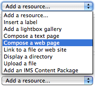
Compose a Web Page Screen Shot

Creating web pages makes elegant Moodle site design easy.

It is easy to overlook  the “Compose a web page” resource tool, especially when one is first using Moodle. But if you are revamping a course, this resource choice is worth serious consideration. Composing Moodle web pages provides instructors ample room to provide detailed directions for class activities without adding unnecessary sprawl to the front page of your course site. I will use some examples from a recent consult I had with Molly Shanley.

Molly wanted to meet because she had taught a course Poli Sci 278 before, using Blackboard. She was now getting ready to build her site in Moodle and wanted tips for building sites for Moodle courses that met biweekly. She had a syllabus that was 90% complete. I decided I would try and sell her on the idea of using Moodle web pages to help structure her course.

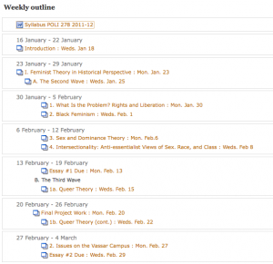
We built a few of the first class meetings with a web page for each meeting. This really reduced front page sprawl, especially in regards to the some of the early class meetings, which contained comprehensive directions and details. We discussed how this approach allowed the main topics of the course to stay afloat at the top level of the site, becoming a sort of topical outline for the semester. Students would be able to easily discern the arc of the course, and to place the topic for each class within that arc. At the same time, the full details for readings and assignments could be accessed quickly and easily. We were happy with the results so we copied and pasted the syllabus outline and fleshed out the bulk of the course.

Outline for Part of the Course

Each Class Becomes a "Branch" of the Course Outline (Draft Syllabus)

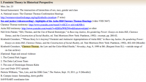
Here’s a sample “Moodle Web Page”, found by clicking on the corresponding link from the outline above:

Sample course meeting

Copying and Pasting Yielded Excellent Results

Since Molly had a well developed syllabus, it was a straightforward mechanical process to paste the details into a corresponding structure in her Moodle site. The front page of her Moodle site became an outline of the entire course. Each class meetings’ corresponding web page will contain detailed information about readings, activities and assignments. Building the design of your course into a corresponding visual and textual pattern in Moodle is excellent instructional design, facilitating the learning and teaching process.

Look forward to Part III where we’ll complete the Moodle site revamping process.

Share

Moodle Site Revamp in Three Easy Stages: Part 1 of 3

by Baynard Bailey

Moodle sites are living breathing documents that evolve as the semester progresses. When push comes to shove during the semester’s crunch, one thing shoved is often an effective course site design. Thankfully, the semester ends and the mess goes away. But when it comes time to teach that course again, it is a good opportunity to revamp that course site. What to do first? Where to start? I hope to walk readers through some of the major steps and processes that will facilitate an effective instructional re-design of a course site.

Currently at Vassar, we are working with Moodle version 1.9.7 so my instructions are tailored to that, but I hope that some of the broader strategies could be applied to any Learning Management System.

In order to provide the best advice possible, I decided I would actually help revamp a site. I reached out to my friend and colleague Karen Robertson and offered to assist her in redesigning her Moodle site for Women’s Studies 240: Constructing Gender. The site was a good candidate for revamping. Prior to last year, it had been team-taught, so Karen had inherited the site and had yet to really “move in”. Last spring’s site contained a wealth of great materials, but the organization could be altered to improve the presentation. Karen warmly received my idea and so we met last week.

Mini Zen Garden

Good Instructional Design Reduces Cognitive Load

I had the goal to design a neat site with a clean and uncluttered look and feel (and then to share the strategies employed in our ACS blog). Karen and I discussed why it was important to keep an uncluttered appearance to the front page of the Moodle site. She reminded me that our goal was to develop a clear and easy to use site in order to reduce labor and cognitive load.

Step 1: Back up your old materials.

Before we began, we backed up the old site. Additionally, we printed out a copy of the main page so we could have a visual map of the old site. We also printed out lists of readings in the file areas so Karen could go through them on her own.

Step 2: Take stock of your current materials. Delete duplicates and unnecessary items (first pass).

We went through the site week by week, deleting unused assignments and various items that had been used in the past but were unnecessary now. Bear in mind, we didn’t go through all of her readings, we just deleted the “low hanging fruit”.

Step 3: Choose a style of course design that fits your teaching style

This is a big step. Karen and I discussed the pros and cons of topics versus weeks (these are the two most commonly used settings in Moodle). Topics are great in that users can choose to have as many or as few topics as fit their curriculum. Weeks are useful in that the dates are auto-created and visually correspond right away to the semester’s calendar.  Karen pointed out that some topics are much longer than others, and that weeks often bridge topics. She emphasized the importance of making it absolutely clear to students what was expected each class.

On my end, I wanted to avoid Moodle “sprawl”. Every time you add a topic or a week, it adds a space to a course site. Sometimes faculty use the “Topics” setting, and then create a topic for each time the class meets or just about any other reason. To make matters worse, faculty often include extensive directions in labels right there on the front page of the site. The end result is a Moodle site that is about ten feet long, difficult to navigate, and a hindrance for faculty and students alike. To avoid “sprawl”, I showed Karen how we could put in extensive and precise directions as a “web page” resource for each topic. Since the directions were web pages, we could even include links to readings, assignments, activities, or anything else we had in Moodle.

Generally, faculty have an excellent sense of the arc of a course and a strong understanding of the intended learning goals for the semester. How well those concepts are communicated in Moodle is a mixture of teaching style and sometimes fluency with Moodle. I wanted to provide Karen a tool that would allow her to describe the arc of the course in a glance, but also allow flexibility and specificity in terms of readings and class activities as the semester evolved. The end result was a compromise between “topics” and “weeks”; we would use the “topics” setting, but provide specific directions and links for each class meeting.

I thought we were done there, as determining the arc of the course would require some deep thinking, but luckily, Karen had already done the deep thinking and quickly summed up the major topics of the course:

  • Feminism and Pop Culture
  • Secret Life of Commodities
  • Visual Pleasure: Hollywood and the Gaze
  • The Romantic Industrial Complex
  • Postermaking

Our next steps would include organizing the files area to best fit the instructional design. As part of our conversation, we had made a prototype topic for the first few classes.

Topic Prototype

Our Topic "Prototype" Keeps the Main Page Simple

I offered to continue to make placeholders for the rest of course. Karen would review the reading list in preparation for our next meeting. It had been a really productive consult with good feelings on both sides. I looked forward to our next meeting.

To be continued…

Share