 Introduction to QGIS
Tuesday, January 30th, 3:10 – 4:40 pm, Ely Hall Rm 114 (GIS Lab)
QGIS is a Free and Open Source (FOSS) Geographic Information System (GIS) program. GIS software enables you to produce maps and other graphic displays of geographic information for analysis and presentation. In this workshop, you will learn to find and obtain data for a mapping project, edit the data, make a printable map layout, and run geospatial analysis tools. This workshop is suitable for beginners to GIS and those who have had experience with commercial products like Esri’s ArcGIS. Led by Neil Curri of ACS. Please register to attend at https://forms.gle/fPiBiKXYtmehYPNL8.
Stay Organized & Save Time with Zotero Citation Manager
Friday, February 2nd, 1:00 – 1:45 pm, Main Library Computer Classroom, Rm 160
Overwhelmed by unorganized PDFs? Want to save time formatting your bibliography? Zotero is a free citation manager for organizing references, storing pdfs, and formatting in-text citations and bibliographies. During this workshop, you will learn how to create a Zotero library, organize and share references, generate bibliographies, and format in-text citations and reference lists in Word and Google Docs. Led by Social Science Librarian Elizabeth Salmon
Computers provided however if possible, please bring a laptop to the session.
Register Online: https://libcal.vassar.edu/event/11829830
 Intro to the Vassar College Libraries Digital Library: Research and Classroom Use
February 7 and 9, 2024, 4-5PM, via Zoom
The Digital Library includes photos, audiovisual materials, manuscripts, and much more! Did you know it now also provides access to Finding Aids, Vassar Scholarship, and a Herbarium? Join us for a tour of the system followed by a Q&A. The tour will include tips on how to find what you need for your research, incorporate use of the DL in the classroom, and how to submit your work to the Vassar Scholarship repository. Led by Nicole Scalessa of Digital Scholarship and Technology Services.
Register Online:
2/7/2024 https://libcal.vassar.edu/event/11885218
2/9/2024 https://libcal.vassar.edu/event/11885223
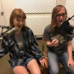
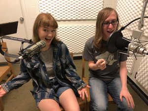
Intro to Audio Recording and Campus Resources
Wednesday, February 14, 3:30 – 4:30 pm, Main Library Electronic Classroom
 Planning to record voice or music and you have never done it before? Interested in podcasting? Perhaps you have an interview you need to edit and share? We’ll review free and cross-platform tools and review resources for audio production. We’ll conclude by visiting the audio nook and the studio in the basement of Chicago Hall. Led by Baynard Bailey of Academic Computing Services.
Introduction to Python for Data Science![]()
February 21, 3:30 – 5:00 PM, Sci Viz Lab
Python has become more and more popular for data maintenance, wrangling, visualization, and analysis. Do you want to see what all the fuss is about? This hands-on workshop will cover the basics of Python coding and will introduce some common data-focused packages. This workshop is suitable for novice coders as well as those with coding or scripting experience in other statistical software such as R or Stata. Computers available, however, if possible, please bring a laptop to the session.
Sponsored by Data Science and Society, Led by Simon Hoellerbauer of DSS
Register Online: https://forms.gle/E4aEpfoceJ6UudU66
Intro to Omeka
March 20 & 22, 4:00-5:00PM via Zoom
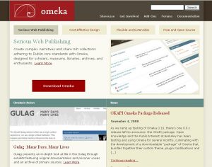
 Omeka is a free, open-source content management system for online digital collections that allows users to publish and exhibit scholarly collections and cultural heritage objects. The Vassar College Digital Scholarship Services Collaboration (DiSSCo) provides a web hosting resource called vassarspaces.net. This service, a Domain of One’s Own (DoOO) product, provides the flexibility for anyone in our academic community to build websites on a variety of platforms, including Omeka. Led by Nicole Scalessa of Digital Scholarship and Technology Services.
Register Online:
3/20/2024 https://libcal.vassar.edu/event/11885125
3/22/2024 https://libcal.vassar.edu/event/11885127
Intro to Scalar
March 25 & 29, 5:00-6:00PM via Zoom
![]() Scalar is an open source, web-based publishing software from the University of Southern California’s Alliance for Networking Visual Culture that allows you to create networked, multi-media online publications.This workshop will begin with the basics of installation along with creating accounts, projects, and content path. It will also cover the management and inclusion of media, such as images and video. Led by Nicole Scalessa of Digital Scholarship and Technology Services.
Scalar is an open source, web-based publishing software from the University of Southern California’s Alliance for Networking Visual Culture that allows you to create networked, multi-media online publications.This workshop will begin with the basics of installation along with creating accounts, projects, and content path. It will also cover the management and inclusion of media, such as images and video. Led by Nicole Scalessa of Digital Scholarship and Technology Services.
Register Online:
3/25/2024 https://libcal.vassar.edu/event/11885084
3/29/2024 https://libcal.vassar.edu/event/11885101
Introduction to Git and Github
March 22, 10:30 AM – 12:00 PM, Sci Viz Lab
![]() Tired of naming files final_draft_v12_comments_corrected_v10.docx? Git is a commonly used version control system that solves this exact problem and is especially helpful when collaborating with others. GitHub is one of the most popular home for Git-based projects on the internet. This workshop will introduce you to Git and GitHub. You will practice making commits, pushing, and pulling, but alone and in collaboration with others. Please bring a laptop to the session.
Tired of naming files final_draft_v12_comments_corrected_v10.docx? Git is a commonly used version control system that solves this exact problem and is especially helpful when collaborating with others. GitHub is one of the most popular home for Git-based projects on the internet. This workshop will introduce you to Git and GitHub. You will practice making commits, pushing, and pulling, but alone and in collaboration with others. Please bring a laptop to the session.
Sponsored by Data Science and Society
Register Online: https://forms.gle/RnY7fasfPD6XKNt89
Cleaning Messy Data with OpenRefine
Wednesday, March 27th, 3:00 – 3:45 pm, Main Library Computer Classroom, Rm 160
![]() Want to spend less time cleaning and prepping your data? Doing the same tasks over and over in Excel? OpenRefine is a free, open source tool designed specifically for cleaning and organizing tabular data, with easy to use features for fixing errors and standardizing data. During this workshop, participants will learn how to upload data to OpenRefine, explore data, and conduct simple data transformations to produce a clean dataset ready for analysis.
Want to spend less time cleaning and prepping your data? Doing the same tasks over and over in Excel? OpenRefine is a free, open source tool designed specifically for cleaning and organizing tabular data, with easy to use features for fixing errors and standardizing data. During this workshop, participants will learn how to upload data to OpenRefine, explore data, and conduct simple data transformations to produce a clean dataset ready for analysis.
Register Online: https://libcal.vassar.edu/event/11832459
Introduction to R for Data Science
April 12, 10:30 AM – 12:00 PM, Sci Viz Lab
![]() R is a statistical programming environment commonly used in academia for creating data visualizations and doing statistical analyses in a more regimented manner. This workshop provides a basic overview of using R and RStudio (a common interactive development environment) for statistical analysis (please note that this workshop does not cover statistical concepts).This workshop is suitable for novice coders as well as those with coding or scripting experience in other statistical software such as SPSS or Stata. Computers available, however, if possible, please bring a laptop to the session.
R is a statistical programming environment commonly used in academia for creating data visualizations and doing statistical analyses in a more regimented manner. This workshop provides a basic overview of using R and RStudio (a common interactive development environment) for statistical analysis (please note that this workshop does not cover statistical concepts).This workshop is suitable for novice coders as well as those with coding or scripting experience in other statistical software such as SPSS or Stata. Computers available, however, if possible, please bring a laptop to the session.
Sponsored by Data Science and Society
Register Online: https://forms.gle/3PoetbRc5G16QeNv5
Campus Resources for Building Websites
Wednesday, April 17, 3:30 – 4:30 pm on Zoom
 Need a website? We will review the options you have available to you as a member of the Vassar Community. We’ll also cover our new resource : vassarspaces.net – where we empower users to become sys admins and install their own apps (WordPress, Scalar, Omeka and more!). Led by Baynard Bailey of Academic Computing Services and Nicole Scalessa of Digital Scholarship and Technology Services.
Register: https://vassar.zoom.us/meeting/register/tJEvdOqtqzspEt09z3XWM8VdxIVUF1G3bbv3
Poster Design for Academia
Wednesday, April 24, 3:30 – 4:30 Library Electronic Classroom, Main Library
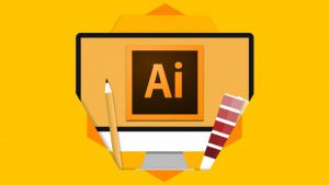 Need a poster for an academic conference? Want to print a giant poster for your event? Come to this hands-on workshop, learn basic design and how to use Illustrator, Powerpoint or Google Slides to make a poster. Led by Baynard Bailey of Academic Computing Services. Please rsvp to babailey@vassar.edu (suggested but not required).

 Now that you have signed up for vassarspaces.net account and built an online resource what’s next? Learn how to set up backup schedules in CPanel and perform a manual local backup of your site(s). Having issues with site loading times, also learn how to use image compression and caching plugins to improve site performance.
 Are you considering building an Omeka, Scalar, or WordPress site to share your work with the world? Have you already created a proof of concept for a digital project and want to know what comes next? You need a Digital Management Plan to ensure sustainability of your site! A DMP describes the data that will be acquired or produced during your project; how the data will be managed, described, stored, accessed, and preserved during and after the completion of the project. Led by Nicole Scalessa of Digital Scholarship and Technology Services.
 Omeka is a free, open-source content management system for online digital collections that allows users to publish and exhibit scholarly collections and cultural heritage objects. The Vassar College Digital Scholarship Services Collaboration (DiSSCo) provides a web hosting resource called vassarspaces.net. This service, a Domain of One’s Own (DoOO) product, provides the flexibility for anyone in our academic community to build websites on a variety of platforms, including Omeka. Led by Nicole Scalessa of Digital Scholarship and Technology Services.
 Wednesday, February 8, 3:00 – 4:00 pm,
  Wednesday, February 15, 3:00 – 4:00 pm on Zoom – Need a website? We will review the options you have available to you as a member of the Vassar Community. We’ll also cover our new resource : vassarspaces.net – where we empower users to become sys admins and install their own apps (WordPress, Scalar, Omeka and more!). Led by Baynard Bailey of Academic Computing Services and Nicole Scalessa of Digital Scholarship and Technology Services. Register:
 Wednesday, March 1, 12:00 – 1:00 pm,
  Wednesday, April 19,
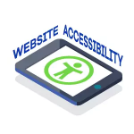 alternative formats for their Moodle materials, and instructors will be able to evaluate the accessibility of their Moodle sites and fix any identified issues. This workshop will demonstrate those tools to you. Led by Steve Taylor of Academic Computing Resources.
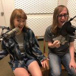
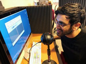
 The space is the legacy of Rick Jones, a retired sound engineer that used to support the technical needs of the language faculty. The studio has supported countless student and faculty projects, as well as professor hosted podcasts like Curtis Dozier’s

 Planning to record voice or music and you have never done it before? Interested in podcasting? Perhaps you have an interview you need to edit and share? We’ll review free and cross-platform tools and review resources for audio production. We’ll conclude by visiting the audio production facilities in the basement of Chicago Hall. Led by Baynard Bailey of Academic Computing Services.