Beaver Pond

Prof. Lynn Christenson of the Environmental Studies program and Keri VanCamp of the Collins Field Station are interested in using the drone to acquire various types of imaging of the Vassar Farm and Ecological Preserve. One area of focus is the beaver pond, which they’d like to view from above at different times of the year and over the years. After several unsuccessful attempts, we were able to collect a series of 200 images and stitch them together into the following visualization.


(Link to website)

Share

Visualizing the Greenway Site

In January, ACS was asked to create an aerial photo of the Greenway site. This is an area in the college’s Ecological Preserve that was originally created as a composting area, but over time had become a dumping site. While the college has begun to clean it up, some interested students wanted to document the clean-up over time. We were able to create this image, comprised of 57 individual photos.


While we were pleased with that result, we were surprised to realize that the photo-stitching software that we used— Pix4Dmapper Pro— also created a 3D visualization of the site, which you can see at this website (click on “3D.”).

Share

Add Panning Motion to Keynote Presentations, and Annotate Screenshots

Keynote provides many tools for animating content of your slide presentation. One easy and very useful movement uses the Magic Move transition.  This tool allows a panning movement across a large image. For example, if you wanted to show the entire length of a webpage or a large photograph, you could use the Magic Move transition to move across the page. This will work with any object that is in one position in the first slide and is in a new position in the following slide. For this this example, I captured a screenshot of an entire webpage that would require scrolling down in order to view all the content. In the first slide, the image is positioned on the slide so that the top of the webpage is visible. In the following slide, the image is positioned so that the bottom of the webpage is visible. Using the Magic Move transition, Keynote will create the panning movement between the two slides.

This is what it would look like:


Steps:
Import image into Keynote slide by dragging and dropping it onto a blank slide.
Screen Shot 2014-12-10 at 3.39.56 PM

Duplicate the slide. To duplicate a slide in Keynote, right-click on the slide you wish to copy, or select Duplicate Slide from the Edit Menu.

Screen Shot 2014-12-10 at 3.40.41 PM

On the new (duplicate) slide position the image so that the bottom portion is visible.

Open the Slide Inspector window.

Click on the slide inspector icon then choose the transition tab.

Under the Effect dropdown menu, choose Magic Move.

screen shot edit pm2

Screen Shot 2014-12-10 at 3.54.43 PM

At the bottom of the inspector menu you will have the option for the transition to start automatically or “on click.”

You will also be able to choose the speed of the transition and whether or not to insert a delay before the start of the effect.

Screen Shot 2014-12-10 at 5.06.08 PM

Tip for Annotating Screenshots:
For this example, I used a free application called Awesome Screenshot.”
It is available for Chrome and Firefox browsers, and it allows you to capture an entire webpage, or any portion of a page. It also provides tools for annotating screenshots.

http://awesomescreenshot.com

Here’s a quick tutorial:


Share

Creating Interactive PDFs using Adobe InDesign

IndesignScreenShot

Using InDesign to create interactive PDFs

The term “interactive PDF” refers to a PDF file designed to be viewed on screen. Interactive PDF features are the parts of a PDF that provide your audience with additional functions that are more commonly found in websites. Some of these features include buttons, hyperlinks, rollover states, embedded sound, and video, among others.

Designing an interactive PDF might be advantageous when you want to create an interactive experience for your reader but don’t necessarily want to place this content on a website. Using Adobe InDesign also allows for total creative control of your design, unlike most blog or webpage templates. Another advantage to creating an interactive PDF is that the file size is generally small and easily sent by email.

There are some disadvantages to this format though. To take advantage of the interactive features, your reader must view the file in Adobe Reader. If the file is opened in a web browser or other programs like Preview, the results are often unpredictable. Another drawback is that while InDesign is a powerful program, it takes some time to learn the design workflow. I have found Lynda.com tutorials to be very helpful in providing basic introductions for creating interactive PDFs.

Click here for Lynda tutorial

Recently, Vassar’s Art History Department chose to use the interactive PDF format to build study guides for Art 106. Students in this course are required to identify many works of art and architecture, but making these images available to students in a clear and concise manner has been a challenge for faculty. Interactive PDFs allow students to view a thumbnail image of each work, along with the corresponding metadata. When these thumbnails are clicked, they link to the Luna database that stores high-resolution, and detail views of each work. When the viewer scrolls over each thumbnail, the caption next to the image disappears. Scrolling on and off the image functions like using a flashcard, and is useful for self-quizzing. Even though this format is designed to be viewed on screen, it can easily be printed as well.

Here are links to two interactive PDfs that demonstrate several of the features mentioned in this post. For proper functionality, remember to view these documents in Adobe Reader.

Click here to view an example of the Art 106 interactive PDF.

Click here to view an example of other interactive PDF features.

Share

Reflection: A Semester with FCP X – Video Editing with non-film students

fcpx2013Last summer the decision was made to use Final Cut Pro X as the supported video editing software for Vassar students. CIS deployed FCP X in the Film Department’s editing labs as well as in the Digital Media Zone in the library. To help us adapt to the switch from beloved FCP 7 to FCP X, we organized an on-campus workshop with Roberto Mighty. For two days Film faculty and CIS employees worked shoulder to shoulder, getting valuable hands-on experience with an interface that was new to most of us. There had been quite a controversy about Apple’s changes from FCP 7 to FCP X, and most of us were apprehensive about the switch. But after two days of excellent instruction, our general sense was that the FCP X could generally do anything FCP 7 did, and it did some things better. I was looking forward to using it with students.

Using FCP X for Digital Storytelling

Past years I’ve worked with French Faculty with students who were tasked with creating digital storybooks. (For more on the pedagogical goals of this project, I invite you to read Digital Storytelling in Intermediate French.) Early in the fall, I met with Tom Parker and Mark Andrews to discuss their classes’ projects. In small groups, the students compose and illustrate children’s storybooks in French, which they scan and narrate. Previously we’d uploaded the images to VoiceThread and done the recordings via their online Flash interface. Students were able to upload and record easily enough, but I found other aspects of VoiceThread lacking (editing, layering audio, search, embedding, restrictive licensing, to name a few). FCP might be harder to learn, but once learned, they would have total flexibility on how they created their projects and they would have a skill that might be used for another project or life after college. Tom and Mark were amenable to the idea so we tried it out.

I only had an hour with the students so it was a bit of a challenge to cover the essentials in such a short period. Luckily, their projects only required them to import their scanned storybook pages into FCP X, then record narration. We spent a fair amount of time doing practice narration. We touched briefly on titles, incorporating sounds and music, and exporting. Students that had brought scans of all of their storybook pages were able to get a significant amount of work done during the workshop. One of the classes was able to have a follow-up workshop where I was able to work with each group, advising and troubleshooting. This was extremely valuable and I wish we had been able to schedule this for both classes. Generally speaking, students adapted well to FCP X and were quite successful. I don’t think I would have been confident enough to use FCP 7 in the same way. Here is an example:

I liked how they were able to incorporate both their narration and some sound effects. The use of titles, music and end credits added a bit of polish too. I should add that most of the students I work with have little to no experience with video or sound editing.

America in the World Digital Narratives

Eve Dunbar and Carlos Alamos co-taught AMST 250: America in the World this past fall. For one of their major assignments, students could choose to write a paper, create a podcast, or a a digital narrative. I trained the entire class to edit audio, but a couple students were interested in using video for their digital narratives, so I met with them one-on-one. The students were able to start editing after an hour of training. Here’s an ambitious project that a student put together based on interviews she made using her phone:

FCP X FTW!

So for me and my work, FCP X has been a win. It is an easy to learn and very capable video editing platform. Students are able to get up and running with their video projects in a way that would have been too daunting to attempt in FCP 7. (One hurdle is that special formatting is required for projects on external drives to show up in FCP X.) Students do have the option to download a trial version of FCP X, which is often all they need to get through a project.

I’ve already got one class scheduled to use FCP X this semester: Candice Swift’s ANTH 245: The Ethnographer’s Craft is going to use FCP X to create digital enthnographies; they will use Final Cut to create voice-overs on top of stills and video. I am looking forward to this FCP X project and others like it this spring.

Share

R for Data Analysis and Graphics

RR is becoming the most widely used statistical software in academic science and it is rapidly expanding into other fields. R is a free language and environment for data manipulation, calculation, graphics and much more. It runs on all of the major platforms, including Windows, Mac and Linux. While it is command line driven, several good graphical user interfaces (GUIs) exist that open it up to a wider group of users with differing technical abilities.

Popularity

When various metrics for the most popular data analysis software packages are compared (Muenchen, R.A., 2013),  R demonstrates a dramatic increase in popularity over the previous 5 to 10 years.  A plot of posts to email discussion lists, shown below, illustrates a rapid growth in discussion of R.  And over the past few years, R has become the most discussed software by nearly a two-to-one margin.  However, one must be careful when interpreting these results.  For example, the consistently low level of discussion for SPSS may be reflective of the fact that it has a simple interface leading to less of a need for discussion.  However, there are also fewer variations in analysis offered in SPSS than those that exist in R and other applications with somewhat less user-friendly interfaces.

fig_1a_listserv11

Sum of monthly email traffic on each software’s main listserv discussion list. From “The Popularity of Data Analysis Software”, http://r4stats.com/articles/popularity/.

User Friendly Interfaces

Over the past few years, a number of GUIs for R have been developed that make R more accessible to a wider group of users.  RStudio, a popular GUI for advanced users, is what is known as an integrated development environment. This interface is similar to MATLAB, is designed for programmers, and provides syntax highlighting and integrated help among other features.

Screenshot of the popular Rstudio graphical user interface.

Screenshot of the popular Rstudio graphical user interface.


Rcmdr, pronounced Rcommander, is a basic-statistics GUI that offers menus, buttons, and dialog boxes to simplify usage for those with less advanced technical skills. The commands that are generated via the user’s actions are shown in an output window. They can be edited and resubmitted, if desired, helping to familiarize the user with the R language. This is useful for those with moderate technical ability who are interested in learning basic R commands. A third R GUI, Deducer is designed to be a free, easy-to-use alternative to proprietary data analysis software such as SPSS, JMP, and Minitab. It has a menu system to do common data manipulation and analysis tasks, and an excel-like spreadsheet in which to view and edit data frames.

rcmdr

Screenshot of the Rcmdr graphical user interface.

Availability

R and RStudio are installed in the SciVis Lab located in the Mudd Chemistry Building. Additionally, both R and the GUIs mentioned above are freely available and can be easily installed on your personal computer. RStudio also offers a web-based version that can be used in lieu of the desktop version. The availability of a web-based server means that one doesn’t have to install software on a personal computers or go to a computer lab. It can be accessed anywhere there is an internet connection. Our system administrators are in the process of evaluating whether it is feasible to host an RStudio web server on campus, and we are hopeful that this convenience will soon be available to the Vassar community. If you would like to learn more about R, please contact ACS liaison Shelly Johnson.

Share

Prezi

by Steve Taylor

Prezi is a tool for creating presentations, just as Powerpoint and Keynote are, but with some interesting differences. Since its creation in 2009, it’s been seen more and more in conferences.

Metaphors
One way in which Prezi differs from earlier presentation tools is its metaphor. Both Powerpoint and Keynote use the metaphor of a series of individual slides that can be shown in a predetermined sequence, just as 35mm slides would be shown with a carousel projector.

In Prezi’s metaphor, the creator arranges materials on an infinitely large canvas and— as I think of it— uses a video camera to pan and zoom through those materials. That can be done on the fly or the creator can pre-record a series of pans and zooms. The resulting presentation maintains the spatial relationships among the various materials.

It’s On the Web
Although they can be downloaded, “Prezis” are assembled on the web, through your browser, and can be presented via your browser as well. They can be shared with the general public or with a select group of colleagues (or members of a class.) You can even collaborate with others on the creation of your Prezi, which makes it a great vehicle for group projects.

Good and Bad Uses
I’ve seen great uses of Prezi and uses that make no sense at all— unfortunately, quite a few of the latter. If your presentation materials consist of a series of bullet-point lists, quotations, graphics, etc. that have no particular spatial relationship to each other, then there’s no particular reason to lay them out side by side and pan from one to another. But if there are spatial relationships— such as in a complex chart, diagram or map— then Prezi may be the perfect tool.

Here are a few examples of great uses for Prezi. You can pan and zoom on your own, or click the Play button to step through a pre-recorded tour.

“Classification of Organisms,” created by Robert Kappus, will lead you systematically through a complex chart. The chart is circular, and the zoomed-in labels and graphics are aligned along radii of the circle, but that poses no problem, as the pre-recorded tour can not only pan and zoom, but rotate the view as well.
The “Physical Features of Africa Quiz” Prezi, created by Emily Thompson, will give you a tour through the major mountain ranges of Africa. Maps tend to be difficult things to project in a classroom, because the amount of detail means that labels often are too small to see from a distance. Prezi is a great vehicle for showing detailed maps, because of the extreme levels of zooming it can support.
One of my favorite uses of Prezi is to explore different details of a complex work of art. Here’s one that I created, providing a tour through some of the details of the painting Garden of Earthly Delights, by Hieronymus Bosch. An instructor can present a series of details from a work like this, without losing the context of each detail.
A number of people have realized that Prezi can be a good tool for creating a concept map— a diagram that shows relationships among various concepts. Here’s an example of a Globalization concept map, created by Dennis Carnduff.

Go to the Prezi website to explore other materials that various people have made public, to get more ideas on how it can be used.

Licensing
Prezi offers three levels of licensing:

  • Public, which is free, provides you with 100 MB of storage, but requires you to make your creations public.
  • Enjoy, which costs $59/year, provides 500 MB storage and allows you to make your creations private.
  • Pro, which costs $159/year, provides 2GB storage.

However, students and teachers— anyone with an “edu” email address— can get the Enjoy level of license for free.

Prezi U
The website also provides a gateway to “Prezi U,” a community of educators who share ideas about using Prezi in their teaching.


Share

Presenting the Image – Powerpoint, Keynote & Prezi

by Matthew Slaats

Certain software programs tend to dominate the conversation at times, leading most to fall in line because of their pervasive nature.  No software has held court so long as Powerpoint, the industry standard when it comes to creating a presentation. The software’s format and interface so easily combined our conceptions of word processing and the analog nature of the 35mm slide, that no other choice seemed to make sense.  This ubiquity, though, is not without problems.  With the desire to integrate various forms of media growing, Microsoft has tended to be a bit slow in their response. I picture all of those who want to integrate web-based video into their presentation, but are constantly reminded that it can only be done on the PC version of the software.  Then there is the draconian method for developing movement within a slide (how many steps will that take?) and the horrible templates they provide for the slides.  My blood begins to boil every time I attend a conference and see bullets. Now we shouldn’t demonize Powerpoint in such a way. It is just a tool, and one that has served us well throughout its life.  But what alternatives are out there?  Is there anything?

One dilemma that I’ve seen boil up in the last several years has focused on a conversation that pits Keynote vs. Powerpoint. Apple’s version of a presentation software provides a much more flexible framework for developing material.  The main benefit of Keynote is its ease of use.  All or most of the functionality of the software is readily accessible and not hidden within a series of menus.  It provides a variety of ways for getting media into a slide and it  allows you to manipulate that information in a multitude of ways.  From easily creating animated movements that direct attention across a single slide to the ability to mask certain parts of an image, Keynote’s adaptivity is an expression of what Apple is known so well for producing. Beyond this, the software easily translates a Powerpoint file directly into Keynote and works in pixels instead of inches, which is a positive for those working with images.  If you are a Mac user, you have in Keynote an alternative to Powerpoint. The question resides in how motivated you are to make a transition from the one standard to another.

Here is a video that describes how to create an animation in Keynote.

http://www.youtube.com/watch?v=jsGOL9iKMtg

So you might ask if there is anything else out there that might be an option?  Yes there is and it is one of the more exciting options to come around in a long time.  Prezi is both a web- and desktop-based application that turns the tables on how a presentation can be constructed.  You are no longer confined to the slide, a 20th century format.  Instead, you have a wide open space upon which text, images, videos from Youtube, and a whole range of other media can be displayed.   Having such a blank canvas can be a bit daunting and requires a bit of creative skill, but the platform allows the user to move, rotate and scale information quite easily.  The other major difference is the ability to zoom in and out of the presentation, which allows elements to be revealed and placed into broader contexts in unique ways.  Beyond that, Prezi is primarily a web-based application.  This is something both Keynote and Powerpoint have been playing with in recent upgrades, but haven’t been as successful in achieving.  What is nice about this opportunity is that there is no need to carry a file around on a device that could be lost.  Your presentation is uploaded to the web and you can access it from any computer.  You no longer have to worry about compatibility because you are working with a PC or Mac. Here is a great video showing Prezi in action. (Click the arrow at each step of the presentation)

So, you now have to make a decision.  Do you stay with the standard or delve into something new?   I say give these other alternatives a try.  Know about them and how you might be able to use them to your advantage.  Though with the changes that have been taking place in this area,  I’m sure there will definitely be something new just around the corner.

Share

A Review of Preview: Free, Easy Photo Editing and PDF Annotation

by Steve Taylor

Basic Image Editing
Over the years, many Vassar faculty members have asked how to get a copy of Adobe PhotoShop®, an expensive program used by professional graphic artists for creating and editing digital images.  Typically they’re not looking for sophisticated, complicated functions, though— just some basic things like re-sizing, cropping, and adjusting the brightness or contrast. Though there are some free or cheap programs that can do these things, such programs are generally not easy to use. Now they— if they are Mac users, anyway— have a great alternative: Preview.

Preview is a program that has been included with the Macintosh operating system for many years. By default, it’s the program that launches if you double-click on a  JPEG file or PDF file. And initially, that’s about all it could do: show you what a file looks like.  But over the years, it’s accrued more functions and the current version— the one that comes bundled with Mac OS 10.6— is an elegant tool for basic image editing.

With the Color Adjustment tool, you can change the brightness, contrast, saturation, temperature, tint, sharpness, and even a sepia effect. The Size Adjustment tool is essentially the same as PhotoShop’s— you can adjust the height, width or resolution, choosing whether to resample the image when doing so or not. You can use your mouse to select a portion of the image and crop the rest out. You can rotate or flip the image. You can copy and paste pieces of the image. When you’re done, you can save the edited version in any of several file formats.

And while this is not new, it’s a nifty capability: you can drag a collection of image files onto the Preview icon to present a slide show.

PDF Annotation
Preview can also display PDF files— in fact, it’s the default PDF viewer on a Macintosh. What’s new is that you can now use Preview to annotate a PDF in various ways.

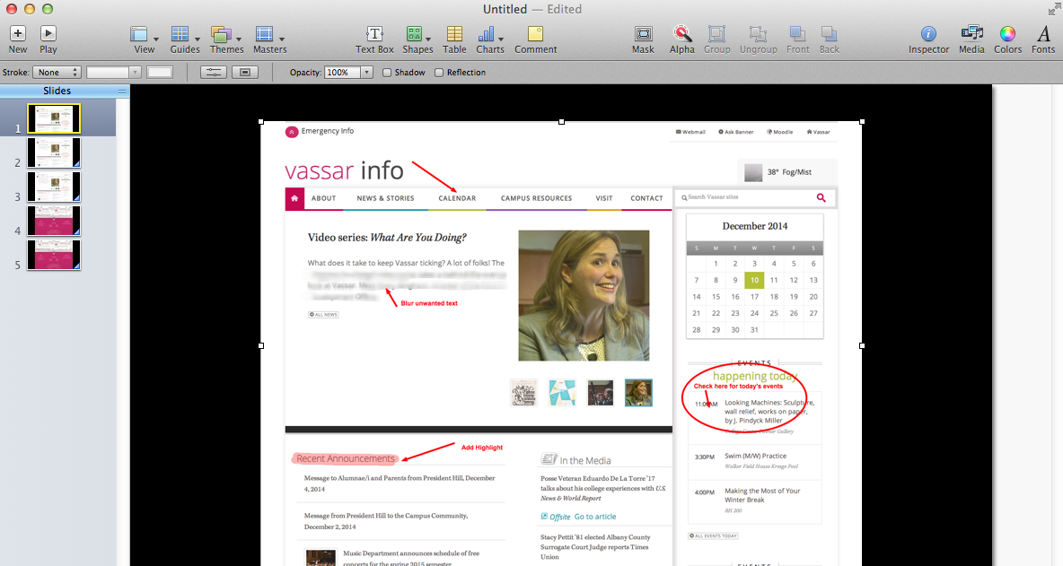
You can drag a circular or rectangular shape around something on your page or make an arrow pointing to it; you can choose the color and line thickness for this.

You can create a text box and type a comment wherever you like; you can choose the font, size and color of your text. For longer comments, or ones you don’t want to clutter up the page too much, you can embed a link to a note that will pop up in the margin— ideal for commenting on student papers submitted as PDFs.

If your PDF was created from a text file (i.e., not simply a scanned image of a text page), you can select a portion of the text and highlight it, underline it, “strikethrough” it, or embed a web link into it. You can also insert a bookmark into a specific spot and name it; all your bookmarks for that document will be listed in the Bookmark menu.

After being saved and shared, all these mark-ups will be viewable by people using PDF viewers other than Preview, such as Acrobat Reader®.

You can’t get a copy of Preview all by itself; it comes bundled with the operating system. If you don’t see all these functions in your Preview, you may not have the current version. For more details about these and other functions, click on the Help menu within Preview.

Share