Relation Between Light Intensity and EM Activity

Description

My project was concerned with finding the relation between light intensity and electromagnetic activity at six different locations on Vassar College’s campus. The level of light intensity was found by use of a photo sensor. Electromagnetic wave levels were obtained by use of a RF Meter. These two variables were then analyzed at each respective location in order to ascertain the correlation between the two variables. This was done by calculating the coefficient of determination, or R squared value.

Results

The coefficient of determination for the data was found to be 0.16. This means that while there is a positive correlation, it is a very weak correlation which is not statistically significant. This means that given the level of light intensity, it is unlikely that a person would be able to predict the level of electromagnetic activity and vice-versa.

Results vs Prediction

The results were contrary to my prediction. I predicted that light intensity and electromagnetic activity would have a significant correlation due to the fact that light is an electromagnetic wave itself, and therefore, hypothetically, more light would result in more electromagnetic waves. However, this experiment made it apparent that electromagnetic waves other than light have enough bearing on the total level of electromagnetic activity to result in there being no significant correlation between the two variables.

Science Learned

In carrying out this experiment I learned that there was an apparatus that could measure the electromagnetic wave activity passing through the air. I did not know that such a device existed. I am also very surprised that a device with this capability is inexpensive enough where an institution can own a large supply of them for students. I also learned that everything that exists in the universe has both an electric current and a magnetic field. Furthermore, I learned that the reason all matter has both an electric current and a magnetic field is due to the movement of electrons around an atom’s nucleus.

Relation with Current Technology

This experiment relates with current technology in a couple of ways. First, the RF meter is interesting in that it can be used to measure the electromagnetic waves of the Wi-Fi or Bluetooth coming off of phones and computers. This can be helpful in showing the amount of data necessitated by different applications. The other way this project relates is that there is a lot of concern by people that the waves given off by technology might be harmful to human health. However, the vast majority of scientists espouse the consensus that these waves are harmless.

What I’d Do Differently

If I were to redo this project, one thing I would do differently is utilize multiple RF meters to accrue data on electromagnetic wave levels. I would then take the average of these several readings to get the level for a location. The reason I would opt to do this is that the RF meter fluctuated greatly when obtaining a reading, which made me question its accuracy. Ideally, I would like to use RF meters manufactured by different companies so as to see if the different manufacturers’ devices fluctuate less than those possessed by Vassar’s Physics Department.

If The Project Continued an Additional 6 Weeks

If this project were extended for six additional weeks, there are a couple things I would do. First, I would add additional locations from which I would obtain data. I would do this so as to see if the correlation between light intensity and electromagnetic waves was stronger in locations other than those from which I obtained my measurements. Also, I would take measurements at all of my chosen locations at three different times between dusk and dawn. I would do this in order to see if the correlation between the two variables is weaker or stronger at different times of the night, when more or less people are awake and using electronic devices.


Movers and Shakers: Reporting Earthquakes

For my project, I was interested in earthquakes; more specifically, I was interested in how people feel the impact of earthquakes that happen further and further away from them. Since noticeable earthquakes are fairly rare on the East Coast, and are certainly beyond my ability to reproduce, I instead collected data from the USGS’s online databases of recent earthquakes and reports thereof.

I decided to focus on  four earthquakes in the US (including Hawaii) which had an unusually high number of responses, and construct models based on the data that I had gathered. Graphing the models themselves proved difficult (since I have multiple input variables, graphs would have to be in 3D), but below are individual graphs of the variables for the earthquake in American Canyon, California. The text form of general model for that earthquake is also below. (I produced graphs for all models, but I only included one, since they all look more or less the same).

The individual plots and model formula more or less behaved as expected. First of all, being further away from the earthquake makes you less likely to report it, which did not come as a surprise (the zero values are because I took the logarithm to make the data more visible, and ln(1 report) =0). The reported shaking (MMI) follows a rough bell curve distribution, which was also to be expected: towns that experienced class 1 shaking were unlikely to report it at all, and very few towns experienced class 7 or 8 shaking (which consist of severe property damage).

The models were also fairly powerful: the models for Pawnee, Waikoloa, Belfair, and American Canyon explained 24%, 22%, 41%, and 56% of the variability in my data, which was a lot more than I was expecting. A big source of error is that the data are not weighted for town size; ten reports from a town of two hundred people is a lot more important than ten reports from a city of eight million, but the model weighs them the same. This is likely why the Pawnee and Waikoloa reports are bad. The data for the Pawnee earthquake (in Oklahoma) features reports from Florida, Nevada, and Maryland, while almost half of the Waikoloa data are reports from one city.

If I could continue this project for another 6 weeks, I would try and write or find a piece of code to weight the data points by zip code population density. Doing this by hand would be impossible (the Pawnee data set contains 3981 zip codes, for example), but a computer could chew through it quickly if I could teach it how. (All of the necessary data is publicly available from the census, so that wouldn’t be a problem).

If I were going to start this project over again entirely, I would try to do comparisons between earthquakes. The way that the USGS’ website is structured makes it impossible to directly compare the reports without downloading and merging hundreds of individual earthquake reports, but again, I could try to find or make a piece of code that could do this. It would open up some interesting questions that were unavailable with this approach: when in the day are people most likely to report an earthquake? How does the magnitude affect how far away the average report is? How about the depth?

The science involved here was in how the energy released by earthquakes is felt by humans, and I learned a lot about that. I also learned a good bit about data wrangling and interpretation from this project; I’ve taken classes about it before, but this was my first use of the techniques in the wild.

Most of the science around earthquakes is based around understanding how they happen with the pipe dream of predicting them. This data is of limited use in that respect, but research like this has potential in understanding how people assess and prepare for earthquakes. Do frequent minor earthquakes make people nervous or jaded? How about larger ones nearby? Even if we can’t predict earthquakes, understanding these kinds of questions could help the USGS and other organizations prepare responses for when they do.

Examining the Draw Force of a Recurve Bow

Recurve Bow Draw Force

Andrew Schrynemakers

Introduction

As an archer, I was interested in the physics behind shooting my recurve bow, and therefore designed an experiment to examine the force involved with drawing my bow. My bow claims to be a 40lb bow, meaning that as the string snaps forward upon firing it, the arrow travels with 40lbs of force. Yet in my experience, drawing the bow seems much easier than lifting up a 40lb weight. I supposed that this was perhaps due to the construction of the limbs of the bow, and the transfer of the force from the large string to the thin arrow. So I designed a bow draw experiment as an attempt to see if the lbs of draw force were equal to the amount printed on the bow. I used the hooked attachment on the dual range force meter in place of my hand to draw the bow at an even pace to my full draw length.  I repeated this several times to make sure my draw speed was even and that the force meter seemed to be correctly calibrated.

Bow Pull photo

Description: Example of un-strung bow (for safety) and Dual Range force meter.

Results

Figure 1. Raw Data From Dual-Range Force Meter

Figure 2. Approximation of force required to pull back bow a certain amount of distance

Analysis

My results show that the force it takes to draw the bow the full 25in to firing position only actually takes 13.65lbs of force. As I pull the bow back, it gets exponentially harder to pull back until it is at its maximum extent, where it levels out for the duration of the test. This was always the same under repeated tests, and the graphs for pulling the bow back 5in, 10in, 15in, 20in, and 25in level off where I have indicated in figure 2. at 1.54lbs, 3.10lbs, 4.96lbs, 9.01lbs, and 13.65lbs, respectively.

This demonstrates that the bow is easier to pull back than the 40lbs it has printed on the limbs, and must be measuring some other statistic, even though it is called the draw weight. They seem to follow what I predicted based on feeling. Drawing a bow is not easy, but most people can do it, and you only use one hand to do so. In the same way, it seems to be much harder for most people to lift a 40lb weight, which is theoretically applying the same amount of stress to the arm, and takes the same amount of strength to lift. Observing this, it seems much more likely that it takes around 14lbs of force to pull back, which is much more doable.

Conclusions

My experiment taught me about using the Logger Pro software in conjunction with a force meter to examine force over time or distance. Both of these are concepts that could be used as part of the data necessary to calculate how fast the arrow it fires might travel, as well as how far the arrow will go. The science I used is directly related to energy, specifically the potential energy stored by the limbs in the bow. On top of this, my tests gave a more useful statistic on whether or not a person could actually pull back a bow or not, and while 40lbs of draw weight sounds like it would be quite difficult, 14lbs is more accurate to what actually goes on and gives people a more reasonable knowledge of whether they’ll be able to do it.

If I had to do this project again, I would possibly check with multiple force meters to make sure they were all calibrated correctly and that none of the data comes from a broken meter. I would also get some help to pull back the bow, as it would be easier to maintain a constant draw at any of the intervals shorter than maximum draw. I would also make sure my Logger Pro software was more cooperative with PC systems, as it took quite a lot of time to get it running.

If i could continue for another six weeks, I would measure the force transferred from the bow into the arrow, how much energy was lost to heat, and see if I could predict how far an arrow would go based on the weight of the draw. The speed of the arrow could then also be measured with a high speed camera and measuring equipment.


Pigmentation and Color Spectroscopy

Simone K. Johnson
Yuhong Chen

Introduction

Our project looked at the color spectroscopy of pigmented substances such as makeup, food coloring, and paint. Using the color spectrometer, we tested each sample for the wavelengths red (645 nm), yellow (585 nm), green (560 nm), and blue (470 nm). Doing this gives a more thorough understanding of the color composition of each sample, and what certain pigmentations reflect and absorb.

This was done using a Vernier ALTA® II Reflectance Spectrometer and logging the data into Excel. We swatched each substance onto a 10 cm by 10 cm square. The spectrometer emits a colored LED light of a certain wavelength onto the sample of swatched pigment and measures the absorbance based on wavelength.

Results: Absorption Readings

(lower number = higher absorbance, higher number = higher reflectance)

560 nm (GREEN) 585nm (YELLOW) 470 nm (BLUE) 645 nm (RED)
Oil Paint (Alizarin Crimson | Pigment: Anthroquinone) 135 173 45 525
Acrylic Paint (Artist’s Loft – Crimson Red) 370 272 271 779
Acrylic Paint (Artist’s Loft – Vermillion) 217 416 48 842
Oil Paint (Burnt Sienna | Pigment: Synthetic Iron Oxide Red) 253 247 118 406
Oil Paint (Cadmium | Pigment: Cadmium Zinc Sulfide + Cadmium Sulpho Selemide) 750 741 171 712
Oil Paint (Cadmium Yellow Hue | Pigment: Zinc Chromate) 675 674 69 728
Oil Paint (Cadmium Yellow Hue | Pigment: Arylide Yellow) 840 777 65 731
Food Coloring  (Red | RED 40 + RED 3 ) 176 248 42 835
Food Coloring  (Blue | BLUE 1 + RED 40 ) 128 79 124 162
Food Coloring (Yellow | YELLOW 5 ) 580 730 32 1005
Lipstick (Rose Lancome) 757 588 60 841
Lipstick (Gazpacho – Amuse Bouche) 36 40 711 885
Lipstick (Tarte Cheerleader) 368 280 84 625
Lipstick (So Sofia) 78 121 78 918
Lipstick (Core Cora) 31 31 441 730
Lipstick (Urban Decay Crimson) 730 750 660 610
Lipstick (Bobbi Brown Russian Doll) 670 563 666 823
Lipstick (Make Up Forever Artist Rouge) 360 571 266 751

Hypothesis, Analysis of Results and Conclusions


The original hypothesis was that the more expensive products would have more pigmentation and return higher numbers on average. However, the conclusion reached was that more expensive products did not necessarily lead to higher pigmentations. The blue wavelengths were noticeably low in every sample, especially the red pigmented colors. There were high variations in lipstick colors. In seven of the nine lipstick colors tested, there was a very low amount of yellow, green and/or blue. There was high red reflectance in all of the samples, as they were red lipsticks. The Urban Decay Crimson lipstick and the Artist Rouge lipstick were the only two lipsticks that had high levels of blue, green, yellow, and red. This high mix of multiple colors could suggest that the pigmentation is stronger or more complex, as it is composed of more colors.

In regards to the cadmium family of oil paint, ‘true’ cadmium pigment is toxic and more expensive. As a result, we acquired two substitutes of ‘cadmium yellow hue’ that use different, often cheaper pigments to emulate the color of cadmium. However, the colors from both brands had slight differentiation on paper and this was evident in the lower reflectance of blues, and the too-high-or-too-low reflectances of yellow and green. The shapes of the spectrums appear similar enough for the imitation shades to be considered good substitutes, but provide further implications on the effect of pigment on color payoff as well as safety of use.


This project taught us about color spectroscopy and interaction between light and color, while giving us an understanding of color dynamics, wavelengths, and properties. We learned about reflective and absorbed lights in the visible light part of the electromagnetic spectrum and how that affects how people interact with color and pigmentation in commercial products. This project also taught us how to work with color spectrometers and equipment usually used for physics projects.

What we learned was that high end did not necessarily translate to higher pigmentation, and higher pigmentation did not necessarily translate to higher quality — that there were more factors that contributed to price and quality, such as the safety, availability, and formulation of the vehicle carrying the pigment all contributed to the ‘quality’ of a pigmented substance. Also, specific shades made up of varying color compositions are often sought after more than shades that are highly concentrated in one color.

Repetition and Continuation

If we did this experiment again, we would probably organize by the pigments in the ingredients list. Unfortunately, due to the makeup industry’s regulations, companies do not have to release all specific information on their pigments and formulas — this can be something that can be further investigated by acquiring pure pigments and trying to match the color composition through the use of more spectrophotometry and some chemistry.

If we were to do this project again, we would probably collect more samples to have more varied data with different colors. We would also be able to buy pure pigments to mix for new colors and make comparisons to the collected samples.

These results are related to current technological developments because it can be used in various ways to advance pigment manufacturing. Color spectroscopy can be used in quality control to ensure consistency during manufacture. Further, color spectroscopy can be used in the analysis of many more pigments, organic, inorganic, or synthetic, which can be used by chemists as well. Last, the emergence of different methods — such as makeup printers and color scanning ink pens — combined with the use of color spectroscopy might revolutionize the industries of art supply, makeup, and other pigmented substances.


Analyzing Rock Salt Runoff with Spectroscopy and Finding the Purest Water Fountain on Campus

An Analysis of Rock Salt Runoff

Michael Eacobacci

Introduction

As someone who is interested in environmental chemistry, I designed a project where I could empirically analyze the environmental effects of something that is done every winter at Vassar, salting the roads and sidewalks.  After the snow melts the water flows down into rivers and lakes, and it carries the dissolved rock salt with it.  This leads to a significantly higher salt concentrations in the water which can be very harmful to many fish/plant species.  Over the course of 16 days I took 12 water samples the river running under the bridge building.  I was careful to sample from around the same area each time and tried to control as many variables as possible.  I then analyzed these samples with a Vernier Spectrometer.  I first calibrated the spectrometer with distilled water taken from one of the Chemistry labs.  Then, to get each data point, I would shake up the water from a specific day, then dip a cuvette into the holding jar, and run the spectrometer.   I analyzed each day’s water two times to insure against a bad sampling.

Results

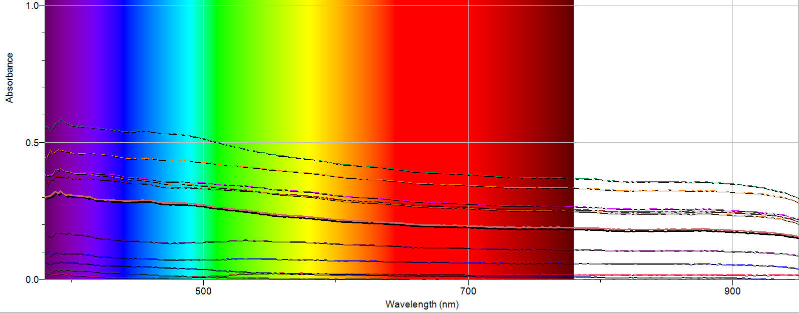
Figure 1.  Raw Data from Spectrometer

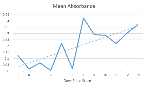
Figure 2.  Data organized into a chart of Mean Absorbance vs. Days After the Storm *Discontinuities on the X-Axis are a result of no data being taken on absent days.

Discussion

I am very pleased with the results my study revealed.  I saw different absorbance for each sample I took, with the highest mean absorbance being 8 days after the storm, which was around the time the snow was melting rapidly.  I also observed a small, but consistent peak at around 390 nm on the readings for days 3, 8, 9, 10, 11 and 15.  Upon further research, I found that salt can absorb light at around this wavelength, so this peak could very well be rock salt runoff polluting the river.  I would also note there is one line (day 0) has a small, broad peak from 500-700 nm where all of the other lines just sloped down through the spectrum.  This could be the result of a sampling error, or something that was only present in the river on that day due to the active snowfall.

Although the data is not perfect, I observed an upward trend in the mean absorption as more days passed after the storm.  This suggests that as snow from the storm melts, rock salt and other pollutants are increasing in concentration in the river due to runoff.  This supports my original hypothesis that runoff from the snow would carry pollutants into the river.

Other

Science that I learned during this experiment is mainly the inner workings of a UV-Vis spectrometer.  It mainly functions by being able to disperse light into its individual wavelengths (380-950 nm) and shooting it through the sample in the cuvette.  The detector on the far side gives a reading based on how much light reaches it, which gives us a measurement of how much light was absorbed by the sample and at which wavelength it was absorbed.  When I loaded a blank with distilled water, I calibrated the spectrometer to have that be 0 absorbance (or 100% transmittance) and compared the river water samples to that.  This allows researchers to determine what compounds are in a sample I also learned about Beer’s law which takes into account cell path length (b) in cm,  concentration (C) in mols/L and molar absortivity (e) in L/mol*cm to give Absorbance, which is unit less.

This project fits into current science by exposing a negative environmental impact of our actions, which is a growing concern in the modern scientific community.  It is becoming ever more important that we are conscious of the way we are affecting our surroundings, and making changes to lessen our impact.

If I were to repeat this experiment, I would have started taking samples earlier than 1 day before the storm to get a better baseline to compare the changes to.  I would also take samples from more than one river so I could draw a more general conclusion, as this one river could be an outlier in either direction.  If I had 6 more weeks, I would continue to take these samples as to see when the river returns to its original state, as when I finished, it was still above where it started.  I would also try to identify what some of the pollutants are by spiking the samples with different compounds (like NaCl) and seeing where the peaks were enhanced.

Finding the Purest Water Fountain on Campus

Joseph Griffen

For my project I went to decided to examine the water quality of different drinking fountains on campus to see if the water quality across campus was the same or if certain dorms had better or worse drinking water than others. Since it would be difficult to test the quality of Vassar’s water in general, I decided a better approach was to test each dorm’s water quality compared with the other dorms, rather than determining the quality of Vassar’s water as a whole. This means that, while my results can point to one dorm having slightly better water than another, I won’t be making any assertions as to the quality of water at Vassar as a whole. For my experiment I ended up testing the water from 7 different drinking fountains, each from a different dorm. The dorms I chose were Main, Lathrop, Davidson, Joss, Jewett, Strong, and Raymond.

To conduct my experiment I took the water samples and placed them in a spectrometer. This shows how much light from specific wavelengths the water absorbs, which can point to there being minerals or other compounds in the water which may pollute it. If a water sample is absorbing significantly more light of a certain spectrum then it generally means that there is some particle in that water that is causing that increase in absorption. One issue with this project, however, was determining what this increase in absorption means. Some extra particles that absorb light could be perfectly harmless or the difference could be so miniscule that it wouldn’t have any noticeable effect in water quality. On the other hand, the increase in absorption could indicate a contaminant that is affecting our drinking quality, perhaps not enough to make it unsafe to drink, but enough for you to stop and think twice about drinking the water. In order to determine whether certain contaminants are present in the water in significant quantities one would have to do detailed specific analysis into the spectrums of color that these contaminants absorb. This would require different, more precise equipment and testing than was able to be conducted. These results therefore, are intended to be a jumping off point, and can indicate which water fountains may have poorer water quality and which further examination of may be able to indicate pollutants in the water more certainly.

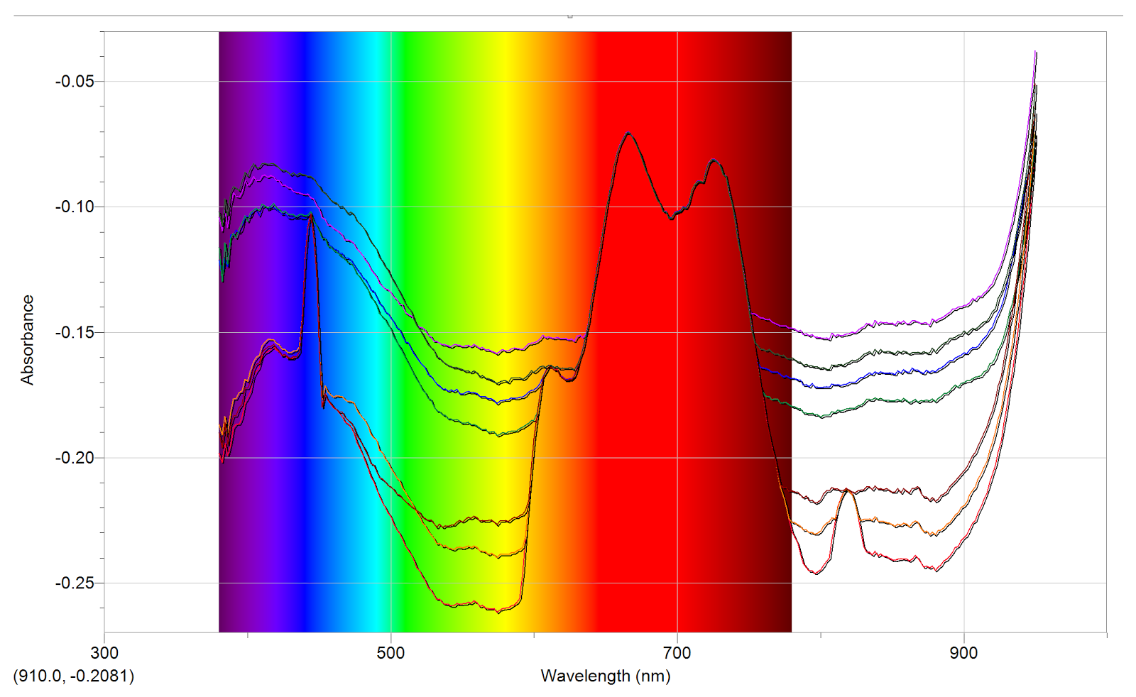
Graph 1: Absorbance vs. Wavelength (with visible spectrum)

Graph 2: Absorbance vs. Wavelength (without visible spectrum)

Here are two graphs that display the results of the spectrometer. They show each water sample and how absorbent each was with regard to the different wavelengths of light. The first graph shows this information with the visible light spectrum so that one can easily see what the wavelengths correspond to. The second more clearly shows the different water samples so that they can be easily compared. Below is a key that matches the color of the line on the graph to the location the water sample was taken from.

Key:

Strong:        Pink

Lathrop:    Black (Darker Olive Green in Graph 2)

Davidson:     Blue

Raymond:    Green

Joss:        Maroon

Jewett:        Orange

Main:        Red

The data clearly shows that there are some significant differences between the water samples from different locations on campus. Initial examination reveals that at some points in the spectrum there is no discernible difference in absorption between any of the samples. For example in the wavelengths of visible light that corresponds to the color red (approximately 600-800nm) there is no significant difference and each sample follows approximately the same pattern. In the spectrum that corresponds to yellow and green light (approx. 500-600nm) as well as most of the infrared spectrum (approx. 800-900nm) the samples split into distinct levels of absorbency. Although there is a little fluctuation between the different samples at other points in the spectrum, we will use these two parts of the spectrum for our comparison because in these places the patterns of the graphs roughly mirror each other which shows that the device is measuring well and the samples are similar, except for that some are absorbing more of the light than others. Additionally these two parts of the spectrum match each other in results and provide clear results that give us a good picture of which water samples are most absorbent.

So, in examining the results we find that we can easily rank the 7 locations in terms of how absorbent they are. The results look like this:

Most Absorbent

  1. Strong
  2. Lathrop
  3. Davidson
  4. Raymond
  5. Joss
  6. Jewett
  7. Main

Least Absorbent

So, what exactly does this tell us? First, we need to realize the limitations of this analysis. We are simply comparing the 7 water samples against each other, not necessarily against water samples that are drinkable or non-drinkable. Hopefully, we can assume that all of the water Vassar provides us to drink with is of a permissible quality. Still, as the results clearly show, not all the water is identical, and there are obvious variations across campus. Since we are simply comparing the samples against each other a ranking of the 7 is a better way to display the results than figures of their actual absorbency. Indeed, in order to get any figure of absorbency we would have to pick one (or several) wavelengths to examine, and the selections would end up being more or less arbitrary. Therefore, a more holistic examination of the results will yield more relevant information and the ranking of the dorms is the best way to display the results. It is, however, important to notice that there is a significant jump between the absorbency of Raymond and Joss. The rest of the samples are relatively close to each other, but split into two distinct groups. Strong, Lathrop, Davidson, and Raymond are significantly more absorbent than Joss, Jewett, and Main.

Now that we’ve discussed exactly what the results show us we need to know how to interpret them. They show absorbency, but what exactly does this mean in terms of water quality? As I explained earlier, this part isn’t as clear as one would hope. Based on the way the spectrometer works, we know that there are some sort of particles that are more present in the water from Strong than the water from Main. What these particles are is hard to tell though. More careful and precise analysis of the specific wavelengths where we see disparities could perhaps reveal more about which particles are present and whether they are present in large enough quantities to be harmful, or if the particles themselves are even harmful at all. Water quality is difficult to measure objectively and often requires multiple tests to check for different possible contaminants. What we do have evidence of, however, is that there are significant differences in the water across campus. In particular, the evidence suggests that Strong has the most extra particles in it, while Main has the least. Further examination could reveal the nature of these extra particles and whether they are good or bad or neutral, but they are present and their presence suggests that further examination may indeed be warranted.

I would say that the results are roughly what I had predicted. Although I didn’t make any actual predictions about which houses would have better or worse water quality, I expected that I would find significant differences between their absorbency in some spectrums and that in others the samples would yield nearly identical results and this ended up being the case.

The science I learned by doing this project mostly related to wavelengths of light and water quality. I learned a lot about how a spectrometer works and what it can tell us about what is in a liquid. By measuring how much light of each wavelength is able to pass through we can learn a lot about the makeup of a substance. Since certain particles in water are known to absorb certain wavelengths of light, knowing which wavelengths are absorbed more significantly can indicate the presence of different materials. It’s interesting to see how something like light can tie into water quality. The two seem like fairly separate fields, so it’s interesting to see how they can overlap like this. It’s also neat to see how we can use light to detect the presence of different particles.

Additionally the application of this for making water quality testing easier is interesting. By using these comparatively simple means of analyzing the contents of water samples, scientists can save significant amounts of time and resources on more complex methods of detecting contaminants in water. Spectroscopy is a promising tool for analyzing water quality that hopefully can contribute to improvements in water quality across the world.

If I were to do this project again I would conduct further research into spectrometers and how they can be used to analyze water quality. I would find spectrometers that can specifically analyze spectrums that correspond to contaminants commonly found in drinking water. By focusing precisely on these spectrums I could check for the presence of contaminants in our drinking water and get more specific results on the overall quality of drinking water at Vassar. By focusing specifically on drinking water and checking for specific contaminants, I would be able to more make concrete conclusions about the quality and how safe it is for drinking instead of just comparing the samples against each other.

If I were to conduct the experiment for another six weeks without significantly changing my approach in the way I discussed in the previous paragraph, I think I would just focus on increasing the sample size. I only took one sample from each dorm and if I took five or ten from different drinking fountains in each building and averaged them I could gather more evidence about the water quality in the entire building as a whole. I would also expand the experiment to the rest of the houses and possibly other buildings on campus. An expanded survey of water quality could yield more interesting results and analysis (i.e. is the water quality better in dorms than in academic buildings?) However, before I expanded the experiment I would want to make sure to work out more precise measurements which would allow me to make better conclusions about what the results can actually tell us about the water quality as I’ve discussed several times already.
In conclusion, while this experiment encountered some errors regarding how much the results can actually tell us about the water quality itself, I think it was successful in providing evidence that there are significant differences in water quality in different places on campus. Moreover, it was able to suggest the water quality was perhaps better in some locations (like Main) than in others (like Strong). While these results will remain inconclusive in exactly how good the water quality is they do point to something that should be explored. Further, more precise research into the water quality at Vassar would be interesting. In particular, as this experiment showed research into the differences in quality between locations yields interesting results that should be explored further.

Wattage as it relates to Loudness in Speakers

Introduction

I chose this project because I noticed how often I had been using my speaker for activities on campus. More often than not, my flat mates would use it to enjoy some music while making dinner, or I would be tasked with supplying the music for a party. Either way, I saw that I was getting a considerable amount of mileage out of my speaker, and became interested to see how much electricity I was drawing with such a loud yet compact machine. My project sought to determine the loudness, measured in decibels, and power consumption, measured in watts, of my speaker and how power consumption is affected as the speaker outputs music at louder volumes. To do this, I used equipment to measure the wattage of my speaker, and a phone app to record the decibels produced. I used a standardized sound clip to make sure the data was consistent across all trials, with each trial being a different level of volume.

Data Interpretation

The graphs were made in Excel using data collected. The data for wattage was collected with Logger Pro, obtained through a free demo, and the Watts Up Pro, obtained through the physics department. The data for decibels was collected using an android app called “Sound Meter.” I collected the data through Logger Pro and copied it over to Excel. Each round of data collection consisted of setting the speaker volume at a certain level, then measuring wattage with the Watts Up and decibels with Sound Meter as I played the first 10 seconds of “Day & Night” by Thundercat. I chose a short song in case I wanted to play through its entirety. The data shows a steady increase for both decibels and watts, however this increase is much smaller than I originally thought. It seems the speaker is able to efficiently use power, as louder volumes increase the wattage very little. Throughout the experiment, the difference between the lowest and highest wattage used is less than 1 complete unit(not counting when the speaker is off). As for decibels, although there was a consistent increase as volume increased, the data stayed in the same general area for each of the measurements for min, average, and max dB. Upon further research I discovered that decibels are a logarithmic unit. Because of this, loudness is not measured in a linear manner. For example, an increase of 10 decibels would mean that a sound is now twice as loud as before.


After researching electricity providers in the Poughkeepsie area, I was able to determine that electricity sells for about $0.073 cents a kWh. I did some calculations using these numbers to interpret the difference in cost from electricity use in playing my speaker at different volumes. Because the difference in wattage and decibels between individual levels of volume is so incrementally small, I found it more illuminating and satisfying to simply use the measurements of the highest and lowest(without being off) volumes. The highest volume had an average loudness of 80 db, with an average power use of 6.29 watts. The lowest level had measurements of 50 dB and 6.08 watts, respectively. In order to have rounder and more intuitive figures, I scaled up the time in the following measurements from 10 seconds to 1 month. If I were to play music through my speaker for an entire month at the loudest volume, I would spend $0.33 on electricity. If I did the same at the quietest volume, I would spend $0.319. The difference in loudness between the highest and lowest volume is 30 dB. So, the difference in rate divided by the difference in loudness gives the total cost difference of playing my speaker at different volumes. This comes out to be an increase of $0.0007 per 1 dB increase.

Discussion

I learned during the course of the experiment the scaling of loudness when measuring in decibels. Since most of the exposure to measurement units we have in our everyday life is linear, it’s a bit unnerving when encountering a logarithmic unit. In relation to current science, it’s interesting to see how the electronics we use everyday consume power. There’s push for energy policy changes and understanding how much energy we use and how is an important part of making those decisions. If I had to do this project, I would invest in a better loudness measuring device. The app on my phone was accurate enough, but having consistent measuring through a more reliable device would have made data gathering easier. If I had to continue this project for another six weeks, I would test the power consumption over longer periods of time, as well as utilizing other different speakers to see how much power is used by different brands at comparable loudness.

Migraines and Physical Conditions

A migraine is a type of severe headache disorder that can last up to 72 hours, and is often associated with nausea, vomiting, numbness, and sensitivity to light, sound or smell; and, more broadly, sleep disturbances, anxiety, or depression. Most migraine sufferers experience migraine attacks one or twice a month, and almost all sufferers are unable to work or function normally during the attacks. Sufferers are sometimes able to detect incoming migraines before the pain hits, through feelings of aura (strange sensory disturbances) or through other premature neurological symptoms (early nausea or sleep disturbances).