Reflection: A Semester with FCP X – Video Editing with non-film students

fcpx2013Last summer the decision was made to use Final Cut Pro X as the supported video editing software for Vassar students. CIS deployed FCP X in the Film Department’s editing labs as well as in the Digital Media Zone in the library. To help us adapt to the switch from beloved FCP 7 to FCP X, we organized an on-campus workshop with Roberto Mighty. For two days Film faculty and CIS employees worked shoulder to shoulder, getting valuable hands-on experience with an interface that was new to most of us. There had been quite a controversy about Apple’s changes from FCP 7 to FCP X, and most of us were apprehensive about the switch. But after two days of excellent instruction, our general sense was that the FCP X could generally do anything FCP 7 did, and it did some things better. I was looking forward to using it with students.

Using FCP X for Digital Storytelling

Past years I’ve worked with French Faculty with students who were tasked with creating digital storybooks. (For more on the pedagogical goals of this project, I invite you to read Digital Storytelling in Intermediate French.) Early in the fall, I met with Tom Parker and Mark Andrews to discuss their classes’ projects. In small groups, the students compose and illustrate children’s storybooks in French, which they scan and narrate. Previously we’d uploaded the images to VoiceThread and done the recordings via their online Flash interface. Students were able to upload and record easily enough, but I found other aspects of VoiceThread lacking (editing, layering audio, search, embedding, restrictive licensing, to name a few). FCP might be harder to learn, but once learned, they would have total flexibility on how they created their projects and they would have a skill that might be used for another project or life after college. Tom and Mark were amenable to the idea so we tried it out.

I only had an hour with the students so it was a bit of a challenge to cover the essentials in such a short period. Luckily, their projects only required them to import their scanned storybook pages into FCP X, then record narration. We spent a fair amount of time doing practice narration. We touched briefly on titles, incorporating sounds and music, and exporting. Students that had brought scans of all of their storybook pages were able to get a significant amount of work done during the workshop. One of the classes was able to have a follow-up workshop where I was able to work with each group, advising and troubleshooting. This was extremely valuable and I wish we had been able to schedule this for both classes. Generally speaking, students adapted well to FCP X and were quite successful. I don’t think I would have been confident enough to use FCP 7 in the same way. Here is an example:

I liked how they were able to incorporate both their narration and some sound effects. The use of titles, music and end credits added a bit of polish too. I should add that most of the students I work with have little to no experience with video or sound editing.

America in the World Digital Narratives

Eve Dunbar and Carlos Alamos co-taught AMST 250: America in the World this past fall. For one of their major assignments, students could choose to write a paper, create a podcast, or a a digital narrative. I trained the entire class to edit audio, but a couple students were interested in using video for their digital narratives, so I met with them one-on-one. The students were able to start editing after an hour of training. Here’s an ambitious project that a student put together based on interviews she made using her phone:

FCP X FTW!

So for me and my work, FCP X has been a win. It is an easy to learn and very capable video editing platform. Students are able to get up and running with their video projects in a way that would have been too daunting to attempt in FCP 7. (One hurdle is that special formatting is required for projects on external drives to show up in FCP X.) Students do have the option to download a trial version of FCP X, which is often all they need to get through a project.

I’ve already got one class scheduled to use FCP X this semester: Candice Swift’s ANTH 245: The Ethnographer’s Craft is going to use FCP X to create digital enthnographies; they will use Final Cut to create voice-overs on top of stills and video. I am looking forward to this FCP X project and others like it this spring.

Share

New Moodle Feature: Annotating Student Papers

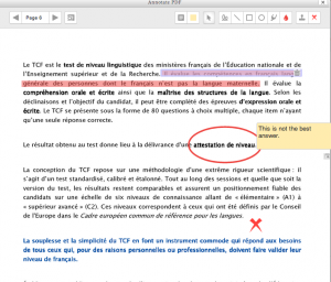
Screen Shot 2014-01-14 at 12.44.32 PMWith the recent upgrade to Moodle 2.6, instructors have a new function available: If a student uploads an assignment in the form of a PDF file, the instructor can make various types of annotations to the file directly within Moodle. Previously, they would have to download the file, use some program that provided annotation functions, then upload that revised version to Moodle, for the student to download. Now that can be done within Moodle.

Annotation functions include highlighting, circling, drawing, stamping an available graphic (like a checkmark or an X), and writing Post-It-type notes.

Here’s a quick demo:

Share

R for Data Analysis and Graphics

RR is becoming the most widely used statistical software in academic science and it is rapidly expanding into other fields. R is a free language and environment for data manipulation, calculation, graphics and much more. It runs on all of the major platforms, including Windows, Mac and Linux. While it is command line driven, several good graphical user interfaces (GUIs) exist that open it up to a wider group of users with differing technical abilities.

Popularity

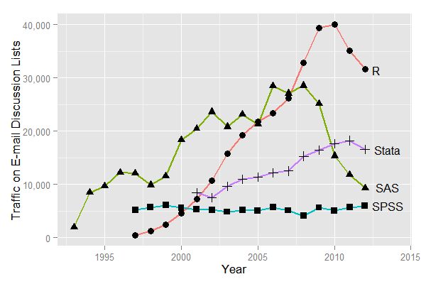
When various metrics for the most popular data analysis software packages are compared (Muenchen, R.A., 2013),  R demonstrates a dramatic increase in popularity over the previous 5 to 10 years.  A plot of posts to email discussion lists, shown below, illustrates a rapid growth in discussion of R.  And over the past few years, R has become the most discussed software by nearly a two-to-one margin.  However, one must be careful when interpreting these results.  For example, the consistently low level of discussion for SPSS may be reflective of the fact that it has a simple interface leading to less of a need for discussion.  However, there are also fewer variations in analysis offered in SPSS than those that exist in R and other applications with somewhat less user-friendly interfaces.

fig_1a_listserv11

Sum of monthly email traffic on each software’s main listserv discussion list. From “The Popularity of Data Analysis Software”, http://r4stats.com/articles/popularity/.

User Friendly Interfaces

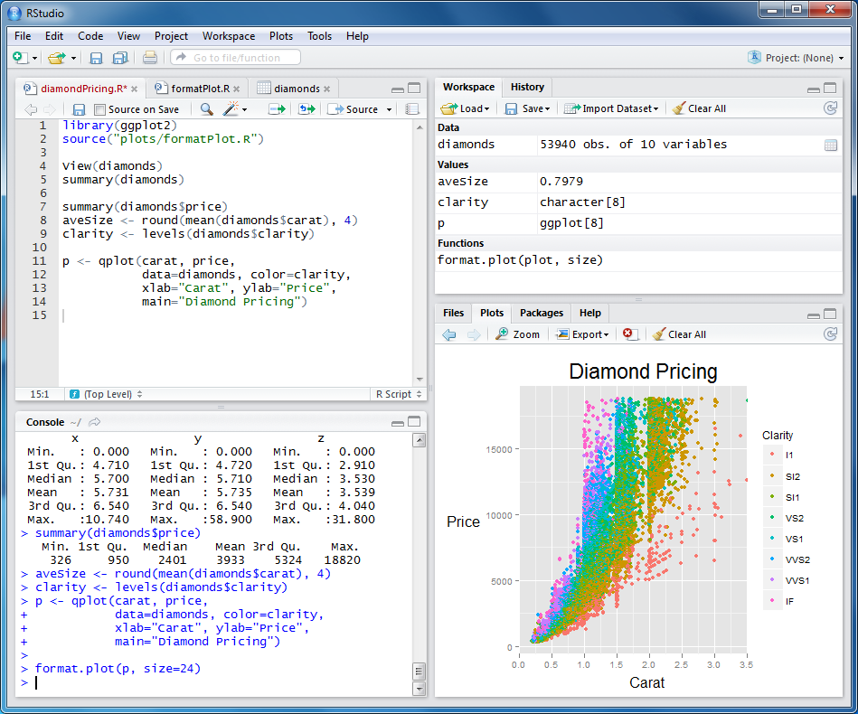
Over the past few years, a number of GUIs for R have been developed that make R more accessible to a wider group of users.  RStudio, a popular GUI for advanced users, is what is known as an integrated development environment. This interface is similar to MATLAB, is designed for programmers, and provides syntax highlighting and integrated help among other features.

Screenshot of the popular Rstudio graphical user interface.

Screenshot of the popular Rstudio graphical user interface.


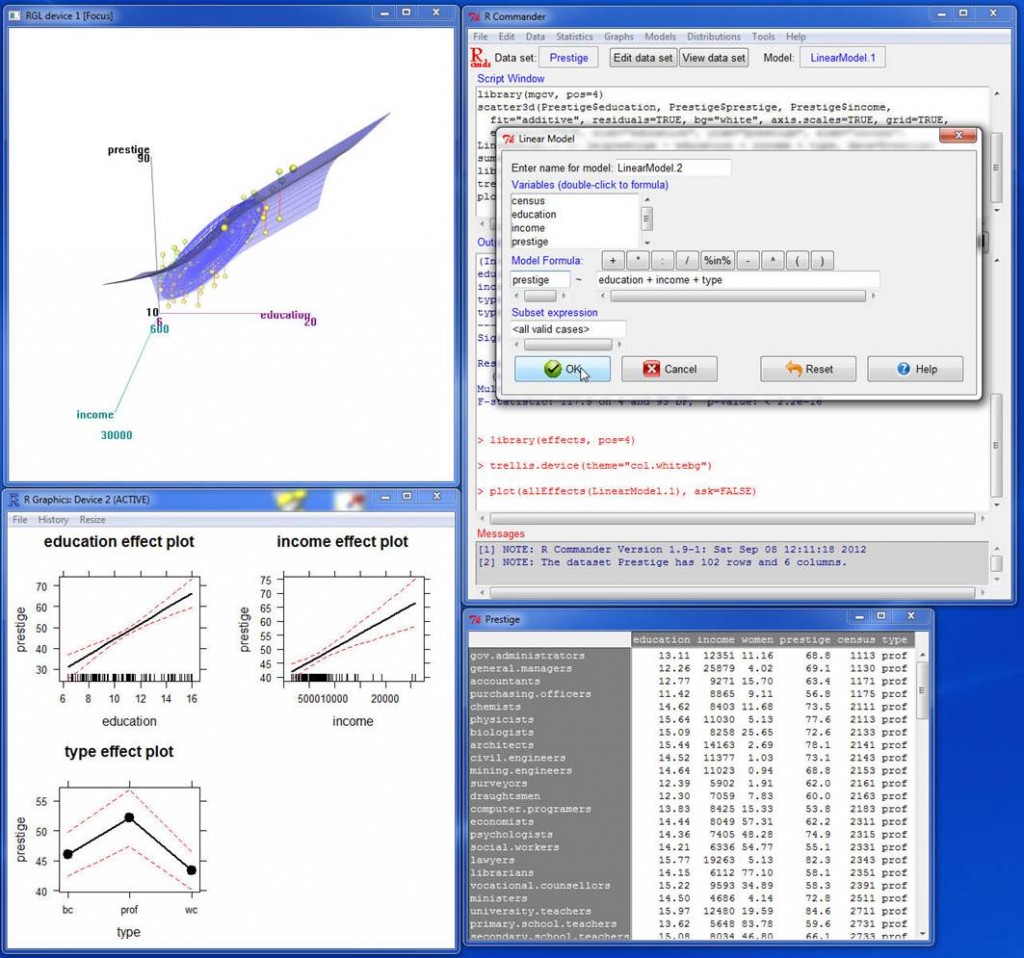
Rcmdr, pronounced Rcommander, is a basic-statistics GUI that offers menus, buttons, and dialog boxes to simplify usage for those with less advanced technical skills. The commands that are generated via the user’s actions are shown in an output window. They can be edited and resubmitted, if desired, helping to familiarize the user with the R language. This is useful for those with moderate technical ability who are interested in learning basic R commands. A third R GUI, Deducer is designed to be a free, easy-to-use alternative to proprietary data analysis software such as SPSS, JMP, and Minitab. It has a menu system to do common data manipulation and analysis tasks, and an excel-like spreadsheet in which to view and edit data frames.

rcmdr

Screenshot of the Rcmdr graphical user interface.

Availability

R and RStudio are installed in the SciVis Lab located in the Mudd Chemistry Building. Additionally, both R and the GUIs mentioned above are freely available and can be easily installed on your personal computer. RStudio also offers a web-based version that can be used in lieu of the desktop version. The availability of a web-based server means that one doesn’t have to install software on a personal computers or go to a computer lab. It can be accessed anywhere there is an internet connection. Our system administrators are in the process of evaluating whether it is feasible to host an RStudio web server on campus, and we are hopeful that this convenience will soon be available to the Vassar community. If you would like to learn more about R, please contact ACS liaison Shelly Johnson.

Share

Flipping the Classroom

arrowsA hot topic in Higher Ed circles is known as “Flipping the Classroom.” The idea is to take the standard, traditional structure of student work in and out of the classroom and flip them— move the lecture out of the classroom and move the “homework” into the classroom. Typically, the lecture is moved out by making a recording of it available to students online.

The idea is for the mostly one-directional transmission of information to happen out of class, so that the in-class time can take maximum advantage of everyone being together.

Of course, this oversimplifies a lot of diverse practices. In reality, a lot of classes— especially humanities and social science classes at small colleges— already place the bulk of their “information transmission” (in the form of reading) outside of class and use class time for discussion. And “homework” may be an inadequate label for what happens in many flipped classrooms. Often, class time is used for what has been called “active learning,” which might include small-group problem-solving or project development.

Benefits
The biggest benefit of flipping is that the most valuable time— the time when everyone in a course is together in one place— is used to its best advantage. If your class time— or even just a portion of it— is used for mostly non-interactive lecturing, why does everyone need to be together?

group_work

[Image from http://serc.carleton.edu/sp/library/sac/]

Another benefit of moving the lecture outside of class is that students can pause a recording, replay it, take careful notes, then continue it. This can be helpful for all students, but especially for those for whom English is not a first language or for students with learning disabilities.

Challenges

[From http://www.theguardian.com/education/mortarboard/2013/feb/19/]

[From http://www.theguardian.com/education/mortarboard/2013/feb/19/]

The biggest challenge with flipping is probably the time and effort required by the instructor— both to produce the lecture recordings and to develop meaningful in-class activities. And some students react negatively to the flipped design— either because they prefer to be passive in the classroom or because they feel that their tuition payment entitles them to a “live performance.”

Interested in flipping, but not sure it’s right for you? You don’t have to flip everything. You can try just flipping two or three class sessions or just portions of a class. Your ACS liaison can help you with the recording.

Share

Prezi

by Steve Taylor

Prezi is a tool for creating presentations, just as Powerpoint and Keynote are, but with some interesting differences. Since its creation in 2009, it’s been seen more and more in conferences.

Metaphors
One way in which Prezi differs from earlier presentation tools is its metaphor. Both Powerpoint and Keynote use the metaphor of a series of individual slides that can be shown in a predetermined sequence, just as 35mm slides would be shown with a carousel projector.

In Prezi’s metaphor, the creator arranges materials on an infinitely large canvas and— as I think of it— uses a video camera to pan and zoom through those materials. That can be done on the fly or the creator can pre-record a series of pans and zooms. The resulting presentation maintains the spatial relationships among the various materials.

It’s On the Web
Although they can be downloaded, “Prezis” are assembled on the web, through your browser, and can be presented via your browser as well. They can be shared with the general public or with a select group of colleagues (or members of a class.) You can even collaborate with others on the creation of your Prezi, which makes it a great vehicle for group projects.

Good and Bad Uses
I’ve seen great uses of Prezi and uses that make no sense at all— unfortunately, quite a few of the latter. If your presentation materials consist of a series of bullet-point lists, quotations, graphics, etc. that have no particular spatial relationship to each other, then there’s no particular reason to lay them out side by side and pan from one to another. But if there are spatial relationships— such as in a complex chart, diagram or map— then Prezi may be the perfect tool.

Here are a few examples of great uses for Prezi. You can pan and zoom on your own, or click the Play button to step through a pre-recorded tour.

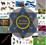
“Classification of Organisms,” created by Robert Kappus, will lead you systematically through a complex chart. The chart is circular, and the zoomed-in labels and graphics are aligned along radii of the circle, but that poses no problem, as the pre-recorded tour can not only pan and zoom, but rotate the view as well.
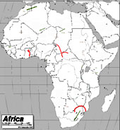
The “Physical Features of Africa Quiz” Prezi, created by Emily Thompson, will give you a tour through the major mountain ranges of Africa. Maps tend to be difficult things to project in a classroom, because the amount of detail means that labels often are too small to see from a distance. Prezi is a great vehicle for showing detailed maps, because of the extreme levels of zooming it can support.
One of my favorite uses of Prezi is to explore different details of a complex work of art. Here’s one that I created, providing a tour through some of the details of the painting Garden of Earthly Delights, by Hieronymus Bosch. An instructor can present a series of details from a work like this, without losing the context of each detail.
A number of people have realized that Prezi can be a good tool for creating a concept map— a diagram that shows relationships among various concepts. Here’s an example of a Globalization concept map, created by Dennis Carnduff.

Go to the Prezi website to explore other materials that various people have made public, to get more ideas on how it can be used.

Licensing
Prezi offers three levels of licensing:

  • Public, which is free, provides you with 100 MB of storage, but requires you to make your creations public.
  • Enjoy, which costs $59/year, provides 500 MB storage and allows you to make your creations private.
  • Pro, which costs $159/year, provides 2GB storage.

However, students and teachers— anyone with an “edu” email address— can get the Enjoy level of license for free.

Prezi U
The website also provides a gateway to “Prezi U,” a community of educators who share ideas about using Prezi in their teaching.


Share

Taxonomy of Learning Environments

by Steve Taylor
There’s been a great deal of talk in higher-education circles over the past year, about the perils and possibilities of online learning. Often that talk has been in the context of MOOCs or Coursera, but there are many variations of online learning and I often find that two people discussing the topic have fairly different things in mind. Here then is a taxonomy that we can use to get a little closer to understanding each other.

Classroom Learning (also called Face-to-Face Learning)
This type of course serves to anchor one end of the spectrum of remoteness in learning environments. It refers to the traditional environment, in which matriculated students and their instructor meet in real space, on a frequent basis— usually two or three times per week. Readings and homework assignments exist on paper.

Enhanced Classroom Learning
As in traditional classroom learning, matriculated students and their instructor meet in real space on a frequent basis, but some of their course materials— and more significantly their course activities— reside on the web. Students may be expected to contribute to online discussions or blogs, collaborate online with classmates on group projects, or take quizzes or exams online.

Blended Learning (or Hybrid) Courses
In this type of environment, matriculated students conduct a majority of their learning online, but meet face-to-face with their class a few times throughout the term of the course. This is essentially a distance-learning approach, with some added checks, giving instructors an opportunity to confirm that students are on track, and possibly to administer an exam in a proctored setting. Blended learning courses are often offered for adult learners in rural areas, who have to drive a long distance to campus.

Distance Learning
In a distance-learning environment, matriculated students take an entire course— or sometimes an entire degree program— online. Many universities offer distance-learning programs for students who would not be able to accommodate the schedule and location of traditional courses. Many public universities, with their commitment to educating the diverse populations of their states, have had distance learning programs for years, and many large, private universities have such programs as well.

Massive Online Open Course (MOOC)
MOOCs started to become prominent in late 2011 or early 2012. They exist entirely online and, unlike the other learning environments mentioned, they do not require learners to be matriculated in any particular institution. They are generally free of charge, but offer no credits. Because there is generally no instructor interaction involved, an individual MOOC may have thousands or even tens of thousands of students.

A number of universities have endorsed and supported their faculty members who wish to design MOOCs. Their motivations at this point seem to be a desire to “push their brand” into a larger population and, to some extent, a desire to provide a public service to that population.

Traditional, residential colleges like Vassar have been providing enhanced classroom learning experiences for many years, but most are just beginning to consider whether it makes sense for them to offer courses with reduced face-to-face time.

Share

Faculty Student Panel on Online Learning

“Teaching with Technology in the Liberal Arts: Present & Future” – a panel discussion

Wednesday, October 24, Vassar College, Poughkeepsie, New York.

A panel of Vassar faculty and students presented diverse perspectives on the use of technology in the curriculum, including online instruction, “flipped classroom” practices, distance learning systems, and their potential impact on our campus.

Moderator: Steve Taylor, Director, Academic Computing Services
Panelists: Ben Ho (Economics Department), Tom Ellman (Computer Science Department), Sarah Cheng ’13 (Committee on Academic Technologies) and Matt Harvey ’13 (VP for Academics, Vassar Student Association)


Share

Vassar Moves up to Moodle 2.0*

by Steve Taylor
Most software programs are in continuous development, as we all know from the “Upgrade to the latest version” alerts that pop up on our screens all too often. When the program runs on a server, as Moodle does, those upgrades usually happen without our notice, because the changes are either small or they happen to a part of the program that’s not so visible to us.

But then there are the big upgrades, the ones where the version number changes on the left side of the decimal point. Moodle has made that change (from 1.9 to 2.0) and we will be implementing the new version at Vassar this summer (2012.)

The most important reason for us to do this is simply to keep up with all the development that happens in and around Moodle. Since Moodle 2.0 was released in late 2010, third-party programmers have abandoned creating and enhancing the products that work with version 1.9 and have devoted themselves exclusively to writing for the new version.

Beyond that compelling-but-unsexy reason for us to upgrade, there are some great improvements to Moodle 2.0:

Better Editor. The editing tool that Moodle presents whenever you write a description, label, blog post, forum post, email message, etc. has been replaced with one that works properly with the Safari and Chrome browsers and is more resistant to the bugs introduced by pasting in text from Microsoft Word. (Text copied from Word includes LOTS and LOTS of invisible tags that can potentially “break” your Moodle page, to an extent that is very difficult to fix.)

External Repositories. When you add a file to your course site, the source doesn’t have to be your desktop computer– now you can directly add a link to a file from an external repository, like YouTube, Flickr, Dropbox, etc.

Better Looking. The new Moodle has more attractive themes to choose from, to set the visual tone for your site; it will also automatically format pages to look good on mobile devices such as smart phones and tablets.

Re-engineered activities. The gradebook, wiki, and quiz activities have been completely overhauled for easier use and better performance.

However…

The new version introduces some challenges, of course. A strength of Moodle is that it’s an open-source product, which  means that third-party developers can create add-on functions. Some of the add-ons that we’ve used at Vassar won’t work with the new version. These include the FLV Player (for streaming video), Scheduler (for office hours), and the Page format (for multiple tabbed pages within a course site.)

Also, there will no longer be a “Files” area, hidden from students, where instructors can upload files for later linking. Hidden folders of files will now reside on the “front page” of a course site.

The switch-over will take place in mid-June. ACS will be working with instructors to make sure that their migrated sites still work properly and that instructors know how to work in the new Moodle.


* (Actually, 2.3)

Share

Moodle Site Revamp in Three Easy Stages: Part 3 of 3

by Baynard Bailey

Elegant Moodle Site Design Part III

In Part I, we set the stage for redesigning our Moodle site by backing up our site and then clearing out unnecessary files. We also chose a design style for our course. In Part II, we employed Moodle “Web Pages” as a way to keep our instructional design elegant and efficient. Now, for Part III, we are going to complete our Moodle site revamp by fleshing out our course site, and building easy to use and understand links to activities and readings.

Order! Order!

A Messy Files Area Increases Cognitive Load for Faculty and Students

Building Simple and Effective Course Links

Before we build the links, it is important to remind ourselves of one of the peculiarities of Moodle. I’m not sure if this applies to all Moodle users, but it applies to Vassar’s current version – Moodle 1.9.16. If you have a file in the files area and there is a live link to the file from your course site, Moodle won’t let you delete the file. However, if you move the file, Moodle won’t automatically update the link with the file’s new location, so the link won’t work for students any more. There is no notification to the instructor that the link is broken. The best way to avoid this problem is to organize your files well before building the course links.

Instructors may choose to build links to every file, or they may choose to provide links to directories containing .pdfs and other course files. The choice depends mostly on the number of readings students access via Moodle. If you have a large number of .pdfs for the students to download, building a link to every file is tedious. It can also promote “Moodle Sprawl”, as every file linked to the front page increases the size of the page. Most professors would benefit from providing a link to a directory or directories containing readings and other files. This is a great strategy IF the professor has a consistent naming system for the files, as the file names will be the students only way of locating the readings.

Many computer systems alphabetize things differently than humans. For example,  in Moodle’s File Area, all capital letters come before all lower case letters. Hence, the letter ‘Z’ comes before the letter ‘a’. All numbers come before letters. Spaces and some symbols come before numbers and letters, other symbols follow letters and numbers. If you have ever looked at your Moodle files and been bewildered by how things are arranged, the  rules of alphabetization are probably to blame. To leverage computer alphabetization, employ a consistent file naming scheme, such as “lastname_of_author-article_title”. If you are capitalizing, make sure that you capitalize the first letter of each file. That way, when students go to find files in a directory with many articles, they will easily be able to find the readings by searching for the author’s name.

Links

Consistent File Naming in Action

Reduce Moodle Clutter: Prioritize Major Assignments and Activities

Major assignments should be highly visible at the beginning of the semester. Having fewer “clutter” items at the top level lends significance to activities and assignments that are displayed on the front page.

Forums are one of the most popular Moodle activities, but be careful to choose a forum / discussion board that suits your course. The “standard forum” in Moodle has the capacity a nigh-infinite number of questions, topics and responses. If you envision a lot of forum activity and a large number of topics during the semester, then the “standard forum” is the right choice (hint: you most likely need just one). However, if you are planning just a few activities that require  forum posts, consider the other forum types:

  • A “single simple discussion” keeps the class focused and responding to a single prompt.
  • “Each person posts one discussion” enables every student to post one topic, like a paper proposal, and everyone else can reply.
  • The “Q &A forum” is the an interesting pedagogical forum: each student must post their opinion or viewpoint before they are allowed to view their fellow students’ posts. If you are trying to prevent groupthink, this might the choice for you.

Finishing Touches

mountain range

A good banner image for a course will be panoramic in its aspect ratio (image courtesy of philflieger in Flickr).

If you haven’t already, be sure to add your contact information and office hours at the top. If you feel so inspired, create a banner (hint: something wide and not too tall, around 100 kb; large pictures punish users accessing via laptops, tablets and smartphones). When uploading the syllabus, apply a naming convention to help keep track of versions. (Hint: use numbers or letters, as having a syllabus titled “final-final-final version” is confusing.) Once you have your readings, major assignments, and activities in place, your Moodle site is ready to go. Hopefully these posts will help you revamp your site. An elegantly designed Moodle site, one that increases functionality and is easy to use, will benefit students and faculty alike.

As a postlude to my Moodle Design series, I’ll be adding an article highlighting some really great but oft-overlooked features in Moodle.

Share