Moodle Site Revamp in Three Easy Stages: Part 2 of 3 – Elegant Design Architecture

Building Elegant Instructional Design Architecture with Moodle Web Pages

by Baynard Bailey

In Part I of this series, I focused on the preliminary stages of revamping a Moodle site. The major steps included backing up your materials, culling unnecessary files, and choosing a course design that fits your teaching style (for most that means choosing a ‘topical’ or ‘weekly’ format). In this post, I hope to provide some tips to empower your Moodle site to enhance student understanding of the overall  arc and flow of the course.

Many of the Moodle sites I see suffer from ‘sprawl’ or ‘bloat’. The site starts out fine, but by the end of the semester, especially for courses that meet more than once a week, the length of the front page stretches on for screen after screen. Scrolling to the bottom of the page (the current week) can take a minute or more, and sifting through past weeks’ materials and activities is tedious. Why put up with this, when you can have an elegantly designed Moodle site that better reflects the structure and scope of your curriculum? Consider putting topics, class meetings or weeks into their own “web pages” within Moodle. The resulting front page of your Moodle site will be an elegant summary of the major topics of your course, easily navigable, and an aid to learning.

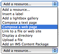
Compose a Web Page Screen Shot

Creating web pages makes elegant Moodle site design easy.

It is easy to overlook  the “Compose a web page” resource tool, especially when one is first using Moodle. But if you are revamping a course, this resource choice is worth serious consideration. Composing Moodle web pages provides instructors ample room to provide detailed directions for class activities without adding unnecessary sprawl to the front page of your course site. I will use some examples from a recent consult I had with Molly Shanley.

Molly wanted to meet because she had taught a course Poli Sci 278 before, using Blackboard. She was now getting ready to build her site in Moodle and wanted tips for building sites for Moodle courses that met biweekly. She had a syllabus that was 90% complete. I decided I would try and sell her on the idea of using Moodle web pages to help structure her course.

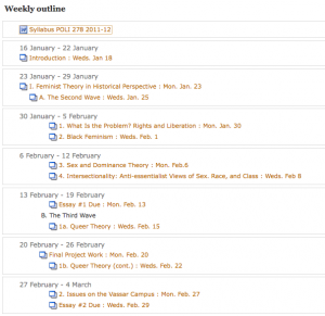
We built a few of the first class meetings with a web page for each meeting. This really reduced front page sprawl, especially in regards to the some of the early class meetings, which contained comprehensive directions and details. We discussed how this approach allowed the main topics of the course to stay afloat at the top level of the site, becoming a sort of topical outline for the semester. Students would be able to easily discern the arc of the course, and to place the topic for each class within that arc. At the same time, the full details for readings and assignments could be accessed quickly and easily. We were happy with the results so we copied and pasted the syllabus outline and fleshed out the bulk of the course.

Outline for Part of the Course

Each Class Becomes a "Branch" of the Course Outline (Draft Syllabus)

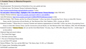
Here’s a sample “Moodle Web Page”, found by clicking on the corresponding link from the outline above:

Sample course meeting

Copying and Pasting Yielded Excellent Results

Since Molly had a well developed syllabus, it was a straightforward mechanical process to paste the details into a corresponding structure in her Moodle site. The front page of her Moodle site became an outline of the entire course. Each class meetings’ corresponding web page will contain detailed information about readings, activities and assignments. Building the design of your course into a corresponding visual and textual pattern in Moodle is excellent instructional design, facilitating the learning and teaching process.

Look forward to Part III where we’ll complete the Moodle site revamping process.

Share

Moodle Site Revamp in Three Easy Stages: Part 1 of 3

by Baynard Bailey

Moodle sites are living breathing documents that evolve as the semester progresses. When push comes to shove during the semester’s crunch, one thing shoved is often an effective course site design. Thankfully, the semester ends and the mess goes away. But when it comes time to teach that course again, it is a good opportunity to revamp that course site. What to do first? Where to start? I hope to walk readers through some of the major steps and processes that will facilitate an effective instructional re-design of a course site.

Currently at Vassar, we are working with Moodle version 1.9.7 so my instructions are tailored to that, but I hope that some of the broader strategies could be applied to any Learning Management System.

In order to provide the best advice possible, I decided I would actually help revamp a site. I reached out to my friend and colleague Karen Robertson and offered to assist her in redesigning her Moodle site for Women’s Studies 240: Constructing Gender. The site was a good candidate for revamping. Prior to last year, it had been team-taught, so Karen had inherited the site and had yet to really “move in”. Last spring’s site contained a wealth of great materials, but the organization could be altered to improve the presentation. Karen warmly received my idea and so we met last week.

Mini Zen Garden

Good Instructional Design Reduces Cognitive Load

I had the goal to design a neat site with a clean and uncluttered look and feel (and then to share the strategies employed in our ACS blog). Karen and I discussed why it was important to keep an uncluttered appearance to the front page of the Moodle site. She reminded me that our goal was to develop a clear and easy to use site in order to reduce labor and cognitive load.

Step 1: Back up your old materials.

Before we began, we backed up the old site. Additionally, we printed out a copy of the main page so we could have a visual map of the old site. We also printed out lists of readings in the file areas so Karen could go through them on her own.

Step 2: Take stock of your current materials. Delete duplicates and unnecessary items (first pass).

We went through the site week by week, deleting unused assignments and various items that had been used in the past but were unnecessary now. Bear in mind, we didn’t go through all of her readings, we just deleted the “low hanging fruit”.

Step 3: Choose a style of course design that fits your teaching style

This is a big step. Karen and I discussed the pros and cons of topics versus weeks (these are the two most commonly used settings in Moodle). Topics are great in that users can choose to have as many or as few topics as fit their curriculum. Weeks are useful in that the dates are auto-created and visually correspond right away to the semester’s calendar.  Karen pointed out that some topics are much longer than others, and that weeks often bridge topics. She emphasized the importance of making it absolutely clear to students what was expected each class.

On my end, I wanted to avoid Moodle “sprawl”. Every time you add a topic or a week, it adds a space to a course site. Sometimes faculty use the “Topics” setting, and then create a topic for each time the class meets or just about any other reason. To make matters worse, faculty often include extensive directions in labels right there on the front page of the site. The end result is a Moodle site that is about ten feet long, difficult to navigate, and a hindrance for faculty and students alike. To avoid “sprawl”, I showed Karen how we could put in extensive and precise directions as a “web page” resource for each topic. Since the directions were web pages, we could even include links to readings, assignments, activities, or anything else we had in Moodle.

Generally, faculty have an excellent sense of the arc of a course and a strong understanding of the intended learning goals for the semester. How well those concepts are communicated in Moodle is a mixture of teaching style and sometimes fluency with Moodle. I wanted to provide Karen a tool that would allow her to describe the arc of the course in a glance, but also allow flexibility and specificity in terms of readings and class activities as the semester evolved. The end result was a compromise between “topics” and “weeks”; we would use the “topics” setting, but provide specific directions and links for each class meeting.

I thought we were done there, as determining the arc of the course would require some deep thinking, but luckily, Karen had already done the deep thinking and quickly summed up the major topics of the course:

  • Feminism and Pop Culture
  • Secret Life of Commodities
  • Visual Pleasure: Hollywood and the Gaze
  • The Romantic Industrial Complex
  • Postermaking

Our next steps would include organizing the files area to best fit the instructional design. As part of our conversation, we had made a prototype topic for the first few classes.

Topic Prototype

Our Topic "Prototype" Keeps the Main Page Simple

I offered to continue to make placeholders for the rest of course. Karen would review the reading list in preparation for our next meeting. It had been a really productive consult with good feelings on both sides. I looked forward to our next meeting.

To be continued…

Share

Google Plus for Educators

by Steve Taylor

Google has “semi-released” a new service that many people consider to be a direct competitor to Facebook: “Google +”. Like Facebook– or Twitter, for that matter– it’s a social network, meaning that you identify other people that you’re interested in and you share information with them.

Nearly every college or university student uses Facebook, so it was natural for faculty and administrators to start exploring how they might take advantage of that to improve communications with students. But many found the idea of an instructor friending a student to be at best a little awkward and at worst, creepy. Part of the problem is that, in Facebook, a “friend” relationship is bi-directional: in order for a student to see her teacher’s postings, the teacher has to see hers. (That problem can be addressed with Groups and restriction settings, but creating those takes more effort than most people want to make.)

Circles

Google+ takes a somewhat different approach: relationships can be one-directional, more like following someone in Twitter. You create “circles” of acquaintances of different types: current friends, high school friends, family members,  co-workers, etc. and include different people in one or more of them. They’ll be notified that you added them to a circle, but they won’t know the name of that circle and they won’t be obligated to add you to any of theirs.

As an example, an instructor could create a circle that includes all of the students in English 101. He can share websites or comments with that circle, so that they appear in those students’ news feeds. But he doesn’t have to share his comments or pictures from last night’s barbecue with that circle. And if none of them add the instructor to any of their circles, he’ll never see anything they post. Of course, if they also make “English 101” circles with the same members, they can share things that are appropriate for that group.

Students could also create temporary circles for chatting and sharing materials among a project group. (As could faculty researchers.)

Hangouts

“Hangout” is the Google+ name for a video chat. At the moment, this is probably the slickest way for a group of people to do video chatting. It’s very easy to do, can accommodate up to ten people at a time, and it’s free. Though you can schedule hangouts, Google thinks of them as being spontaneous– like if you’re hanging out in the college center and friends bump into you and hang out for a while. But an instructor could use the hangout feature for online office hours or for holding study sessions. Or for collaborating with research colleagues. Or for interviews.
There are other features too, but circles and hangouts seem to be the most intriguing ones for educational use. As of this writing, Google+ is in pre-release, which is to say that it’s available to people who know someone who knows someone, but it should be generally available soon.

Share

Open Data & Tools for Information Visualization

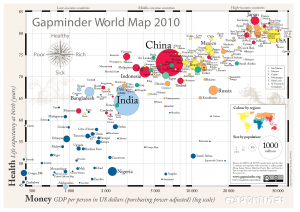
Gapminder World Map 2010

by Cristián Opazo

In a previous post we examined the broad field of data visualization, ranging from the ubiquitous charts and graphs to be found on every news site to the sophisticated instances of visualization of experimental data at the frontier of research in the natural sciences. In this post, I intend to offer a sample of the most relevant and useful data sources and visualization tools available on the web, with a particular emphasis on those with potential impact in higher education.

Before there were data visualization tools, of course, there was data. One of the most important consequences of the profound impact of the internet on our culture has been the ever-increasing promotion and acceptance of initiatives of open access to human knowledge. This translates, among other things, into a wealth of open data repositories readily available for usage, like the World Bank Data site, the databases from the Organization for Economic Co-operation and Development (OECD), and projects by the Open Knowledge Foundation. Ever since making its way into the White House in 2009, the Obama administration has been true to its campaign promises of making public data available through a series of online portals, such as data.gov, usa.gov, and USAspending.gov, which offer a variety of demographic, financial and social data sets alongside useful visualization tools. (As an aside, we recently learned with horror that the existence of these sites could be threatened by the compromises reached during the approval of the latest U.S. federal budget.) The data.gov site features a series of educational projects in K-12 and higher ed for students to learn about government data, how to use it, and help create the tools that enable others to do so. On USAspending.gov, interested citizens can find out information about how their tax dollars are spent and get a broad picture of the federal spending processes. You can view and compare, for instance, the relative spending of every government agency at a glance.

Having open data repositories as well as open architectures for the development of appropriate tools for analysis and visualization of these data is crucial for an informed, educated society. Here’s an inspiring 5-minute talk by Tim Berners-Lee, inventor of the world wide web, about the relevance of this issue.

News organizations around the world have also made efforts not only to make publicly available data accessible to readers, but also provide interactive tools for easy analysis and visualization. The British paper The Guardian has been a leader in this regard through its Data Store site. They have collected, curated and made available global development data from sources that include the United Nations, the World Bank, and the International Monetary Fund (IMF). Here is a sample search for world literacy rates using the Data Store analysis tools. Furthermore, The Guardian’s Open Platform initiative allows developers to create custom applications through its open API. The site has been also successful in crowdsourcing a number of large data analysis efforts including sifting through Sarah Palin’s recently released email archive.

Wikileaks world map of embassy cables. Illustration by Finbarr Sheehy for the Guardian (Nov. 29, 2010)

A number of tools now allow us to analyze, visualize, publish and share our own data, allowing us to become active participants of this new paradigm of open knowledge. Sites like Gapminder.org, created by the great Hans Rosling have acquired well-deserved attention because of their ability to make instant sense of otherwise impenetrable mountains of data. The Gapmider World application allows to interactively pick and choose world data about wealth and health indicators and dynamically visualize it through the years. Similarly, the interactive portal visualizing.org is “a community of creative people working to make sense of complex issues through data and design.”

Another site worth experimenting with is Many Eyes, by IBM Research, which also provides you with the ability of contributing your own data and creating visualizations such as word trees and tag clouds, charts and maps. In traditional Google fashion, Google Fusion Tables provide an open application that makes it possible to host, manage, collaborate on, visualize, and publish data tables online. Finally (if you haven’t had enough already), this blog post by Vitaly Friedman, author and editor-in-chief of Smashing Magazine, feature a series of  interesting approaches to data visualization.

Enjoy, explore, and contribute!

Share

Knowing What You Don’t Know

by Steve Taylor

One of the findings of research into learning and student behavior is that many under-performing students are over-confident in their mastery of their material. Over-confidence leads to inadequate studying. One remedy is to provide students with frequent opportunities for assessment. These opportunities don’t have to be in the form of time-consuming exams. They can be quick, ungraded assessments, whose only goals are to let students know if they really know what they think they know. If you’re worried that adding frequent assessments will eat away at your class time and add to your own workload, you may find some relief in technology. Here are two techniques.


Moodle Quizzes
One way is to create short, ungraded, auto-corrected quizzes in Moodle (or whatever Learning Management System you use.) Since students can take them out of class, they won’t affect your in-class time. And if they’re multiple-choice, or some other objective-answer format, you can designate the right answer so that Moodle can tell the student how well he or she did. Keeping them ungraded removes any temptation for the student to cheat. This is important, because the assessment has to be genuine— devoid of any self-delusion— in order to be effective. It also means that you don’t have to worry about honesty issues.

Not many Vassar instructors make use of Moodle-based quizzes. That may be partly due to the fact that they take some effort to create, but also to the fact that a multiple-choice quiz may not seem to be a valid measure to base a grade on. But it may be just valid enough to make students re-think whether or not they’ve studied enough.


Clickers
Another way to conduct a quick, ungraded quiz is to do it in class, with clickers. Clickers (known more formally as Audience Response Systems) are small, handheld devices that each student in a class can use to instantly submit an answer to a multiple-choice question. In most cases, their use is anonymous. They may take up no extra time in your class, because you probably already do frequent comprehension checks in class, by asking “Is that clear? Does everyone understand that? Can we move on?” The problem with that method is that most people will mumble assent, whether they understand the material or not. Who wants to be the one person in class who says that they don’t get it?

One student may not want to admit that he doesn’t understand the material; another may think she understands it, but be wrong. A quick quiz will address both problems. And besides letting students know where they stand, it may also let you know if you need to spend more time on the topic or if you can move on.

A clicker system will display your question on the projection screen, collect everyone’s silent, anonymous answers, then display the results as a graph. The results may be surprising to everyone.

ACS has a set of clickers that can be borrowed as needed.

Share

Don’t Assume Too Much: Teaching the ‘Digital Natives’

by Baynard Bailey

In Academic Computing Services, we supervise a number of students that are truly experts in multimedia production in a variety of forms. They continually wow us with their outstanding project work. The students create remarkable multimedia in a variety of forms (video, web sites, sound projects etc.). Based on these wonderful projects, it would be easy for us to believe that all college students possess this remarkable level of digital fluency. Faculty that have also been ‘wowed’ by student digital projects could be lured to into making this assumption as well.

According to the British Journal of Education Technology article, The ‘digital natives’ debate: A critical review of the evidence, despite students’ nearly 100% fluency in email, word processing and web surfing, “only a minority of the (students 21%) were engaged in creating their own content and multimedia for the Web, and that a significant proportion of students had lower level skills than might be expected of digital natives.” My experience working with Vassar students confirms this conclusion. Despite being very facile with computers, most students need guidance and support when it gets to the nitty-gritty of multimedia production, whether it is video editing or posting to WordPress.

[media id=1 width=400 height=300]

Alex Levy's ability to create beautiful video is the exception, not the norm.

If an assignment for class requires students to create some kind of media that isn’t a standard part of the course (like a podcast, movie, poster, website or digital story), arrange for mandatory skills training for the students. I’ve witnessed the best results when the workshops are scheduled as part of class time. In a pinch, arrangements can be made for something outside of class, though I’d encourage making it required. My experience is that if something is optional for students, they will opt not to come (and regret it later). In general, the students  have a tendency to overestimate their own digital production abilities, and then find themselves ‘stuck’ later on (e.g. two weeks after the workshop) when support is not available. At the very least, students should be put in contact with someone who can provide one-on-one help. Providing skill training as part of the curriculum will empower all students to have their best chances for success.

Share

Back Channels in the Classroom

By Matthew Slaats

There has been an ongoing conversation taking place here at Vassar College, about the role of the computer in the classroom. At a time when technology seems ubiquitous, there are still very strong opinions on the pros and cons of students using laptops in class. These range from those focused on the “chalk and talk” method to having highly digital classrooms. To me this is not a discussion of right or wrong, but a question of appropriateness, especially when trying to create an atmosphere of engaged learning.

One place where I feel that digital technology can make a major impact is the large lecture hall. Typically, these spaces are about the transmission of information from faculty to student. The relationship is directional, emanating from the lectern or chalkboard to the eyes and ears of students. At an early stage in a college career, this is a vital transaction, providing a foundation for the years to come. The lecture hall is a standard on every campus and will continue to be for many years. Concerns arise, however, as the computer begins to invade this space, allowing students’ minds to wander to their ever-growing social network. So, what can be done to maintain focus and build on the possibilities of the information being provided?

One idea that I’ve been thinking about for several years is the “back channel.” No, I’m not going to talk about some grimy alleyway to place misbehaving students in. What I would like to consider is a virtual space, organized and developed by students, that allows them to engage in conversation, ask questions, and bring their own perspective to what had been a one-sided conversation. This online space would allow for the class presentation to be viewed alongside other modes of communication. After a cursory review, an instructor might then bring some of these topics into the conversation when meeting with smaller groups. There are also significant possibilities for those students who are just a bit too shy to raise their hands.

With Powerpoint and Adobe Connect developing webcasting capabilities, this idea is already a possibility. A recent New York Times article discussed options and identified initiatives at several universities to create just such a space.

No matter which side of the conversation you fall on, may it be chalkboard or webboard, the important thing is to find modes of teaching that allow students to engage. It is about making the information meaningful, not just for meaning’s sake, but in such a way that the student can make it a part of their own personal experience. Providing modes of response accomplishes this objective.

Share

The 2011 Teaching with Technology Forum

by Steve Taylor

On April 7, Academic Computing Services (ACS) hosted its 9th annual Teaching with Technology Forum. The forum features a keynote address, given this year by Prof. Lisa Paravisini, on the topic “Teaching with Blogs: Going from the Source to Cyberspace.”

Twelve faculty members and two Computing & Information Services members presented posters and made themselves available to explain technology projects that they had undertaken over the past year. Here’s an overview of those presentations:

“Native Narratives in Archaeology: a Tumblr Blog”
Students in Sara Gonzalez’ class created blogs and made archaeology-based postings about Native North American culture. Tumblr.com was used to collect the separate blogs into an organized whole.

“Blogging About Semiotics in WordPress”
Students in Saúl Mercado’s Semiotics course use a blog to apply theories to contemporary linguistic and multi-media objects. Their postings have explored intermedial art, fictional language, the evolution of language, the semiotics of gesture, the language of robots, as well as sports and advertising.

“Off the Wall: The Frances Lehman Loeb Center Blog”
Nicole Roylance, Coordinator of Public Education and Information at the Lehman Loeb Art Center, maintains a very active blog site about exhibits and events in the Center.

“Developing an Online Multimedia Database of the Vassar College Costume Collection”
Arden Kirkland has been developing online materials for exploring and learning about Vassar’s historic costume collection. She has begun using the new, web-based “Omeka” system to organize data, photos, 3D representations, etc. , as well as a blog in which student participants share their experiences with the collection.

“The Queer of Color Glossary Project”
Hiram Perez’ course “Queer of Color Critique,” explores issues of race and sexuality. He and Sean Wehle (2013) created the Queer of Color Glossary, a blog site intended “to house a growing discussion of queer of color terms, theories, practices, activism, and art.”

“High Performance Computing for the Sciences”
Marc Smith and Jodi Schwarz co-taught a bioinformatics course, which included both Computer Science and Biology majors. The two groups learned to work together to develop software for analyzing biological data.

“VAST Stories in WordPress”
Erin McCloskey’s students work with local middle school students via the Vassar After-School Program. She created a blog site, both to share the children’s work with friends and family and to develop the Vassar students’ ability to write for a broad audience.

“Viva and Bacteris: Blogging About the Small Stuff”
David Esteban maintains two blogs— one about viruses and one about bacteria— and he expects students in all of his classes to write entries as guest bloggers. They choose a recent study from the primary literature and write a brief description. The target audience is the general public, so the students— including freshmen— must describe the work in an accessible and interesting way.

“Memory Across Generations: an Oral History Project About Holocaust Memory”
Students in Silke von der Emde,’s course, “Memory Across Generations,” collected oral history materials concerning the Holocaust. They conducted face-to-face interviews with two Vassar alumni/ae in NYC using digital recording devices, Skype interviews with more remote alumnae/i, and one in-class videoconference with Marvin Chomsky in Austria. They used a blog to collect all of the information and results.

“Vassar Campus Sound Map”
Students in Tom Porcello’s Media Studies course on Sound explored the use of immersive audio representations of spaces, called soundscapes. Nick Inzucchi (2011) created a 3D, interactive, virtual environment, using 15 simultaneous sound recordings from a campus space.

“Learning in Lynda.com’s Online Training Library”
Chad Fust, of CIS, provided information about Lynda.com, the broad set of online training materials on technology subjects, now available to college constituents.

“Blogging the Chester Cycle”
Dorothy Kim and her students performed a play from the 16th-century Chester Cycle, in Toronto. They used a blog site to document their rehearsals and preparations and to provide related material to the community.

“The Faculty Lounge Network: Online Campus Tools for the Vassar Community”
Students in Tobias Armborst’s Architectural Design course were tasked with addressing the spatial aspect of the issue of encouraging a feeling of community among the faculty. John McCartin (2011) and William Mann (2012) responded by organizing a directory of available faculty lounge spaces on campus an facilitating a way for faculty members to reserve and cater those spaces. They created an attractive brochure and The Lounge Explorer, an interactive website with which faculty members could explore the available spaces.

“eBook readers: iPad 2 vs. Kindle”
John Collier, of CIS, demonstrated and compared the most recent models of iPad and Kindle, with particular regard to their use as e-readers.

Share

Presenting the Image – Powerpoint, Keynote & Prezi

by Matthew Slaats

Certain software programs tend to dominate the conversation at times, leading most to fall in line because of their pervasive nature.  No software has held court so long as Powerpoint, the industry standard when it comes to creating a presentation. The software’s format and interface so easily combined our conceptions of word processing and the analog nature of the 35mm slide, that no other choice seemed to make sense.  This ubiquity, though, is not without problems.  With the desire to integrate various forms of media growing, Microsoft has tended to be a bit slow in their response. I picture all of those who want to integrate web-based video into their presentation, but are constantly reminded that it can only be done on the PC version of the software.  Then there is the draconian method for developing movement within a slide (how many steps will that take?) and the horrible templates they provide for the slides.  My blood begins to boil every time I attend a conference and see bullets. Now we shouldn’t demonize Powerpoint in such a way. It is just a tool, and one that has served us well throughout its life.  But what alternatives are out there?  Is there anything?

One dilemma that I’ve seen boil up in the last several years has focused on a conversation that pits Keynote vs. Powerpoint. Apple’s version of a presentation software provides a much more flexible framework for developing material.  The main benefit of Keynote is its ease of use.  All or most of the functionality of the software is readily accessible and not hidden within a series of menus.  It provides a variety of ways for getting media into a slide and it  allows you to manipulate that information in a multitude of ways.  From easily creating animated movements that direct attention across a single slide to the ability to mask certain parts of an image, Keynote’s adaptivity is an expression of what Apple is known so well for producing. Beyond this, the software easily translates a Powerpoint file directly into Keynote and works in pixels instead of inches, which is a positive for those working with images.  If you are a Mac user, you have in Keynote an alternative to Powerpoint. The question resides in how motivated you are to make a transition from the one standard to another.

Here is a video that describes how to create an animation in Keynote.

http://www.youtube.com/watch?v=jsGOL9iKMtg

So you might ask if there is anything else out there that might be an option?  Yes there is and it is one of the more exciting options to come around in a long time.  Prezi is both a web- and desktop-based application that turns the tables on how a presentation can be constructed.  You are no longer confined to the slide, a 20th century format.  Instead, you have a wide open space upon which text, images, videos from Youtube, and a whole range of other media can be displayed.   Having such a blank canvas can be a bit daunting and requires a bit of creative skill, but the platform allows the user to move, rotate and scale information quite easily.  The other major difference is the ability to zoom in and out of the presentation, which allows elements to be revealed and placed into broader contexts in unique ways.  Beyond that, Prezi is primarily a web-based application.  This is something both Keynote and Powerpoint have been playing with in recent upgrades, but haven’t been as successful in achieving.  What is nice about this opportunity is that there is no need to carry a file around on a device that could be lost.  Your presentation is uploaded to the web and you can access it from any computer.  You no longer have to worry about compatibility because you are working with a PC or Mac. Here is a great video showing Prezi in action. (Click the arrow at each step of the presentation)

So, you now have to make a decision.  Do you stay with the standard or delve into something new?   I say give these other alternatives a try.  Know about them and how you might be able to use them to your advantage.  Though with the changes that have been taking place in this area,  I’m sure there will definitely be something new just around the corner.

Share

Math on the web

by Cristián Opazo

Since its inception, the World Wide Web has gradually evolved in order to accommodate user’s needs, particularly in regards to input and output of text and images. What started as very rudimentary displays based on the ASCII character set, has now become expanded, standardized systems like Unicode, HTML4 (and hopefully soon HTML5), CSS and all other web standards in use today. But what about the most universal of human languages, mathematics? The evidence tells us that the ability to display mathematical expressions on the web has evolved very slowly, and is very far from reaching a point of widespread adoption, which is somewhat surprising considering the great amounts of potential users around the world.

Even though a standard for math on the web, MathML, has existed since 1998, with its latest version MathML 3.0 adopted very recently, it is a tool with remarkably little use on the web. There are many reasons for this: the reluctance of users to learn a new coding language from scratch, the availability of “user-friendly” tools like MathType and Microsoft Equation Editor (now bundled into Office 2010), but particularly the widespread, cult-like use of TeX and LaTeX, the gold-standard of typesetting systems, which has been adopted by academics, scientists (and more importantly, publishers) since its development in the late 1970’s. As you may have experienced, the divide between those who are willing to publish some math (that may not look perfect but was generated with little effort), and those whose mathematical expressions must look nothing-less-than-perfect (no matter the effort), is enormous; the first camp prefers limited (but easy-to-use) equation editors, whereas the other favors TeX or LaTeX, and publish math online by rendering their documents into PDFs, in a way avoiding the web altogether.

So, in order to do the right thing we all should learn MathML, right? Wrong. The same way that most of us who publish web content on a regular basis (through blogs, Facebook, Twitter, etc.) do not type HTML code from scratch, there are many ways to generate MathML code from other sources. Here’s a nice list of software tools that will allow you to render (or convert) your math expressions into MathML. Just keep in mind that, in order to be able to display MathML code natively (i.e. without a special plug-in), you must use a good web browser (i.e. one that cares about open standards). Until recently, everybody’s favorite Firefox was the only browser that supported MathML natively, but since August, 2010, Safari and Google Chrome also do. (Perhaps unsurprisingly, Internet Explorer does not support MathML natively -only through the third-party plug-in MathPlayer.)

Now, how can we generate beautiful math expressions in WordPress sites— like this one? Sure, you could reconfigure your WordPress server by hacking into the the PHP, but there are easier ways. Since WordPress is an open-source application, developers are continuously creating new functionality for it: here’s the latest list of all LaTeX plugins for WordPress. We’ve only tried a few of these, but the main difference between them is the fact that most generate math expressions as graphics (GIFs or PNGs), whereas only a few of them generate proper MathML code. (Also, in some cases, the code compilation and rendering of images occurs locally, whereas in other cases, it happens remotely, which is a relevant point to discuss with your systems administrator.)

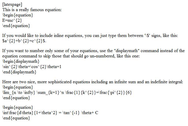
Here at Vassar, we have just installed the QuickLaTeX plug-in and are very happy with its performance— if what you want to do is typing or copy/pasting your good ‘ol LaTeX commands. All you need to do is to start your post with the expression “latexpage” (between square brackets), and then enter your LaTeX code below.

Here’s an example:

This is a really famous equation:

(1)   \begin{equation*} E=mc^{2} \end{equation*}

If you would like to include inline equations, you can just type them between ‘$’ signs, like this: a^{2}+b^{2}=c^{2}.

If you want to number only some of your equations, use the displaymath command instead of the equation command to skip those that should go un-numbered, like this one:

    \begin{displaymath} \sin^{2}\theta+\cos^{2}\theta=1 \end{displaymath}

Here are two nice, more sophisticated equations featuring an infinite sum and an indefinite integral:

(2)   \begin{equation*} \lim_{n \to \infty} \sum_{k=1}^n \frac{1}{k^{2}}=\frac{\pi^{2}}{6} \end{equation*}

(3)   \begin{equation*} \int\frac{d\theta}{1+\theta^2} = \tan^{-1} \theta+ C \end{equation*}

As you can see, the equations are rendered as PNG image files (sure, it’s not MathML, but it’s the next best thing.) Here’s the code that generates the expressions above:

QuickLaTeX can also render graphics on the fly through the pgfplots package. Here’s an example:

Rendered by QuickLaTeX.com

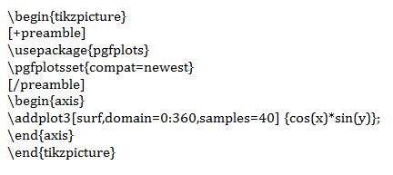
Here’s the code that generated the 3-D plot above:

Here’s a quick start guide to QuickLaTeX, featuring some neat examples.

As you can see from the results above, this plugin is already available on our WordPress production system. Please let us know what you think!

Share