ACS Collaborates with ART 386 students and faculty on “first-of-its-kind exhibition.”

Amitabha Buddha, Central Tibet, 19th century; pigment on cloth; 38 1/2 x 25 1/2 in.; The Rubin Museum of Art, New York, F1997.6.3.

Amitabha Buddha, Central Tibet, 19th century; pigment on cloth; 38 1/2 x 25 1/2 in.; The Rubin Museum of Art, New York, F1997.6.3.

ART 386,  Embodying Compassion in Buddhist Art: A Curatorial Training Seminar was taught by Karen Lucic during Fall semester, 2014. The purpose of the class was to give students the opportunity to research and curate an exhibition at the Frances Lehman Loeb Art Center. During the summer of 2014, Professor Lucic contacted me to discuss creating a website for her students to use as a repository for their research and eventually this site would become a companion site to the final exhibition in April, 2015. Over the course of the Fall semester, students wrote and compiled content for the site and they worked closely with ACS to design and populate the site.

From ART 386 Syllabus:

Each student will be responsible for the digital content and interpretation of 2-3 works in the exhibition. The instructor will assign the objects to each student, based on her/his experience and preparation. These student contributions will be posted on the exhibition application and/or website. (60% of grade.)

Students will work in teams to produce additional resources for the exhibition: gallery guide, interactive maps, guide to web resources, etc. Students in the team will also give feedback on other team members’ work before submission (20% of grade.)

From ART 386 Assignment Sheet:

The purpose of this assignment is to create digital educational content for the exhibition. Always remember who your audience is: visitors to the exhibition, or online users, who might not know much—or anything—about the topic. What you write, and your choice of materials should be based on your assessment of what will enhance their experience and understanding of the exhibition. Texts should be concise and to the point. Other materials should be short but engaging.

For each work you have been assigned:

1) Write an interpretative text (no more than 100 words) for app/website

2) Select one comparative image (must be open access and high resolution); include full caption of comparative image

3) Write a text (no more than 100 words) explaining the comparison

4) Select an audio file, if possible, that enhances the work (no more than two minutes). Examples: chanting, singing, mantra recitation, etc.

5) Select a video file, if possible, that enhances understanding of the work (no more than 2 minutes). Examples: practitioners circumambulating, prostrating, spinning prayer wheels, making sand mandalas, offering incense, etc.

6) If there are no appropriate audio or video files, choose another comparative image.

7) Compile a list of unfamiliar terms from your texts, with definitions

8) Map your work, at least by country. With some works (Putuoshan, Nachi, etc.), it may be possible to be more precise about locations.

9) Record your written contributions.

While students were working to create the content for the site, ACS student employee Bryce Daniel worked on building a wireframe for the WordPress site. Professor Lucic also collaborated with Duke University students to design an App for the exhibition. The App hosted audio files recored and edited by ACS Consultant, Baynard Bailey. These recordings, narrated by both students and Professor Lucic, include short commentaries describing individual pieces in the exhibit, as well as a pronunciation guide for a glossary of terms.

The Embodying Compassion WordPress site is a comprehensive online exhibit reference guide, containing audio, video, images, interactive hotspot maps, and extensive research, curated by ART 386 students. This project proved to be a excellent example of how students, faculty, and ACS consultants collaborate to produce educational materials for the classroom and public audience.


Links:

Embodying Compassion Website

The Frances Lehman Loeb Art  Center: Embodying Compassion is a first-of-its-kind exhibition celebrating one of the most important figures in Buddhist art, April 23-June 28, 2015

Get the App


Share

Add Panning Motion to Keynote Presentations, and Annotate Screenshots

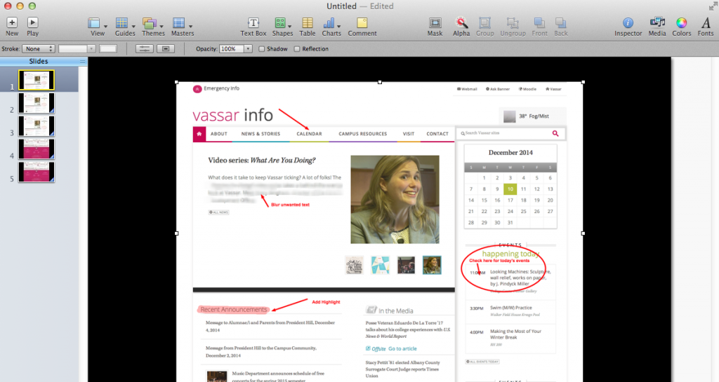
Keynote provides many tools for animating content of your slide presentation. One easy and very useful movement uses the Magic Move transition.  This tool allows a panning movement across a large image. For example, if you wanted to show the entire length of a webpage or a large photograph, you could use the Magic Move transition to move across the page. This will work with any object that is in one position in the first slide and is in a new position in the following slide. For this this example, I captured a screenshot of an entire webpage that would require scrolling down in order to view all the content. In the first slide, the image is positioned on the slide so that the top of the webpage is visible. In the following slide, the image is positioned so that the bottom of the webpage is visible. Using the Magic Move transition, Keynote will create the panning movement between the two slides.

This is what it would look like:


Steps:
Import image into Keynote slide by dragging and dropping it onto a blank slide.
Screen Shot 2014-12-10 at 3.39.56 PM

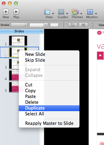
Duplicate the slide. To duplicate a slide in Keynote, right-click on the slide you wish to copy, or select Duplicate Slide from the Edit Menu.

Screen Shot 2014-12-10 at 3.40.41 PM

On the new (duplicate) slide position the image so that the bottom portion is visible.

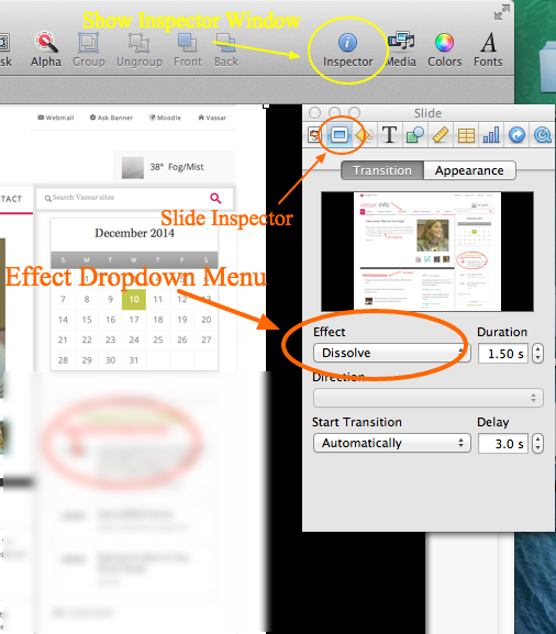
Open the Slide Inspector window.

Click on the slide inspector icon then choose the transition tab.

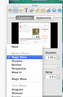
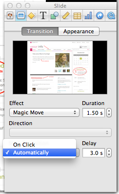
Under the Effect dropdown menu, choose Magic Move.

screen shot edit pm2

Screen Shot 2014-12-10 at 3.54.43 PM

At the bottom of the inspector menu you will have the option for the transition to start automatically or “on click.”

You will also be able to choose the speed of the transition and whether or not to insert a delay before the start of the effect.

Screen Shot 2014-12-10 at 5.06.08 PM

Tip for Annotating Screenshots:
For this example, I used a free application called Awesome Screenshot.”
It is available for Chrome and Firefox browsers, and it allows you to capture an entire webpage, or any portion of a page. It also provides tools for annotating screenshots.

http://awesomescreenshot.com

Here’s a quick tutorial:


Share

Publishing a Google Presentation in Moodle

by Amy Laughlin

Upload a PowerPoint or Keynote slideshow to Google drive and embed it in your Moodle site, and any changes you make to your presentation will be immediately reflected on your Moodle site. Your students will be able to view the presentation directly from within Moodle.

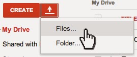
Click the upload arrow in your Google Drive and then choose Files

Upload-Files

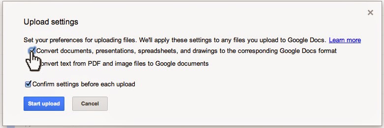
Make sure conversion is turned on:

Upload-Settings-Convert

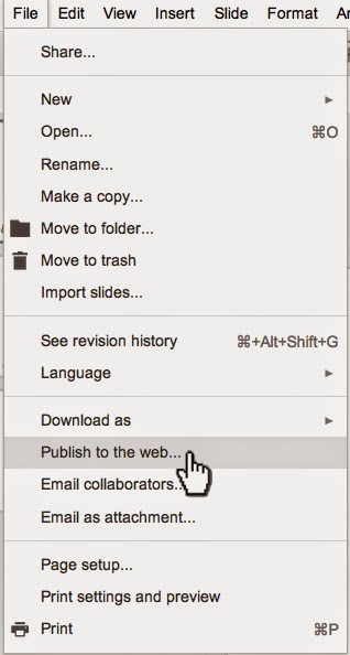
Once your presentation is uploaded, open it in your Google drive and click File > Publish to the Web.

File-Publish-to-the-Web

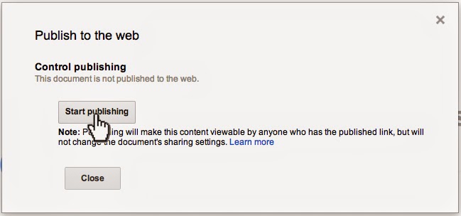
Then choose > Start publishing

Publish-to-the-Web

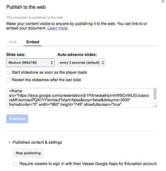
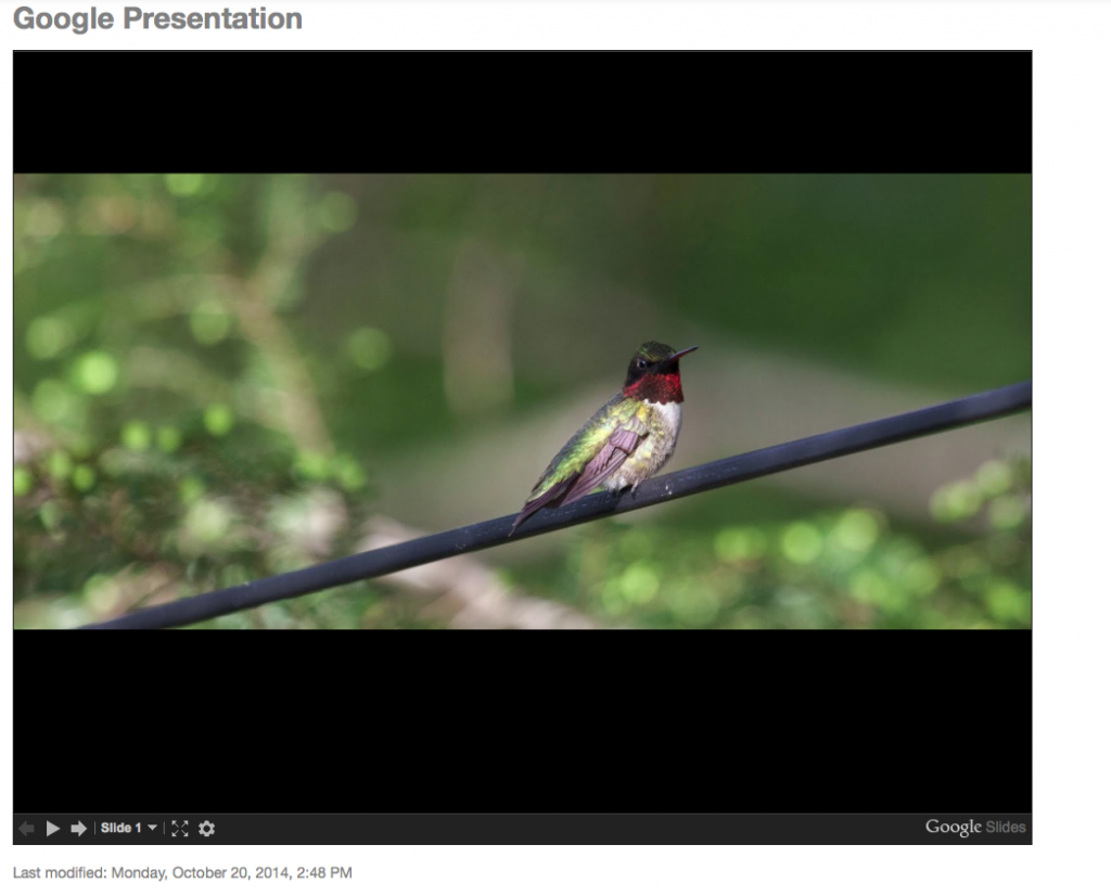
You will then see a dialog box that allows you to choose the size of your presentation and whether to Link or Embed. Choose the Embed tab, and copy the iframe source code.

Screen Shot 2014-10-20 at 2.33.16 PM

Now return to your Moodle site, turn editing on, and click on > Add an activity or resource.

Screen Shot 2014-10-20 at 2.41.48 PM

Choose > Add Page

Screen Shot 2014-10-20 at 2.42.28 PM

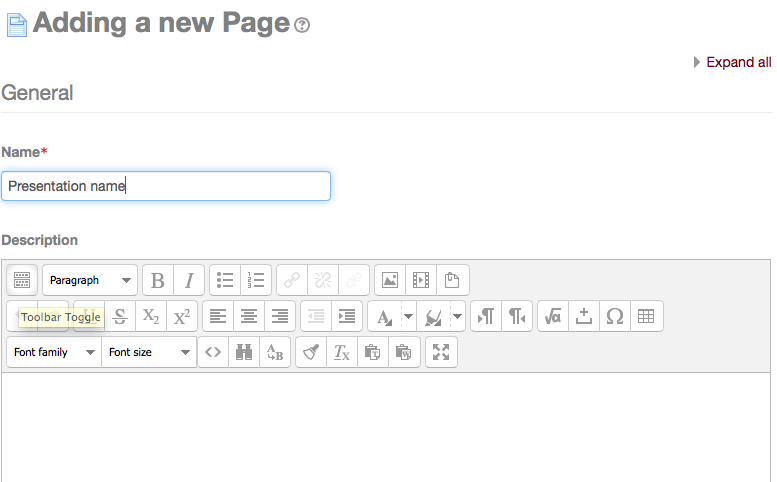
Add the name and description of your presentation. Make sure the toolbar toggle is turned on to reveal all the toolbar options. The toolbar toggle button is the first button in the upper left corner of the toolbar.

Screen Shot 2014-10-20 at 2.44.03 PM

Scroll down to the Content section (below the page description).

Screen Shot 2014-10-20 at 2.56.52 PM

Click on the edit HTML source button (<>).

Screen Shot 2014-10-20 at 2.44.15 PM

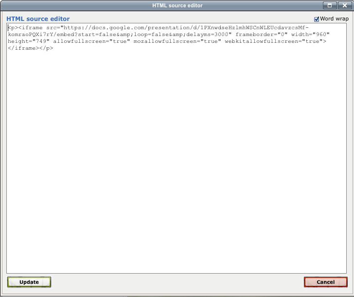
Paste in the Embed code that you copied from the Google Presentation Publishing page, then choose Update, to save.

Screen Shot 2014-10-20 at 3.04.04 PM

Click either the “Save and Return to Course” or “Save and Display” button at the bottom of the screen.

Your Google Presentation is now live and published to your Moodle site. You can edit and update your slideshow from your Google Drive and your changes will automatically be reflected in your Moodle site. Note that you may need to refresh your browser page in order to see the slideshow.

From your course page in Moodle, your presentation will appear like this:

Screen Shot 2014-10-20 at 3.12.14 PM

When your students click on the presentation file, a new Moodle screen will open displaying the slideshow:

Screen Shot 2014-10-20 at 3.12.35 PM

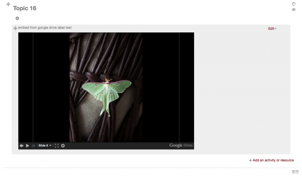
You may also embed your presentation as a Label instead of a Page in Moodle. When adding and Activity or Resource, choose Label instead of Page (all other steps remain the same), and your slideshow will be immediately visible from a section on your course page.

Screen Shot 2014-10-20 at 3.13.15 PM

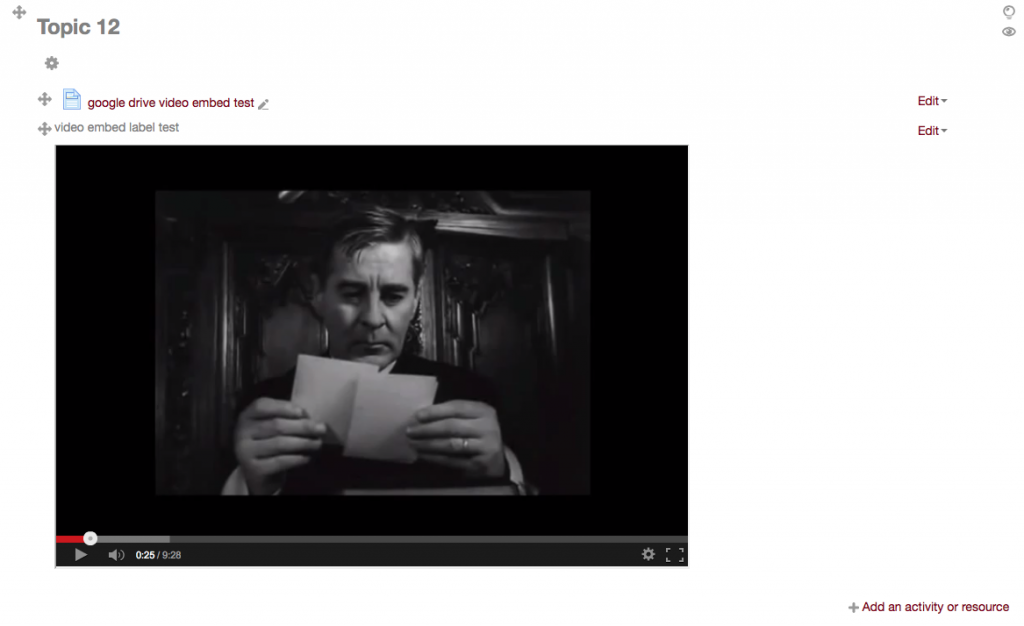
 Works with video too.

If you want to embed video that is stored on your Google Drive you can copy the iframe code from the Google Drive Viewer. This is a great option if your video is not posted on YouTube or Vimeo.

Screen Shot 2014-10-21 at 12.42.30 PM

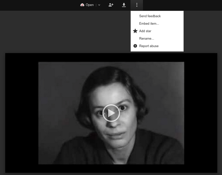
After uploading your video to Google Drive, select it and choose Open with > Google Drive Viewer, from the More drop-down menu. Once the video is open in Google Drive Viewer, click on the three vertical dots on the top menu, then choose Embed item.

Screen Shot 2014-10-21 at 12.33.09 PM


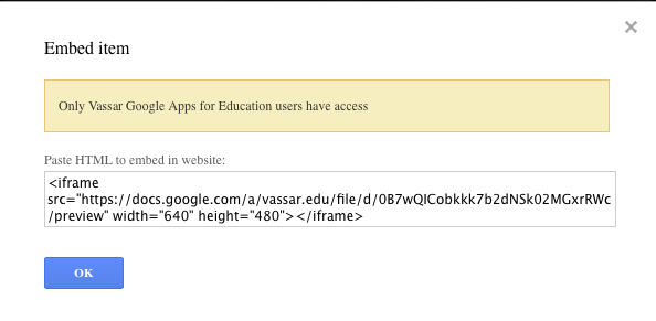
This screen will appear:

Screen Shot 2014-10-21 at 12.33.43 PM

Copy the embed code into a page or label using the HTML editor button in your Moodle site, following the same procedure as described above, to embed a slideshow presentation.

The resulting video will look like this in you Moodle site:

Screen Shot 2014-10-21 at 12.31.48 PM

If you embed the video into a Moodle page then you will see the page icon. When clicked, it will open a separate window for viewing the video. If you embed the iframe code into a Moodle label you will see the video embedded in your course front page.


Share

Creating Interactive PDFs using Adobe InDesign

IndesignScreenShot

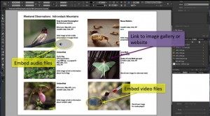
Using InDesign to create interactive PDFs

The term “interactive PDF” refers to a PDF file designed to be viewed on screen. Interactive PDF features are the parts of a PDF that provide your audience with additional functions that are more commonly found in websites. Some of these features include buttons, hyperlinks, rollover states, embedded sound, and video, among others.

Designing an interactive PDF might be advantageous when you want to create an interactive experience for your reader but don’t necessarily want to place this content on a website. Using Adobe InDesign also allows for total creative control of your design, unlike most blog or webpage templates. Another advantage to creating an interactive PDF is that the file size is generally small and easily sent by email.

There are some disadvantages to this format though. To take advantage of the interactive features, your reader must view the file in Adobe Reader. If the file is opened in a web browser or other programs like Preview, the results are often unpredictable. Another drawback is that while InDesign is a powerful program, it takes some time to learn the design workflow. I have found Lynda.com tutorials to be very helpful in providing basic introductions for creating interactive PDFs.

Click here for Lynda tutorial

Recently, Vassar’s Art History Department chose to use the interactive PDF format to build study guides for Art 106. Students in this course are required to identify many works of art and architecture, but making these images available to students in a clear and concise manner has been a challenge for faculty. Interactive PDFs allow students to view a thumbnail image of each work, along with the corresponding metadata. When these thumbnails are clicked, they link to the Luna database that stores high-resolution, and detail views of each work. When the viewer scrolls over each thumbnail, the caption next to the image disappears. Scrolling on and off the image functions like using a flashcard, and is useful for self-quizzing. Even though this format is designed to be viewed on screen, it can easily be printed as well.

Here are links to two interactive PDfs that demonstrate several of the features mentioned in this post. For proper functionality, remember to view these documents in Adobe Reader.

Click here to view an example of the Art 106 interactive PDF.

Click here to view an example of other interactive PDF features.

Share