Prezi

by Steve Taylor

Prezi is a tool for creating presentations, just as Powerpoint and Keynote are, but with some interesting differences. Since its creation in 2009, it’s been seen more and more in conferences.

Metaphors
One way in which Prezi differs from earlier presentation tools is its metaphor. Both Powerpoint and Keynote use the metaphor of a series of individual slides that can be shown in a predetermined sequence, just as 35mm slides would be shown with a carousel projector.

In Prezi’s metaphor, the creator arranges materials on an infinitely large canvas and— as I think of it— uses a video camera to pan and zoom through those materials. That can be done on the fly or the creator can pre-record a series of pans and zooms. The resulting presentation maintains the spatial relationships among the various materials.

It’s On the Web
Although they can be downloaded, “Prezis” are assembled on the web, through your browser, and can be presented via your browser as well. They can be shared with the general public or with a select group of colleagues (or members of a class.) You can even collaborate with others on the creation of your Prezi, which makes it a great vehicle for group projects.

Good and Bad Uses
I’ve seen great uses of Prezi and uses that make no sense at all— unfortunately, quite a few of the latter. If your presentation materials consist of a series of bullet-point lists, quotations, graphics, etc. that have no particular spatial relationship to each other, then there’s no particular reason to lay them out side by side and pan from one to another. But if there are spatial relationships— such as in a complex chart, diagram or map— then Prezi may be the perfect tool.

Here are a few examples of great uses for Prezi. You can pan and zoom on your own, or click the Play button to step through a pre-recorded tour.

“Classification of Organisms,” created by Robert Kappus, will lead you systematically through a complex chart. The chart is circular, and the zoomed-in labels and graphics are aligned along radii of the circle, but that poses no problem, as the pre-recorded tour can not only pan and zoom, but rotate the view as well.
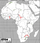
The “Physical Features of Africa Quiz” Prezi, created by Emily Thompson, will give you a tour through the major mountain ranges of Africa. Maps tend to be difficult things to project in a classroom, because the amount of detail means that labels often are too small to see from a distance. Prezi is a great vehicle for showing detailed maps, because of the extreme levels of zooming it can support.
One of my favorite uses of Prezi is to explore different details of a complex work of art. Here’s one that I created, providing a tour through some of the details of the painting Garden of Earthly Delights, by Hieronymus Bosch. An instructor can present a series of details from a work like this, without losing the context of each detail.
A number of people have realized that Prezi can be a good tool for creating a concept map— a diagram that shows relationships among various concepts. Here’s an example of a Globalization concept map, created by Dennis Carnduff.

Go to the Prezi website to explore other materials that various people have made public, to get more ideas on how it can be used.

Licensing
Prezi offers three levels of licensing:

  • Public, which is free, provides you with 100 MB of storage, but requires you to make your creations public.
  • Enjoy, which costs $59/year, provides 500 MB storage and allows you to make your creations private.
  • Pro, which costs $159/year, provides 2GB storage.

However, students and teachers— anyone with an “edu” email address— can get the Enjoy level of license for free.

Prezi U
The website also provides a gateway to “Prezi U,” a community of educators who share ideas about using Prezi in their teaching.


Share

Moodle Site Revamp in Three Easy Stages: Part 2 of 3 – Elegant Design Architecture

Building Elegant Instructional Design Architecture with Moodle Web Pages

by Baynard Bailey

In Part I of this series, I focused on the preliminary stages of revamping a Moodle site. The major steps included backing up your materials, culling unnecessary files, and choosing a course design that fits your teaching style (for most that means choosing a ‘topical’ or ‘weekly’ format). In this post, I hope to provide some tips to empower your Moodle site to enhance student understanding of the overall  arc and flow of the course.

Many of the Moodle sites I see suffer from ‘sprawl’ or ‘bloat’. The site starts out fine, but by the end of the semester, especially for courses that meet more than once a week, the length of the front page stretches on for screen after screen. Scrolling to the bottom of the page (the current week) can take a minute or more, and sifting through past weeks’ materials and activities is tedious. Why put up with this, when you can have an elegantly designed Moodle site that better reflects the structure and scope of your curriculum? Consider putting topics, class meetings or weeks into their own “web pages” within Moodle. The resulting front page of your Moodle site will be an elegant summary of the major topics of your course, easily navigable, and an aid to learning.

Compose a Web Page Screen Shot

Creating web pages makes elegant Moodle site design easy.

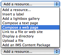
It is easy to overlook  the “Compose a web page” resource tool, especially when one is first using Moodle. But if you are revamping a course, this resource choice is worth serious consideration. Composing Moodle web pages provides instructors ample room to provide detailed directions for class activities without adding unnecessary sprawl to the front page of your course site. I will use some examples from a recent consult I had with Molly Shanley.

Molly wanted to meet because she had taught a course Poli Sci 278 before, using Blackboard. She was now getting ready to build her site in Moodle and wanted tips for building sites for Moodle courses that met biweekly. She had a syllabus that was 90% complete. I decided I would try and sell her on the idea of using Moodle web pages to help structure her course.

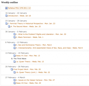
We built a few of the first class meetings with a web page for each meeting. This really reduced front page sprawl, especially in regards to the some of the early class meetings, which contained comprehensive directions and details. We discussed how this approach allowed the main topics of the course to stay afloat at the top level of the site, becoming a sort of topical outline for the semester. Students would be able to easily discern the arc of the course, and to place the topic for each class within that arc. At the same time, the full details for readings and assignments could be accessed quickly and easily. We were happy with the results so we copied and pasted the syllabus outline and fleshed out the bulk of the course.

Outline for Part of the Course

Each Class Becomes a "Branch" of the Course Outline (Draft Syllabus)

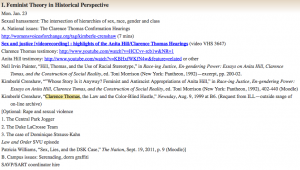
Here’s a sample “Moodle Web Page”, found by clicking on the corresponding link from the outline above:

Sample course meeting

Copying and Pasting Yielded Excellent Results

Since Molly had a well developed syllabus, it was a straightforward mechanical process to paste the details into a corresponding structure in her Moodle site. The front page of her Moodle site became an outline of the entire course. Each class meetings’ corresponding web page will contain detailed information about readings, activities and assignments. Building the design of your course into a corresponding visual and textual pattern in Moodle is excellent instructional design, facilitating the learning and teaching process.

Look forward to Part III where we’ll complete the Moodle site revamping process.

Share

Moodle Site Revamp in Three Easy Stages: Part 1 of 3

by Baynard Bailey

Moodle sites are living breathing documents that evolve as the semester progresses. When push comes to shove during the semester’s crunch, one thing shoved is often an effective course site design. Thankfully, the semester ends and the mess goes away. But when it comes time to teach that course again, it is a good opportunity to revamp that course site. What to do first? Where to start? I hope to walk readers through some of the major steps and processes that will facilitate an effective instructional re-design of a course site.

Currently at Vassar, we are working with Moodle version 1.9.7 so my instructions are tailored to that, but I hope that some of the broader strategies could be applied to any Learning Management System.

In order to provide the best advice possible, I decided I would actually help revamp a site. I reached out to my friend and colleague Karen Robertson and offered to assist her in redesigning her Moodle site for Women’s Studies 240: Constructing Gender. The site was a good candidate for revamping. Prior to last year, it had been team-taught, so Karen had inherited the site and had yet to really “move in”. Last spring’s site contained a wealth of great materials, but the organization could be altered to improve the presentation. Karen warmly received my idea and so we met last week.

Mini Zen Garden

Good Instructional Design Reduces Cognitive Load

I had the goal to design a neat site with a clean and uncluttered look and feel (and then to share the strategies employed in our ACS blog). Karen and I discussed why it was important to keep an uncluttered appearance to the front page of the Moodle site. She reminded me that our goal was to develop a clear and easy to use site in order to reduce labor and cognitive load.

Step 1: Back up your old materials.

Before we began, we backed up the old site. Additionally, we printed out a copy of the main page so we could have a visual map of the old site. We also printed out lists of readings in the file areas so Karen could go through them on her own.

Step 2: Take stock of your current materials. Delete duplicates and unnecessary items (first pass).

We went through the site week by week, deleting unused assignments and various items that had been used in the past but were unnecessary now. Bear in mind, we didn’t go through all of her readings, we just deleted the “low hanging fruit”.

Step 3: Choose a style of course design that fits your teaching style

This is a big step. Karen and I discussed the pros and cons of topics versus weeks (these are the two most commonly used settings in Moodle). Topics are great in that users can choose to have as many or as few topics as fit their curriculum. Weeks are useful in that the dates are auto-created and visually correspond right away to the semester’s calendar.  Karen pointed out that some topics are much longer than others, and that weeks often bridge topics. She emphasized the importance of making it absolutely clear to students what was expected each class.

On my end, I wanted to avoid Moodle “sprawl”. Every time you add a topic or a week, it adds a space to a course site. Sometimes faculty use the “Topics” setting, and then create a topic for each time the class meets or just about any other reason. To make matters worse, faculty often include extensive directions in labels right there on the front page of the site. The end result is a Moodle site that is about ten feet long, difficult to navigate, and a hindrance for faculty and students alike. To avoid “sprawl”, I showed Karen how we could put in extensive and precise directions as a “web page” resource for each topic. Since the directions were web pages, we could even include links to readings, assignments, activities, or anything else we had in Moodle.

Generally, faculty have an excellent sense of the arc of a course and a strong understanding of the intended learning goals for the semester. How well those concepts are communicated in Moodle is a mixture of teaching style and sometimes fluency with Moodle. I wanted to provide Karen a tool that would allow her to describe the arc of the course in a glance, but also allow flexibility and specificity in terms of readings and class activities as the semester evolved. The end result was a compromise between “topics” and “weeks”; we would use the “topics” setting, but provide specific directions and links for each class meeting.

I thought we were done there, as determining the arc of the course would require some deep thinking, but luckily, Karen had already done the deep thinking and quickly summed up the major topics of the course:

  • Feminism and Pop Culture
  • Secret Life of Commodities
  • Visual Pleasure: Hollywood and the Gaze
  • The Romantic Industrial Complex
  • Postermaking

Our next steps would include organizing the files area to best fit the instructional design. As part of our conversation, we had made a prototype topic for the first few classes.

Topic Prototype

Our Topic "Prototype" Keeps the Main Page Simple

I offered to continue to make placeholders for the rest of course. Karen would review the reading list in preparation for our next meeting. It had been a really productive consult with good feelings on both sides. I looked forward to our next meeting.

To be continued…

Share

Google Plus for Educators

by Steve Taylor

Google has “semi-released” a new service that many people consider to be a direct competitor to Facebook: “Google +”. Like Facebook– or Twitter, for that matter– it’s a social network, meaning that you identify other people that you’re interested in and you share information with them.

Nearly every college or university student uses Facebook, so it was natural for faculty and administrators to start exploring how they might take advantage of that to improve communications with students. But many found the idea of an instructor friending a student to be at best a little awkward and at worst, creepy. Part of the problem is that, in Facebook, a “friend” relationship is bi-directional: in order for a student to see her teacher’s postings, the teacher has to see hers. (That problem can be addressed with Groups and restriction settings, but creating those takes more effort than most people want to make.)

Circles

Google+ takes a somewhat different approach: relationships can be one-directional, more like following someone in Twitter. You create “circles” of acquaintances of different types: current friends, high school friends, family members,  co-workers, etc. and include different people in one or more of them. They’ll be notified that you added them to a circle, but they won’t know the name of that circle and they won’t be obligated to add you to any of theirs.

As an example, an instructor could create a circle that includes all of the students in English 101. He can share websites or comments with that circle, so that they appear in those students’ news feeds. But he doesn’t have to share his comments or pictures from last night’s barbecue with that circle. And if none of them add the instructor to any of their circles, he’ll never see anything they post. Of course, if they also make “English 101” circles with the same members, they can share things that are appropriate for that group.

Students could also create temporary circles for chatting and sharing materials among a project group. (As could faculty researchers.)

Hangouts

“Hangout” is the Google+ name for a video chat. At the moment, this is probably the slickest way for a group of people to do video chatting. It’s very easy to do, can accommodate up to ten people at a time, and it’s free. Though you can schedule hangouts, Google thinks of them as being spontaneous– like if you’re hanging out in the college center and friends bump into you and hang out for a while. But an instructor could use the hangout feature for online office hours or for holding study sessions. Or for collaborating with research colleagues. Or for interviews.
There are other features too, but circles and hangouts seem to be the most intriguing ones for educational use. As of this writing, Google+ is in pre-release, which is to say that it’s available to people who know someone who knows someone, but it should be generally available soon.

Share

A Review of Preview: Free, Easy Photo Editing and PDF Annotation

by Steve Taylor

Basic Image Editing
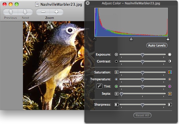
Over the years, many Vassar faculty members have asked how to get a copy of Adobe PhotoShop®, an expensive program used by professional graphic artists for creating and editing digital images.  Typically they’re not looking for sophisticated, complicated functions, though— just some basic things like re-sizing, cropping, and adjusting the brightness or contrast. Though there are some free or cheap programs that can do these things, such programs are generally not easy to use. Now they— if they are Mac users, anyway— have a great alternative: Preview.

Preview is a program that has been included with the Macintosh operating system for many years. By default, it’s the program that launches if you double-click on a  JPEG file or PDF file. And initially, that’s about all it could do: show you what a file looks like.  But over the years, it’s accrued more functions and the current version— the one that comes bundled with Mac OS 10.6— is an elegant tool for basic image editing.

With the Color Adjustment tool, you can change the brightness, contrast, saturation, temperature, tint, sharpness, and even a sepia effect. The Size Adjustment tool is essentially the same as PhotoShop’s— you can adjust the height, width or resolution, choosing whether to resample the image when doing so or not. You can use your mouse to select a portion of the image and crop the rest out. You can rotate or flip the image. You can copy and paste pieces of the image. When you’re done, you can save the edited version in any of several file formats.

And while this is not new, it’s a nifty capability: you can drag a collection of image files onto the Preview icon to present a slide show.

PDF Annotation
Preview can also display PDF files— in fact, it’s the default PDF viewer on a Macintosh. What’s new is that you can now use Preview to annotate a PDF in various ways.

You can drag a circular or rectangular shape around something on your page or make an arrow pointing to it; you can choose the color and line thickness for this.

You can create a text box and type a comment wherever you like; you can choose the font, size and color of your text. For longer comments, or ones you don’t want to clutter up the page too much, you can embed a link to a note that will pop up in the margin— ideal for commenting on student papers submitted as PDFs.

If your PDF was created from a text file (i.e., not simply a scanned image of a text page), you can select a portion of the text and highlight it, underline it, “strikethrough” it, or embed a web link into it. You can also insert a bookmark into a specific spot and name it; all your bookmarks for that document will be listed in the Bookmark menu.

After being saved and shared, all these mark-ups will be viewable by people using PDF viewers other than Preview, such as Acrobat Reader®.

You can’t get a copy of Preview all by itself; it comes bundled with the operating system. If you don’t see all these functions in your Preview, you may not have the current version. For more details about these and other functions, click on the Help menu within Preview.

Share