New Moodle Feature: Annotating Student Papers

Screen Shot 2014-01-14 at 12.44.32 PMWith the recent upgrade to Moodle 2.6, instructors have a new function available: If a student uploads an assignment in the form of a PDF file, the instructor can make various types of annotations to the file directly within Moodle. Previously, they would have to download the file, use some program that provided annotation functions, then upload that revised version to Moodle, for the student to download. Now that can be done within Moodle.

Annotation functions include highlighting, circling, drawing, stamping an available graphic (like a checkmark or an X), and writing Post-It-type notes.

Here’s a quick demo:

Share

Flipping the Classroom

arrowsA hot topic in Higher Ed circles is known as “Flipping the Classroom.” The idea is to take the standard, traditional structure of student work in and out of the classroom and flip them— move the lecture out of the classroom and move the “homework” into the classroom. Typically, the lecture is moved out by making a recording of it available to students online.

The idea is for the mostly one-directional transmission of information to happen out of class, so that the in-class time can take maximum advantage of everyone being together.

Of course, this oversimplifies a lot of diverse practices. In reality, a lot of classes— especially humanities and social science classes at small colleges— already place the bulk of their “information transmission” (in the form of reading) outside of class and use class time for discussion. And “homework” may be an inadequate label for what happens in many flipped classrooms. Often, class time is used for what has been called “active learning,” which might include small-group problem-solving or project development.

Benefits
The biggest benefit of flipping is that the most valuable time— the time when everyone in a course is together in one place— is used to its best advantage. If your class time— or even just a portion of it— is used for mostly non-interactive lecturing, why does everyone need to be together?

group_work

[Image from http://serc.carleton.edu/sp/library/sac/]

Another benefit of moving the lecture outside of class is that students can pause a recording, replay it, take careful notes, then continue it. This can be helpful for all students, but especially for those for whom English is not a first language or for students with learning disabilities.

Challenges

[From http://www.theguardian.com/education/mortarboard/2013/feb/19/]

[From http://www.theguardian.com/education/mortarboard/2013/feb/19/]

The biggest challenge with flipping is probably the time and effort required by the instructor— both to produce the lecture recordings and to develop meaningful in-class activities. And some students react negatively to the flipped design— either because they prefer to be passive in the classroom or because they feel that their tuition payment entitles them to a “live performance.”

Interested in flipping, but not sure it’s right for you? You don’t have to flip everything. You can try just flipping two or three class sessions or just portions of a class. Your ACS liaison can help you with the recording.

Share

Prezi

by Steve Taylor

Prezi is a tool for creating presentations, just as Powerpoint and Keynote are, but with some interesting differences. Since its creation in 2009, it’s been seen more and more in conferences.

Metaphors
One way in which Prezi differs from earlier presentation tools is its metaphor. Both Powerpoint and Keynote use the metaphor of a series of individual slides that can be shown in a predetermined sequence, just as 35mm slides would be shown with a carousel projector.

In Prezi’s metaphor, the creator arranges materials on an infinitely large canvas and— as I think of it— uses a video camera to pan and zoom through those materials. That can be done on the fly or the creator can pre-record a series of pans and zooms. The resulting presentation maintains the spatial relationships among the various materials.

It’s On the Web
Although they can be downloaded, “Prezis” are assembled on the web, through your browser, and can be presented via your browser as well. They can be shared with the general public or with a select group of colleagues (or members of a class.) You can even collaborate with others on the creation of your Prezi, which makes it a great vehicle for group projects.

Good and Bad Uses
I’ve seen great uses of Prezi and uses that make no sense at all— unfortunately, quite a few of the latter. If your presentation materials consist of a series of bullet-point lists, quotations, graphics, etc. that have no particular spatial relationship to each other, then there’s no particular reason to lay them out side by side and pan from one to another. But if there are spatial relationships— such as in a complex chart, diagram or map— then Prezi may be the perfect tool.

Here are a few examples of great uses for Prezi. You can pan and zoom on your own, or click the Play button to step through a pre-recorded tour.

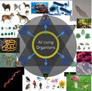
“Classification of Organisms,” created by Robert Kappus, will lead you systematically through a complex chart. The chart is circular, and the zoomed-in labels and graphics are aligned along radii of the circle, but that poses no problem, as the pre-recorded tour can not only pan and zoom, but rotate the view as well.
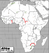
The “Physical Features of Africa Quiz” Prezi, created by Emily Thompson, will give you a tour through the major mountain ranges of Africa. Maps tend to be difficult things to project in a classroom, because the amount of detail means that labels often are too small to see from a distance. Prezi is a great vehicle for showing detailed maps, because of the extreme levels of zooming it can support.
One of my favorite uses of Prezi is to explore different details of a complex work of art. Here’s one that I created, providing a tour through some of the details of the painting Garden of Earthly Delights, by Hieronymus Bosch. An instructor can present a series of details from a work like this, without losing the context of each detail.
A number of people have realized that Prezi can be a good tool for creating a concept map— a diagram that shows relationships among various concepts. Here’s an example of a Globalization concept map, created by Dennis Carnduff.

Go to the Prezi website to explore other materials that various people have made public, to get more ideas on how it can be used.

Licensing
Prezi offers three levels of licensing:

  • Public, which is free, provides you with 100 MB of storage, but requires you to make your creations public.
  • Enjoy, which costs $59/year, provides 500 MB storage and allows you to make your creations private.
  • Pro, which costs $159/year, provides 2GB storage.

However, students and teachers— anyone with an “edu” email address— can get the Enjoy level of license for free.

Prezi U
The website also provides a gateway to “Prezi U,” a community of educators who share ideas about using Prezi in their teaching.


Share

Taxonomy of Learning Environments

by Steve Taylor
There’s been a great deal of talk in higher-education circles over the past year, about the perils and possibilities of online learning. Often that talk has been in the context of MOOCs or Coursera, but there are many variations of online learning and I often find that two people discussing the topic have fairly different things in mind. Here then is a taxonomy that we can use to get a little closer to understanding each other.

Classroom Learning (also called Face-to-Face Learning)
This type of course serves to anchor one end of the spectrum of remoteness in learning environments. It refers to the traditional environment, in which matriculated students and their instructor meet in real space, on a frequent basis— usually two or three times per week. Readings and homework assignments exist on paper.

Enhanced Classroom Learning
As in traditional classroom learning, matriculated students and their instructor meet in real space on a frequent basis, but some of their course materials— and more significantly their course activities— reside on the web. Students may be expected to contribute to online discussions or blogs, collaborate online with classmates on group projects, or take quizzes or exams online.

Blended Learning (or Hybrid) Courses
In this type of environment, matriculated students conduct a majority of their learning online, but meet face-to-face with their class a few times throughout the term of the course. This is essentially a distance-learning approach, with some added checks, giving instructors an opportunity to confirm that students are on track, and possibly to administer an exam in a proctored setting. Blended learning courses are often offered for adult learners in rural areas, who have to drive a long distance to campus.

Distance Learning
In a distance-learning environment, matriculated students take an entire course— or sometimes an entire degree program— online. Many universities offer distance-learning programs for students who would not be able to accommodate the schedule and location of traditional courses. Many public universities, with their commitment to educating the diverse populations of their states, have had distance learning programs for years, and many large, private universities have such programs as well.

Massive Online Open Course (MOOC)
MOOCs started to become prominent in late 2011 or early 2012. They exist entirely online and, unlike the other learning environments mentioned, they do not require learners to be matriculated in any particular institution. They are generally free of charge, but offer no credits. Because there is generally no instructor interaction involved, an individual MOOC may have thousands or even tens of thousands of students.

A number of universities have endorsed and supported their faculty members who wish to design MOOCs. Their motivations at this point seem to be a desire to “push their brand” into a larger population and, to some extent, a desire to provide a public service to that population.

Traditional, residential colleges like Vassar have been providing enhanced classroom learning experiences for many years, but most are just beginning to consider whether it makes sense for them to offer courses with reduced face-to-face time.

Share

Faculty Student Panel on Online Learning

“Teaching with Technology in the Liberal Arts: Present & Future” – a panel discussion

Wednesday, October 24, Vassar College, Poughkeepsie, New York.

A panel of Vassar faculty and students presented diverse perspectives on the use of technology in the curriculum, including online instruction, “flipped classroom” practices, distance learning systems, and their potential impact on our campus.

Moderator: Steve Taylor, Director, Academic Computing Services
Panelists: Ben Ho (Economics Department), Tom Ellman (Computer Science Department), Sarah Cheng ’13 (Committee on Academic Technologies) and Matt Harvey ’13 (VP for Academics, Vassar Student Association)


Share

Vassar Moves up to Moodle 2.0*

by Steve Taylor
Most software programs are in continuous development, as we all know from the “Upgrade to the latest version” alerts that pop up on our screens all too often. When the program runs on a server, as Moodle does, those upgrades usually happen without our notice, because the changes are either small or they happen to a part of the program that’s not so visible to us.

But then there are the big upgrades, the ones where the version number changes on the left side of the decimal point. Moodle has made that change (from 1.9 to 2.0) and we will be implementing the new version at Vassar this summer (2012.)

The most important reason for us to do this is simply to keep up with all the development that happens in and around Moodle. Since Moodle 2.0 was released in late 2010, third-party programmers have abandoned creating and enhancing the products that work with version 1.9 and have devoted themselves exclusively to writing for the new version.

Beyond that compelling-but-unsexy reason for us to upgrade, there are some great improvements to Moodle 2.0:

Better Editor. The editing tool that Moodle presents whenever you write a description, label, blog post, forum post, email message, etc. has been replaced with one that works properly with the Safari and Chrome browsers and is more resistant to the bugs introduced by pasting in text from Microsoft Word. (Text copied from Word includes LOTS and LOTS of invisible tags that can potentially “break” your Moodle page, to an extent that is very difficult to fix.)

External Repositories. When you add a file to your course site, the source doesn’t have to be your desktop computer– now you can directly add a link to a file from an external repository, like YouTube, Flickr, Dropbox, etc.

Better Looking. The new Moodle has more attractive themes to choose from, to set the visual tone for your site; it will also automatically format pages to look good on mobile devices such as smart phones and tablets.

Re-engineered activities. The gradebook, wiki, and quiz activities have been completely overhauled for easier use and better performance.

However…

The new version introduces some challenges, of course. A strength of Moodle is that it’s an open-source product, which  means that third-party developers can create add-on functions. Some of the add-ons that we’ve used at Vassar won’t work with the new version. These include the FLV Player (for streaming video), Scheduler (for office hours), and the Page format (for multiple tabbed pages within a course site.)

Also, there will no longer be a “Files” area, hidden from students, where instructors can upload files for later linking. Hidden folders of files will now reside on the “front page” of a course site.

The switch-over will take place in mid-June. ACS will be working with instructors to make sure that their migrated sites still work properly and that instructors know how to work in the new Moodle.


* (Actually, 2.3)

Share

Google Plus for Educators

by Steve Taylor

Google has “semi-released” a new service that many people consider to be a direct competitor to Facebook: “Google +”. Like Facebook– or Twitter, for that matter– it’s a social network, meaning that you identify other people that you’re interested in and you share information with them.

Nearly every college or university student uses Facebook, so it was natural for faculty and administrators to start exploring how they might take advantage of that to improve communications with students. But many found the idea of an instructor friending a student to be at best a little awkward and at worst, creepy. Part of the problem is that, in Facebook, a “friend” relationship is bi-directional: in order for a student to see her teacher’s postings, the teacher has to see hers. (That problem can be addressed with Groups and restriction settings, but creating those takes more effort than most people want to make.)

Circles

Google+ takes a somewhat different approach: relationships can be one-directional, more like following someone in Twitter. You create “circles” of acquaintances of different types: current friends, high school friends, family members,  co-workers, etc. and include different people in one or more of them. They’ll be notified that you added them to a circle, but they won’t know the name of that circle and they won’t be obligated to add you to any of theirs.

As an example, an instructor could create a circle that includes all of the students in English 101. He can share websites or comments with that circle, so that they appear in those students’ news feeds. But he doesn’t have to share his comments or pictures from last night’s barbecue with that circle. And if none of them add the instructor to any of their circles, he’ll never see anything they post. Of course, if they also make “English 101” circles with the same members, they can share things that are appropriate for that group.

Students could also create temporary circles for chatting and sharing materials among a project group. (As could faculty researchers.)

Hangouts

“Hangout” is the Google+ name for a video chat. At the moment, this is probably the slickest way for a group of people to do video chatting. It’s very easy to do, can accommodate up to ten people at a time, and it’s free. Though you can schedule hangouts, Google thinks of them as being spontaneous– like if you’re hanging out in the college center and friends bump into you and hang out for a while. But an instructor could use the hangout feature for online office hours or for holding study sessions. Or for collaborating with research colleagues. Or for interviews.

There are other features too, but circles and hangouts seem to be the most intriguing ones for educational use. As of this writing, Google+ is in pre-release, which is to say that it’s available to people who know someone who knows someone, but it should be generally available soon.

Share

Knowing What You Don’t Know

by Steve Taylor

One of the findings of research into learning and student behavior is that many under-performing students are over-confident in their mastery of their material. Over-confidence leads to inadequate studying. One remedy is to provide students with frequent opportunities for assessment. These opportunities don’t have to be in the form of time-consuming exams. They can be quick, ungraded assessments, whose only goals are to let students know if they really know what they think they know. If you’re worried that adding frequent assessments will eat away at your class time and add to your own workload, you may find some relief in technology. Here are two techniques.


Moodle Quizzes
One way is to create short, ungraded, auto-corrected quizzes in Moodle (or whatever Learning Management System you use.) Since students can take them out of class, they won’t affect your in-class time. And if they’re multiple-choice, or some other objective-answer format, you can designate the right answer so that Moodle can tell the student how well he or she did. Keeping them ungraded removes any temptation for the student to cheat. This is important, because the assessment has to be genuine— devoid of any self-delusion— in order to be effective. It also means that you don’t have to worry about honesty issues.

Not many Vassar instructors make use of Moodle-based quizzes. That may be partly due to the fact that they take some effort to create, but also to the fact that a multiple-choice quiz may not seem to be a valid measure to base a grade on. But it may be just valid enough to make students re-think whether or not they’ve studied enough.


Clickers
Another way to conduct a quick, ungraded quiz is to do it in class, with clickers. Clickers (known more formally as Audience Response Systems) are small, handheld devices that each student in a class can use to instantly submit an answer to a multiple-choice question. In most cases, their use is anonymous. They may take up no extra time in your class, because you probably already do frequent comprehension checks in class, by asking “Is that clear? Does everyone understand that? Can we move on?” The problem with that method is that most people will mumble assent, whether they understand the material or not. Who wants to be the one person in class who says that they don’t get it?

One student may not want to admit that he doesn’t understand the material; another may think she understands it, but be wrong. A quick quiz will address both problems. And besides letting students know where they stand, it may also let you know if you need to spend more time on the topic or if you can move on.

A clicker system will display your question on the projection screen, collect everyone’s silent, anonymous answers, then display the results as a graph. The results may be surprising to everyone.

ACS has a set of clickers that can be borrowed as needed.

Share

The 2011 Teaching with Technology Forum

by Steve Taylor

On April 7, Academic Computing Services (ACS) hosted its 9th annual Teaching with Technology Forum. The forum features a keynote address, given this year by Prof. Lisa Paravisini, on the topic “Teaching with Blogs: Going from the Source to Cyberspace.”

Twelve faculty members and two Computing & Information Services members presented posters and made themselves available to explain technology projects that they had undertaken over the past year. Here’s an overview of those presentations:

“Native Narratives in Archaeology: a Tumblr Blog”
Students in Sara Gonzalez’ class created blogs and made archaeology-based postings about Native North American culture. Tumblr.com was used to collect the separate blogs into an organized whole.

“Blogging About Semiotics in WordPress”
Students in Saúl Mercado’s Semiotics course use a blog to apply theories to contemporary linguistic and multi-media objects. Their postings have explored intermedial art, fictional language, the evolution of language, the semiotics of gesture, the language of robots, as well as sports and advertising.

“Off the Wall: The Frances Lehman Loeb Center Blog”
Nicole Roylance, Coordinator of Public Education and Information at the Lehman Loeb Art Center, maintains a very active blog site about exhibits and events in the Center.

“Developing an Online Multimedia Database of the Vassar College Costume Collection”
Arden Kirkland has been developing online materials for exploring and learning about Vassar’s historic costume collection. She has begun using the new, web-based “Omeka” system to organize data, photos, 3D representations, etc. , as well as a blog in which student participants share their experiences with the collection.

“The Queer of Color Glossary Project”
Hiram Perez’ course “Queer of Color Critique,” explores issues of race and sexuality. He and Sean Wehle (2013) created the Queer of Color Glossary, a blog site intended “to house a growing discussion of queer of color terms, theories, practices, activism, and art.”

“High Performance Computing for the Sciences”
Marc Smith and Jodi Schwarz co-taught a bioinformatics course, which included both Computer Science and Biology majors. The two groups learned to work together to develop software for analyzing biological data.
“VAST Stories in WordPress”
Erin McCloskey’s students work with local middle school students via the Vassar After-School Program. She created a blog site, both to share the children’s work with friends and family and to develop the Vassar students’ ability to write for a broad audience.

“Viva and Bacteris: Blogging About the Small Stuff”
David Esteban maintains two blogs— one about viruses and one about bacteria— and he expects students in all of his classes to write entries as guest bloggers. They choose a recent study from the primary literature and write a brief description. The target audience is the general public, so the students— including freshmen— must describe the work in an accessible and interesting way.

“Memory Across Generations: an Oral History Project About Holocaust Memory”
Students in Silke von der Emde,’s course, “Memory Across Generations,” collected oral history materials concerning the Holocaust. They conducted face-to-face interviews with two Vassar alumni/ae in NYC using digital recording devices, Skype interviews with more remote alumnae/i, and one in-class videoconference with Marvin Chomsky in Austria. They used a blog to collect all of the information and results.

“Vassar Campus Sound Map”
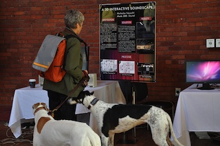
Students in Tom Porcello’s Media Studies course on Sound explored the use of immersive audio representations of spaces, called soundscapes. Nick Inzucchi (2011) created a 3D, interactive, virtual environment, using 15 simultaneous sound recordings from a campus space.

“Learning in Lynda.com’s Online Training Library”
Chad Fust, of CIS, provided information about Lynda.com, the broad set of online training materials on technology subjects, now available to college constituents.

“Blogging the Chester Cycle”
Dorothy Kim and her students performed a play from the 16th-century Chester Cycle, in Toronto. They used a blog site to document their rehearsals and preparations and to provide related material to the community.

“The Faculty Lounge Network: Online Campus Tools for the Vassar Community”
Students in Tobias Armborst’s Architectural Design course were tasked with addressing the spatial aspect of the issue of encouraging a feeling of community among the faculty. John McCartin (2011) and William Mann (2012) responded by organizing a directory of available faculty lounge spaces on campus an facilitating a way for faculty members to reserve and cater those spaces. They created an attractive brochure and The Lounge Explorer, an interactive website with which faculty members could explore the available spaces.

“eBook readers: iPad 2 vs. Kindle”
John Collier, of CIS, demonstrated and compared the most recent models of iPad and Kindle, with particular regard to their use as e-readers.

Share

A Review of Preview: Free, Easy Photo Editing and PDF Annotation

by Steve Taylor

Basic Image Editing
Over the years, many Vassar faculty members have asked how to get a copy of Adobe PhotoShop®, an expensive program used by professional graphic artists for creating and editing digital images.  Typically they’re not looking for sophisticated, complicated functions, though— just some basic things like re-sizing, cropping, and adjusting the brightness or contrast. Though there are some free or cheap programs that can do these things, such programs are generally not easy to use. Now they— if they are Mac users, anyway— have a great alternative: Preview.

Preview is a program that has been included with the Macintosh operating system for many years. By default, it’s the program that launches if you double-click on a  JPEG file or PDF file. And initially, that’s about all it could do: show you what a file looks like.  But over the years, it’s accrued more functions and the current version— the one that comes bundled with Mac OS 10.6— is an elegant tool for basic image editing.

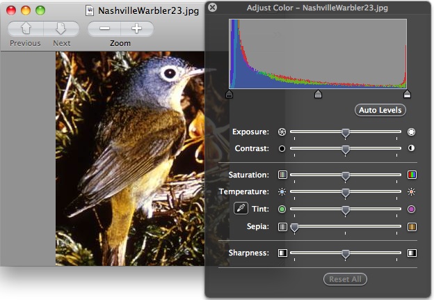
With the Color Adjustment tool, you can change the brightness, contrast, saturation, temperature, tint, sharpness, and even a sepia effect. The Size Adjustment tool is essentially the same as PhotoShop’s— you can adjust the height, width or resolution, choosing whether to resample the image when doing so or not. You can use your mouse to select a portion of the image and crop the rest out. You can rotate or flip the image. You can copy and paste pieces of the image. When you’re done, you can save the edited version in any of several file formats.

And while this is not new, it’s a nifty capability: you can drag a collection of image files onto the Preview icon to present a slide show.

PDF Annotation
Preview can also display PDF files— in fact, it’s the default PDF viewer on a Macintosh. What’s new is that you can now use Preview to annotate a PDF in various ways.

You can drag a circular or rectangular shape around something on your page or make an arrow pointing to it; you can choose the color and line thickness for this.

You can create a text box and type a comment wherever you like; you can choose the font, size and color of your text. For longer comments, or ones you don’t want to clutter up the page too much, you can embed a link to a note that will pop up in the margin— ideal for commenting on student papers submitted as PDFs.

If your PDF was created from a text file (i.e., not simply a scanned image of a text page), you can select a portion of the text and highlight it, underline it, “strikethrough” it, or embed a web link into it. You can also insert a bookmark into a specific spot and name it; all your bookmarks for that document will be listed in the Bookmark menu.

After being saved and shared, all these mark-ups will be viewable by people using PDF viewers other than Preview, such as Acrobat Reader®.

You can’t get a copy of Preview all by itself; it comes bundled with the operating system. If you don’t see all these functions in your Preview, you may not have the current version. For more details about these and other functions, click on the Help menu within Preview.

Share