Category Archives: Mix and Measure Colors Workshop

Science Matters at Dutchess Community College: Mix and Measure Colors Workshop held by Prof. Magnes from Vassar College.

Computational Methods in Quantum Mechanics

In this post I will attempt to teach the reader two computational methods that are commonly used to analyse quantum systems. These methods are known as the matching method and the Monte Carlo method. These methods each have their own advantages and disadvantages in various scenarios which is why I believe it would be useful to the reader to have both of these methods under their tool belt.

The basis of all of our calculations in a quantum system will typically be based on the time independent Schrödinger equation, so lets first analyse this equation to see how it can be used computationally.

We can approximate the double partial derivative of the wave function as:

Now that we have an equation for the double partial derivative, we can enter this back into the Schrödinger equation and rearrange the terms in the following way:

We now have an equation that allows us to compute any wavefunction given an energy and potential.

Matching Method

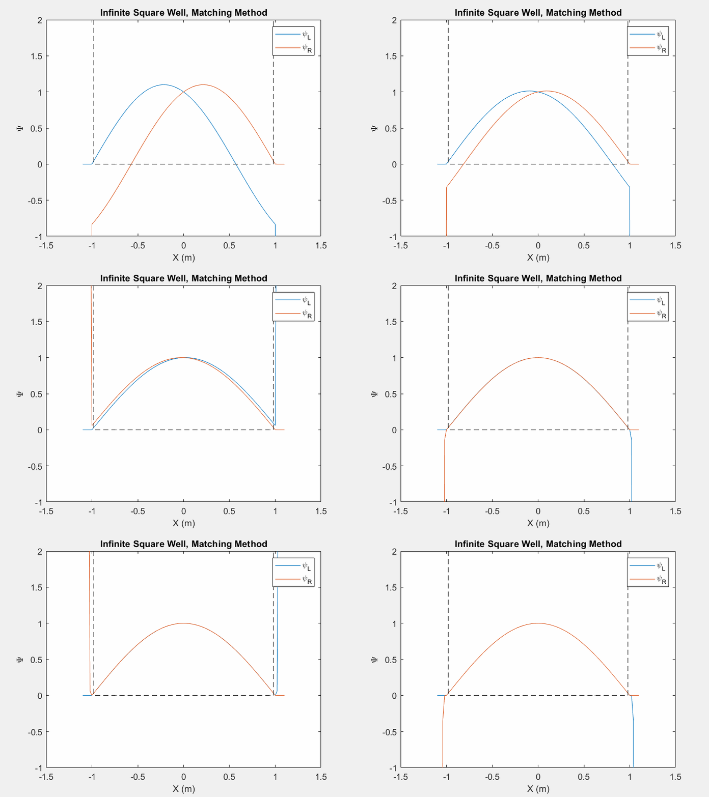
Now that we can calculate a wavefunction we must find the eigenenergies associated with a system in order to determine the eigenstate. There are multiple ways to do this, one such is the matching method which is particularly useful for asymmetric potential systems. The goal of the matching function is to generate a smooth and continuous wave function by combining two wavefunctions which are generated from the left and right corners of the potential array.

Figure (1) – Matching method inside an infinite square well.

The  inputs  of a matching method function are an initial energy guess, the potential array, the spatial step size, and an indexing point which we will use to check the slope of each wavefunction.  In order to calculate each wave function, there are unique initial conditions for even and odd parity solutions:

Using equation 3 and the initial conditions, we can calculate the first wavefunction using our initial energy guess. Then, we repeat this process by first flipping the potential array and generating a second wavefunction with the same initial conditions. We then flip this second wavefunction so that we have effectively generated one array from left to right and a second array from right to left. We then normalize each wavefunction at the indexed point so that they intersect.

Now we may calculate the slope of each wavefunction at the index. We then call a secondary matching function which keeps track of the orientation of the slopes. If each slope’s relative orientation remains the same, then our ‘change in energy’ value, which we will add afterwords, remains the same. If each slope’s relative orientation changes, then our ‘change in energy’ value is halved and negated. In either case, we then add a ‘change in energy’ value to the original energy guess, recalculate the left and right wavefunctions and repeat the process.

This function allows us to find eigenstates and hone in on the eigenenergies of a system. Once we reach a certain limit, the ‘change in energy’ value will be so small that we can stop the program and merge the two functions at the index point.

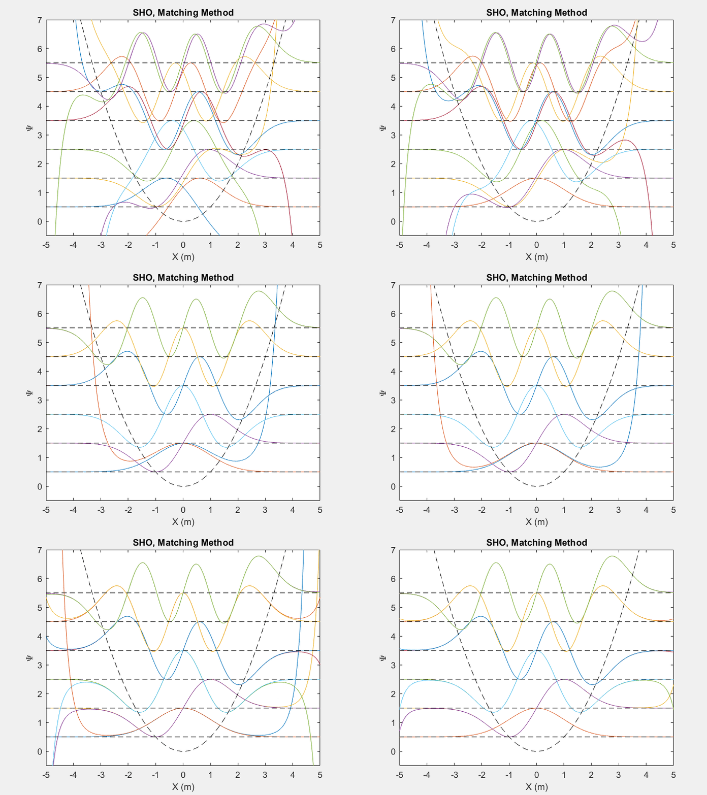
There are many useful applications of this method, one such is the quantum harmonic oscillator. The quantum harmonic oscillator is a useful analog for many arbitrary potentials which have stable equilibrium points.

Figure (2) – Top shows the matching method running on the first 6 energy levels of a quantum harmonic oscillator. Bottom shows the end result.

Figure (3) – The probability distribution of the 100th energy level as a result of the matching method.

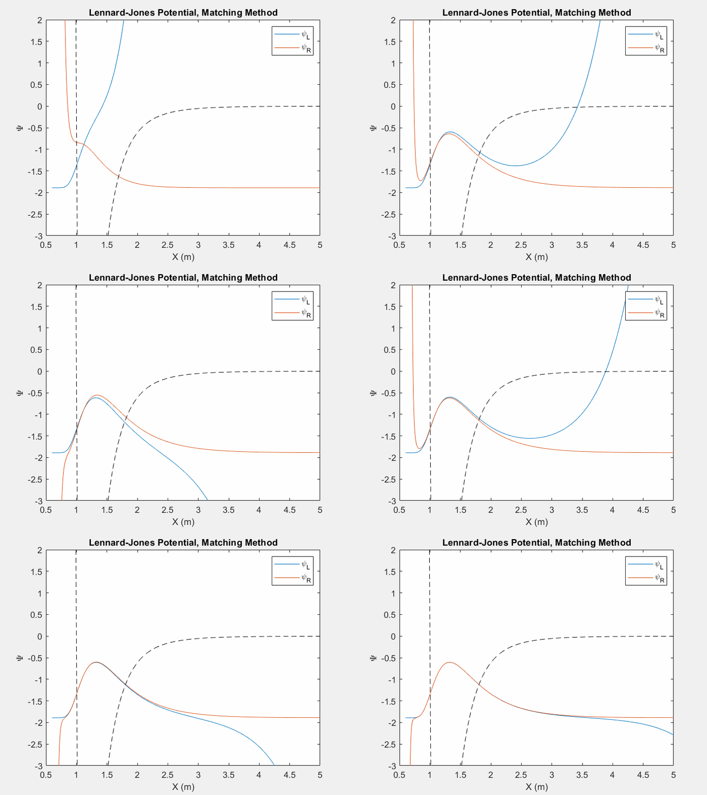
Figure (4) – Another useful potential to study is the Lennard Jones potential. This potential is used to model the van der Waals forces between inert atoms.

Monte Carlo Method

Another useful computational method is the Monte Carlo method. Rather than guessing at the energy as in the matching method, in this method we will be guessing at the wavefunction and iterating on this guess. The idea of a Monte Carlo method is that we randomly change a system and only keep the changes that bring us closer to a solution we would expect. In the case of quantum mechanics, this will be used to randomly change the wavefunction and only keep the changes that lower the energy of the system.

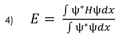
In order to implement this approach, we must first understand how to calculate energy using equation 4 below:

In order to preform these integrals in discrete space, we can use several different methods, but for this process I chose to use the trapezoidal integration method:

Applying this method to the quotient and denominator of equation 4 leaves us with the following equations:

Now equation 4 becomes:

But now we have energy on both sides of the equation. In order to resolve this, we need to substitute in the time independent Schrödinger equation (Eq. 1) which gives us

Finally, in order to get rid of the double partial derivatives, we substitute in equation 2 and find:

This is the final solution which will allow us to calculate the energy in any system given a wavefunction and potential array.

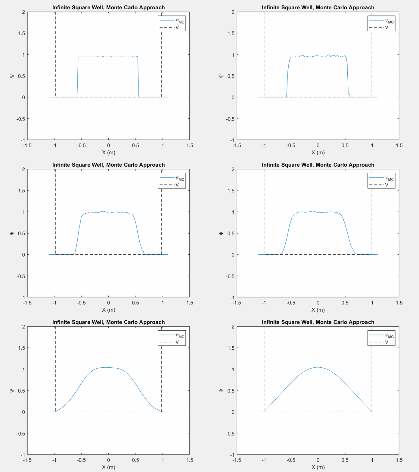
Now that we can calculate energy, we can utilize the Monte Carlo method. This method is actually quite simple; we create a function that takes in an arbitrary guess of the wavefunction and calculate the energy of this guess. Then we randomly pick a point of the wavefunction and change it by a random amount. Then we recalculate the energy of the system and if the energy has decreased, we can keep that random change, otherwise discard the change and revert to the previous wavefunction. We repeat this process over and over again until we reach a point in which the energy does not change after a certain number of attempts. At this point we can assume the we reached the ground state of our potential system.

Figure (5) – The Monte Carlo method in an infinite square well. This animation takes place over ~5 million iterations.

Figure (6) – Monte Carlo method in a Lennard Jones potential. This animation takes place over ~50 million iterations.

Typically when using the Monte Carlo method on a new potential system, it is actually quite difficult in order to tell when we have reached the ground state unless we actually watch the iterations as they happen. As the wavefunction starts to change less and less we can assume that we are nearing the ground state.  This is still a very slow process and it can take vastly different times to reach the ground state depending on your initial wavefunction guess and the step size of your random changes.

While the Monte Carlo method is significantly slower than the matching method, it is still incredibly useful in finding the ground state energy of an arbitrary system. We typically need little to no intuition as to what the ground state looks like when we make our initial wavefunction guess. As long as the Monte Carlo method is run for a sufficient amount of time, the function will approach a ground state. Another downside of the Monte Carlo method is that it will only search for the ground state. The matching method, however, is useful in finding multiple energy levels. This method will resonate around any eigenstate as long as our initial energy guess and ‘change in energy’ value permits it. Overall, both functions have their applications and can be very useful in tandem.

As an aside, I should also say that both of these methods are only useful if we already understand how to describe the potential of a system and only seek the eigenenergies of said system. In the real world, most researchers are typically suffering from the inverse problem, in which we know the energies of the system but must use this information in order to construct a potential that coincides with these energies. While these methods may not be useful for those researchers, I still think these are valuable, especially to the student who wishes to study systems that we may already know how to describe.


Share

Analysis of C. Elegans Worm Diffraction Patterns using Lag, Density, and Poincaré plots

Overview & Background:

For my project, I analyzed non-saturated data taken in Professor Jenny Magnes’ laboratory of “roller” and “wildtype” C. elegans. worms. The goal was to use computational techniques to differentiate between worm types. To this end, I created three different types of graphs: lag, density, and Poincaré plots. All three used normalized data. Although my lag and Poincaré plot codes create 2D plots comparing non-lagged to lagged data as well as 3D plots that compare multiple lags, I am only including the 2D plots here due to the number of graphs I have.
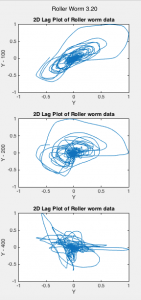
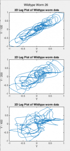
Lag plots display the value of the data at time (t) versus the data at time (t – lag), where lag is a fixed time displacement. These plots determine whether data is random or not. They are one method for inferring information about dynamical attractors from observations.[1] The time delay is used to reconstruct the attractor. I plotted lag plots with lags of 200 and 400 (Figs. 1-2).
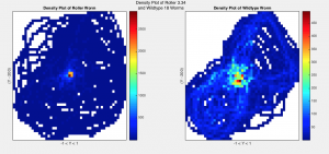
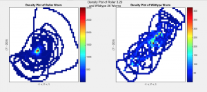
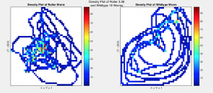
I then created density plots by binning the data into a 50 x 50 matrix and plotting the intensities of values in each bin (Fig. 3). These plots give information about the number of times point (x,y) appears in each plot by representing the counts with color. The density plot code also calculates the area of each plot divided by the area of values equal to zero (AreaRatio) and the area of each plot not equal to zero over the area of values that are (zeroRatio) (Fig. 5). These ratios describe the motion of the worms, specifically how much area they use to move around in.

Finally, I created Poincaré plots by plotting each value (point at t) against the next chosen value (point at t + lag) (See Fig. 4). Poincaré plots are return maps that can be used to help analyze data graphically. The shape of the plot describes how the system evolves over time and allows scientists to visualize the variability of their data.[2] They have two basic descriptors: SD1 and SD2.[3] Defining the “line of identity” as a 45-degree diagonal line across the plot, SD1 measures the dispersion of points perpendicular to the line of identity while SD2 measures the dispersion of points along the line. My code calculates and returns these statistical measures as well as the ratio SD1/SD2 for each lag determined by user input. For this project, I used lags of 1 and 100 (Fig. 6).

Results:

I. Lag Plots

Fig. 1 Lag plots of Roller Worms 3.20, 3.26, and 3.34 for lag values of 100, 200, and 400.

Fig. 2 Lag plots of Wildtype Worms 18, 19, and 26 for lag values of 100, 200, and 400.

 II. Density Plots

Fig. 3 Density Plots of Roller worms 3.20, 3.26, and 3.34 (left) compared to Wildtype Worms 18, 19, and 26 (right) with lag 200

III. Poincaré Plots


Fig. 4 Poincaré Plots of Roller Worms 3.20, 3.26, and 3.34 (top) and Wildtype Worms 18, 19, and 26 (bottom) for lag values of 1 and 100

IV. Data

Fig. 5 Values of SD1, SD2, Ratio of SD1/SD2, Area Ratios, and Zero Ratios for Roller Worms 3.20,3.26, 3.32 (left) and WildType Worms 18, 19, and 26 (right) for lag values of 100, 200, and 400 as well as average values per worm-type (bottom).

Discussion:

The lag plots indicate that my data is non-chaotic because they all had non-random structures. There appears to also be differences between worm-types, although this difference is difficult to quantize. As the lag increases, the lag plots appear more chaotic for both worm-types, moving from aligning with the x = y line to appearing more random and diffused. The plots show a difference between worm-types, but quantifying this difference will take further analysis. Wildtype worms tended to fall closer to the x = y line than roller worms. This is a sign of moderate autocorrelation. This suggests prediction of future behavior is possible using an autoregressive model.[4]

The density plots show a clear distinction between worm-type, with rollers tending to have more circular-shaped plots with highest intensity values at the center while wildtype worms appear to take up less of the plot area, with highest intensity values along the diagonal and at the center of the plot. This is confirmed by the area and zero ratios (Fig. 5). Wildtype ratios were on average larger than those of rollers, with area ratio values ranging from 0.04-0.4 more and zero ratio values ranging from 0.1-0.4 more for rollers. This gives us a quantifiable way to measure the difference between the motions of the two worm-types. However, whether these differences are statistically significant or not remains to be seen.

The Poincaré plots show little difference from the x = y line for a lag of one. However, at lag 100 they do deviate from the line. Although lag differences between the worm types are difficult to quantify, these plots do appear to follow similar patterns to those in the previous two types of plots. The values of SD1 and SD2 helped quantify plot differences. Although SD1 did not differ on average by a notable amount (~0.0008-0.1), SD2 did show a notable difference. For the average roller, SD1 was approximately 0.3 for all lags. SD2 for wildtypes was around 0.5. The SD values decreased as the lag increased for both worms. These values resulted in a SD1/SD2 ratio for rollers over 1.3 times larger than that of the wildtype for all lags.

Conclusion & Future Steps:

These results indicate it may be possible to discern between worm-types using the computational methods described above. However, further analysis of the plots as well as analysis of more worm data is necessary to draw definitive conclusions. Statistical analysis should be employed on the ratios and SD values listed in Fig. 5 to determine whether they are statistically significant. This code could be used in the future to check if data is random or chaotic, find patterns in data, and compare and differentiate data sets. Certain improvements could be made to the code. The Poincaré code could plot the ellipse with SD1 and SD2 as shown in source [3]. The density plot takes longer to calculate at higher bin numbers, which corresponds to higher resolution. Improvements could be made to the code to improve computational time. This code also can only run one lag at a time. With improved speed, it could be altered so users can input as many lags as they want at a time, like with the Poincaré and lag plot codes.

References:

[1] Sauer, Timothy D. “Attractor Reconstruction.” Scholarpedia. 2011. Web. 11 Dec. 2016. <http://www.scholarpedia.org/article/Attractor_reconstruction>

[2]Golińska, Agnieszka K. Poincaré Plots in Analysis of Selected Biomedical Signals.” Studies in Logic, Grammar and Rhetoric. 2013. Web. 11 Dec. 2016. <https://www.degruyter.com/view/j/slgr.2013.35.issue-1/slgr-2013-0031/slgr-2013-0031.xml>

[3]Goshvarpour, Atefeh. Goshvarpour, Ateke. Rahat, Saeed. “Analysis of lagged Poincaré plots in heart rate signals during meditation.” Digital Signal Processing. 2015. Web. 11 Dec. 2016. <https://www.researchgate.net/publication/222569888_Analysis_of_lagged_Poincare_plots_in_heart_rate_signals_during_meditation>

[4] “Lag Plot: Moderate Autocorrelation.” NIST SEMATECH: Engineering Statistics Handbook. Web. 11 Dec. 2016. <http://www.itl.nist.gov/div898/handbook/eda/section3/lagplot2.htm>

Share

Gravity Assist

Overview:

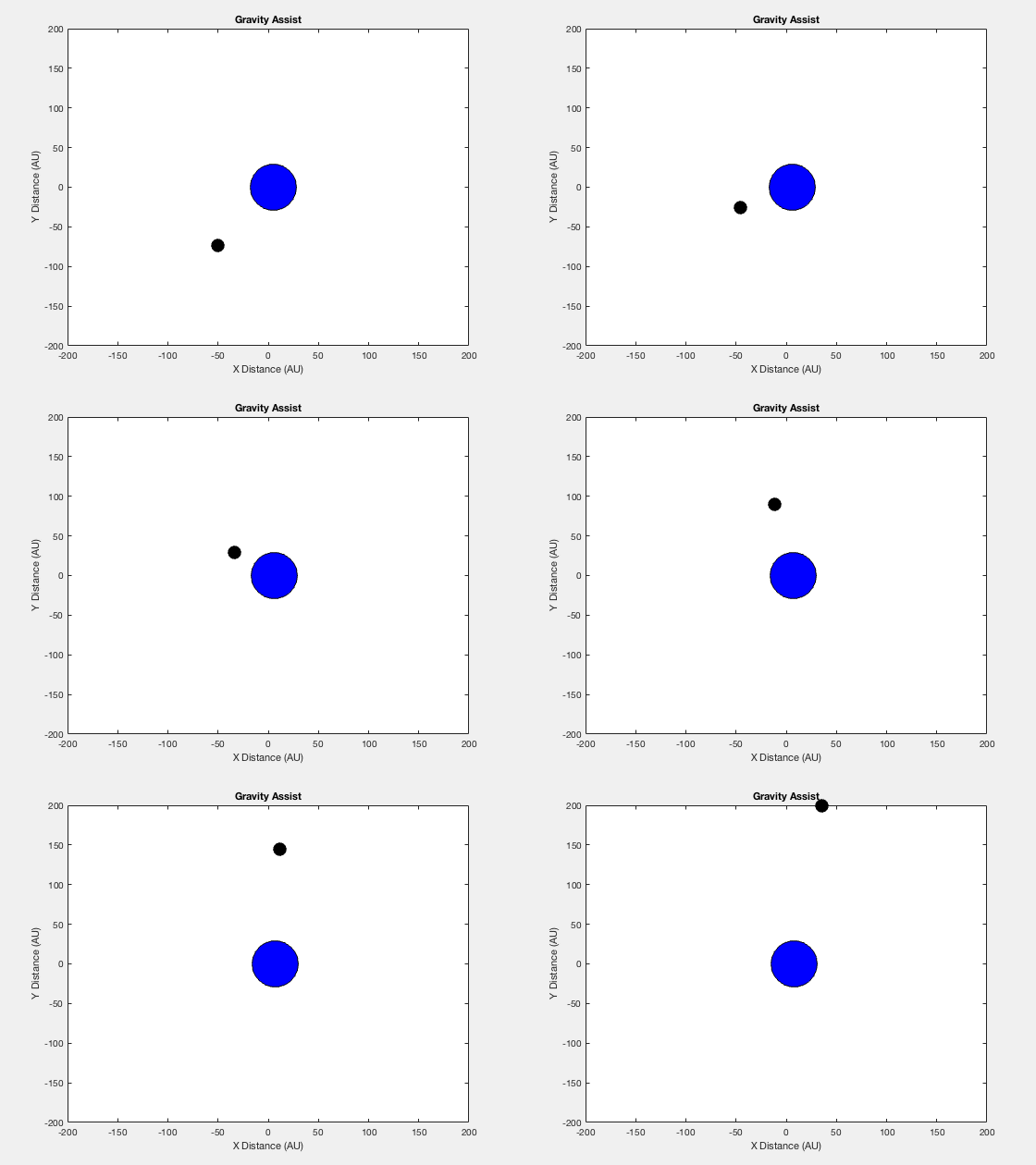
The computational problem that I worked on for my final project was to simulate a satellite undergoing a gravity assist as it passes a planet. The “gravity assist” is a technique used to help spacecrafts reach targets that are “higher up” in the sun’s potential well. This program creates 2-D animations that are not centered around either the satellite or the planet to express the gravitational interactions between the two. What is meant by neither body being centered is that the both the planet and satellite are moving. The planet is used to change the satellite’s trajectory. The program itself generates a velocity graph of the gravity assist of a satellite as it passes by a planet and the velocity graph of a satellite that gets caught and temporarily orbits the planet. The program’s purpose is to show how the initial conditions of a spacecraft as it passes a planet determines its trajectory.

Methods:

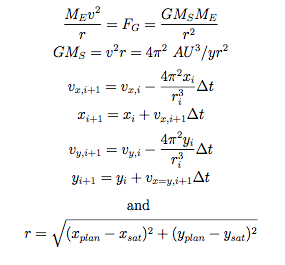
The following image shows how the differential equations used in the program were derived. The equations are from a model for the earth’s orbit around a stationary sun. Assuming that the earth has a circular orbit around a stationary sun it allows for the use of constants instead of inputting information for the masses of the two bodies and the gravity between them. What was changed from the earth-sun example is that the larger body is in motion. Also instead of the “r” value being the radius from the sun the “r” value represents the distance between our planet and satellite.

sling-shot-equations

The method specifically used was the Euler-Cromer method (using i+1) because it conserves energy when used with oscillatory problems. So the positions of both the planet and satellite are calculated at each time step and then the velocities are calculated accounting for how the distance between the two change. Now the velocities are based on interactions between the two bodies. In this program it is assumed the size difference between the two is great enough that the satellite doesn’t change the planet’s path.

Figures:

assist-the-og

Figure 1: The gravity assist of a satellite as it passes nearby a planet.

catch-and-relaease

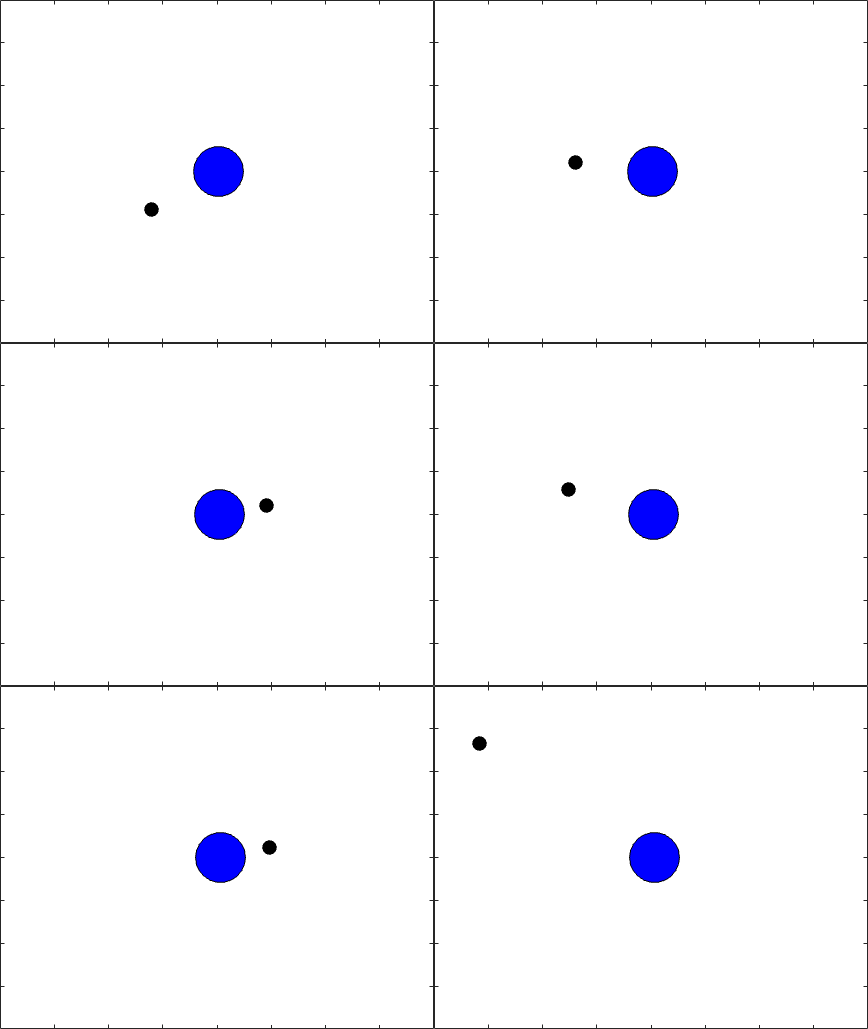
Figure 2: The gravitational capture of a satellite by a planet for two revolutions.

assistog

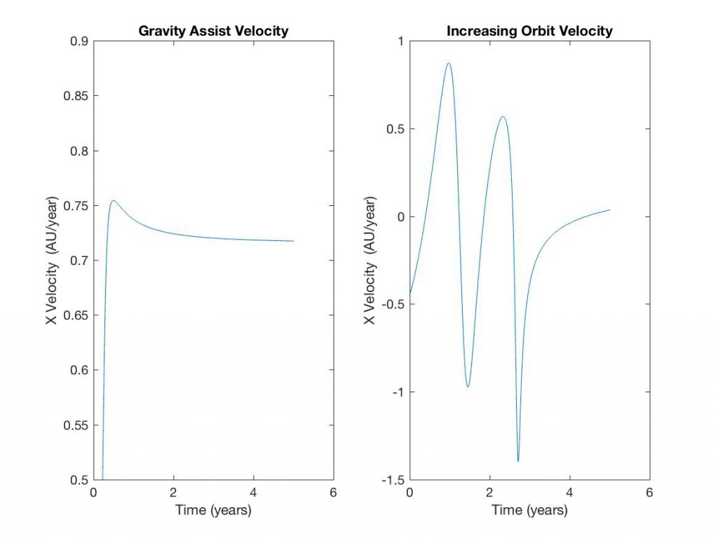
Figure 3: Graphs of the the change in the Velocity over 5 years

Discussion:

The planet’s initial conditions were an initial position at the origin and an x-velocity of 5 AU/yr. In the gravity assist simulation the satellite began 86 AU away at (-50,-75) with an initial x-velocity of 0.15 AU/yr and y-velocity of 2 AU/yr. The program then simulated the position and velocity for 5 years and after interacting with the planet the the satellite was 4,195 AU (the “r” value)  from the planet and had a final x-velocity of 0.717 AU/yr and a final y-velocity of 1.61 AU/yr. So the total velocity changed from ~2 AU/yr to ~1.75 AU/yr. The left of Figure 3 shows the change in the x-velocity over 5 years, the spike in the graph represent the satellite’s interaction with the planet and then as the two get further away the velocity settles to a constant value.

The second simulation represents a “catch and release” scenario where the satellite is caught by the planet’s gravity but as the two move the satellite is able escape the planet’s gravity. In the simulation it appears that the two touch but the figures are similar to point charges in that that the mass used for the calculations is at the very center. What seems to be the outside of the shapes is just an image representation used in the simulations.

In this scenario the planet still begins at the origin but it has an x-velocity of 1 AU/yr. The satellite now begins ~74 AU away (-55,-50), has an initial x-velocity of -0.45 AU/yr  and y-velocity of 0.45 AU/yr. After 5 years and two complete revolutions the satellite is ~500 AU away (the “ODr” value) and has an x-velocity of 0.036 AU/yr and a final y -velocity of 0.157 AU/yr. The total velocity decreased from ~0.64 AU/yr to ~0.16 AU/yr, the change in the x-velocity over the 5 years is shown on the right of Figure 3.

Conclusion:

The simulations accurately modeled the gravity interactions between a satellite and a planet. If the velocities of the satellite and planet are great enough as the bodies interact (~2 AU/yr for the satellite and 5 AU/yr for the planet) then the two will pass each other with only a change in trajectory of the smaller body. But if the two are moving at low velocities that are close in value (~0.64 AU/yr for the satellite and 1 AU/yr for the planet)  then the smaller body will get caught in the gravity of larger.

The “gravity assist” technique allows for fuel conservations as spacecrafts travel to higher orbits because the trajectory can be changed through interactions with planets. The drawback of the technique is the total velocity decreases after interaction with the planet, in the assist case there was a decrease in velocity by 12.5%. The limitation of the program is that it is unable to simulate changing the velocity at any point in the path which could be done with a spacecraft. Further investigations could look at finding the ideal relationships between travel time, speed, and fuel consumption when trying to reach a specific trajectory.

Resources:

Giordano, Nicholas J., and Hisao Nakanishi. Computational Physics. Upper Saddle River, NJ: Pearson/Prentice Hall, 2006. Print.

“A Gravity Assist Primer.” NASA. NASA, n.d. Web. 11 Dec. 2016.

Share

Fourier Analysis of Unemployment Rate in U.S.

Overview:

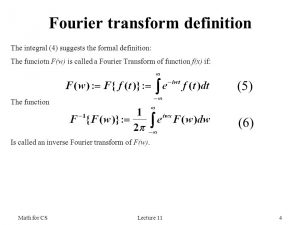
Throughout the course in computational physics this semester, I learned how to apply Matlab to different concepts and lessons in physics. I wanted to apply what I learned and collaborate them with ideas and materials from my major in Economics. For this project, I analyzed the data of the unemployment rate in U.S. using Fourier analysis. The Fourier transform decomposes a function of time into the frequency components that make up the original function. As a result, one can look at the different cycles and waves that make up the function. I look at the percent changes in the unemployment rate monthly from February 1948 to October 2016. The Fourier transform data has the amplitude graphed against its frequency, so I can look at the different cycles of the unemployment rate. The second part of the project was to apply a filter to the Fourier transformation. By applying the low-pass filter, I filter out the high frequency data. Then, I inverse Fourier transform the low-pass filtered data to compare it to the original data. I expected the data to have less noise, because the high frequency data that affect the volatility of the data in low periods will be filtered.

Fourier Transformation:

The first part of the project was to Fourier transform the unemployment data. I needed reliable data recorded frequently, so I used the unemployment rate recorded monthly from the U.S. Bureau of Labor Statistics. Then I had to apply the Fourier transformation.

fo

Eq. 1

According to Fourier’s theorem, every function can be written in terms of a sum of sines and cosines to arbitrary precision; given function f(t), the Fourier transform F(f(t)) is obtained by taking the integral of f(t)’s sines and cosines function. The exponent factor is just the sum [cos(2*pi*frequency*t)-i*sin(2*pi*frequency*t)]. Discrete Fourier transform can be expressed into the next set of equations from the previous ones.

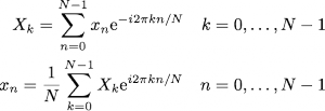
fouriereq

Eq. 2

The top equation in Eq. 2 is the discrete Fourier transform. The bottom equation is used to get the inverse of the Fourier transform or the original function from the Fourier transform equation. Since the equations in Eq. 2 are just a sum of exponential terms, it appears to be a very straightforward numerical evaluation. In reality, discrete Fourier transforms take a very long time to compute. Each term involves computing the exponential factor, which then have to be multiplied by xn and added to the running total. The total number of operations is of order N^2, because each sum for a given frequency component has N terms and there are N frequency components. However, one can see that the exponential terms in the discrete Fourier transform are multiples of one another. This makes it possible to group up terms in the sums in a way you can store those values and reuse them in evaluating the different components of the discrete Fourier transformation. This is how the fast Fourier transformation came about.

With discrete data set of N ~ 1000, I can perform the fast Fourier transform or the FFT to efficiently compute the discrete Fourier transform. Then, I squared the absolute values of the transformed data. Making this change to the data does not affect the data under Parseval’s Theorem that states, “the squared magnitude of the Fourier Series coefficients indicates power at corresponding frequencies.” The reason behind the squaring manipulation was to change the complex numbers to real components for graphing. Then, I graphed the amplitudes that I get from fft against the frequency. The highest frequency was the data being recorded every month, so I had to set the maximum frequency at .5. Bi-monthly data is the lowest period I can get accurate data from due to Nyquist frequency, which states that minimum rate at which a signal can be sampled without introducing errors is twice the highest frequency present in the signal. Any amplitude that belongs to higher frequencies than .5 would have errors. Many Fourier analysis of signals in physics is shown in varying range of Hertz. However, the periods in economic data have relatively very high periods compared to physics data periods measured in degrees of seconds. As a result, the frequency is relatively low in this graph. Also, the frequency is measured in number of unemployment cycles per month.

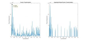
fouriertransform

Figure 1.1

Left side of figure 1.1 shows the graph of the Fourier transformation. The right side just has amplitudes of less than 30,000 amplitude filtered out, so that it would be easier to look at the frequencies with higher amplitudes. One of the challenges of the project was getting the most accurate graph that I can. There are so many different ways the economic data can come out, however, the most accurate graph would have to show evidence that align with known theories in economics.

Analysis:

The frequencies with the highest peaks are the most significant components of the original data. The Fourier transformation graph of figure 1.1 has large peaks near the frequencies of .01699 cycles/month and .3653 cycles/month. These frequencies correspond to 58.858 months/cycle and 2.737 months/cycle respectively.

Business cycles, which include unemployment cycles, are supported very strongly to have cycle length of 5 years on average, which is 60 months. The high peaks that happen above and below the frequency of .01699 are the cycle components of fluctuations that happen in the business cycle. The Cycles do have an average period length of 58.858 months, but cycles can also happen in shorter or longer lengths. The other significant peak range is at 2.737 months/cycle. This aligns with the seasonal unemployment rate; the unemployment rate has a cycle for every fiscal quarter, which is about 3 months. Through these evidences, I can say that the unemployment rate data has been accurately Fourier transformed.

http___www-nber-org_cycles_cyclesmain-1

Figure 1.2

The known theories support the numbers I have, but I also wanted to compare my numbers to the actual numbers. Figure 1.2 is a record of U.S. business cycle expansions and contractions from the National Bureau of Economic Research. They also provide the average cycle (duration in months) of business cycles for both trough from previous trough and peak from previous peak. I looked at peak from previous peak, since the difference wasn’t significant. The average duration of business cycles from economic data of 1859-2009 was 56.4 months, which is very close to the value I got. However, the data also had recorded the average business cycles from 1945-2009. This applies more directly to my transformed data, because my data was from 1948-2016. The average for this period was 68.5 months. I wanted to look at why this data’s average was a bit off from my most significant peak.

The average does fit in the range of the cycle fluctuations, but I figured out that the most plausible reason is that because my transformed data was not smoothed out. One can see in Figure 1.1 Fourier Transformation graph that the business cycle frequency peaks at x=.01699 cycles/month (58.858 months/cycle) and drops to the next point where x=.01335 cycles/month (74.906 months/cycle). The average of the two months/cycle points is 66.882 months/cycle, which is much closer to the data presented in Figure 1.2. If my transformed data were to be smoother with more data points, then the average would have been more accurate.

Low-Pass Filter:

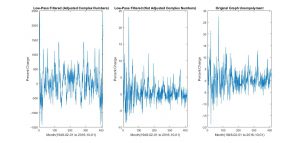
fourierfilteredfinal

Figure 1.3

For the second part of the project, I wanted to apply a simple filter on the transformed data and see how the original data would be affected by that. The idea behind it was to filter out high frequencies above a certain point so that only the low frequency components would be left over for the data. If I were to build up the unemployment function again using the filtered components, what would the original data look like?

I expected the unemployment data to have less noise after the filter, because only the longer period cycles would build up the unemployment rates. I used the inverse Fourier transform function ifft to return the Fourier transformed data back to unemployment rate vs. time graph. The graph on the very right in figure 1.3 is the original unemployment rate graph taken from U.S. Bureau of Labor Statistics. I simply used ifft on the transformed data to return it.

The first step to filtering was to filter the power component of the transformed data, shown in the left, 1st graph of figure 1.3. This wasn’t an accurate representation, because the y axis has been affected by Parseval’s theorem. In order to fix this problem, I filtered the data only applied with fft. The most accurate filter graph I got was the middle graph in figure 1.3.

Analysis:

I made components from 300 to 412 (higher frequency components) equal to 0, so that we would still keep the information about those components and not lose resolution. Then, I inverse Fourier transformed that data. Consequently due to the change of the total length with data, the inverse produces transformed data with different unemployment rates from the original graph, including complex numbers. I was able to only plot the real number components. However, the filter helped me see the general trend of the unemployment rate changes at the exchange of some loss of information; the real number components that I do care about in the middle graph of figure 1.3 represents a more accurate graph of unemployment data with less high frequency noise. The evidence is shown in the decrease in fluctuations of the unemployment rate changes when the middle and right graph are compared in figure 1.3. The rates’ general trend converge more along 0. We do see a time (phase) shifting, but this does not impact the Fourier series magnitude and the inverse.

Conclusions:

The numbers I have gotten through the Fourier Transformation looks accurate and they align with the actual data published. I view my attempt at learning the material and applying it to have been successful. Since, I have used the data from 1948-2016, I should focus on the business cycle published between 1945 and 2009 in figure 1.2. The average of the business cycle is longer post 1945. Assuming that the trend will continue, I can look at the lower frequency end of the most significant peak fluctuation in the Fourier transform graph of figure 1.1. The reasonably lowest amplitude value of the fluctuation range has an x value of .009709 cycles/month, which is about 103 months or 8.6 years.

Our economy has been expanding since the end of the last business cycle, 2009, after the 2008 recession. The decrease in unemployment rate since 2009 has been polynomially decreasing, which indicates we are entering the contraction stage of the business cycle. Since we 7.5 years out of the 8.6 year business cycle I predict has passed, using my data, I can predict that the recession and increase in unemployment rate will happen in the next 1 or 2 years.

Additionally, it would have been interesting to develop filtering methods and programs further so I can get more smooth and accurate data on low frequency business cycles. However, given the time, I believe that the simple low-pass filter was sufficient to show how a filter affects the Fourier transform data and its inverse.

Reference:

NBER. “US Business Cycle Expansions and Contractions.” The National Bureau of Economic Research. NBER, 20 Sept. 2010. Web. 09 Dec. 2016.

Series, Nber Working Paper. Matthew D. Shapiro (n.d.): n. pag. NBER. NBER, 1988. Web. 9 Dec. 2016.

US. Bureau of Labor Statistics, Unemployment Level [UNEMPLOY], retrieved from FRED, Federal Reserve Bank of St. Louis; https://fred.stlouisfed.org/series/UNEMPLOY, November 29, 2016.

MIT. “The Fourier Series and Fourier Transform.” Circuit Analysis (n.d.): 102-23. MIT. MIT, Spring 2007. Web. 9 Dec. 2016.

James, J. F. A Student’s Guide to Fourier Transforms: With Applications in Physics and Engineering. Cambridge: Cambridge UP, 2011. Print.

Share

Review of Robert and Juan’s Frequency Shifting Project

ULTRASONIC ANALYSIS

This post seems like a good introduction to the project. You clearly define your goals of wanting to work out the physics/ technical issues of shifting pitches, such as the nyquist frequency limitation and the means of computing the frequencies of a sound file using the Fourier Transform. Your scheduling is also reasonably divided into these two categories, with plenty of breathing room for research, and troubleshooting. You also list your references which is helpful for someone following your research.


AUDIO SIGNAL PROCESSING-PRELIMINARY DATA


I think this is a great post for detailing four possible technical approaches to shifting pitches. Each technique is explained well enough for the phenomena to be generally understood, and your audio aids help make the theory more palpable. In changing the sample rate, I was unclear how the reading of the sound file is connected to a frequency value such as 88.2 kHz. Is it as simple as the speakers sending each sound element out twice as fast? Also in the upsampling/downsampling what elements are you adding to the array? Are they empty elements, or is the sound file processed and the elements added are continuous or wave-dependant. For the phase shifting, do all the frequency x-values of the fourier transform simply have a constant added? Finally when finding peaks of the fourier transform, how are the sine waves shifted? By a constant multiplier?

MORE RESULTS -SHIFTING FREQUENCIES UP AND THE EFFECTS OF LINEAR SHIFTING


Although recording limitations stopped you from accomplishing the goals you initially described (shifting an ultrasound frequency into the audible range), you were able to maintain the fundamental goal of this project, pitch shifting, by deciding to manipulate an infrasound wave instead. I thought it was interesting how the nyquist frequency you mentioned before seems to have come back as an obstacle. Also using a frequency source that is very simple and well understood, such as the red and green laser interference, was probably a good idea in order to have a good control over what your shifting model without unreliable frequency generators. Also, it would be nice to have the ‘circshift function’ you applied to the fourier transform, better explained in the post. You detailed the pitch relationship issue in class very well, and it seems a very interesting problem, one with possible solutions in linear or nonlinear scalar multiplied shifting.

AUDIO SIGNAL PROCESSING


It seems the idea of shifting infrasound to the audible range has fallen out, but I think taking a previously recorded sound wave is an excellent idea, especially for the scope of a computational physics course. The results are fascinating as well. I wonder if the large amount of audible frequencies was not added for nefarious reasons, but rather to make sure the owner knows there is a signal output, although I reasonably agree with you. Your remarks of sine waves at the end are very interesting as well, I wonder if biologically, rats have a different reaction to different pitch intervals than humans. Your future work seems very cool with having a working pitch shifting mechanism, and would be interesting to see finalized and applied practically or creatively, such as for a musician, or in smartphone apps (though I’m sure both exist in some form).

Share

Review of Sarah and Lily’s Project

I appreciate astronomy as much as any Vassar physics student, and I think that your original goals were pretty comprehensive and distinct. The kepler laws are a pretty well-documented and studied set of physics, and it seems a challenging and rewarding problem to solve them numerically, especially since a few Vassar classes (PHYS 210, Astro 230) focus on solving them analytically. The analytical solutions, if I am remembering correctly, were pretty taxing and so using a numerical approximation seems a good way to solve a pretty complex problem.

Project Plan:

It seems to me as though you guys had a pretty firm grasp on the kinds of concepts and equations that would be necessary to solve these problems. I do have a couple questions:

  1. Did you consider simulating the effects of tidal forces or at least just the magnitudes of tidal forces? Especially in the moon/earth/sun system, tidal forces seem to be a pretty central piece of physics. I think it would have been cool to see these forces in the original two-body program and then even cooler to note how the moon, with a relatively small mass (at least compared to the sun), so intensely affects the tidal forces on the Earth.
  2. I’m not sure why you chose to try to solve the three-body system before solving the system with the two large masses. Having written the original program, would it not have been trivial (or at least logical) to then just increase the mass of the Earth and give the sun some sort of initial velocity?

Preliminary Results:

The euler-chromer method seems to me to be a pretty effective way of solving these differential equations. I like the visuals that you’ve provided to display the results, especially the juxtaposition of the radius plot next to the more visually gratifying plot of the Earth’s actual motion. It is really cool to see this radius plot side by side, and an effective way to verify that your solution seems to be correct. Once again, a couple more questions:

  1. You note that you intentionally left out the masses of the sun and earth as the sun’s mass is so large in comparison. Similarly, you’ve also assumed that the sun does not move. These seem like pretty crucial assumptions, and I think it would have been good to show that your solution is still correct and that the sun is only moving a little bit when it is allowed to move. I say this also because as I noted before, the final goal for your project was to create a program that might have simulated two massive co-orbiting bodies. Wouldn’t you have had to write an expression for masses and an initial velocity anyway? Seems to me like this could have been a pretty key step in the grand scheme of your project.
  2. Did you consider a different method besides euler chromer? Since the euler chromer only evaluates derivatives at the beginning of an interval, could this have had some effect on the results you were getting?

Final Results:

I give you props for solving the system using an analytical method; it seems that you’ve shown a situation where the numerical approximation of the motion might actually be more complex. I think you also did a great job problem-solving and exploring possible sources of error, it seems like your search was really comprehensive and that you checked every piece of your code. One comment:

  1. Why did you choose to use the “straight-line” model when simulating just the Earth and the Moon? Does this really add anything to solving the problem? Isn’t the Earth and Moon system practically identical to the Earth and Sun system? Once again, I feel like this is where not using mass and initial velocity in the initial problem may have come back to hurt you. That seems to me like a pretty crucial step that could have affected the whole project,

Conclusion:

I like your discussion of the methods you used. This, to me is the most important part of physics, evaluating whether or not what you have done is useful or correct. Since the whole point of a numerical approximation is to lessen the taxing nature of the analytical solution, it is especially important to identify problems for which it is not effective. That being said, why did you abandon the third part of your project? Instead of spending so much time trying to fix the second part, might it not have been better to see if the Euler-Chromer method is effective when evaluating that kind of problem? Overall, really good job and good physics.

Share

Analysis of Juan and Robert’s Frequency Shifting Project

Before I comment, let me apologize for getting this done somewhat late. I’m at a conference in Pittsburgh right now and it’s been crazy!

To begin, I found the goals of the project to be quite clear: to perform frequency shifting on recorded or computed sound signals, specifically ultrasound signals. I’ve personally often wondered about this problem, and the ramifications of trying to fix it (i.e. with respect to a record player which, when spinning at the wrong frequency, either plays back sound too low and slow, or too high and quickly).

Next I move to your “Ultrasonic Analysis” post.

Your explanation of “ultrasonic” is crystal clear, though I suppose the name is pretty straightforward. Next, however, you mention that it is necessary to sample at a rate slightly higher than the Nyquist frequency—why is that? I suppose it’s because you have ultrasonic (above 20000 Hz) signals, but when I first looked through this that fact wasn’t immediately clear. Also, what was, all in all, your higher frequency bound (at least at the outset, before you realized you couldn’t measure ultrasonic sound)?

So you’ve changed from shifting high frequencies down to shifting low frequencies up, since you couldn’t detect ultrasound. Are there any major differences, that you know of, in the two approaches? Is one more difficult than the other? It seems like you have to worry less about aliasing errors in the low frequencies, which is nice. Also, the frequency difference between octaves (or other harmonically “nice” steps) is much smaller than an high frequencies. Does this mean that techniques that preserve harmonic qualities are easier to implement?

Now I’ll discuss your “Preliminary Data” post

The inclusion of several examples is quite well done here. With respect to audio, it’s not too cluttered, but gives enough context for those who may be unfamiliar with the basic concepts. However, I do think some visual examples could be beneficial. I think that a combination of sight and sound can really make what you’re doing clear to the reader/listener.

You’ve explained up- and down-sampling really well—I’m just curious how the algorithm is put into practice. Did you experiment with removing different points, and compare the results? Would there even be a noticeable difference?

I’m a little confused when you talk about phase shifting… is this just shifting in the frequency domain? I was always under the impression that “phase” had a different meaning for acoustic waves, which is extracted from the imaginary sound data in the frequency domain.

Now I’m discussing your “More Results” post.

About halfway down, you mention the “harmonic quality” situation—this would be the perfect place for an image (perhaps show it logarithmically so that you don’t bunch up the high frequencies in the graph), to help those of us who prefer to learn visually. Or, perhaps a better way would be to come up with a pretty universally understandable analogy that makes the comparison/conceptualization easier for the viewer. I’m not sure what this would be, but maybe you could think of something.

I like that you again included several sound files, since it gives listeners that perhaps couldn’t perceive differences during your presentation another chance to go back and listen for some subtle differences, especially with regards to harmonics characteristics (or if anyone decided to listen before your presentation).

Now I’ve moved to your “conclusions” post

Again you’ve shifted—back to high frequencies. Why is this?

Conceptually, your methodology makes a lot of sense to me; it’s pretty straightforward to imagine what’s going on. However, I’m still a little confused as to the actual algorithm you used. Did you use the downsampling technique you meantioned earlier? It looks like, from your graphs, that you performed a “circshift” in the frequency domain.

You say “rat mediation”… I wonder, did you mean “rat meditation?” Silly rats.

What you mention right before your future work—making an abrasive sound from two sinusoids—is super cool. I’d love to see some results there. Future work sounds cool—so, say you were to mulitply your signal by 2 in the frequency domain. Is that what you mean by “transposition?” Were there any big problems that made it difficult to do this analysis? I imagine that a little more than just multiplying by a constant goes into it.

Other remarks:

I also wanted to mention that during your talk, you mentioned the “harmonic relations” between frequencies, and how such relations (since they are ratios) are not conserved. You explained that this could lead to dissonance and other sort of unpleasant sounds, which I think you demonstrated superbly both with your description and with your audio example. Well done.

Overall, this project was very interesting, and relatively easy to follow conceptually. I appreciate the focus on sound and demontrating sound behavior to the audience. As I mentioned periodically, I think your work could benefit from some more visuals (that is not to say that the images you do have are not good; I think they are actually quite appropriate).

Share

Adam Warner Project Review by John Loree

On the whole, I thought your project was very well done, however there are a few pints within that I found to be somewhat unclear. First, your explanation of the differences between European and American options is delayed until your final results, and is somewhat sparse. Second, the equations used for the finance Monte Carlo method are neither shown nor explained, as are the rest of the parameters in the Ising model aside from the tendency to act within the market (Ci and Si). It would have been helpful to have provided a slightly more rigorous outline of each of the equations you provided above the very good general explanation. Finally, I think a section mentioning the further possible uses of each model in finance above these relatively simple scenarios would have been interesting, not something necessarily in depth, just a section that prompts the reader to consider further, more useful applications of your option models.

To elaborate on the first critique, In you preliminary data you mentioned how the European option is easier to computationally model using the Black-Scholes model, and later, in your results, you state how the primary difference between the American model and European models are the ability to prematurely act upon options prior to reaching maturity. While you provided a convincing argument as to why the binomial trees provide a better prediction, you did not provide an argument as to why the Black-Scholes model is useless. Having read your explanations and code, it is clear that binomial trees are more complicated and volatile, and your project would be strengthened greatly by explaining why this extra complexity needs to implemented.

The second critique has to do with understanding each of the models that you use. While your project delves into depth on the background theory of Monte Carlo integration and approximation, as well as consider the general sweep of each each of the methods in your write up, some of the innards of each equation are left unclear for the reader. In the Monte Carlo method, you discussed how you were able to price options using a simpler equation that required less variables. It would have been helpful to show this equation and discuss why it is applicable to finance options. As for the Ising model, you discussed the magnetization and market tendencies of the buyers and sellers, yet you did not discuss how your approximation of the strength of the relations with nearby nodes (the “first term” of Equation 3 in your conclusion) affects the market strategies of each of the buyers.

My final critique is a direct result of the obvious simplicity of this method. Even to someone poorly versed in Economics and market theory, it is clear that this method is a loose estimate, at best. The volatility of the market is arbitrarily set and constant, the market must be modeled in isolation, and all the actors in the market have to be actively participating. In reality, markets can become more or less volatile as you have discussed and would have been nice to have seen that model implemented or elaborated upon in your conclusion even though you ran out of time. Furthermore, it would have been inspiring to talk about the possible ways to take the market out of isolation in a model, ie to model related markets through independent, co-inhabiting Ising models. This could then inspire the reader to think about the possible use of the ising model in practice, for example modeling the fracking and deepwater crude oil platform markets. However, I was taught a significant amount by your project, and thought on the whole it was extremely successful.

Share