Indiana Jones and the Archaeological Dig

While we’re on the topic of the use of archaeology in films, the ever-popular Indiana Jones series of movies deserves a mention.

I grew up on these movies, and for years we had a whip in our costume box so my brother could dress up as Indiana, who was the ultimate action hero with a mild-mannered professor for an alter-ego. When archaeologists want to discuss popular misconceptions of what archaeologists do, they tend to point towards Indiana Jones, who we first meet in The Raiders of the Lost Ark as he steals a gold treasure from a perfectly preserved ancient temple, dodging booby traps and the incensed natives. His catchphrase, “That belongs in a museum!” does little to counteract the fact that Indiana Jones is more looter than archaeologist.

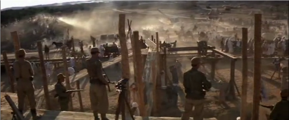
How much does Indiana’s character affect what people think of archaeologists? When I watched the movies as a child, I already had such a strong association between archaeology and digging that the only scene in the movie in which I felt archaeology was being performed was the Nazi-funded excavation in Cairo. My impression of archaology was no more correct, then- (had you asked me for an example of an archaeological dig in a movie I night have pointed you to Jurassic Park) but it was not quite so shaped by the movies as concerned archaeologists might fear.

However, Indiana Jones is a powerful icon, and public archaeology tends to evoke him whenever possible in order to generate interest.

These two exhibits, one by the National Science Foundation and the other by National Geographic, both compare modern archaeologists to the famous hero, emphasizing discovery and unlocking secrets in particular. Visit them, and you’ll notice that one adopts a more critical stance than the other, but both focus on similarities over differences. Is this comparison harmful to public archaeology?

Review of Colonial Williamsburg’s Online Exhibit, “Mapping Colonial America”

I have chosen to review the “Mapping Colonial America” online exhibit on the Colonial Williamsburg website.  The home page of the actually Colonial Williamsburg website consists of scrolling images that relate to a number of really cool blogs and articles relating to colonial US history.  Among these links is also access to a page titled “Help Preserve America’s History,” allowing site visitors to make donations.


To access the exhibit, one must click a link title “Museums” and from there click “Online Exhibits and Multimedia.”  That page then lays out links to the online exhibits including a summary of each one.  I have chosen to focus on the online exhibits, “Mapping Colonial America,” which discusses and displays colonial maps from the collection at Colonial Williamsburg.

The multimedia presentation first displays a home page with the title of the exhibit with a sketch of a ship and what appears to be an old compass.  This presentation is based on the book “Degrees of Latitude: Mapping Colonial America,” written by Margaret Beck Pritchard and Henry G. Taliaferro.  The presentation display twenty-two maps with a variety of views as well as a brief description of each.  At the top of the page, there a number of topics including “Discovery & Exploration,” briefly discussing the importance and use of maps in colonial America.  The other topics include “Boundary Disputes,” “Navigation &Trade,” “French & Indian War,” “Revolutionary War,” and a “New Nation.”  These topics set the stage for the exhibit, giving an essence to and providing a context for the maps on display.

When clicking “got to maps,” the viewer can begin in 1701 viewing a map entitled “A New Map of Virginia, Maryland, Pensilvania, New Jersey, Part of New York, and Caroline.”  On the bottom of the page is a timeline with marks indicating the time period of the rest of the maps, giving the viewer a sense of where they are in the timeline of colonial American maps.  To the left is a more specific timeline relating to the date the map was created offering information of important events that occurred in colonial America.  On the right is information about the map itself such as the creator of the map, their profession, when the map was created, where it was created, and some interesting facts about it.  The presentation also allows the viewer to click on the map for more specific information about it as well as alternative ways to view the map including close ups of writing on the map.  The viewer may also zoom in on the actual map, which is pretty cool because it allows the viewer to have a more personal experience with the artifact allowing for closer exploration and observation.

I personally really enjoyed this exhibit.  I feel that this multimedia presentation did a great job of condensing relevant information and putting it in one accessible place.  I thought the exhibit was well organized in that the viewer could look through all of the maps but could also click on a map for further information about it.  The number of settings and different ways to view the map were effective as, and I think maybe create a greater impact than seeing the artifact in person.  I say this because the way in which the images are set up, give the viewer an idea of what to look for on the map.  However, I think that this exhibit would be pretty confusing for someone who is not super tech savvy.  I also wish there was a comments section or something like that to offer a place for community discussion.