
 I have chosen to review the “Mapping Colonial America” online exhibit on the Colonial Williamsburg website. The home page of the actually Colonial Williamsburg website consists of scrolling images that relate to a number of really cool blogs and articles relating to colonial US history. Among these links is also access to a page titled “Help Preserve America’s History,” allowing site visitors to make donations.
 To access the exhibit, one must click a link title “Museums” and from there click “Online Exhibits and Multimedia.” That page then lays out links to the online exhibits including a summary of each one. I have chosen to focus on the online exhibits, “Mapping Colonial America,” which discusses and displays colonial maps from the collection at Colonial Williamsburg.
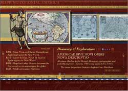
The multimedia presentation first displays a home page with the title of the exhibit with a sketch of a ship and what appears to be an old compass. This presentation is based on the book “Degrees of Latitude: Mapping Colonial America,” written by Margaret Beck Pritchard and Henry G. Taliaferro. The presentation display twenty-two maps with a variety of views as well as a brief description of each. At the top of the page, there a number of topics including “Discovery & Exploration,” briefly discussing the importance and use of maps in colonial America. The other topics include “Boundary Disputes,” “Navigation &Trade,” “French & Indian War,” “Revolutionary War,” and a “New Nation.” These topics set the stage for the exhibit, giving an essence to and providing a context for the maps on display.
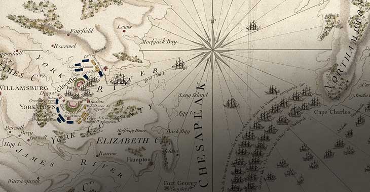
 When clicking “got to maps,” the viewer can begin in 1701 viewing a map entitled “A New Map of Virginia, Maryland, Pensilvania, New Jersey, Part of New York, and Caroline.” On the bottom of the page is a timeline with marks indicating the time period of the rest of the maps, giving the viewer a sense of where they are in the timeline of colonial American maps. To the left is a more specific timeline relating to the date the map was created offering information of important events that occurred in colonial America. On the right is information about the map itself such as the creator of the map, their profession, when the map was created, where it was created, and some interesting facts about it. The presentation also allows the viewer to click on the map for more specific information about it as well as alternative ways to view the map including close ups of writing on the map. The viewer may also zoom in on the actual map, which is pretty cool because it allows the viewer to have a more personal experience with the artifact allowing for closer exploration and observation.
I personally really enjoyed this exhibit. I feel that this multimedia presentation did a great job of condensing relevant information and putting it in one accessible place. I thought the exhibit was well organized in that the viewer could look through all of the maps but could also click on a map for further information about it. The number of settings and different ways to view the map were effective as, and I think maybe create a greater impact than seeing the artifact in person. I say this because the way in which the images are set up, give the viewer an idea of what to look for on the map. However, I think that this exhibit would be pretty confusing for someone who is not super tech savvy. I also wish there was a comments section or something like that to offer a place for community discussion.