Indiana Jones and the Archaeological Dig

While we’re on the topic of the use of archaeology in films, the ever-popular Indiana Jones series of movies deserves a mention.

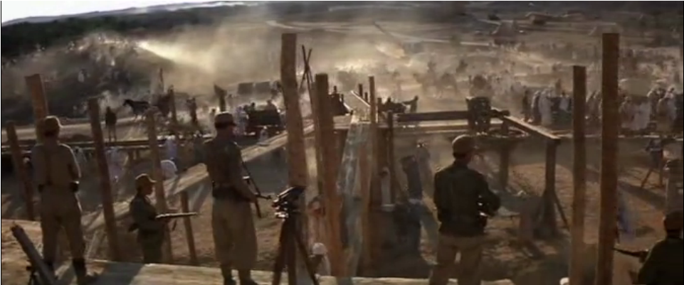
I grew up on these movies, and for years we had a whip in our costume box so my brother could dress up as Indiana, who was the ultimate action hero with a mild-mannered professor for an alter-ego. When archaeologists want to discuss popular misconceptions of what archaeologists do, they tend to point towards Indiana Jones, who we first meet in The Raiders of the Lost Ark as he steals a gold treasure from a perfectly preserved ancient temple, dodging booby traps and the incensed natives. His catchphrase, “That belongs in a museum!” does little to counteract the fact that Indiana Jones is more looter than archaeologist.

How much does Indiana’s character affect what people think of archaeologists? When I watched the movies as a child, I already had such a strong association between archaeology and digging that the only scene in the movie in which I felt archaeology was being performed was the Nazi-funded excavation in Cairo. My impression of archaology was no more correct, then- (had you asked me for an example of an archaeological dig in a movie I night have pointed you to Jurassic Park) but it was not quite so shaped by the movies as concerned archaeologists might fear.

However, Indiana Jones is a powerful icon, and public archaeology tends to evoke him whenever possible in order to generate interest.

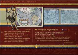
These two exhibits, one by the National Science Foundation and the other by National Geographic, both compare modern archaeologists to the famous hero, emphasizing discovery and unlocking secrets in particular. Visit them, and you’ll notice that one adopts a more critical stance than the other, but both focus on similarities over differences. Is this comparison harmful to public archaeology?

Monet’s Gardens in Giverny

In class we have been discussing the many different ways in which an archaeological site can be displayed as an exhibit.  Although it may not exactly be an archaeological site, Monet’s Gardens in Giverny is a great example of how some exhibits, like the St. Mary’s exhibit in Maryland, take the approach of recreating the site as it was in the past.

Monet’s gardens and house in Giverny was the home of the French impressionist painter, Claude Monet and his family.  The gardens were inspiration for many of Monet’s famous works including Bridge over a Pond of Water Lilies (1899).  Many years after Monet had passed and the property remained neglected by the family, it was finally in 1977 that Gérald van der Kemp was appointed curator at Giverny by the Academie des Beaux-Arts.  After about 10 years of restoration the property was well suited for visitors.  The idea behind the restoration process was to make the property look very similar to its original form.

There are currently many gardeners staffed to keep up the appearance of the garden throughout the year.  When I visited, everything was green because it was the summertime, so the gardens were not nearly as colorful as the gardens in Monet’s paintings, however still incredibly beautiful.  There were simple paths leading around the pond that Monet had painted.  Visitors could also stand on the bridge that Monet painted and take pictures.  The lilies, which are essentially to recreating Monet’s scene of the pond, were also being tended to by a gardener in a green boat (as seen in the picture).  In front of the house there were many thick gardens full of a variety of multicolored flowers and thin dirts paths among the plots leading to the modest yet brightly colored ivy covered house.


The house was clearly restored and polished, however maintained the essence of the French countryside. Some of the furniture I believe was actually used by Monet and his family and underwent restoration.  Visitors could walk through the house and see a completely furnished sun-filled bedroom, a bright yellow kitchen, and living room.  The living room walls were lined with Monet’s paintings from ceiling to floor, left to right.  A painting resting on an easel was located in the corner of the room giving the room a sense of life and a relationship to the painter who once lived there.  For me, it gave the space an emotive quality.  When exiting the property visitors were first led into a large gift shop with a very high ceiling that sold jewelry, prints of Monet’s paintings, art books, etc…  I visited with a bus tour (because that’s how my family rolls) and the gardens themselves were not crowded but within the house and gift shop it was pretty packed.

Overall it was an amazing visit.  I really enjoyed the recreation of the property – it was definitely an effective way of showing the site to the public.  It is also obviously a very popular museum.  According to the website, <giverny.org>, approximately 500,000 guests visit this museum annually!  The pictures here are from my visit they depict the pond, the gardens, and the house.


(First image is from <http://0.tqn.com/d/arthistory/1/0/r/S/mfp_mma_17.jpg> )


Looking Both Ways

Looking Both Ways is an online, interactive exhibit about the Alutiiq People of Southern Alaska, created by the Smithsonian Arctic Studies Center, the Alutiiq Museum and Archaeological Repository and the Alaska Native Heritage Center. The names of these three institutions are displayed largely on the homepage, indicating the collaborative nature of the project.

The exhibit provides a brief introduction to the region and people and map, which you can click on to learn about each village. Each village has about five photographs from different time periods with descriptions that name specific individuals and locations. The exhibit also has a section entitled “Object Categories,” which is comprised of different pages, such as “Our Ancestors,” or “Our Beliefs,” that use archaeological artifacts to tell the story of their way of life and show their evolution from the time of their ancestors through the present. These materials are, however, completely removed from their context, photographed against a white background, and the descriptions rarely tell you from which site they were found, which village they belonged to, what they meant to their owners or how they were found. Furthermore, images under the “Our Way of Living” section are given no dates, and are photographed as if primitive tools, no longer in use, but they sill allow the viewer to associate them with contemporary Alutiiq life. (see right)

I think the main idea of the site is to attempt tell the story of the Alutiiq people from their perspective, and teach the public about their heritage and identity. However, the exhibition focuses primarily based on the incontrovertible evidence of archaeological material to build their story, rather than through the multiple perspectives of oral histories, and in doing so loses any sense of indigenous authorship, despite its alleged collaboration. Whether the individual tribes where a part of the process, remains unclear.

While there are a lot of good ideas in this site, and it is very engaging, in some areas I believe is misuses images, as Perry warns us in her article. Some of the pictures are so obviously staged that they seem a bit phony, more like Halloween costume advertisements than images of real contemporary people, as they are completely removed from any sort of context (see left). Images such as these perpetuate stereotypes, and do not enable the viewer to create this new, factual-based conception of modern and historical indigenous life that the site aims to depict.

Review of Colonial Williamsburg’s Online Exhibit, “Mapping Colonial America”

I have chosen to review the “Mapping Colonial America” online exhibit on the Colonial Williamsburg website.  The home page of the actually Colonial Williamsburg website consists of scrolling images that relate to a number of really cool blogs and articles relating to colonial US history.  Among these links is also access to a page titled “Help Preserve America’s History,” allowing site visitors to make donations.


To access the exhibit, one must click a link title “Museums” and from there click “Online Exhibits and Multimedia.”  That page then lays out links to the online exhibits including a summary of each one.  I have chosen to focus on the online exhibits, “Mapping Colonial America,” which discusses and displays colonial maps from the collection at Colonial Williamsburg.

The multimedia presentation first displays a home page with the title of the exhibit with a sketch of a ship and what appears to be an old compass.  This presentation is based on the book “Degrees of Latitude: Mapping Colonial America,” written by Margaret Beck Pritchard and Henry G. Taliaferro.  The presentation display twenty-two maps with a variety of views as well as a brief description of each.  At the top of the page, there a number of topics including “Discovery & Exploration,” briefly discussing the importance and use of maps in colonial America.  The other topics include “Boundary Disputes,” “Navigation &Trade,” “French & Indian War,” “Revolutionary War,” and a “New Nation.”  These topics set the stage for the exhibit, giving an essence to and providing a context for the maps on display.

When clicking “got to maps,” the viewer can begin in 1701 viewing a map entitled “A New Map of Virginia, Maryland, Pensilvania, New Jersey, Part of New York, and Caroline.”  On the bottom of the page is a timeline with marks indicating the time period of the rest of the maps, giving the viewer a sense of where they are in the timeline of colonial American maps.  To the left is a more specific timeline relating to the date the map was created offering information of important events that occurred in colonial America.  On the right is information about the map itself such as the creator of the map, their profession, when the map was created, where it was created, and some interesting facts about it.  The presentation also allows the viewer to click on the map for more specific information about it as well as alternative ways to view the map including close ups of writing on the map.  The viewer may also zoom in on the actual map, which is pretty cool because it allows the viewer to have a more personal experience with the artifact allowing for closer exploration and observation.

I personally really enjoyed this exhibit.  I feel that this multimedia presentation did a great job of condensing relevant information and putting it in one accessible place.  I thought the exhibit was well organized in that the viewer could look through all of the maps but could also click on a map for further information about it.  The number of settings and different ways to view the map were effective as, and I think maybe create a greater impact than seeing the artifact in person.  I say this because the way in which the images are set up, give the viewer an idea of what to look for on the map.  However, I think that this exhibit would be pretty confusing for someone who is not super tech savvy.  I also wish there was a comments section or something like that to offer a place for community discussion.

Burarra Gathering: Sharing Indigenous Knowledge

Burarra Gathering is an online project authored by Questacon, Australia’s National Science and Technology Centre. At its physical location in Canberra, Questacon provides public exhibitions that promote greater awareness of science and technology within the community, emphasizing fun and hands-on experience. One of their outreach projects is Burarra Gathering, an interactive online exhibition (based on a physical one by the same name) that brings users on a virtual trip to the land of the Burarra people. The creators wanted to explore the significance of Indigenous technologies, and were intend upon making the exhibit ‘collaborative’ with the Burarra people of northern Arnhem Land.

The exhibit does an interesting job of presenting the intersection of Indigenous and ‘mainstream’ cultures. Our virtual host, a teenage boy named Danaja, is depicted wearing a brightly colored jersey and shorts, next to his grandfather in muted colors and a scruffy beard. Both guiding characters introduce the viewer to choice vocabulary of the Burarra language, and demonstrate usage of ‘traditional’ technologies like trapping fish, navigating a boat, understanding seasons, making fire with sticks, and tracking animals. Everything is animated, which perhaps appeals to their younger target audience, but also prevents any sense of real ‘intimacy’ with artifacts.

Perhaps the most interesting part of the online exhibit is the ‘permit application.’ Aboriginal land in Australia is privately owned, and you must be an invited guest to be issued a permit to visit. Danaja presents a postcard inviting us to visit the Burarra people, then asks that the user inputs their name into a simplified version of a permit application. The permit explains the importance of protecting the privacy, culture, and environment of Aboriginal communities.

The interface is not the smoothest by today’s standards, but the site could definitely be interesting and informative in classroom settings. Questacon says that Burarra Gathering has been successful because it shows that indigenous knowledge can be presented in engaging ways, and it helped cultivate a close relationship between Questacon and a remote Burarra community. They also say that it has inspired future creation of more projects that allow Indigenous communities to tell their stories online.

Review: The British Sloop Industry Online Exhibition

I looked at the the British Sloop Industry Exhibit from the Underwater Archaeology Museum. The authors, Chuck Meide (Director, Lighthouse Archaeological Maritime Program) and Sam Turner (Director of Archaeology, LAMP) identify themselves in the introduction and provide a list of acknowledgments on the credits page (which is, perhaps significantly, a separate page.) The webmaster, T. Kurt Knoerl, is listed at the bottom of the page. In the pictures that follow, none of the people are identified by name (attention is paid to the artifact or process being depicted), nor are the photographers identified. Self-erasure from the record is not the most reflexive method, even if a crew list is provided in the credits.

The introduction provides a historical context concerning Industry’s activities before it embedded itself in a sandbar in St. Augustine’s Harbor in 1764 (St. Augustine being, unfortunately, the sloop’s final destination), and the ship’s subsequent discovery by Southern Oceans Archaeological Research, Inc. in 1997.  The historical background gives a strong narrative of “discovering” and “colonization”, and mention of indigenous settlements is peripheral. This surprised me, as one panicky primary source reported that the beached ship (heavy with artillery and weapons) had been ransacked by Timucuan Indians, such that locals were now fearing all-out warfare. Certainly this is significant! “Today there are no known Native Americans who call themselves Timucuan”, but there must be ways to delve back into the record (archaeological or historical) to integrate that part of the story.

The methodology section provides an interesting account of how looting changes the archaeological process (but in an oddly disaffected way) and includes original surveys, but the jargon is not always explained. The findings section does not contain a full catalogue (a link to a dissertation on Industry provides a larger report), but each item is accompanied by a description, pictures, and historical context, making it the easiest to understand. However, this setup exactly mirrors what one might encounter in a museum, so I am not entirely sure what the online experience “adds” (other than helpful links to said dissertation and LAMP’s website, which are indeed helpful to have as immediate resources.)

SOAR worked to engage the general public through articles, high school internships (providing students with generalized training in nautical studies, museum practice, and public interpretation as well), television segments, and public talks. A section titled “Conservation” shows schoolchildren around a cannon submerged in a tank of water, speaking to the conservation of artifacts as well as public interest.

Review: NPS Archaeology Exhibit

The National Park Service’s Archaeology Program hosts a series of online archaeology exhibits, one of which is called The Earliest Americans.The Exhibit's Home Screen. The exhibit’s home screen has a sidebar with a list of subheadings containing links- the first two of which focus on archaeologists and archaeology as a discipline.  These hypermediate the exhibit as constructed, as the bearer of praxis and not just pure information. According to the first of these subheadings, the exhibit was inspired by a Harris poll that assessed the American public’s understanding of archaeology and attempts to move the public’s conception of archaeology away from archaeology and toward an understanding of publicly funded archaeology. The second subheading acknowledges past misrepresentations of early inhabitants of America and discusses the nomination of new National Historic landmarks. Three more subheadings divide the nation into the Midwest, Northeast, and Southeast. These subheadings begin with a migratory narrative of the prehistoric people in the area then have further panels focusing on archaeological and geological conclusions about the area and artifacts.

Each subheading can be converted into a Word document, which betrays the exhibitors’ conception of the exhibit as closer to a book than a museum experience- though links allow the audience to explore under self-direction, there is no video or interactive programming, so text is the dominant medium.

The exhibit is as much about archaeology as it is about early American inhabitants. Photos of archaeologists at work juxtaposed with artist’s interpretations of prehistoric scenes encourage the audience to engage with the text as a product.  Links allow the interested reader to engage deeper with the scholars by reading the study on which it was based. However, this reflexive attempt is mitigated by the fact that the exhibit is almost entirely lacking a female perspective: though one female archaeologist is portrayed in a photograph, the illustrations show only male figures and the narratives are either male-centered or genderless.

Highway to the Past: The Archaeology of the Central Artery Project–A Review.

The online archaeology exhibit, “Highway to the Past: The Archaeology of the Central Artery Project,” was created by “an intern from Northeastern University.” Though it would be preferable to know the name of this intern, the website was part of an archaeological project conducted by the Massachusetts Historical Commission, which lends it some legitimacy. That is, assuming the intern was actually working for the Commission. Knowing the author of a site can give the viewer an idea of the perspective the author is presenting a topic from, and may suggest possible biases. It can also help the reader decide whether or not the author can be trusted as an expert on their subject.  Here, it is a bit ambiguous.

This exhibit does a good job clearly and concisely explaining the context of the archaeological finds and what the objects are. There are also many pictures of the sites, the excavation process, and the artifacts. Only one of the sites in the archaeological project (which was done over a large area before the construction of a major highway in Boston) was described as a Native American site. Interestingly, unlike the other sites, which were fairly precisely dated (from the 1600s to 1900s), this site was given no date—not even an estimate. Perhaps we are expected to assume the site is from pre-Colombian times? Not including even a general date sort of puts the Native American site in a timeless space, which is both weird and inaccurate. Also, there is no mention of any Native Americans in any of the other sites, as if they did not and do not exist in more recent times, alongside the colonizers and their descendants. The website also does not provide much analysis for the reader as to the meanings of the artifacts. On the Native American site page, they merely provide a list of artifacts and encourage the reader to guess “what kind of activities” the Native Americans carried out there. There is no mention of which specific tribe or group might have used the site, which, along with not giving a time period, doesn’t help contest the image many people have of all Native American groups being basically the same. There is no use of any line of evidence besides the artifacts presented for people to guess what went on at the site.

Overall, the site is a pretty intuitive experience, and a good, if simple, use of the Internet as a medium for presenting archaeology. It uses a map of the general area of the sites as the basis for navigation, so that each page takes you to a new archaeological site. The overall purpose of the site seemed to be to educate the general public about how archaeology can uncover interesting windows into the past, even while progress is being made in the present (with the construction of the new highway). As might be expected with a large, urban governmental construction project, there is no evidence that any local people or descendants of the sites excavated were involved in any of the process.