Background and Motivation:
Many ordered physical phenomena such as ferromagnetic materials and solid state crystals are formed in nature from a nonequilibrium state of many particles or components, often with various distinct types or properties. Though studying single particle or two particle systems are essential to understanding physical phenomena at fundamental scales, the complex systems presented by multicomponent, many particle systems present interesting problems, and may come with significant practical applications. For example, ferromagnetism is a widely used and familiar phenomenon involving a large number of particles in an ordered solid. In the first half of the 20th century, physicist Ernst Ising was able to provide a mathematical model for magnetism by employing a simple dynamic two-component system of discrete particles in a lattice. Magnetism arises as an inherently quantum mechanical phenomenon that can be described as a collection of atoms with non-zero electron spin states and their associated magnetic dipole moments. The Ising model uses statistical mechanics and simplifies the system to a graph of particles with two possible states, spin up or spin down, interacting according to nearest neighbor approximations. Though the model is a gross simplification of the physical system, it is actually able to predict phase transitions across a temperature threshold from, say, ferromagnetic states to nonmagnetic states. Furthermore, due to the discrete nature of the model, it can smoothly be implemented in computational simulations without much loss of generality. An implementation of the Ising model in MatLAB, and mapping the associated phase transition, is described below.
Models involving multiple-component dynamics from nonequilibrium states can also be used to describe the self-assembly of molecular structures. Despite being a nonequilibrium process, self-assembly has largely been studied according to purely statistical mechanical models that consider the discrete dynamics of the particles to play no role in the evolution of the system except to convey the concept that systems tend to evolve along paths that minimize the free energy of the system [2]. Though this assumption holds for systems in near equilibrium states or for simple systems under mild nonequilibrium conditions, descriptions that do not account for the dynamics that emerge out of local interactions between particles fail to accurately describe the evolution of systems far from equilibrium. This is particularly true for self-assembly processes that reach thermodynamic equilibrium on long time scales with respect to experimental or computational limitations. For example, a system of particles forced into harsh nonequilibrium conditions, such as a liquid that is rapidly supercooled, may experience binding errors during crystallization, leading to kinetically trapped structures corresponding to “randomly” emergent local minima on the free-energy landscape. It is worth noting that kinetic trapping can also affect self-assembly of multi-component solid state systems under mild nonequilibrium conditions due to the slow mixing of components within a given system.
The Ising Model:
The Ising model was originally developed by German physicists Wilhelm Lenz and Ernst Ising in the 1920s. As stated above, the Ising model simplifies a magnetic solid by assuming that particles are fixed to an evenly spaced lattice of points and all have spin states aligned in either the +z or –z direction ( or
or  ). Due to interactions between nearby magnetic dipoles, particles have particular energy states associated with them according to a nearest-neighbors approximation. Here, a two-dimensional Ising model is implemented with each particle having four nearest-neighbors, as shown in Figure 1. The interaction energy between two particles with parallel spin components is given by
  (the subscript
  denoting “same”), and the interaction energy between two particles with antiparallel spin components is given by
  (
( denoting “different”). According to the theory of magnetism, magnetic dipoles with parallel alignments are in lower energy states than those with antiparallel alignments. This condition is satisfied by
  .
.
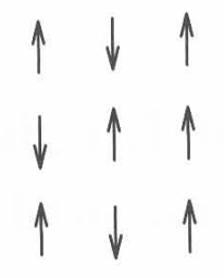
Figure 1. Schematic spin model for a ferromagnet. [1]
The dynamics of the model is achieved by randomly choosing particles at some rate  to flip to its opposite spin state with a success rate proportional to a Boltzmann factor with respect to the energy of the chosen particle. This probability is given by given by
  , where
  and
and  indexes over all four nearest neighbors. It becomes apparent that for flip events with
  flip with a probability of unity, corresponding to a lowering of energy, and that there is also non-zero probability for a particle to flip to a higher energy state [1]. However, the system should tend toward microstates with lower energy on a statistical whole, eventually approaching some minimum value given a finite number of particles and space.
Results and Analysis:

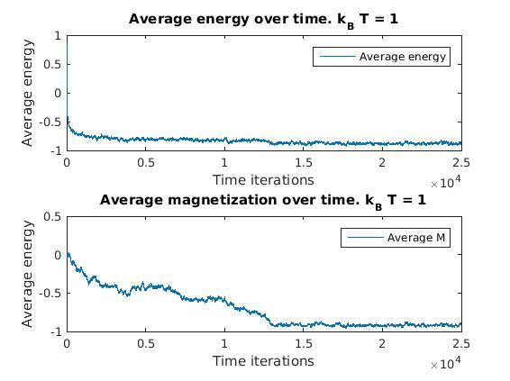
Figure 2(a) and 1(b): Monte Carlo implementation of Ising model (2D). Figure 2(a) shows a time series plot of the spin lattice. Lattice was initiated with particles in a checkerboard pattern (ie. with alternating spins). Temperature was below critical value and no magnetic field was applied. Figure 2(b) shows plots of the average energy and magnetization over time iterations. Energy decreases over time, and magnetization tends to approach either +1 or -1, implying total parallel alignment.
As expected, the energy decreases over time, and small localized domains of aligned spins begin to appear. Total alignment (or magnetization  ), is quickly approached as the free energy “reward” for parallel alignments increases. That is, at low temperatures, the Boltzmann factor is very small for positive values of
  , and thus the chance of flipping to a higher energy state is lower.
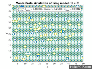
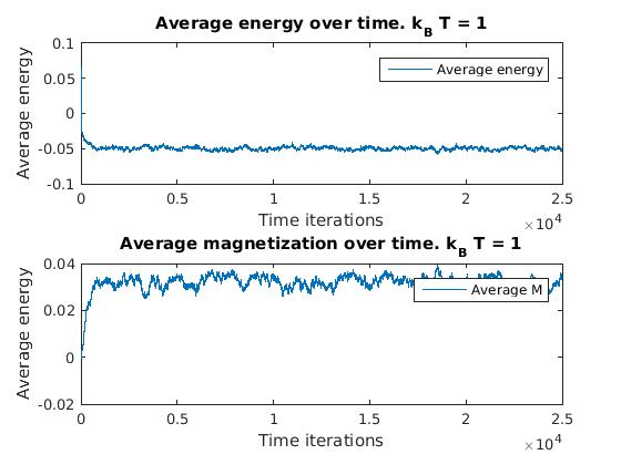
Figure 3(a) and (b): Monte Carlo implementation of Ising model (2D) with constant magnetic field in positive direction (ignore H=0 label). 3(a) shows a time series plot of spin lattice. Lattice was initiated with particles in a checkerboard pattern (ie. with alternating spins). Temperature was below critical value. Figure 3(b) plots the average energy and magnetization over time iterations. Energy approaches finite negative value and magnetization approaches finite positive value.
As a positive constant magnetic field is applied to the entire lattice, all dipoles begin to align along the direction of the magnetic field. However, once magnetized, if the magnetic field is set to zero, the magnetization will generally fall back down to zero unless the interaction energy for alignment for the material is large enough (for example, in ferromagnets).
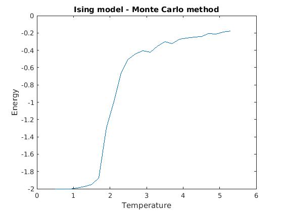
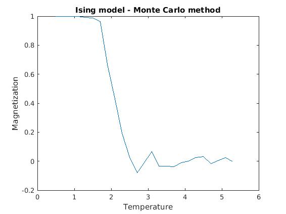
Figure 3(a) and (b): Monte Carlo implementation of Ising model (2D). Spin dynamics were calculated for each temperature value over 25,000 Monte Carlo iterations, and the last 1,000 values of energy and magnetization were averaged and plotted against temperature. All calculations were done for a 50×50 lattice, with all other relevant parameters normalized to one.
Figures 3(a) and (b) demonstrate the phase transition from a ferromagnetic state to zero magnetization. One can note some instability in both the magnetization and energy plots around 2.25 (units scaled to  ), indicating a critical point in the temperature. The system becomes incredibly sensitive to small perturbations as the properties of the material are rapidly changing over temperature. Exact analyical solutions for the critical point how that
  [1]. As T approaches 4, the system crosses the phase transition boundary according to mean field theory.
Future work:
The methods utilized by the Ising model to calculate the dynamics of many-particle systems is not limited to spin systems. The assumptions made by the Ising model, such as that the system dynamics are dominated by nearest neighbor interactions between n-types of particles and obey statistical mechanics, can easily be generalized to other systems as well. For example, consider the slow deposition of molecules with two distinct conformers onto a reactive substrate surface. Supposing that there are significant intermolecular interactions between the molecules and the substrate surface and between the molecules themselves, the dynamics of the system may be simplified to a growing analog of an Ising gas with two-components forced onto an underlying lattice. If this underlying substrate has significant nonhomogenous structure on the scale of the lattice spacings, patterns in the depositing overlayer may emerge. This has actually been observed in certain organic-inorganic interfaces, and the resultant structure may play a key role in the functionality of the material [4].
Conclusion:
A Monte Carlo simulation of the Ising model was developed in MatLAB, along with some extensions to multi-component growth modeling of gaseous particles solidifying on a substrate. Ideally, my implementation of Ising model can be generalized and used to develop other multi-component simulations with more complexity. This program had a number of limitations in its practical usage and theoretical robustness. For one, the order of calculates necessary to compute various results increases rapidly with complexity. My implementation in particular was limited to simulating a 2D lattices containing somewhere between a couple hundred and a thousand points, where as magnetic solids are 3D objects containing on the order of  atoms. Furthermore, though many unnecessary boundary effects were avoided by implementing toroidal boundary conditions on the lattice edges, which is useful for treating magnetism in the bulk, there is a lack of middle ground where both the bulk and the magnet edges can be accurately simulated in this model. There were also a number of significant approximations and assumptions made during the formalism of the model that affects the accuracy and relevance of the model to real physical systems. However, the model is surprisingly qualitatively powerful despite its simplicity, and has a wide range of applications to other multi-component systems.
References:
[1] Giordano, Nicholas J. Computational Physics. 2nd ed. Upper Saddle River, NJ: Prentice Hall, 2006. Print.
[2] S. Whitelam, L. O. Hedges, and J. D. Schmit, Self-Assembly at a Nonequilibrium Critical Point, Phys. Rev. Let., 112, 155504 (2014).
[3] S. Whitelam, Growth on a rough surface, 2016.
[4] C. Ruggieri, S. Rangan, R. Bartynski, E. Galoppini, Zinc(II) Tetraphenylporphyrin Adsorption on Au(111): An Interplay Between Molecular Self-Assembly and Surface Stress, J. Phys. Chem. C, 2015, 119 (11), pp 6101–6110

 , where
  is the position vector,
  is the wave vector,
  , and
, and  is a lattice vector (the position vector between two lattice sites) [1]. In one dimension, this reduces to the criterion that
  , where
  ,
,  is the periodicity of the potential, and
  is an integer. It follows from Bloch’s theorem that if
  is a solution to the Schrodinger equation, then
  is also a solution, provided that
  for some integer
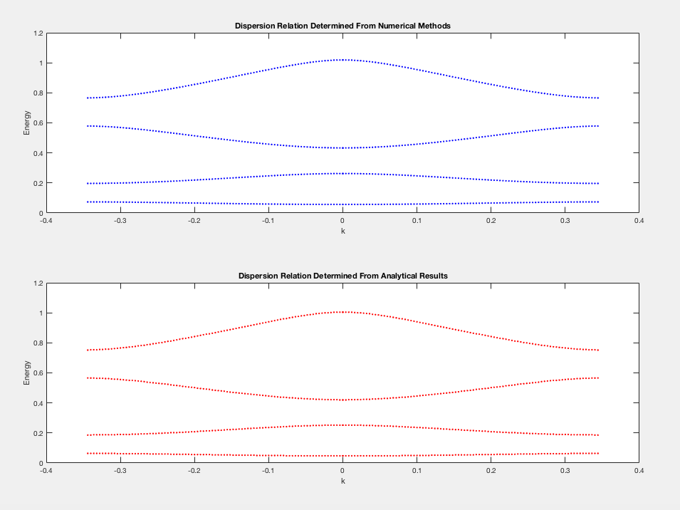
  [1]. It is common to plot the allowed energies against
  for
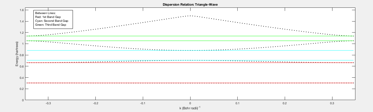
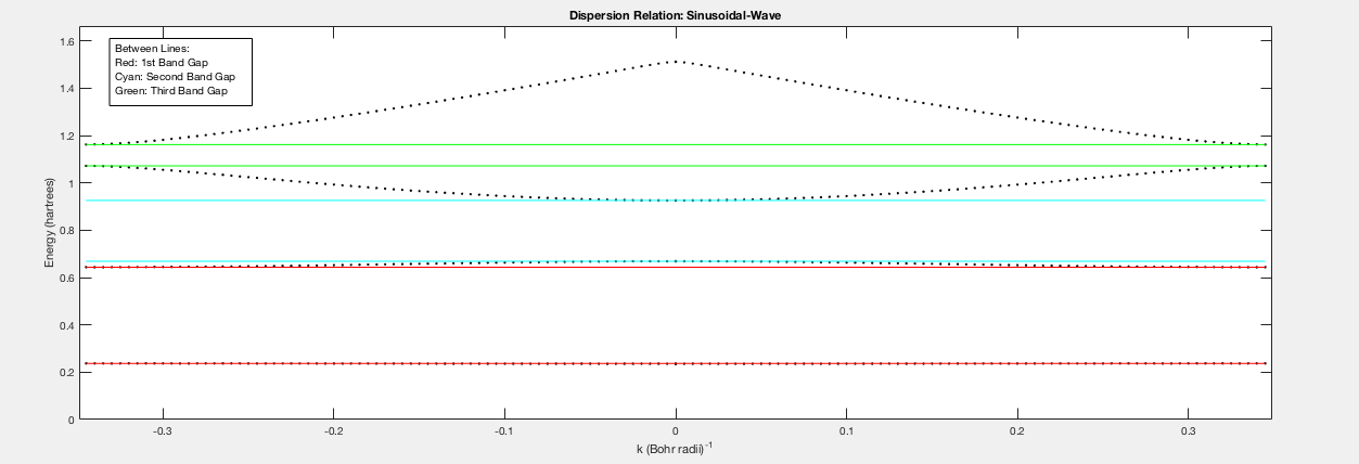
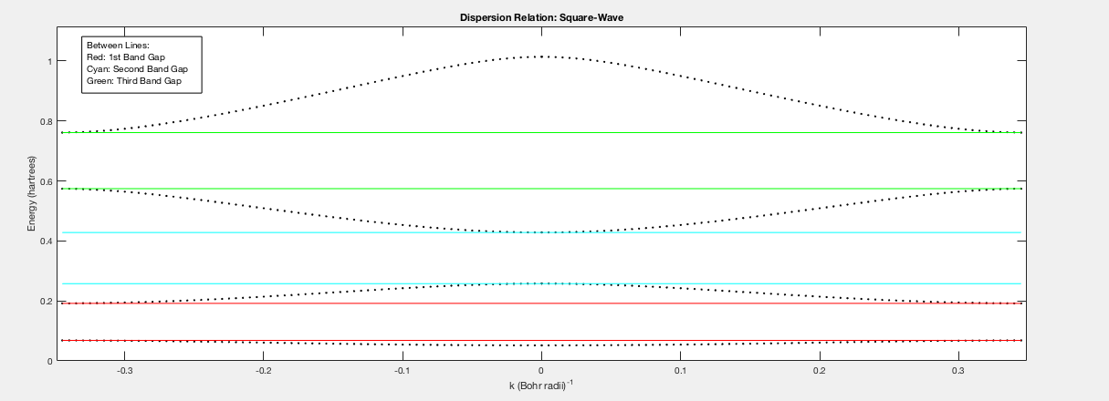
for  (known as the first Brillouin zone), as this gives a complete account of the allowed energies of the system [1]. The energy of the allowed wavefunctions as a function of
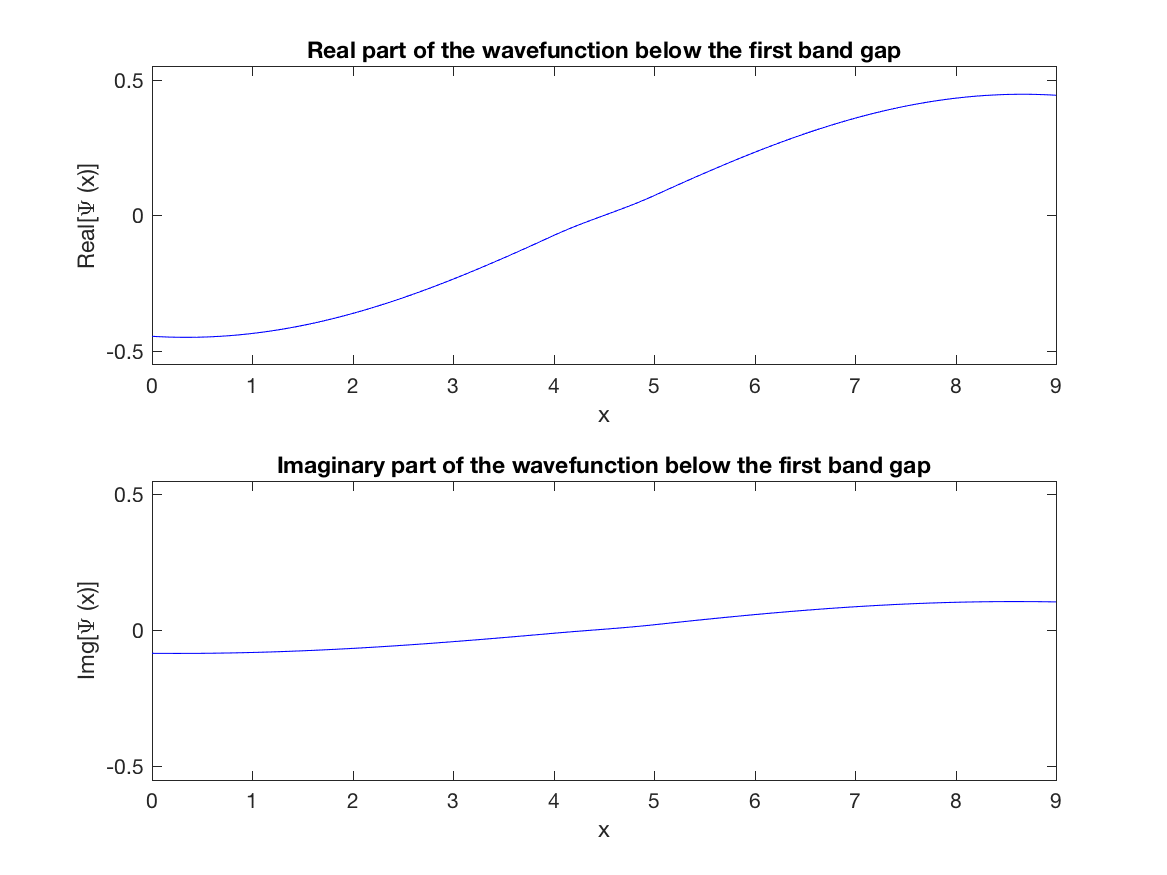
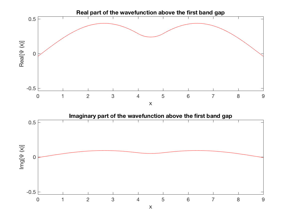


 , so there exists two linearly independent solutions for each value of
  , which we will denote as
  and
and  [2,3]. In other words, any wavefunction with wavenumber
  for some complex numbers
  and
and  [2,3].
![\[\frac{\hbar^2}{2m} \frac{d^2}{dx^2} \psi+V\psi=E\psi \approx \frac{\hbar^2}{2m} \frac{\psi_{n+1}+\psi_{n-1}-2\psi_{n}}{\Delta x^2}+V_n \psi_n=E\si_n,\]](https://pages.vassar.edu/magnes/wp-content/ql-cache/quicklatex.com-3a21641f1efed382fee2b8f1a9f52d3a_l3.png "Rendered by QuickLaTeX.com")
 is the potential function,
  is the spacial step size, and
  spacial spacial step [3]. Rearranging terms gives:
 ![\[ \psi_{n+1}=\frac{2m(\Delta x^2)}{\hbar^2}(E-V_n)\psi_n-\psi_{n-1}+2\psi_n,\]](https://pages.vassar.edu/magnes/wp-content/ql-cache/quicklatex.com-98242c095b31fd4db957a11ecc1d80b8_l3.png "Rendered by QuickLaTeX.com")
 ,
,  and
and  ,
,  can be chosen without loss of generality [2,3].
 , and
, and  [1,2]. These boundary conditions can be expressed in terms of the coefficients
  and
and  , where
  ,
,  ,
,  , and
, and  [2]. For this system of equations to be satisfied, the determinant of the coefficients must be equal to zero. That is, the allowed energies for a given value of
  . If
. If  , then
  is treated as the energy and new values of
  ,
,  ,
,  , and
, and  are computed. This process is repeated many times so that several allowed energies are found for the chosen value of
  is chosen to be too small, an insufficient number of roots are found for
  to create a viable dispersion curve. If the energy step size is chosen too large, then the program is unable to locate the zeros of
  . Suggestions on how to implement this modification can be found in “Numerical Solution of the 1D Schrodinger Equation: Bloch Wavefunctions,” by Dr. Constantino Diaz [2]. An even more interesting progression of this work would be to write a program that can solve the Schrodinger equation in a two or three-dimensional potential lattice. The particular method employed in this program is not generalizable to higher dimensions, but other methods that also apply Bloch’s theorem to provide appropriate boundary conditions can be applied to periodic potentials of higher dimension [2]. In the case of higher dimensional potentials, the dispersion relation is anisotropic with respect to spatial orientation. Qualitatively, this is due to the fact that the spacing between potential barriers is different along distinct spatial directions [1]. A program that could allow students to explore this directional dependence of the dispersion relation and plot the associated wavefunctions could be a helpful tool to solidify the effect of spatial anisotropy on wavefunctions in crystals.
