by Cristián Opazo
In a previous post we examined the broad field of data visualization, ranging from the ubiquitous charts and graphs to be found on every news site to the sophisticated instances of visualization of experimental data at the frontier of research in the natural sciences. In this post, I intend to offer a sample of the most relevant and useful data sources and visualization tools available on the web, with a particular emphasis on those with potential impact in higher education.
Before there were data visualization tools, of course, there was data. One of the most important consequences of the profound impact of the internet on our culture has been the ever-increasing promotion and acceptance of initiatives of open access to human knowledge. This translates, among other things, into a wealth of open data repositories readily available for usage, like the World Bank Data site, the databases from the Organization for Economic Co-operation and Development (OECD), and projects by the Open Knowledge Foundation. Ever since making its way into the White House in 2009, the Obama administration has been true to its campaign promises of making public data available through a series of online portals, such as data.gov, usa.gov, and USAspending.gov, which offer a variety of demographic, financial and social data sets alongside useful visualization tools. (As an aside, we recently learned with horror that the existence of these sites could be threatened by the compromises reached during the approval of the latest U.S. federal budget.) The data.gov site features a series of educational projects in K-12 and higher ed for students to learn about government data, how to use it, and help create the tools that enable others to do so. On USAspending.gov, interested citizens can find out information about how their tax dollars are spent and get a broad picture of the federal spending processes. You can view and compare, for instance, the relative spending of every government agency at a glance.
Having open data repositories as well as open architectures for the development of appropriate tools for analysis and visualization of these data is crucial for an informed, educated society. Here’s an inspiring 5-minute talk by Tim Berners-Lee, inventor of the world wide web, about the relevance of this issue.

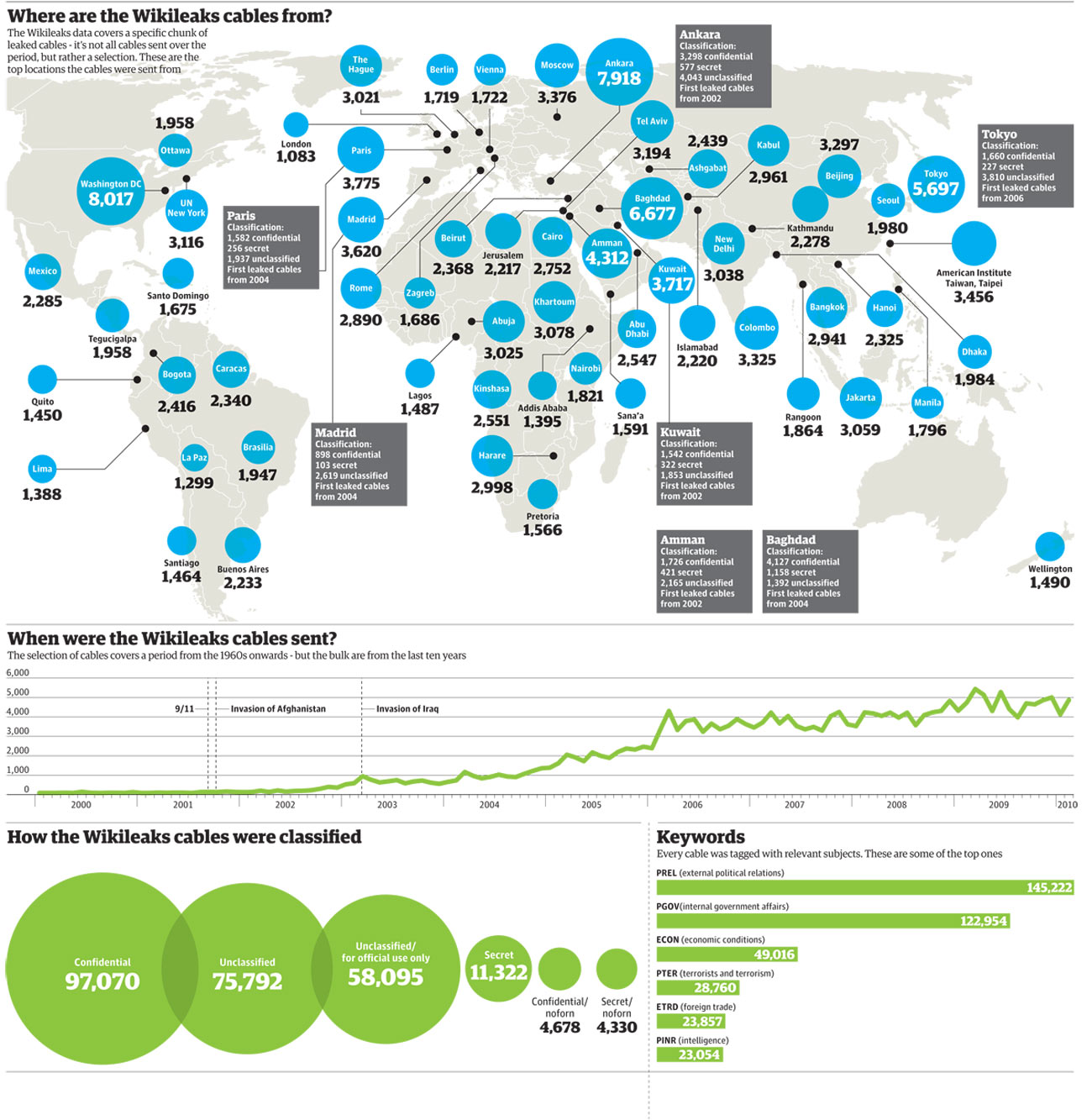
Wikileaks world map of embassy cables. Illustration by Finbarr Sheehy for the Guardian (Nov. 29, 2010)
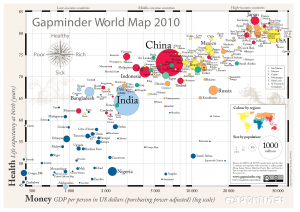
A number of tools now allow us to analyze, visualize, publish and share our own data, allowing us to become active participants of this new paradigm of open knowledge. Sites like Gapminder.org, created by the great Hans Rosling have acquired well-deserved attention because of their ability to make instant sense of otherwise impenetrable mountains of data. The Gapmider World application allows to interactively pick and choose world data about wealth and health indicators and dynamically visualize it through the years. Similarly, the interactive portal visualizing.org is “a community of creative people working to make sense of complex issues through data and design.”
Another site worth experimenting with is Many Eyes, by IBM Research, which also provides you with the ability of contributing your own data and creating visualizations such as word trees and tag clouds, charts and maps. In traditional Google fashion, Google Fusion Tables provide an open application that makes it possible to host, manage, collaborate on, visualize, and publish data tables online. Finally (if you haven’t had enough already), this blog post by Vitaly Friedman, author and editor-in-chief of Smashing Magazine, feature a series of interesting approaches to data visualization.
Enjoy, explore, and contribute!


