Overview & Background:
For my project, I analyzed non-saturated data taken in Professor Jenny Magnes’ laboratory of “roller” and “wildtype” C. elegans. worms. The goal was to use computational techniques to differentiate between worm types. To this end, I created three different types of graphs: lag, density, and Poincaré plots. All three used normalized data. Although my lag and Poincaré plot codes create 2D plots comparing non-lagged to lagged data as well as 3D plots that compare multiple lags, I am only including the 2D plots here due to the number of graphs I have.
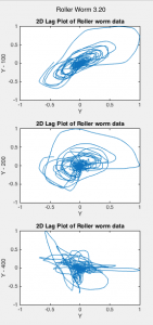
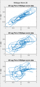
Lag plots display the value of the data at time (t) versus the data at time (t – lag), where lag is a fixed time displacement. These plots determine whether data is random or not. They are one method for inferring information about dynamical attractors from observations.[1] The time delay is used to reconstruct the attractor. I plotted lag plots with lags of 200 and 400 (Figs. 1-2).
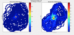
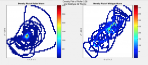
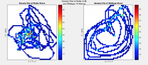
I then created density plots by binning the data into a 50 x 50 matrix and plotting the intensities of values in each bin (Fig. 3). These plots give information about the number of times point (x,y) appears in each plot by representing the counts with color. The density plot code also calculates the area of each plot divided by the area of values equal to zero (AreaRatio) and the area of each plot not equal to zero over the area of values that are (zeroRatio) (Fig. 5). These ratios describe the motion of the worms, specifically how much area they use to move around in.
Finally, I created Poincaré plots by plotting each value (point at t) against the next chosen value (point at t + lag) (See Fig. 4). Poincaré plots are return maps that can be used to help analyze data graphically. The shape of the plot describes how the system evolves over time and allows scientists to visualize the variability of their data.[2] They have two basic descriptors: SD1 and SD2.[3] Defining the “line of identity” as a 45-degree diagonal line across the plot, SD1 measures the dispersion of points perpendicular to the line of identity while SD2 measures the dispersion of points along the line. My code calculates and returns these statistical measures as well as the ratio SD1/SD2 for each lag determined by user input. For this project, I used lags of 1 and 100 (Fig. 6).
Results:
I. Lag Plots
Fig. 1 Lag plots of Roller Worms 3.20, 3.26, and 3.34 for lag values of 100, 200, and 400.
Fig. 2 Lag plots of Wildtype Worms 18, 19, and 26 for lag values of 100, 200, and 400.
II. Density Plots
Fig. 3 Density Plots of Roller worms 3.20, 3.26, and 3.34 (left) compared to Wildtype Worms 18, 19, and 26 (right) with lag 200
III. Poincaré Plots
Fig. 4 Poincaré Plots of Roller Worms 3.20, 3.26, and 3.34 (top) and Wildtype Worms 18, 19, and 26 (bottom) for lag values of 1 and 100
IV. Data
Fig. 5 Values of SD1, SD2, Ratio of SD1/SD2, Area Ratios, and Zero Ratios for Roller Worms 3.20,3.26, 3.32 (left) and WildType Worms 18, 19, and 26 (right) for lag values of 100, 200, and 400 as well as average values per worm-type (bottom).
Discussion:
The lag plots indicate that my data is non-chaotic because they all had non-random structures. There appears to also be differences between worm-types, although this difference is difficult to quantize. As the lag increases, the lag plots appear more chaotic for both worm-types, moving from aligning with the x = y line to appearing more random and diffused. The plots show a difference between worm-types, but quantifying this difference will take further analysis. Wildtype worms tended to fall closer to the x = y line than roller worms. This is a sign of moderate autocorrelation. This suggests prediction of future behavior is possible using an autoregressive model.[4]
The density plots show a clear distinction between worm-type, with rollers tending to have more circular-shaped plots with highest intensity values at the center while wildtype worms appear to take up less of the plot area, with highest intensity values along the diagonal and at the center of the plot. This is confirmed by the area and zero ratios (Fig. 5). Wildtype ratios were on average larger than those of rollers, with area ratio values ranging from 0.04-0.4 more and zero ratio values ranging from 0.1-0.4 more for rollers. This gives us a quantifiable way to measure the difference between the motions of the two worm-types. However, whether these differences are statistically significant or not remains to be seen.
The Poincaré plots show little difference from the x = y line for a lag of one. However, at lag 100 they do deviate from the line. Although lag differences between the worm types are difficult to quantify, these plots do appear to follow similar patterns to those in the previous two types of plots. The values of SD1 and SD2 helped quantify plot differences. Although SD1 did not differ on average by a notable amount (~0.0008-0.1), SD2 did show a notable difference. For the average roller, SD1 was approximately 0.3 for all lags. SD2 for wildtypes was around 0.5. The SD values decreased as the lag increased for both worms. These values resulted in a SD1/SD2 ratio for rollers over 1.3 times larger than that of the wildtype for all lags.
Conclusion & Future Steps:
These results indicate it may be possible to discern between worm-types using the computational methods described above. However, further analysis of the plots as well as analysis of more worm data is necessary to draw definitive conclusions. Statistical analysis should be employed on the ratios and SD values listed in Fig. 5 to determine whether they are statistically significant. This code could be used in the future to check if data is random or chaotic, find patterns in data, and compare and differentiate data sets. Certain improvements could be made to the code. The Poincaré code could plot the ellipse with SD1 and SD2 as shown in source [3]. The density plot takes longer to calculate at higher bin numbers, which corresponds to higher resolution. Improvements could be made to the code to improve computational time. This code also can only run one lag at a time. With improved speed, it could be altered so users can input as many lags as they want at a time, like with the Poincaré and lag plot codes.
References:
[1] Sauer, Timothy D. “Attractor Reconstruction.” Scholarpedia. 2011. Web. 11 Dec. 2016. <http://www.scholarpedia.org/article/Attractor_reconstruction>
[2]Golińska, Agnieszka K. Poincaré Plots in Analysis of Selected Biomedical Signals.” Studies in Logic, Grammar and Rhetoric. 2013. Web. 11 Dec. 2016. <https://www.degruyter.com/view/j/slgr.2013.35.issue-1/slgr-2013-0031/slgr-2013-0031.xml>
[3]Goshvarpour, Atefeh. Goshvarpour, Ateke. Rahat, Saeed. “Analysis of lagged Poincaré plots in heart rate signals during meditation.” Digital Signal Processing. 2015. Web. 11 Dec. 2016. <https://www.researchgate.net/publication/222569888_Analysis_of_lagged_Poincare_plots_in_heart_rate_signals_during_meditation>
[4] “Lag Plot: Moderate Autocorrelation.” NIST SEMATECH: Engineering Statistics Handbook. Web. 11 Dec. 2016. <http://www.itl.nist.gov/div898/handbook/eda/section3/lagplot2.htm>

