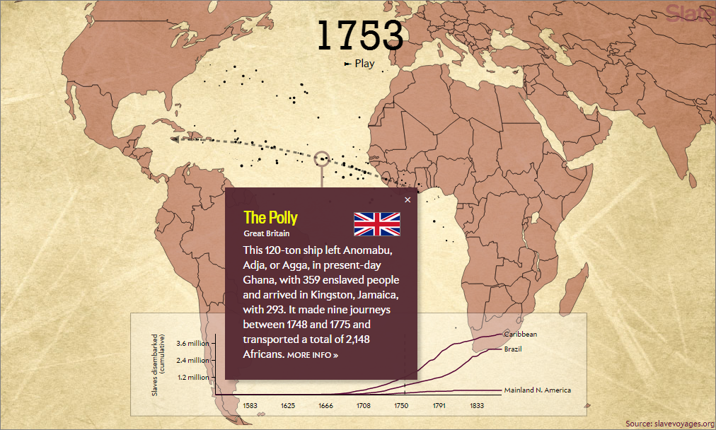
 Andrew Kahn at Slate.com has created a striking map-based animated graphic describing the Atlantic slave trade over 315 years. Slave-carrying ships represented as dots dart across a map of the Atlantic ocean from Africa to North and South America (and a few to Europe and South Africa), representing the flow of slaves. By pausing the graphic and clicking on a dot, the viewer can read details about each ship, including the name of the ship, its origin, destination, the number of enslaved people at the start and end of each voyage, and a link slavevoyages.org for more information.
Several trends are noted in the article. Different nation-states dominated the Atlantic slave trade at different times, bringing captives mostly to their different holdings in the Americas. By the end of the Atlantic slave trade in the 19th century, more than 12.5 million Africans had been enslaved and transported on over 20,000 voyages, with an estimated 2 million who did not survive the journey.