
food for creative making, doing, and thinking
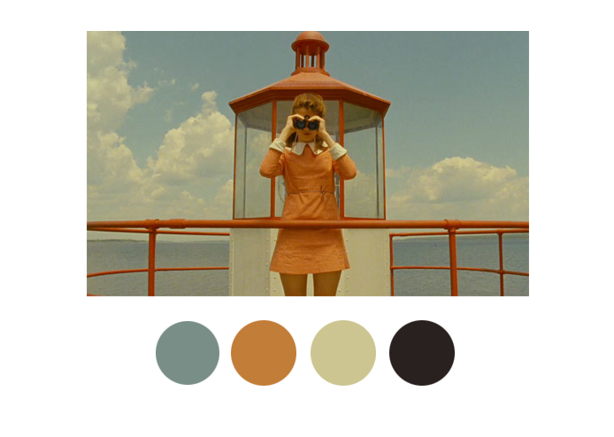
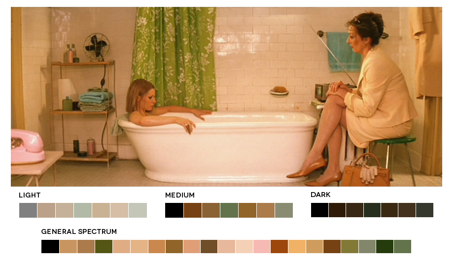
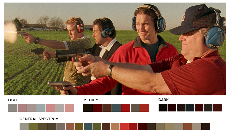
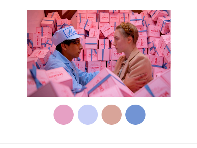
This is Vassar, so naturally, everyone loves Wes Anderson’s films. Aside from their intriguing plots, quirky characters, and witty dialogue, however, Anderson’s films contain many visual elements that are smart, sophisticated, and stimulating. At first glance, Anderson’s sets are obviously eye-catching and unconventional. The setting in which the characters live becomes just as important as the characters themselves and, in many ways, help to define the characters’ identities. When one looks closer, however, it is clear that Anderson is building these sets with a particular color scheme in mind. AnOther collected various examples of stills from different Anderson movies paired with specific palettes from sources like Tumblr and Movies in Color, and the evidence is striking. As a visual arts student, I really appreciate the attention Anderson pays to color and cohesiveness. There is certainly much to be said about the ways in which colors can impact the emotional charge or mood of a scene in film, and Anderson’s incorporation of color in his films is an excellent example of the different creative arts working together to create more impactful work. Here are a few of my favorite image/palette combinations:
http://wesandersonpalettes.tumblr.com/
http://moviesincolor.com/tagged/wes-anderson
http://moviesincolor.com/tagged/wes-anderson
http://wesandersonpalettes.tumblr.com/