
[Update 12 hours after originally publishing this essay: Well, this is interesting… and a little bit embarrassing: I seem to have misread the Census Flows Mapper data entirely incorrectly. So much for the “test drive”; it’s like I pulled out of the car lot and onto the highway with the emergency brake on the whole time! As my former student and University of Buffalo researcher Bart Roberts pointed out to me, the blue counties marked “net loss” on the map I generated represent places that Brooklyn lost net population to; i.e., they should be marked “cooler than Brooklyn,” not “less cool” as I originally did. And conversely, the yellow counties marked “net gain” on the map are places that Brooklyn gained population from; they should be marked “less cool than Brooklyn,” not “cooler” as I originally did.
Because the formatting is all screwed up when I try to strike-through the text I’ve corrected, which would have been the proper blog thing to do, I’ve instead had to cut out the incorrect parts from the original essay that you see in amended form below. To read the initial analysis that unfortunately gave a whole lot of Buffalo boosters false hopes, e-mail me for the original essay.]
If you want to understand musical landscapes, be those places known for their indigenous artistic idioms and innovations, or just places where musicians congregate to make their living, then you need to grapple with the issue of migration. I think there are at least two reasons for this. First, like other artists, great musical talents may be born anywhere, every minute, but their artistic development and economic rewards aren’t randomly distributed; musicians have long had to pack up and move to pursue these goals. This is the insight of the so-called creative-city thesis, but I was reminded of it by a passage from Théo Lessour’s Berlin Sampler discussing Claire Woldoff, the gruff, androgynous star of the cabaret scene in 1920s Weimer-era Berlin:
Despite her out-and-out Berliner accent, Waldoff was actually born and raised in the countryside, the eleventh child of sixteen. She really was every inch the self-made star, making the decision to come to Berlin herself in 1907 (pg. 84).
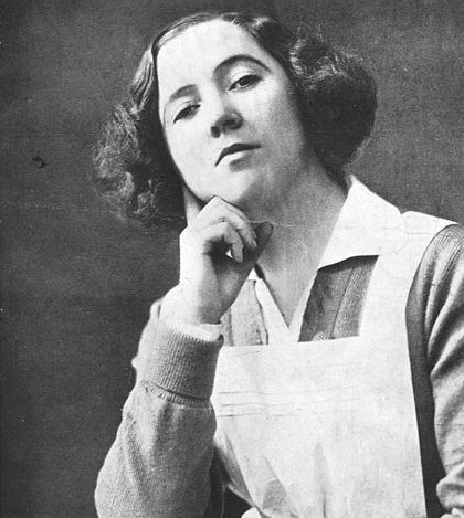
Claire Waldoff, star of 1920s Berlin cabaret
Second, as I’ve argued in my own work (following the claims of John Urry and other spatial theorists), the most important assessments and celebrations of “authentic” or “original” musical places don’t come from a local crowd. Instead, they reflect the perspective of significant outsiders who behold, evaluate, and (in today’s market economies) consume places for their own, non-local ends. The synthesis of these two points give us reason to suspect that creative talent is less likely to blaze its own geographical path (if it ever did in such a self-willed burst of genius) than to follow the broader movements of people from its own demographic and cultural kind.
Census Flows Mapper
Today we have remarkable data-gathering techniques for hypothesizing about and tracking the movement of musical and otherwise creative talent. And a new, user-friendly online application lets even novice geographers parse the most recent evidence for these phenomena. This week the U.S. Census Bureau released its Census Flows Mapper, which reports and analyzes annual county-level migration data as derived from a weighted average of the 5 most recent years (2006-10) of the American Community Survey. With this app, you can isolate and examine people who moved away (i.e., outbound migration), people who moved in (inbound migration), or the net migration flows combining those two patterns. You can also examine smaller sub-groups of migration flows by choosing one category from one population characteristic at a time.
Counties are imprecise units where a concept as geographically and culturally specific as ‘landscapes’ are concerned. We tend to think that neighborhoods or tighter local scenes are the active unit for creative agglomeration, but their impact can be diluted when they’re swallowed up by county-level data. Thus, the musical scene concentrated in L.A.’s Hollywood/Silverlake/Echo Park constellation has to contend with the data noise generated by Los Angeles County, the sprawling and most populous county in the U.S. So for my purposes here, a bit of extrapolation and consideration of what can be weak signals from the data is necessary.
However, New York City offers a great place to examine the impact of musical/creative landscapes becase, rather than being subsumed by a larger county, it actually comprises five separate counties corresponding to the five boroughs. So you can use the Census Flows Mapper to track migration in and out of each borough.
So let’s give Census Flows Mapper a test drive. Let’s look at the gravity that Brooklyn exerts on America’s young urbanites.
The 25-29-year-old demographic
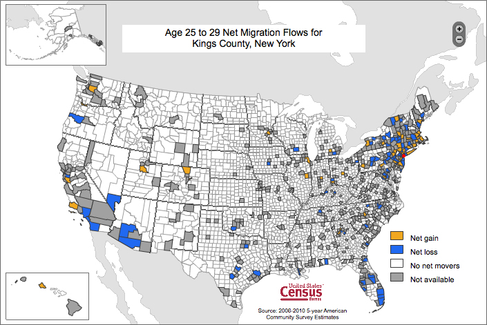
To do this, I’ve chosen to examine the flows of migrants ages 25-29 into and out of Kings County, which corresponds to Brooklyn. This group isn’t exactly the same age bracket as, say, the recent graduates depicted in the HBO series Girls, but unfortunately the Census measurement covering that group (ages 20-24) overlaps with the college student demographic, which has a very different geographical footprint, so the next older bracket will have to do.

And of course, Brooklyn contains many different social worlds of 25-29-year-olds. There are many low-income/low-education neighborhoods, immigrant enclaves, and (in the case of Brooklyn’s large Orthodox/Hassidic community) a community where the late 20s marks peak marrying/childbearing years. But I think these groups are maybe less likely to undertake long-distance domestic migrations as your stereotypical hipster looking for the next “cool city.” Their economic means and/or cultural values may discourage such serious relocations; alternately, their migration may be international, not domestic. Consequently, domestic county-to-county migrations of 25-29-year-olds into and out of Kings County isn’t all that bad an indicator for the cultural gravity that Brooklyn exerts on the economically secure, well educated and nightlife-active “generation” that will include musicians and their primary audiences.
In the “average” year recorded by the 2006-10 Census data, Brooklyn lost more people in the 25-29 bracket than it gained: 5487 outmigrants compared to 2640 inmigrants. That’s a small sliver of Brooklyn’s total (all-ages) migration (68,292 outmigrants compared to 8864 inmigrants), but compared to the other age brackets, 25-29-year-olds are more likely to move to Brooklyn than to move out. Using Census Flows Mapper, we can follow the moves of 25-29-year-olds into two categories of cities: those cooler and less cool than Brooklyn.
(By the way, if you’re following those numbers, Brooklyn’s apparent net loss of 59,428 migrants across all age brackets isn’t at all inconsistent with the pattern of population growth that Brooklyn has recorded in recent years. Keep in mind that Census Flows Mapper is only estimating domestic moves, i.e., from one U.S. county to another. So there are at least two sources of population change missing here, (1) foreign migrations and (2) natural population increase, that are probably quite relevant for understanding Brooklyn’s recent growth.)
What does it mean to be a city “cooler than Brooklyn”? Remembering that people are always moving into Brooklyn and out of it from across the country (in this period by an approximate ratio of 2:1), some cities saw more 25-29 year olds come from Brooklyn on the whole than they sent to it. We can see this this by grouping and ranking all the counties with net positive inmigration from Brooklyn, identifying those counties that have notable cities, and making the assumption that those 25-29-year-old ex-Brooklynites headed primarily to those cities. (Inmigration from Brooklyn to rural places is also evident in these data — look for the missing numbers under the “county rank in net inmigration” column — but that’s a subject for a different day.) A city that ranks high on this list, then, no doubt saw people of this age bracket leave for Brooklyn, but still more arrived from it.
Conversely, what does it mean to be a city “less cool than Brooklyn”? Simply that it lost more 25-29 year olds to the NYC borough than it gained from it; i.e., it recorded net positive outmigration to Brooklyn. Again, the data derive from the county level, with the assumption being that most 25-29-year-olds left the big cities within counties when they headed to Brooklyn. (And if you don’t see a particular city on the lists below, then either they zeroed out in Brooklyn inmigration/outmigration, or the Census Flows Mapper had no data for this age bracket.)
Cooler than Brooklyn (redux)
To begin, let’s look at the cities that are cooler than Brooklyn. From 85 counties reported by the U.S. Census Bureau as receiving net positive inmigration of 25-29-year-olds from Brooklyn over the 2005-09 period, I stopped counting after identifying 25 cities.
The top 25 cities cooler than Brooklyn
|
city
|
county rank in net inmigration
|
county prop. of net inmigration
|
|---|---|---|
|
Bronx
|
1
|
14.8%
|
|
Queens
|
2
|
6.1%
|
|
Los Angeles
|
4
|
3.8%
|
|
Jersey City
|
5
|
3.6%
|
|
Newark
|
6
|
3.1%
|
|
Ft. Lauderdale
|
9
|
2.8%
|
|
Las Vegas
|
11
|
2.2%
|
|
Columbia, SC
|
13
|
1.9%
|
|
Austin
|
14
|
1.8%
|
|
Miami
|
15
|
1.7%
|
|
Orlando
|
16
|
1.7%
|
|
San Diego
|
19
|
1.5%
|
|
Albany
|
20
|
1.5%
|
|
Oakland
|
27
|
1.1%
|
|
Tampa
|
31
|
0.9%
|
|
Houston
|
32
|
0.9%
|
|
Ann Arbor
|
33
|
0.8%
|
|
Nashville
|
37
|
0.8%
|
|
Madison
|
49
|
0.5%
|
|
Baltimore
|
50
|
0.5%
|
|
Burlington
|
54
|
0.5%
|
|
Tuscon
|
55
|
0.5%
|
|
Hartford
|
60
|
0.4%
|
|
San Antonio
|
64
|
0.4%
|
|
Lexington
|
73
|
0.2%
|
Source: 5-year average of American Community Survey (2006-10).
The first thing to note is that the “coolest” places compared to Brooklyn are the “even more outer” boroughs: Bronx, Queens, and (in the #4 county, not reported above) Staten Island; these three boroughs comprise 24.9% of all net outmigration under examination here. Destinations further into New York state comprise another 9.8% of these outward flows: suburban Long Island (Nassau County), denser parts of the Mid-Hudson Valley (Rockland and Dutchess Counties), urban New Jersey, and Albany. A very generous definition of New York City’s tri-state metropolitan area (inclusive of all New Jersey and Connecticut) adds another 13.7%, for a total of almost half (48.4%) of all net positive outmigration from Brooklyn. I would consider this first kind of move to comprise migrations of local to near-regional scale. They’re interesting because the net inmigration flows aren’t randomly distributed across the area (see the next table), but they don’t necessarily draw from the comparative, fully emancipated scan of “cities I could move to” that longer-distance moves do.
More to the point, within the NYC metropolitan area more 25-29 year olds are moving to areas with costs of living lower than what they can find in Brooklyn (or its “hip” neighborhoods, at least). There are two hypotheses, not exclusive of one another, that are worth considering to explain this picture. First, this could be the effect of gentrification: people in this age bracket (maybe disproportionately from lower-income brackets; remember that about a quarter of Brooklyn’s population lives in poverty) are moving out/being pushed out to lower-cost areas of the metropolitan periphery. Second, I can’t help but think of the effects of Brooklyn’s cost of living on a demographic whose earning patterns bear the scars of the recent recession; this net outmigration could reveal a return migration by 25-29-year-olds who grew up in the metropolitan area and discovered they couldn’t afford to stay in Brooklyn.
Now look at the rest of the list. Poor L.A., so near and dear to my heart, I slighted you in my earlier misreading of the Census Flows Mapper data. In fact, Los Angeles gains more people ages 25-29 from Brooklyn than it loses. So too for all the idealized “southern California” region, i.e. San Diego and (not shown here, the #72 less cool than Brooklyn county) Orange County. More broadly, other much-lauded “creative cities” are shown to be net importers of 25-29-year-olds from Brooklyn: Austin, Miami, Oakland, Nashville. So, too, are a good number of famous college towns, and (an overlapping category) bastions of urban grit (like Baltimore) and political idealism well known among the young, educated and adventurous in this country. Interestingly, many Sunbelt cities dominated by service, corporate, and tourism industries that you might have expected “creative” young people to leave are also “cooler than Brooklyn.” Possibly this reflects another wave of return migration.
Less cool than Brooklyn (redux)
Now let’s look at the cities that are less cool than Brooklyn. This table is derived from a much more centralized geography: 19 cities appear in the 52 counties reported by the U.S. Census Bureau as sending net positive outmigration of 25-29-year-olds to Brooklyn.
The 19 cities less cool than Brooklyn
|
city
|
county rank in net outmigration
|
county prop. of net outmigration
|
|---|---|---|
|
Manhattan
|
1
|
22.6%
|
|
Buffalo
|
2
|
5.8%
|
|
Pittsburgh
|
3
|
4.2%
|
|
Portland
|
4
|
3.8%
|
|
Providence
|
6
|
3.1%
|
|
Columbus
|
7
|
3.0%
|
|
Atlanta
|
10
|
2.6%
|
|
Seattle
|
12
|
2.5%
|
|
Washington, D.C.
|
13
|
2.2%
|
|
Boston
|
14
|
2.0%
|
|
New Haven
|
16
|
1.9%
|
|
Denver
|
20
|
1.7%
|
|
San Francisco
|
21
|
1.6%
|
|
Indianapolis
|
23
|
1.5%
|
|
Minneapolis
|
25
|
1.4%
|
|
Cincinatti
|
27
|
1.2%
|
|
Honolulu
|
28
|
1.2%
|
|
Chicago
|
29
|
1.1%
|
|
Charlotte
|
31
|
1.0%
|
Source: 5-year average of American Community Survey (2006-10).
Note: Atlanta’s rank should be a little lower than this, since DeKalb County
(which contains approximately 10% of the city of Atlanta) is the #12 “cooler than Brooklyn” county.
Here, the first thing to note is that the #1 “city” less cool than Brooklyn is the neighboring NYC borough of Manhattan (New York County); it accounts for 22.6% of all net outmigration under examination here. Manhattan is of course the one borough that’s more expensive to live in than Brooklyn; add in the fact that most of the edgy nightlife has left “the City,” and the attraction of Brooklyn on Manhattan’s 25-29-year-olds is understandable. Points further into New York state originate another 21.6% of Brooklyn migrants age 25-29, from far Long Island (Suffolk County) and the metropolitan sprawl (Westchester & Orange Counties), to the suburbs around Albany, to upstate cities like Buffalo (Erie County), Ithaca (Tompkins County) and even south of the Quebec border. Using the same generous definition of New York City’s tri-state metropolitan area as above brings us up to 48.7% of all net outmigration here.
At the broader scale, certain profiles of places “less cooler than Brooklyn” emerge in the cities that saw positive net outmigration of 25-29-year-olds to Kings County. Rustbelt cities of the Northeast and Midwest surrendered a good number of 25-29-year-olds: Buffalo, Pittsburgh, Providence, Columbus, New Haven, Indianapolis, Minneapolis, Cincinatti. But many hyped “creative cities” lost more people in this age bracket than they gained: Portland, Atlanta, Seattle, Washington DC, Boston, Denver, San Francisco, Chicago, Charlotte. Overlaying both of these categories, cities well known for their higher educational institutions sent 25-29-year-olds (their graduates?) to Brooklyn, as did counties not reported in this table: the homes of RPI, SUNY Stony Brook, UC Santa Barbara, UI Urbana-Champaign, etc..
Some perspective is in order. A city like Portland is hardly losing its 25-29-year-olds; it shows up on this list simply because it lost more people in this age bracket to Brooklyn than it received from it. For this and other media-celebrated cities, what the “uncooler than Brooklyn” concept provides is a snapshot of geographical hierarachy. Overall, young people are increasingly moving into Portland, but from within that critical demographic mass, a significant counterflow of young people is moving out to Brooklyn… and possibly other cities that I haven’t checked. So these data specifically provide a relational, Brooklyn-centric picture of geographical hierarchy — not bad if you’re a real estate agent or a planning theorist inclined to view the 25-29 age bracket’s footprint as the last word in analytical significance.
But at best, these Census data only begin to suggest the urban pecking orders — or “hipster hierarchy,” if you must — espoused by musical/creative communities within these cities. Maybe a smaller core of ex-Brooklynites stay in Portland, Seattle, or Atlanta because they’ve succeeded in these cities’ music industries, while many other would-be contenders pack up to try their luck in Brooklyn. Who can say? These migration data start outline structural patterns that are necessary but insufficient to support such ethnographic claims without further investigation into the urban lives of America’s 25-29-year-olds.