
Overview:
Throughout the course in computational physics this semester, I learned how to apply Matlab to different concepts and lessons in physics. I wanted to apply what I learned and collaborate them with ideas and materials from my major in Economics. For this project, I analyzed the data of the unemployment rate in U.S. using Fourier analysis. The Fourier transform decomposes a function of time into the frequency components that make up the original function. As a result, one can look at the different cycles and waves that make up the function. I look at the percent changes in the unemployment rate monthly from February 1948 to October 2016. The Fourier transform data has the amplitude graphed against its frequency, so I can look at the different cycles of the unemployment rate. The second part of the project was to apply a filter to the Fourier transformation. By applying the low-pass filter, I filter out the high frequency data. Then, I inverse Fourier transform the low-pass filtered data to compare it to the original data. I expected the data to have less noise, because the high frequency data that affect the volatility of the data in low periods will be filtered.
Fourier Transformation:
The first part of the project was to Fourier transform the unemployment data. I needed reliable data recorded frequently, so I used the unemployment rate recorded monthly from the U.S. Bureau of Labor Statistics. Then I had to apply the Fourier transformation.
Eq. 1
According to Fourier’s theorem, every function can be written in terms of a sum of sines and cosines to arbitrary precision; given function f(t), the Fourier transform F(f(t)) is obtained by taking the integral of f(t)’s sines and cosines function. The exponent factor is just the sum [cos(2*pi*frequency*t)-i*sin(2*pi*frequency*t)]. Discrete Fourier transform can be expressed into the next set of equations from the previous ones.
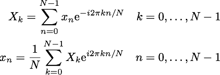
Eq. 2
The top equation in Eq. 2 is the discrete Fourier transform. The bottom equation is used to get the inverse of the Fourier transform or the original function from the Fourier transform equation. Since the equations in Eq. 2 are just a sum of exponential terms, it appears to be a very straightforward numerical evaluation. In reality, discrete Fourier transforms take a very long time to compute. Each term involves computing the exponential factor, which then have to be multiplied by xn and added to the running total. The total number of operations is of order N^2, because each sum for a given frequency component has N terms and there are N frequency components. However, one can see that the exponential terms in the discrete Fourier transform are multiples of one another. This makes it possible to group up terms in the sums in a way you can store those values and reuse them in evaluating the different components of the discrete Fourier transformation. This is how the fast Fourier transformation came about.
With discrete data set of N ~ 1000, I can perform the fast Fourier transform or the FFT to efficiently compute the discrete Fourier transform. Then, I squared the absolute values of the transformed data. Making this change to the data does not affect the data under Parseval’s Theorem that states, “the squared magnitude of the Fourier Series coefficients indicates power at corresponding frequencies.” The reason behind the squaring manipulation was to change the complex numbers to real components for graphing. Then, I graphed the amplitudes that I get from fft against the frequency. The highest frequency was the data being recorded every month, so I had to set the maximum frequency at .5. Bi-monthly data is the lowest period I can get accurate data from due to Nyquist frequency, which states that minimum rate at which a signal can be sampled without introducing errors is twice the highest frequency present in the signal. Any amplitude that belongs to higher frequencies than .5 would have errors. Many Fourier analysis of signals in physics is shown in varying range of Hertz. However, the periods in economic data have relatively very high periods compared to physics data periods measured in degrees of seconds. As a result, the frequency is relatively low in this graph. Also, the frequency is measured in number of unemployment cycles per month.
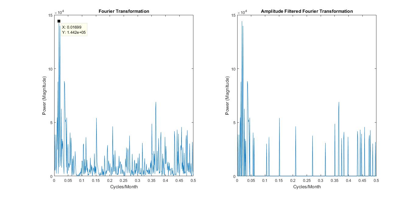
Figure 1.1
Left side of figure 1.1 shows the graph of the Fourier transformation. The right side just has amplitudes of less than 30,000 amplitude filtered out, so that it would be easier to look at the frequencies with higher amplitudes. One of the challenges of the project was getting the most accurate graph that I can. There are so many different ways the economic data can come out, however, the most accurate graph would have to show evidence that align with known theories in economics.
Analysis:
The frequencies with the highest peaks are the most significant components of the original data. The Fourier transformation graph of figure 1.1 has large peaks near the frequencies of .01699 cycles/month and .3653 cycles/month. These frequencies correspond to 58.858 months/cycle and 2.737 months/cycle respectively.
Business cycles, which include unemployment cycles, are supported very strongly to have cycle length of 5 years on average, which is 60 months. The high peaks that happen above and below the frequency of .01699 are the cycle components of fluctuations that happen in the business cycle. The Cycles do have an average period length of 58.858 months, but cycles can also happen in shorter or longer lengths. The other significant peak range is at 2.737 months/cycle. This aligns with the seasonal unemployment rate; the unemployment rate has a cycle for every fiscal quarter, which is about 3 months. Through these evidences, I can say that the unemployment rate data has been accurately Fourier transformed.

Figure 1.2
The known theories support the numbers I have, but I also wanted to compare my numbers to the actual numbers. Figure 1.2 is a record of U.S. business cycle expansions and contractions from the National Bureau of Economic Research. They also provide the average cycle (duration in months) of business cycles for both trough from previous trough and peak from previous peak. I looked at peak from previous peak, since the difference wasn’t significant. The average duration of business cycles from economic data of 1859-2009 was 56.4 months, which is very close to the value I got. However, the data also had recorded the average business cycles from 1945-2009. This applies more directly to my transformed data, because my data was from 1948-2016. The average for this period was 68.5 months. I wanted to look at why this data’s average was a bit off from my most significant peak.
The average does fit in the range of the cycle fluctuations, but I figured out that the most plausible reason is that because my transformed data was not smoothed out. One can see in Figure 1.1 Fourier Transformation graph that the business cycle frequency peaks at x=.01699 cycles/month (58.858 months/cycle) and drops to the next point where x=.01335 cycles/month (74.906 months/cycle). The average of the two months/cycle points is 66.882 months/cycle, which is much closer to the data presented in Figure 1.2. If my transformed data were to be smoother with more data points, then the average would have been more accurate.
Low-Pass Filter:
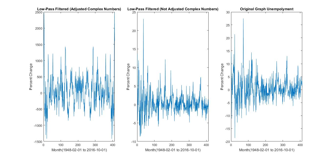
Figure 1.3
For the second part of the project, I wanted to apply a simple filter on the transformed data and see how the original data would be affected by that. The idea behind it was to filter out high frequencies above a certain point so that only the low frequency components would be left over for the data. If I were to build up the unemployment function again using the filtered components, what would the original data look like?
I expected the unemployment data to have less noise after the filter, because only the longer period cycles would build up the unemployment rates. I used the inverse Fourier transform function ifft to return the Fourier transformed data back to unemployment rate vs. time graph. The graph on the very right in figure 1.3 is the original unemployment rate graph taken from U.S. Bureau of Labor Statistics. I simply used ifft on the transformed data to return it.
The first step to filtering was to filter the power component of the transformed data, shown in the left, 1st graph of figure 1.3. This wasn’t an accurate representation, because the y axis has been affected by Parseval’s theorem. In order to fix this problem, I filtered the data only applied with fft. The most accurate filter graph I got was the middle graph in figure 1.3.
Analysis:
I made components from 300 to 412 (higher frequency components) equal to 0, so that we would still keep the information about those components and not lose resolution. Then, I inverse Fourier transformed that data. Consequently due to the change of the total length with data, the inverse produces transformed data with different unemployment rates from the original graph, including complex numbers. I was able to only plot the real number components. However, the filter helped me see the general trend of the unemployment rate changes at the exchange of some loss of information; the real number components that I do care about in the middle graph of figure 1.3 represents a more accurate graph of unemployment data with less high frequency noise. The evidence is shown in the decrease in fluctuations of the unemployment rate changes when the middle and right graph are compared in figure 1.3. The rates’ general trend converge more along 0. We do see a time (phase) shifting, but this does not impact the Fourier series magnitude and the inverse.
Conclusions:
The numbers I have gotten through the Fourier Transformation looks accurate and they align with the actual data published. I view my attempt at learning the material and applying it to have been successful. Since, I have used the data from 1948-2016, I should focus on the business cycle published between 1945 and 2009 in figure 1.2. The average of the business cycle is longer post 1945. Assuming that the trend will continue, I can look at the lower frequency end of the most significant peak fluctuation in the Fourier transform graph of figure 1.1. The reasonably lowest amplitude value of the fluctuation range has an x value of .009709 cycles/month, which is about 103 months or 8.6 years.
Our economy has been expanding since the end of the last business cycle, 2009, after the 2008 recession. The decrease in unemployment rate since 2009 has been polynomially decreasing, which indicates we are entering the contraction stage of the business cycle. Since we 7.5 years out of the 8.6 year business cycle I predict has passed, using my data, I can predict that the recession and increase in unemployment rate will happen in the next 1 or 2 years.
Additionally, it would have been interesting to develop filtering methods and programs further so I can get more smooth and accurate data on low frequency business cycles. However, given the time, I believe that the simple low-pass filter was sufficient to show how a filter affects the Fourier transform data and its inverse.
Reference:
NBER. “US Business Cycle Expansions and Contractions.” The National Bureau of Economic Research. NBER, 20 Sept. 2010. Web. 09 Dec. 2016.
Series, Nber Working Paper. Matthew D. Shapiro (n.d.): n. pag. NBER. NBER, 1988. Web. 9 Dec. 2016.
US. Bureau of Labor Statistics, Unemployment Level [UNEMPLOY], retrieved from FRED, Federal Reserve Bank of St. Louis; https://fred.stlouisfed.org/series/UNEMPLOY, November 29, 2016.
MIT. “The Fourier Series and Fourier Transform.” Circuit Analysis (n.d.): 102-23. MIT. MIT, Spring 2007. Web. 9 Dec. 2016.
James, J. F. A Student’s Guide to Fourier Transforms: With Applications in Physics and Engineering. Cambridge: Cambridge UP, 2011. Print.
