High-Performance Computing at Vassar

What is HPC?
Have you ever tried to run some code or perform some data analysis on your personal computer, and it ended up taking several hours or even days to finish? Frequently, we interact with data sets or projects that are simply too taxing for a single computer (even a very powerful one) to complete. This happens very frequently in a variety of fields across disciplines. High-Performance Computing (or HPC as it is known) is a field in technology concerned with providing advanced computing resources to researchers in order to speed up their data processing or modeling projects. Typically, these computing resources take the form of what is known as a computing “cluster”, which is really just a fancy name for a large number of computers that are all connected together and process data in unison.

Who can benefit from HPC?
-Students
-Faculty
-Non-Faculty Researchers
-Administrative Staff

HPC at Vassar (on-campus)
Here at Vassar, we have a computing cluster named “Junior” that was built in 2010. Junior has been used by many faculty and students over the years to run countless analyses and simulations for coursework and research in the Sciences and Humanities. The big advantage of using a system like Junior is that it has what’s called a job scheduler program installed. In Junior’s case, the scheduler program is called SLURM. Slurm enables users to submit the code or analysis that they want to run, and then the system will automatically load the required packages and software to complete the job, and output it into a user-specified format. This means that a user can submit a job that might take the system several days to finish, and then go and work on something else while awaiting the results, confident that work is being performed by the automated processes on the computer the whole time.

HPC at Vassar (off-campus/remote)
Here at Vassar, we have access to off-campus HPC resources as well:

  1. Through an agreement with the NSF-supported XSEDE system (The Extreme Science and Engineering Discovery Environment), Vassar researchers are able to apply for computing allocations on a variety of cluster environments that provide abundant libraries of packages, software, compilers, and user interfaces. The best part – It’s completely 100% free for Vassar! Your tax dollars are hard at work creating and maintaining this extensive network of HPC resources for use by all researchers.
  2. Vassar has an agreement with Amazon Web Services (or AWS) to provide for Virtual computing environments hosted in Amazon’s many data centers around the country. While we do pay by the hour for resources through AWS, the scalability and versatility afforded to us through this system are incredibly useful. Computing environments can be built and made accessible to the end-user very quickly and easily by administrators on campus. 
  3. We are exploring additional resources such as Google Cloud, Microsoft Azure, products from IBM, and partnerships with other colleges and universities with more robust computing infrastructure. We are also looking into avenues for the upgrade and/or replacement of Junior.

HPC Projects & Initiatives at Vassar
Many faculty at Vassar have been involved in using HPC in the course of their research and teaching. Courses and projects in BiologyChemistryCognitive Science, Computer Science, Mathematics, and Physics & Astronomy all make use of Junior and other HPC resources for course work and projects.

Just a few of the specific HPC projects underway or already completed include:

  • Chemistry Molecular research by Franco Caruso and Miriam Rossi which utilized Materials Studio in a cluster environment and has resulted in the publication of two successful journal submissions with a third in progress.
  • Biology research on viruses and bacteria using QIIME and other genetic analysis tools on both the local cluster and in AWS by David Esteban.
  • Deep learning research and course work using GPU-enhanced computational systems in the cloud by Joshua de Leeuw
  • Computational Quantum Chemistry research by Leah I. Bendavid on XSEDE.

Find out More!
If you’re interested in learning more about HPC, or getting in touch with other people at Vassar who are using HPC resources, please email Chris Gahn, the ACS Consultant for the Sciences.

Share

Main Campus Orthomosaic

The VSA organization Vassar Urban Enrichment asked us to create an aerial image of the entire main campus (i.e. not including the Vassar Farm, Townhouses, golf course, etc.) After a few tries with the ACS drone, we determined that the wifi signal it uses to communicate with its controller was insufficient for handling the distance we needed and the occasional obstacles in between. Drone pilot Chad Fust then used his own drone, which uses an RF signal, rather than wifi, and we were able to complete the project in two sections. The result is a merge (“orthomosaic”) of about 900 individual photos.


(Link to website)

Share

Beaver Pond

Prof. Lynn Christenson of the Environmental Studies program and Keri VanCamp of the Collins Field Station are interested in using the drone to acquire various types of imaging of the Vassar Farm and Ecological Preserve. One area of focus is the beaver pond, which they’d like to view from above at different times of the year and over the years. After several unsuccessful attempts, we were able to collect a series of 200 images and stitch them together into the following visualization.


(Link to website)

Share

Visualizing the Greenway Site

In January, ACS was asked to create an aerial photo of the Greenway site. This is an area in the college’s Ecological Preserve that was originally created as a composting area, but over time had become a dumping site. While the college has begun to clean it up, some interested students wanted to document the clean-up over time. We were able to create this image, comprised of 57 individual photos.


While we were pleased with that result, we were surprised to realize that the photo-stitching software that we used— Pix4Dmapper Pro— also created a 3D visualization of the site, which you can see at this website (click on “3D.”).

Share

Prezi

by Steve Taylor

Prezi is a tool for creating presentations, just as Powerpoint and Keynote are, but with some interesting differences. Since its creation in 2009, it’s been seen more and more in conferences.

Metaphors
One way in which Prezi differs from earlier presentation tools is its metaphor. Both Powerpoint and Keynote use the metaphor of a series of individual slides that can be shown in a predetermined sequence, just as 35mm slides would be shown with a carousel projector.

In Prezi’s metaphor, the creator arranges materials on an infinitely large canvas and— as I think of it— uses a video camera to pan and zoom through those materials. That can be done on the fly or the creator can pre-record a series of pans and zooms. The resulting presentation maintains the spatial relationships among the various materials.

It’s On the Web
Although they can be downloaded, “Prezis” are assembled on the web, through your browser, and can be presented via your browser as well. They can be shared with the general public or with a select group of colleagues (or members of a class.) You can even collaborate with others on the creation of your Prezi, which makes it a great vehicle for group projects.

Good and Bad Uses
I’ve seen great uses of Prezi and uses that make no sense at all— unfortunately, quite a few of the latter. If your presentation materials consist of a series of bullet-point lists, quotations, graphics, etc. that have no particular spatial relationship to each other, then there’s no particular reason to lay them out side by side and pan from one to another. But if there are spatial relationships— such as in a complex chart, diagram or map— then Prezi may be the perfect tool.

Here are a few examples of great uses for Prezi. You can pan and zoom on your own, or click the Play button to step through a pre-recorded tour.

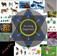
“Classification of Organisms,” created by Robert Kappus, will lead you systematically through a complex chart. The chart is circular, and the zoomed-in labels and graphics are aligned along radii of the circle, but that poses no problem, as the pre-recorded tour can not only pan and zoom, but rotate the view as well.
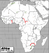
The “Physical Features of Africa Quiz” Prezi, created by Emily Thompson, will give you a tour through the major mountain ranges of Africa. Maps tend to be difficult things to project in a classroom, because the amount of detail means that labels often are too small to see from a distance. Prezi is a great vehicle for showing detailed maps, because of the extreme levels of zooming it can support.
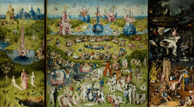
One of my favorite uses of Prezi is to explore different details of a complex work of art. Here’s one that I created, providing a tour through some of the details of the painting Garden of Earthly Delights, by Hieronymus Bosch. An instructor can present a series of details from a work like this, without losing the context of each detail.
A number of people have realized that Prezi can be a good tool for creating a concept map— a diagram that shows relationships among various concepts. Here’s an example of a Globalization concept map, created by Dennis Carnduff.

Go to the Prezi website to explore other materials that various people have made public, to get more ideas on how it can be used.

Licensing
Prezi offers three levels of licensing:

  • Public, which is free, provides you with 100 MB of storage, but requires you to make your creations public.
  • Enjoy, which costs $59/year, provides 500 MB storage and allows you to make your creations private.
  • Pro, which costs $159/year, provides 2GB storage.

However, students and teachers— anyone with an “edu” email address— can get the Enjoy level of license for free.

Prezi U
The website also provides a gateway to “Prezi U,” a community of educators who share ideas about using Prezi in their teaching.


Share

Open Data & Tools for Information Visualization

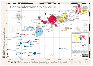
Gapminder World Map 2010

by Cristián Opazo

In a previous post we examined the broad field of data visualization, ranging from the ubiquitous charts and graphs to be found on every news site to the sophisticated instances of visualization of experimental data at the frontier of research in the natural sciences. In this post, I intend to offer a sample of the most relevant and useful data sources and visualization tools available on the web, with a particular emphasis on those with potential impact in higher education.

Before there were data visualization tools, of course, there was data. One of the most important consequences of the profound impact of the internet on our culture has been the ever-increasing promotion and acceptance of initiatives of open access to human knowledge. This translates, among other things, into a wealth of open data repositories readily available for usage, like the World Bank Data site, the databases from the Organization for Economic Co-operation and Development (OECD), and projects by the Open Knowledge Foundation. Ever since making its way into the White House in 2009, the Obama administration has been true to its campaign promises of making public data available through a series of online portals, such as data.gov, usa.gov, and USAspending.gov, which offer a variety of demographic, financial and social data sets alongside useful visualization tools. (As an aside, we recently learned with horror that the existence of these sites could be threatened by the compromises reached during the approval of the latest U.S. federal budget.) The data.gov site features a series of educational projects in K-12 and higher ed for students to learn about government data, how to use it, and help create the tools that enable others to do so. On USAspending.gov, interested citizens can find out information about how their tax dollars are spent and get a broad picture of the federal spending processes. You can view and compare, for instance, the relative spending of every government agency at a glance.

Having open data repositories as well as open architectures for the development of appropriate tools for analysis and visualization of these data is crucial for an informed, educated society. Here’s an inspiring 5-minute talk by Tim Berners-Lee, inventor of the world wide web, about the relevance of this issue.

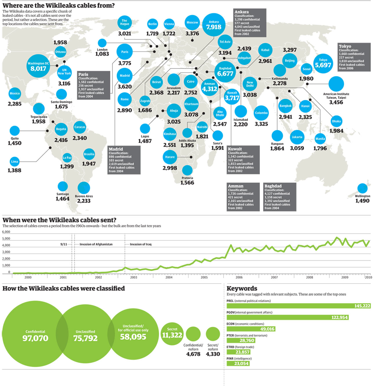
News organizations around the world have also made efforts not only to make publicly available data accessible to readers, but also provide interactive tools for easy analysis and visualization. The British paper The Guardian has been a leader in this regard through its Data Store site. They have collected, curated and made available global development data from sources that include the United Nations, the World Bank, and the International Monetary Fund (IMF). Here is a sample search for world literacy rates using the Data Store analysis tools. Furthermore, The Guardian’s Open Platform initiative allows developers to create custom applications through its open API. The site has been also successful in crowdsourcing a number of large data analysis efforts including sifting through Sarah Palin’s recently released email archive.

Wikileaks world map of embassy cables. Illustration by Finbarr Sheehy for the Guardian (Nov. 29, 2010)

A number of tools now allow us to analyze, visualize, publish and share our own data, allowing us to become active participants of this new paradigm of open knowledge. Sites like Gapminder.org, created by the great Hans Rosling have acquired well-deserved attention because of their ability to make instant sense of otherwise impenetrable mountains of data. The Gapmider World application allows to interactively pick and choose world data about wealth and health indicators and dynamically visualize it through the years. Similarly, the interactive portal visualizing.org is “a community of creative people working to make sense of complex issues through data and design.”

Another site worth experimenting with is Many Eyes, by IBM Research, which also provides you with the ability of contributing your own data and creating visualizations such as word trees and tag clouds, charts and maps. In traditional Google fashion, Google Fusion Tables provide an open application that makes it possible to host, manage, collaborate on, visualize, and publish data tables online. Finally (if you haven’t had enough already), this blog post by Vitaly Friedman, author and editor-in-chief of Smashing Magazine, feature a series of  interesting approaches to data visualization.

Enjoy, explore, and contribute!

Share

Presenting the Image – Powerpoint, Keynote & Prezi

by Matthew Slaats

Certain software programs tend to dominate the conversation at times, leading most to fall in line because of their pervasive nature.  No software has held court so long as Powerpoint, the industry standard when it comes to creating a presentation. The software’s format and interface so easily combined our conceptions of word processing and the analog nature of the 35mm slide, that no other choice seemed to make sense.  This ubiquity, though, is not without problems.  With the desire to integrate various forms of media growing, Microsoft has tended to be a bit slow in their response. I picture all of those who want to integrate web-based video into their presentation, but are constantly reminded that it can only be done on the PC version of the software.  Then there is the draconian method for developing movement within a slide (how many steps will that take?) and the horrible templates they provide for the slides.  My blood begins to boil every time I attend a conference and see bullets. Now we shouldn’t demonize Powerpoint in such a way. It is just a tool, and one that has served us well throughout its life.  But what alternatives are out there?  Is there anything?

One dilemma that I’ve seen boil up in the last several years has focused on a conversation that pits Keynote vs. Powerpoint. Apple’s version of a presentation software provides a much more flexible framework for developing material.  The main benefit of Keynote is its ease of use.  All or most of the functionality of the software is readily accessible and not hidden within a series of menus.  It provides a variety of ways for getting media into a slide and it  allows you to manipulate that information in a multitude of ways.  From easily creating animated movements that direct attention across a single slide to the ability to mask certain parts of an image, Keynote’s adaptivity is an expression of what Apple is known so well for producing. Beyond this, the software easily translates a Powerpoint file directly into Keynote and works in pixels instead of inches, which is a positive for those working with images.  If you are a Mac user, you have in Keynote an alternative to Powerpoint. The question resides in how motivated you are to make a transition from the one standard to another.

Here is a video that describes how to create an animation in Keynote.

http://www.youtube.com/watch?v=jsGOL9iKMtg

So you might ask if there is anything else out there that might be an option?  Yes there is and it is one of the more exciting options to come around in a long time.  Prezi is both a web- and desktop-based application that turns the tables on how a presentation can be constructed.  You are no longer confined to the slide, a 20th century format.  Instead, you have a wide open space upon which text, images, videos from Youtube, and a whole range of other media can be displayed.   Having such a blank canvas can be a bit daunting and requires a bit of creative skill, but the platform allows the user to move, rotate and scale information quite easily.  The other major difference is the ability to zoom in and out of the presentation, which allows elements to be revealed and placed into broader contexts in unique ways.  Beyond that, Prezi is primarily a web-based application.  This is something both Keynote and Powerpoint have been playing with in recent upgrades, but haven’t been as successful in achieving.  What is nice about this opportunity is that there is no need to carry a file around on a device that could be lost.  Your presentation is uploaded to the web and you can access it from any computer.  You no longer have to worry about compatibility because you are working with a PC or Mac. Here is a great video showing Prezi in action. (Click the arrow at each step of the presentation)

So, you now have to make a decision.  Do you stay with the standard or delve into something new?   I say give these other alternatives a try.  Know about them and how you might be able to use them to your advantage.  Though with the changes that have been taking place in this area,  I’m sure there will definitely be something new just around the corner.

Share

Visualizing Information

by Cristián Opazo

A 3-D visualization of a particle collision event at the LHC

Living in the information age has fundamentally transformed the way we interact with the world around us. In particular, it has transformed the way we digest information from the many sources at our disposal. Understanding diverse, complex sets of data has become a familiar task for all of us to deal with even through the simple process of reading the paper every morning. In other words, information technologies are reshaping our literacy to necessarily include new digital literacies.

The term Scientific Visualization has been used for decades in relation to the use of computer technologies as a way of synthesizing the results of modeling and simulation in scientific and engineering practice. More recently, visualization is increasingly also concerned with data from other sources, including large and heterogeneous data collections found in business and finance, administration, the social sciences, humanities, and even the arts. A new research area called Information Visualization emerged in the early ’90s, to support analysis of heterogeneous data sets in diverse areas of knowledge. As a consequence, the term Data Visualization is gaining acceptance to include both the scientific and information visualization fields. Today, data visualization has become a very active area of research and teaching.

The origins of this field are in the early days of computer graphics in the ’50s, when the first digital images were generated by computers. With the rapid increase of processing power, larger and more complex numerical models were developed, resulting in the generation of huge numerical data sets. Also, large data sets were generated by data acquisition devices such as medical scanners, electronic microscopes and large-scale telescopes, and data was collected in large databases containing not only numerical and textual information, but also several varieties of new media. Advanced techniques in computer graphics were needed to process and visualize these new, massive data sets.

A 3-D sonogram image of a baby fetus

Edward Tufte‘s now classic books on information visualization, The Visual Display of Quantitative Information (1983) and Envisioning Information (1991), encourage the use of visual paradigms with the goal of understanding complex relationships by synthesizing both statistics and aesthetic dimensions. A little earlier, Jacques Bertin, the French cartographer and geographer, introduced a suite of ideas parallel to Tufte’s in his book Semiologie Graphique (1967). The basis of Bertin’s work is the acknowledgment that graphic tools present a set of signs and a rule-based language that allow one to transcribe existing complex relations among qualitative and quantitative data. For Bertin and Tufte, the power of visual perception and graphic presentation has a double function, serving both as a tool for discovery and a way to augment cognition.

In future posts, I will describe in more detail the current landscape of data visualization across the fields of natural sciences, social sciences, humanities and the arts. Stay tuned.

Share